fbpx

The nature of Nature

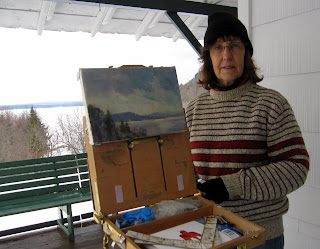
“Keuka Lake Vineyard,” oil on canvasboard, 9X12

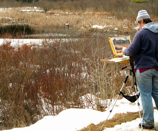
This year I am teaching plein air painting in two venues. I believe that all aspiring painters should study plein air. Why?
Character: The strength of plein air painting lies in its relationship to reality, but that is also its greatest weakness. Slavish homage to what one sees is a dangerous trap, even more deadly than the same tendency in figure or still-life painting.
Our appreciation of place is not entirely visual: it also encompasses sound and smell and spatial awareness. There are certain experiences in nature—such as standing in the sand on an elliptical shoreline—that are tremendously appealing in real life, but which make for weak paintings. A literal rendering of them is worse than banal: it lies about the character of the place.
The challenge for the plein air painter is to portray the place in a way that gives a sense of the non-visual cues—the warmth of the wind, drumming of the waves, crickets in dry grass. Either the non-representational aspects of painting become more dominant, or you fail. This happens in ways that figure or still-life never force you to consider.
Composition: We know intellectually that paintings built upon a strong, simple schematic project more powerfully than those pieced together from innumerable details. Nature, however, is essentially an infinite layering of innumerable details. With landscape painting, there is no solution but to fall back on the basic tools of composition: thumbnails, value studies, and shape studies. Painting students who rely on their instructors’ model poses or still lives will never learn to compose the way a plein air student—picking and choosing from the environment’s complexities—will learn to compose.
Communication: Painting is pointless if it is devoid of any emotional or intellectual content. Despite that, it is surprisingly easy to “phone it in” at times, especially in the controlled environment of the studio. We’ve all done it. But everyone has an emotional relationship of some kind with nature, and it is impossible to avoid expressing that.
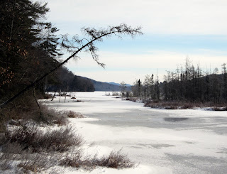
“Piseco Outlet,” oil on canvasboard, 9X12

Upcoming classes

The two venues I’m teaching in are convenient for both the local student who wants to study in Rochester and the out-of-town student who wants to take a single, intensive class:

  1. Weekly classes in the Rochester area, every Wednesday from 5:30-8:30 PM, meeting in some of the loveliest parts of Monroe County, from the pier at Charlotte to High Falls to Genesee Valley and more. The tuition is $100 a month. Email me herefor more information.
  2. “Adirondack Wild,” a plein air painting workshop at the Irondequoit Inn in Piseco from September 30 to October 5, 2012. The Adirondack preserve is the biggest, wildest park in the Lower 48, and at $775 all-inclusive (room and board) for five days and nights, this is the deal of the century. Download a brochure here.

It’s not easy being green

“Jamie’s waterfall,” 12X16, oil on canvasboard. Painted in two hours flat, and after
packing my car and driving six hours. Only possible because I was working with a color matrix.
We are at that moment when the greens of the northeast suddenly become massive, heavy, and sometimes overbearing to new painters. We love summer, we want to share how delicious it is… and then we hit the wall of green.
Sue Bailey Leo’s version
of my green matrix.
I paint with color matrices wherever possible because they speed the process up, and the more one can get out of one’s own way, the better things go. In the case of foliage, a matrix allows one to separate the different green tones in a painting.
I don’t generally paint with a green pigment on my palette (with the occasional exception of chromium oxide green because it’s the exact shade and weight of summer foliage in the northeast). Instead, I mix them:

This matrix is, top to bottom: black, ultramarine blue.
Left to right: Cad. lemon yellow (or Hansa yellow, depending on my mood), Indian yellow hue (or gamboge hue), yellow ochre.
That gives you nine yellows ranging from high-chroma to subdued, blue to almost orange. In addition, you can tweak each color to either side by adding more of one or the other component, and you can also tint each tone by adding white.
The same matrix, mixed and with the addition of a row of cad. orange in the “yellows”.
Sometimes I shake it up by adding a row of cadmium orange tints, as above.

I’ve taught with this matrix for years and can attest that it helps beginning painters escape the deadly weight of greens, fast. 
Sue Bailey Leo’s first trip out this season. Note
 how effectively she was able to separate the greens.
And here is me, painting in a creek this week. Never happier than when wet, cold, and totally into the process.
Painting in the creek in front of Jamie’s waterfall, at dusk. I loves my Keens!

Some Days, You Just Can’t Get Rid of a Bomb

“Loren’s farm,” oil on canvasboard, 12X16

 At our last painting session, Marilyn whipped out her grayscale markers (making me instantly regret that I hadn’t brought mine along). The forest was remarkably dark and moody this week, and the spring foliage far less advanced than down on the lake plains, and I was finding it difficult to find a range of values.

Marilyn Fairman sketching in grayscale markers.
A tonal drawing immediately reveals the strengths and weaknesses of one’s composition—if it doesn’t work in the simplified view, it isn’t going to work after you’ve invested hours painting, either. In fact, the painting I did in that last session ended up mired in a compositional issue that would have been immediately apparent had I done some fundamental drawing before starting, but I was tired and cutting corners. 
“Canoes at Irondequoit Inn,” oil sketch
To me, the difference between an adequate painter and an excellent painter is the amount of time said artist spends drawing. I wrote earlier this week about watercolor sketching, and have written frequently about drawing with a plain, ordinary graphite pencil.
“Breakwater at Irondequoit Bay,” oil sketch
In the field, however, I most often sketch with oils on small canvases. Here is a sketch I did of the canoes at the Irondequoit Inn, and another of the breakwater at Irondequoit Bay.* They took about as long as a graphite or watercolor sketch would have, but their purpose is somewhat different: they are simplified and monumental in the same way as the tonal grayscale marker (which is by far the fastest way of sketching). 

And the painters home from the hill…
I did three other paintings in the Adirondacks. One was a complete bomb (despite having spent a long time drawing and an equally long time painting).  I followed that up by inadvertently discharging the battery of my car outside of cell-phone range, leaving me stranded with a dead car with its keys stuck in the ignition. Marilyn set off on foot to get help while I dug out the battery—not as obvious as you might think, since it’s stowed in the side of the trunk. But a bad painting and a dead battery did nothing to dampen my high good spirits.

I’m struggling with something, which is by no means uncomfortable when you’re not fixated on the results. I have been working for the past few years on patterning my paint-handling in a more abstract way, but in the process I’ve lost some of the depth that a more traditional landscape approach gives. Now that has to be reintroduced.

“Mountain meadow,” oil on canvasboard, 12X16
But my hermitage (which became less hermit-like as the week went on) is over and I’m happy to be back in Rochester, in my studio, surrounded by my family, friends, and students.
*An alert reader will note that the Irondequoit Inn and Irondequoit Bay are about 200 miles apart. I leave that mystery to you to decipher.

There just might be something to this.

Early spring morning, Piseco Lake, oil on canvasboard, 12X16

Yesterday, I wrote about a Stillman & Birn Alpha Series sketchbook that Jamie Grossman gave me, and my first attempt to pre-sketch my paintings in it in watercolor.
This morning as I walked my appointed rounds, I carried the sketchbook and watercolors instead of my camera. The first thing I noticed—of course—is that it took rather longer to make my circuit than it usually does.
I’ve had my eye on this lovely house set on a hill for a few years, and there being a convenient bench, I sat down to sketch it. (I decided that it will be a better painting when the leaves are leafed out.) From there, I moved to a tree in the deep woods with a triple trunk, which proved to be very difficult, but which was good observationally. In both cases, I was approaching the project too much like real painting, which just irritates when all one has is one small brush.
My sketch, a bench.
This last sketch I did much more quickly, just ripping off a pencil drawing and then flooding the sheet with a color map. And it is frankly more satisfying than either of my earlier sketches (which you can’t see because I finished my day after dark and forgot to photograph them).
Transcribed directly
to canvas
Because I didn’t have a toned canvas, I decided to underpaint my finished study in alkyds. (By this point, time had ceased to be a meaningful constraint.) And it was a good day for them, too—the wind whipping off the lake dried them in no time. My alkyd painting is a simplified but direct rendition of the watercolor sketch.
In the end, this painting took me about four hours, and that is about what I’d expect for a field sketch of this size (12X16). So whatever time I spent on the watercolor sketch was saved on the final project.

Alkyd underpainting, transcribed from
watercolor sketch.

 Marilyn Fairman has joined me in the hermitage, and we spent the afternoon painting intensively. Tomorrow, we have all day to paint. What a joy that will be.

Experimenting

Cloud moving in over Oxbow Outlet, Oil on canvasboard, 16X20

I stopped to see my pal Jamie Grossman last week, and we fell into a conversation about sketchbooks. We both use them religiously, but (unlike Jamie) I tend to use the cheapest sketchbooks available and fill them with scribbled notes. Ever generous, Jamie gave me a Stillman & Birn Alpha Series sketchbook and suggested I try using it with watercolors, gel pens, acrylics, or ink instead of simply drawing with a pencil or graphite stick.
Sketch #1, from the seat of my car.
Jamie does lovely sketchbooks that hover on the line of being artist’s books—very lovely, very lively. I’m not interested in going there, but I can see the value in doing color sketches instead of pencil sketches. And all mental stretches are a good thing, right?
Balanced sketchbook on top
of my pochade box. 
I like to sketch whenever I have to sit, so I brought it with me to church last Sunday. However, a dynamic young rapper named CuevasWalker was preaching, and he defied capture in any form except the loosest gesture drawing.
I am in a self-imposed hermitage this week, which seems like the perfect opportunity to test Jamie’s idea. I brought only a #2 pencil and a Cotman pocket watercolor kit (with its one brush). My reasoning is that if my sketch kit expands beyond what I can put in my pocket, it’s useless.
Sketch #2. I still can’t bring myself to
paint across the spread like Jamie does…
Obstacle number one was apparent as soon as I reached my location: sketchbooks don’t fit on easels; they need to be balanced. My first sketch, therefore, was done from the driver’s seat of my trusty Prius—and I worked very fast because I was parked in a fire lane.
I tried again, balancing the sketchbook on top of my pochade box. That worked just fine, but I don’t think this sketch told me more about my composition than a pencil drawing would have.
Bug repellent… a necessity in
the spring in the Adirondacks.
Then I moved to oils. And that ended up being one of those transcendent experiences where one is totally engrossed in the process of painting, and whether it turns out well is immaterial (although, looking at these sketches, I do wish I’d worked from my original vantage point). 

I will try this process again today. Marilyn Fairman joins me to paint for two days. I’m both excited to paint with her and sad to see the solitude end.

P.S. Sorry about my month’s absence. We were marrying off our eldest, and that was an amazing project in itself, one which left no time for other creative ventures.

The place itself…

Flailing around

“Spring fever”(figure sketch, oil on canvas, 24X30)
Inevitably, someone will ask me, “How long did that painting take you?” This is a question I dread, as it is unanswerable.

This figure sketch was done last Saturday and took me about four hours of actual painting time—three hours with the model, and one hour to rough in a background. But that’s misleading.

I have painted this model for years. My studio is full of paintings of her—good, bad and indifferent. To some degree, every one of them was practice for this painting, just as this painting is practice for ones that will follow. Some were trips down dead ends. Some are works that stand up in their own right.

At this point, the model and I know each other pretty well. When she’s under the weather, my canvas shows it. And when she’s full of beans (far more often than not) it shows that too.  Painting the same model or a small cadre of models allows the artist to learn the subject and produce work that’s perhaps not as superficial as might otherwise happen. (The same is true of painting the same locale repeatedly.)

Occasionally, a student will complain about this repetition, but I feel pretty secure in saying that they have my permission to complain after they nail it perfectly. Since I never do, I don’t expect any of them to be calling my bluff any time soon.

The Saturday before last was one of those days of—as my friend Brad Marshall so aptly describes it—“flailing around.” But in that bad day of painting (and I’ve embarrassed myself by showing you just how bad it gets) was the germ of the following week’s better (albeit hardly perfect) painting.

I’m distracted: it’s income tax time, and my oldest child is being married in four weeks. On top of that, it has been an enchantingly warm spring and I can’t help but think about being outdoors right now. Neither could  the model, evidently. During a break I looked up to catch her staring out the window—and that was, in fact, the pose I was looking for. (More frequently than not, the pose I want to paint is one taken by the model when she’s not consciously posing.)

Headed for the slops pile: the prior week’s figure attempt. Promise you won’t let it get around.
So this prior painting will go in the slops pile, where I will allow it to ferment until I am absolutely certain there is nothing left to be mined from it, at which point I’ll slash it and get rid of it. Because for every painting that is decent, there is one or more that are… not failures, exactly, but stops on the way. My friend Marilyn Fairman, who is more fiscally conservative and scrapes down paintings she doesn’t like, calls those moments “saving the canvas,” as in, “I drove over to Piseco and saved a canvas today.” (She says it’s far better than leaving it to suffer.)

We all recognize those misfires as essential to producing the work we really want to make. As my pal Mary (a writer) says, “I’m typing along, and I’ve got an awning and a flowerpot and whatever else I can throw in there; it’s really bad, it’s schlock, but I keep typing and then suddenly, if I persevere, something comes together.”

The important thing is to get past the idea that “this work is good; ergo I’m a good artist.” A good painter is simply one who persists at painting.

A Child Walks With Jesus


This morning, I was in the sanctuary at St. Thomas’ Episcopal Church when I realized with surprise that the Stations of the Cross are on display—well, they would be, since they were made for Lent. (I don’t attend a Lenten-observing church anymore, and the calendar gets away from me.)


(If you would like to walk the Way of the Cross, it is done each Friday at 5:30 PM. The address is 2000 Highland Avenue, Rochester. Their full Lenten schedule is here.)
I made these Stations during my own personal annus horribilis, a year in which I was being treated for colorectal cancer. The quality is—looking back—uneven. No surprise there, since there were many days I could barely lift a pencil.
I was surprised to realize that they are also no longer on the internet in any form, so I dug deep into my archives and found copies of the illustrations and the original text, which I have reproduced here:
The idea of the Stations of the Cross originated in pilgrimages to Jerusalem, in the form of was later called the Via Dolorosa or “Way of Suffering”. This was an effort to understand in some small way the suffering of Christ by following him on the route of his conviction and execution.

 Gaudenzio Ferrari, Statue of Jesus climbs the Praetorian Steps, Polychrome wood, ca. 1510 Italy, Sacro Monte di Varallo (VC), Chapel XXXII

Of course, most devout Christians never get to Jerusalem. Attempts to replicate the Via Dolorosa experience for the rest of us appeared as early as the 5th century. Eventually these took the form of connected shrines, bas relief carvings on indoor or outdoor church walls, or woodcuts in bound books.
 Albrecht DĂĽrer (1471 -1528), ‘The Large Passion: The Crucifixion’, Germany, About 1498
For both the points on the Via Dolorosa and the images disseminated throughout Europe, the term “Stations” was in use after about the 15th century.
By the 16th century, out-of-door Stations of the Cross were a regular sight on the approaches to many large churches—most commonly with seven settings, but ranging up to 30.

by Adam Kraft (1490) in Nuremberg
In 1731, Pope Clement XII fixed the number of stations at the modern 14. These are:

  1. Jesus is condemned to death
  2. Jesus accepts the cross
  3. Jesus falls the first time
  4. Jesus meets His Mother
  5. Simon of Cyrene carries the cross
  6. Veronica wipes the face of Jesus
  7. Jesus falls the second time
  8. Jesus meets the women of Jerusalem
  9. Jesus falls the third time
  10. Jesus is stripped of His garments
  11. Crucifixion: Jesus is nailed to the cross
  12. Jesus dies on the cross
  13. Jesus’ body is removed from the cross (Deposition or Lamentation)
  14. Jesus is laid in the tomb and covered in incense.
The problem for we literalist Protestants is that Stations 3, 4, 6, 7, and 9  have no clear basis in the Bible.
So how does an evangelical proceed when asked to make Stations of the Cross for an Episcopal church? The Episcopal Church frequently hearkens back to what it calls its three-legged stool, which is in itself a recapitulation of Richard Hooker’s hierarchical ranking of doctrine:
  1. “What Scripture doth plainly deliver.”
  2. That which may be concluded “by force of reason.”
  3. That which “the church by her ecclesiastical authority” thinks and defines as true.
No room there for Veronica, no matter how lovely the story is.
Ironically, I could have just waited for the Catholics. In 2007, Pope Benedict approved a new set of Stations for Catholics, called the Scriptural Way of the Cross. Those Stations are:
  1. Jesus in the Garden of Gethsemane,
  2. Jesus is betrayed by Judas and arrested,
  3. Jesus is condemned by the Sanhedrin,
  4. Jesus is denied by Peter,
  5. Jesus is judged by Pilate,
  6. Jesus is scourged and crowned with thorns,
  7. Jesus takes up His cross,
  8. Jesus is helped by Simon to carry His cross,
  9. Jesus meets the women of Jerusalem,
  10. Jesus is crucified,
  11. Jesus promises His kingdom to the repentant thief,
  12. Jesus entrusts Mary and John to each other,
  13. Jesus dies on the cross,
  14. Jesus is laid in the tomb.
One thing—the originals are the property of St. Thomas’ Episcopal Church, but the right of reproduction resides with me, the artist. And that I share freely with the world. Go ahead and share them with anyone who might enjoy it.

Adirondack Wild, a plein air painting workshop

The porch at the Irondequoit Inn at dusk… a beautiful, relaxing place to listen to the loons on Piseco Lake.
A few years ago, my husband and son signed up for a father-son canoe trip in Speculator, NY. Because I’m always restless to paint, I rode up with them. And because I live near IrondequoitBay on Lake Ontario, I naturally booked a room at the Irondequoit Inn in Piseco, sight unseen.

That was the start of a beautiful friendship.

Canoes and kayaks near the beach at Irondequoit Inn, photo courtesy of Eric & Liz Davis.

Over my life, I’ve backpacked in the High Peaks, visited Ausable Chasm, camped along the Fulton Chain, toddled through Santa’s Workshop, been to the top of Whiteface Mountain in an overheating old Chevy station wagon, scouted for “Herkimer Diamonds,” pored over old boats at the museum at Blue Mountain Lake, hiked up to Lake Tear of the Clouds. But although I’ve painted all over the world, I had—until that trip—never painted in the Adirondacks.
Irondequoit Inn from their private island on Piseco Lake.
Cool photo, huh? Taken by Eric & Liz Davis.

Several years ago, I taught in the southwest desert. It was very interesting, and I came home having made some wonderful friends and taken some great photos, but I really got no brilliant work done.

Mill Stream, on the Irondequoit Inn grounds, photo courtesy of Eric & Liz Davis.
There were two limitations. The first is that the southwest desert doesn’t resonate with me in the same way as the northeast does, despite the fact that it is theoretically more painterly, being a land of broad vistas and warm colors. The second is that distances are so great that we spent an inordinate amount of time driving.

This year I am teaching a painting workshopin conjunction with the Irondequoit Inn’s 120th Anniversary, from September 30-October 5, which is the height of leaf season in the mountains.
My painting buddies will love the ambiance of this old-fashioned Inn, with its broad porches, antique furniture and casual charm. There is a beach, an island, and three streams on the Inn’s own property, along with three wonderful lakes within spitting distance: Piseco, Oxbow, and Lake Pleasant, meaning that no long drives need be undertaken.


Weather closing in on Piseco Lake outlet.

The price is fantastic—$775, including lodging and meals—even our box lunches for out in the field! And because the Inn is doing the management, I am free to concentrate on what I do best—teaching painting.
Here is a link to the brochure, and a link to more images (in no particular order). My NYC painting pals should note that they can take the train to Rensselaer/Albany and rent a car from there. (Or, if you don’t drive, they should contact me and I’ll see what I can do to arrange a car pool.)
I do hope you are able to join us.

More on extreme painting

Tom Thomson in his grey canoe

I spent a few extra days in Piseco last week. It was beautiful and austere in the silent falling snow. Shivering outside while painting in my nylon waterproof jacket and latex gloves, I spent more than a little bit of time considering the rigors experienced by Tom Thomson in the backwoods.

Thomson’s training was anything but conventional. He learned lettering and design in business school in Seattle—an idea that seems impossibly weird today. In 1905, he took up a position as a senior artist at a Toronto photoengraving firm. Given the state of photogravure at the turn of the last century, one should assume that the majority of his job involved what we would now call pre-press rather than actual design.

In 1909 Thomson joined the staff of Grip Ltd., where he came under the tutelage of the firm’s chief designer, J.E.H. MacDonald. MacDonald contributed much to Thomson’s artistic development: he himself was a formally-trained artist.

The McMichael Collection exhibits early works by Thomson and the Group of Seven and they are workmanlike but prosaic—typical landscape painting and graphic design of the period.

Tom Thomson’s own business card from his days in graphic design.

The radical change in their vision is partly attributed to a visit they made in 1913 to Buffalo, where they saw an exhibit of Scandinavian Impressionist and Art Nouveau paintings that they understood could be adapted to the Canadian viewpoint.

Danish painter Ahled Maria Larsen’s “Kejserkroner” (1910). I’m sure she will appreciate being remembered thus: “Side-by-side with her role as a mother and hostess, Larsen still found time to paint…” (Her work looks more contemporary than her peers’ from this distance.)

But it also came from the land itself. In 1912, Thomson and his fellows began travelling to the Mississagi Forest Reserve and Algonquin Park, the place with which he is most closely associated.

When painting on location, Thomson used a small wooden sketch box to carry his oil paints, palette, and brushes. His painting boards (generally about 9X12) were stowed in slots fitted in the top. This sketch box was similar to the modern pochade box except that it didn’t sit on an easel. Thomson worked sitting in his canoe, or on a handy log or rock with his sketchbox set in front of him.

Paintbox belonging to Barker Fairley, a disciple of the Group of Seven. Thomson’s would have been similar, for this was a kind of paintbox used until quite recently, when quick-release pochade boxes came into vogue.

In 1913 Thomson exhibited his first major canvas, A Northern Lake, at the Ontario Society of Artists exhibition. The provincial government purchased the canvas for $250, roughly equal to $5500 in current dollars. That year, Dr. James MacCallum guaranteed Thomson’s expenses for a year, allowing him to quit his job and head back to Algonquin. His career was made.

Thomson’s home base when he visited Algonquin was a small hotel called Mowat Lodge. He would stay at the Lodge in early spring and late fall, and then move into the woods when the lake and river ice broke up. In the depth of winter, he painted in his studio shack, a converted construction shed in a back lot in Toronto. It was there he painted full-size canvases from his field sketches.

Thomson was a certified guide, fire ranger, avid fisherman, expert canoeist, woodsman and painter—in short, a backwoods renaissance man. (Ironically, he was barred from enlisting in the Great War for health reasons.)

He was also plagued by self-doubt. AY Jackson recounted that in the fall of 1914 Thomson threw his sketch box into the woods in frustration. He said that Thomson “was so shy he could hardly be induced to show his sketches.”

It was in the solitude of Algonquin’s lakes and woods that he discovered himself as a painter. The backwoods can be dangerous, and it’s also where he died.

Thomson died sometime between July 8 and July 16, 1917, when his body was found floating in Canoe Lake. Although the cause of death was recorded as accidental drowning, his demise has become one of Canada’s most enduring mysteries, involving, variously, a love affair, a fight with a German neighbor about the Great War, a drunken brawl, or suicide.

I have a canoe, a pochade box, and a fishing pole. The ice will be breaking up in a month or so… do I have a backwoods painting trip in me?

Painting in the Adirondack Wilderness


“Oxbow Lake Outlet in February melt,” oil on board, 12X16, Carol L. Douglas. It was 10Âş F when we left the Irondequoit Inn to prospect for sites. That gives you a real appreciation for Tom Thomson and the Group of Seven.

To landscape painters, Tom Thomson and the Group of Seven are tied to Canada’s Algonquin Provincial Park. Both represent a muscular, vigorous kind of backwoods painting. Imagine Tom Thomson (who was a backwoods guide in addition to being a painter) snowshoeing into the woods to paint a winter scene, or paddling his paint-box in by canoe right after the Spring melt.

Even cars and roads don’t significantly change the winter painting experience. You’re still using cold paint in cold weather. Here Marilyn paints the view below.

I love the Oxbow Lake outlet in all seasons, and winter is no exception. Curiously, the water flows away from the lake here, into a stream.
This week, I met Marilyn Fairman (this year’s Irondequoit Inn featured artist) in Piseco to do some winter painting. When you strip away the convenience of decent roads and cars, our experience this week was much the same as those Group of Seven painters. We donned woolen sweaters and socks and hoisted our paintboxes to the edge of a boggy inlet to paint, just as Thomson and company did nearly a century ago.

Despite my great love for the view of Oxbow Lake (above) I chose to paint downstream for the lovely winter reds, golds and greens.
Adirondack Park is as untrammelled as is Algonquin. It’s a rocky, forested, watery fastness that was too inhospitable to support pre-industrial society. It doesn’t mesh well with the modern world of cell phones, internet and automobiles, either.
And it’s vast—far vaster, in fact, than Algonquin Provincial Park.
It’s the largest park in the contiguous United States. You could shove Yellowstone, Yosemite, Grand Canyon, Glacier, and Great Smoky Mountains National Parks into it with room to spare. In fact, at 6.1 million acres (or 9,375 sq mi, or 24,281 sq km), it’s more than three times the size of Algonquin.
One of my goals was to show Marilyn some of my favorite painting haunts. Turns out, she knows as many as I do, since she lives on the southern edge of the Park.
We spent some time looking at sites along Lake Pleasant and the west branch of the Sacandaga River, which is a rather lazy river that winds through a lovely Grimpen Mire. In twenty miles, there were literally dozens of prospects that took my breath away. They range from the intimate—rocks and water and bogs—to the panoramic.

Marilyn in her winter woolies. Remember when my student Kamillah Ramos painted from this site in November? Piseco Lake looks far different when it’s ice-bound.
I’m teaching a workshop here at the end of September (details to come), which is the height of northeastern color here in the mountains (and much warmer than February). The question isn’t finding something to paint; it’s how to tamp down the excitement long enough to work. I promise you, it will be a workshop like you’ve never seen before, of woodsmoke and the wind whispering through pines, rocky scarps and soft maples flaming violet along the bogs.

Addendum:

Here is a link to the workshop information. I’d love to see you there!