fbpx

The Radnor Hunt

Each week until the end of the year I’ll be giving you a behind-the-scenes look at one of my favorite paintings. These are paintings that are available for you to purchase unless otherwise noted.
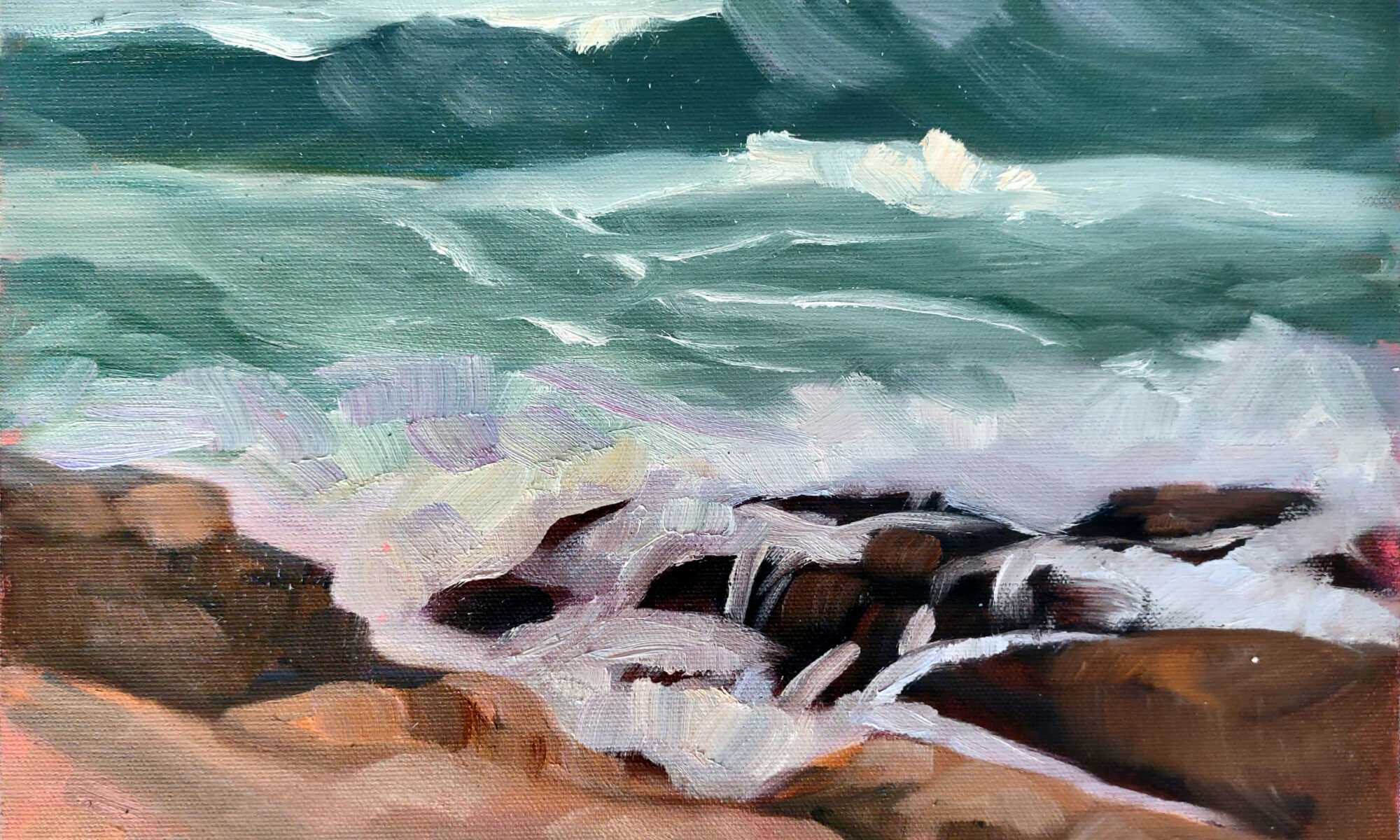
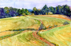
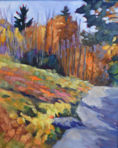
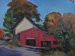
Autumn Farm, Evening Blues, oil on canvasboard, $1449 framed, includes shipping in continental US.

I had horses as a kid, and I rode, but the kind of riding I did was generally country lanes or along the Erie Canal. My mare, Bess, had been trained to an English saddle and bit, so I rode her on an old hunt saddle. My gelding, Oscar, was trained to a Western saddle, so I rode him Western with a curb bit. Our third horse, Capricious, was too much for me, so I rode him as little as I could. I did do my first jump on him. It was inadvertent. I didn’t see the ditch, he did, and he flew over it beautifully.

I took enough riding lessons that my parents were pretty sure I wouldn’t fall off. After that they left me to get on with it. There was little style to my riding. I had no special clothes or boots. Our horses weren’t shod because we never rode on the road. In fact, much of their lives were spent turned out in our old orchard, where they’d get drunk every fall on rotting fruit.

I do love drawing and painting horses. This is Scout, my friend Roger’s horse. No sense fussing; he doesn’t know how to hold a pose.

As an avid reader of British literature, I always loved the idea of the hunt. However, the closest I ever got to it were the hunter-jumper classes at the Niagara County Fair. In field hunting, the riders are dressed with formal elegance, there’s a pack of baying hounds, and the horses are beautiful, muscular and brave. I always imagined them streaming along tree-lines and taking fences at a full gallop.

So when I had the chance to paint near the historic Radnor Hunt in Malvern, PA, I was thrilled. I would paint the landscape and when the horses appeared I would somehow limn them into my composition.

Few things have been more of a let-down. It was a weekday, so the riders were in ratcatcher, which is a nice enough combination of tweed and tan, but hardly the pinks (which are actually scarlet coats) or black-and-white of a formal hunt. I first spotted the riders as they picked their way slowly down a far hillside and crossed the road towards me. You can see them in my painting as little marks, if you look carefully.

The hounds didn’t seem particularly motivated to start with, and they promptly lost the scent (if they’d ever had it in the first place). Riders and horses trotted around aimlessly, a few taking soft jumps over a drainage ditch, while the huntsman tried his darndest to get the dogs organized. As the false starts dragged on, most riders pulled up in groups of two or three and chatted. Their horses cropped grass. Eventually it was apparent even to me that the subject of the hunt had outfoxed the dogs. They turned and headed back up the hill from whence they had come.

It’s easy to do a gesture drawing of a horse. You go at it just the same way you do with people.

It was hardly a scene from one of Anthony Trollope‘s novels, but I did get a cracking good painting out of it.

Yes, I romanticize horses.

Autumn Farm, Evening Blues is 12X16. $1449 includes shipping and handling in continental US. It’s a bargain compared to what a good hunter will cost you, and you won’t have feed, vet or farrier bills. Click here to purchase online.

Reserve your spot now for a workshop in 2025:

Content over conscience

Two students analyzing an Andrew Wyeth watercolor for values and composition.

On the second day of my Rockport Immersive workshop, I took my students to the Farnsworth Art Museum to look at landscape paintings. As you might imagine, the Wyeth family are featured prominently. I want to say up front that I admire NC, Andrew, and especially Jamie Wyeth, who, in addition to having his forebears’ amazing chops, can often make me laugh out loud.

“Before you can paint like Wyeth, you need to learn to draw like Wyeth,” I tell my students.

A current exhibition documents Andrew Wyeth’s relationship with siblings Alvaro and Anna Christina Olson and their ramshackle saltwater farm in Cushing, ME.

Andrew Wyeth spent time at the Olson House from 1938 until immediately after the Olson’s deaths in December, 1967 and January, 1968. Christina was the more famous Olson, as she was the subject for Wyeth’s Christina’s World. A victim of a degenerative muscular disorder, she lived most of her life as an invalid. At the age of 53, she lost her ability to stand, so she crawled everywhere. (She chose to not use a wheelchair.)

The Wyeths summered in Maine and Andrew kept a studio in the Olsons’ house, where he painted the farm, the house, and its inhabitants countless times. He said that he was looking out the window of that studio when he saw Christina crawling up the hill after visiting her parent’s gravesite. Christina, however, was not the model for the painting. At 55, she was no longer in her first flush of youth, so Wyeth used his wife Betsy as his model. It lends a bit of implausible pulchritude to an otherwise bleak painting.

On Monday, we studied figure in the landscape. Photo by our model, Loren Brown.

“The challenge to me,” Wyeth said, “was to do justice to her extraordinary conquest of a life which most people would consider hopeless.” Personally, I’ve always thought Christina’s World is a fine mid-century abstraction that had reality superimposed on it. If it has an emotional pull at all, I don’t feel it.

That’s not to dismiss his incredible contributions to art. I encourage my students to spend time looking at his paintings. I stress this because, as I told my flock today, “Before you can paint like Wyeth, you need to learn to draw like Wyeth.” He was meticulous in his preparation.

Yesterday, while looking at watercolors of the interior of the Olson house, one of my students said, “Andrew Wyeth got rich painting the Olsons and their house and farm. Why didn’t he do anything to make their lives easier?”

The Olsons lived in grinding rural poverty. Wyeth’s paintings show unfinished plank walls, or walls with open lath where the plaster has fallen away, or the interior of their barn, untouched by modern agricultural conveniences. They used an outhouse, an unimaginable hardship for a disabled woman.

When MoMA bought Christina’s World, Wyeth became, essentially, an overnight success. There is an unbridgeable gap between that beaten-down farm and the Wyeths’ life in Chadds Ford, PA, so my student isn’t the first person to ask the question. Several sources have written that Wyeth offered the Olson family gifts, but Christina refused any money. How much of that is mythmaking and how much is true, I can’t say. Nor can anyone else, since all the principals are dead.

Talking to Cassie Sano about her figure painting. Photo by our model, Loren Brown.

Even if it is true, there are lots of reasons needy people don’t accept help, including the fear of stigma and loss of pride. Christina Olson could think of herself as Andrew Wyeth’s equal as long as she didn’t accept his money.

There’s no getting around the fact that Wyeth profited from the struggles of a disabled person. Nor did his wealth, built in part on their backs, bring them any relief. The final insult of poverty is that it kills you young. Alvaro lived to 73, Christina to 74. In contrast, Andrew Wyeth lived to 91, Betsy to 98.

That was then, and this is now, and we’re less ethically hazy, right? Every time I see a cell-phone video of a person being assaulted or dragged screaming to an unknown fate, I recognize that there was a cameraman or woman dispassionately filming, not lifting a finger to help the victim. Apparently, cameras without consciences will always be with us.

Reserve your spot now for a workshop in 2025:

Monday morning art school: how do I know I’m finished?

Dawn Wind, Twin Lights, 9X12, oil on archival canvasboard, $869 includes shipping and handling in the continental US.

“I know it’s not done, but it’s where I stop because I’m afraid I’ll mess up what I have,” a student messaged me. She was painting in a plein air event where ‘unfinished’ and ‘overdone’ were both errors.

“I think you won’t mess it up, and you can always scrape back to this level if you do,” I replied. She was painting in oils, which have the advantage of a partial undo. In fact, that can be the resolution of many problems, because the average of your errors, revealed by scraping back, is often the right answer.

Apple Blossom Time, 9×12, oil on canvasboard, $869 includes shipping and handling in the continental US.

For most of us, figuring out when a piece is finished is an almost-intuitive process that varies from one piece to another. My answer is, “I’m done when I’m sick of working on it,” but that isn’t particularly helpful advice. There are, of course, some objective factors guiding me:

Intention: I often start with a specific idea for a piece. I’ll never realize that 100%, because the human mind has its own ideas. However, I want to know that I’ve at least made my point.

Composition: I’m a bear about understanding the composition from the very beginning. If I haven’t done that, no technique at the end can save the painting. That said, there may be adjustments needed to strengthen my original idea-darks restated, or brushwork softened or made more precise.

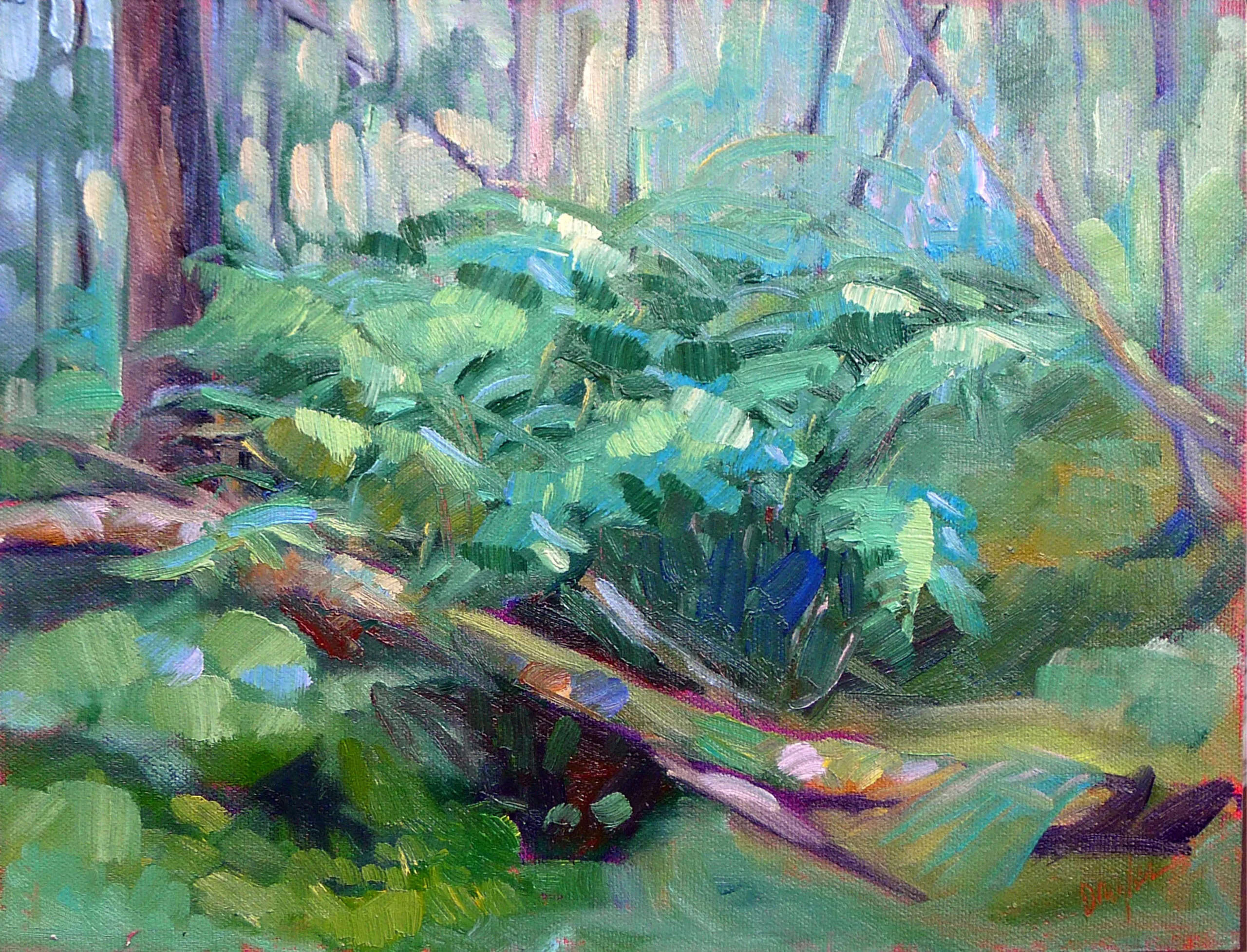
Bracken Fern, 9X12, oil on canvasboard, $869 framed includes shipping in continental US.

Technique: Have I built up my paint level to a satisfying conclusion? Is my brushwork fluid? Are there places of rest? Are there passages that just need more energy?

Emotional impact: This is a question that’s best asked in the design phase, but if I finish and it’s just meh, I might need to ask why. If it’s that I have no emotional connection with the work, I will scrape it out. However, sometimes the emotional impact of a piece is dampened by overworking passages, and that is something I can put right. In oils or pastels, I can scrape or brush out the offending passage. In watercolor the solution is usually to start again. The second version of a watercolor is often much looser than the first. (That’s one of many reasons to paint the subject in grisaille before you jump to color.)

My energy levels: I’m not superhuman. That feeling of exhaustion can be the signal that it’s time to quit before I do something stupid. Or, it just might mean I have to come back another day.

Feedback: I rarely ask for feedback, and then only from a very small cadre of fellow painters. However, you may feel you need critique. In the context of a class, that’s important: you should be open to new ideas. At a painting event, you run the risk of chasing back and forth trying to incorporate everyone’s comments into your work. That’s a sure-fire way to wreck a painting.

Church & Maine, 22X30, Cooper Dragonette, Oil on Panel, 2023. This is a great example of a highly-detailed, highly-finished painting that is nevertheless not overdone. (Courtesy of the artist.)

Personal Style: I’m usually a moderately-loose painter. That influences when I consider a work finished. You may be much more detailed and polished. While the technique remains the same, the endpoint differs. A person who is making a highly-detailed painting like Cooper Dragonette‘s fabulous painting of downtown Belfast, above, will take much more time getting the details right.

Deadlines: In some cases, I’m working against external factors like customer-dictated deadlines. I have always found that such deadlines sharpen my focus, but others may find them horrifying.

Endless revisions: Almost every artist has, at one time or another, had a painting in the studio that won’t leave. I’ve had a few of these, upon which I dabbled until flummoxed, only to pull them out again in six months to dabble again. For me, this never ends well; I might as well have tossed them at the beginning.

Ultimately, the decision about when we’re finished is highly individual. It involves technical assessment, emotional connection, and our own unique creative process. As we gain experience and refine skills (which we should do throughout our lives) that endpoint changes.

Reserve your spot now for a workshop in 2025:

A portrait of lost time

Each week until the end of the year I’ll be giving you a behind-the-scenes look at one of my favorite paintings. These are paintings that are available for you to purchase unless otherwise noted.

Grain elevators, Buffalo, New York, 18X24, oil and cold wax on canvas, in a handmade cherry frame, $2318 includes shipping in continental US.

This is a portrait of lost time, both my own and my hometown’s. I was born in North Buffalo in 1959; I lived with my grandmother in South Buffalo for my last year of high school. My bus ride took me down South Park Avenue past the notorious Commodore Perry Projects, right through the First Ward where the rebranded Silo City is located. That’s on the verge of being hip, and a state park has made the grotty old waterfront into something beautiful. The nearby area now called Larkinville is a true success story. Restaurants, offices, shops and condos now fill an area that was once a terrifying post-industrial, apocalyptic wasteland. I don’t miss it a bit.

Bennett Grain Elevator, Buffalo, circa 1870, courtesy Lower Lakes Marine Historical Society. Wooden elevators often burned catastrophically. 

Buffalo was built on the back of the grain elevator. It was invented there by Joseph Dart and Robert Dunbar in 1842-1843. Before that, grain was handled in bags, which were wrestled off lake freighters (schooners and brigantines) and moved to canal boats to head down the Erie Canal. Dart and Dunbar’s elevator scooped loose grain out of the holds of the boats and lifted it to the top of a tower. It could then be dumped directly into canal boat or rail car, oldest product first. Think of it as the earliest example of cross-docking.

At the start of the 20th century, Buffalo was the fifth-largest city in the US and the largest grain port in the world. Much of the grain harvested in the Midwest was shipped through Buffalo. Lake Ontario and the St. Lawrence Seaway are separated from the other Great Lakes by Niagara Falls, which meant that lake freighters couldn’t go any farther east than Buffalo.

That problem wasn’t really solved until 1932. The Fourth Welland Canal meant grain could just float right out from Minnesota to the Atlantic Ocean and beyond. That was the death-knell for Buffalo’s grain elevators, although their demise was slow.

The Standard Elevator (the one on the left in my painting) was built in 1928. The elevator is unloading a lake freighter while simultaneously loading a canal barge. Courtesy Buffalo and Erie County Historical Society.

My uncle Bob had a job as a night watchman in Silo City when he was a college student. Whenever I waxed lyrical about the elevators, he talked about the rustle and squeak of thousands of rats along his beat. Uncle Bob and my husband and I canoed up the Buffalo River once. It was completely industrial, with Pratt & Lambert still dumping pigments into the water.

The siloes still crowd the river on both sides, but they’re mostly empty now, a decaying reminder of the past. Only the General Mills elevator still accepts freighters, because they’re still manufacturing in Buffalo.

Buffalo loves its grain elevators but can’t quite figure out what to do with them. I feel exactly the same, but I’m a landscape painter.  I painted the view from the Ohio Street Bridge. That’s the Standard Elevator on the left, and the Electric Elevator and Perot Malting on the right.

Scoopers in the hold of a freighter move grain towards the marine leg of the elevator. What a miserable job that must have been.

My challenge was to illustrate the worn surfaces of the elevators from a distance. I like cold wax medium. It can be brushed or troweled on, depending on how it’s thinned, and it can be burnished, scraped, sanded, or abused in a million different ways once it’s in place. I used it in the sky, applying it in thin, pigmented layers, and then buffed and burnished it so it had the character of the elevators’ own old brick walls.

That’s the Buffalo of my youth, but it’s not the Buffalo you’ll see today, much of which has had a facelift in the ensuing decades. “The reuse projects are really cool but they’re only cool in light of where the city is coming from,” a Buffalonian told me.

Last week I wrote about how you can’t go back and recapture lost memories. This painting is of something that still exists, but in a city that has changed beyond all measure. It’s 18X24, in a handmade cherry frame, and it’s available for $2318. It’s a bargain compared to what an historic elevator will cost you, and sized to fit in a living room to boot. Click here to purchase online.

Reserve your spot now for a workshop in 2025:

Your success does not diminish me

Watercolor and gouache painting by student Mark Gale.

Your success doesn’t diminish me is a lesson that’s taken me a long time to learn. It’s why I can now celebrate my peers’ triumphs without being consumed with envy. It hasn’t always been that way.

Constantly measuring myself against others was depressing. The downside of being a competitive person is that one seldom appreciates one’s own successes. Get a second-place award in a show and you’re simmering because the grand prize eluded you. Hit a benchmark in sales and you immediately start clawing toward the next benchmark. While that spurs you on to achievement, it’s not much fun.

Oil painting by student Lynda Mussen.

Jealousy is rooted in the lie that there’s only so much success out there, and if you take a chunk of it, there’s that much less for me. In the short run, that’s true. After all, there’s only one First Place ribbon in any art show. In the long run, the possibilities for success are nearly limitless. The trick is in starting to see beyond the lockstep track that every other artist seems to be following.

That shift to an abundance mindset has made me, ironically, feel more successful. It’s also helped me become more generous. That ability to give something away fosters more of the abundance mindset – in me. Sharing time and talent creates a whole that is greater than the sum of its parts. That synergy is what gives rise to schools of painting, by the way.

The flip side of this is gratitude. Our intellect, our talents, and the place and time in which we were born all contribute to success, and they are an accident of birth. My great-grandfather was a talented landscape designer, but he was also an immigrant. My grandmother wrote and my father was an excellent artist and photographer. But that was the Great Depression and they were very poor, which prevented them from taking the risks necessary to be full-time artists. As my mother (also the child of immigrants) used to say, “In my day, we didn’t have time to self-actualize.”

Acrylic painting by student Patricia Harrington.

One way in which that Great Depression generation was hampered was in having no models for entrepreneurship. That’s just as true for anyone whose parent has worked in a 9-5 corporate job, and it’s what gives rise to the canard that you can’t make a living in art. Everyone’s path to success is different, but lots of people have been very successful in the arts: as visual artists, actors, filmmakers, animators, teachers, curators, etc.

Your path is fixed only by your ideas and determination, but it does help to have some idea of how to run a business. Beyond that, however, how anyone else achieves success is irrelevant. You’re the only person who matters in your own art career, and you make your own measuring stick.

Oil painting by student Beth Carr.

A person with an abundance mindset has much more patience for the process. That’s critical to developing top-notch artistic chops. Once you stop needing to win, there’s no motivation to produce a one-hit wonder. That in turn stops the painter from trapping himself in a schtick that sells, but which prohibits growth.

Above all, remember that your worth isn’t tied up in your art-it rests in you as a human being. Yes, it’s great to be a competent, successful artist, but that’s hardly the most important thing in life.

Reserve your spot now for a workshop in 2025:

Monday Morning Art School: composition is about light, not objects

Fog over Whiteface Mountain, 11×14, $1087 includes shipping in continental US.

“From now on, I’m gonna stop thinking about composition being about things,” my correspondent wrote, “and start thinking about it as shadows.”

I feel like a deficient teacher, because composition is always about light and dark. Hue, chroma, line and objects may feed into that, but it’s value that makes a composition weak or strong.

Beauchamp Point, Autumn Leaves, 12X16, oil on archival canvasboard, $1449 includes shipping in continental United States.

I ask my critique students to analyze their compositions based on Edgar Payne‘s exhaustive list of possible compositions in Composition of Outdoor Painting. (This used book is now so expensive that I can no longer recommend buying it. Check it out of the library.) The idea isn’t to slavishly follow one of his designs; it’s to understand whether you have an underlying design in the first place, and how you might strengthen it.

But these compositional armatures are always about value, even when that value takes the form of an object. There are many times when objects and shadows coincide; for example, a large piñon and some small creosote bushes can combine in a dark triangular mass, because they’re both dark objects usually set against light-colored grasses. On the other hand, sidewalk chalk isn’t going to create any kind of structure against a concrete sidewalk unless the artist thinks about the shadows rather than the chalk.

Quebec Brook, oil on canvasboard, 12X16, $1449 framed includes shipping in continental US.

By now, most of you have gotten the message that a painting needs to compel on a tiny screen (or from thirty feet) as well from three feet or three inches.

You do this with value. It’s not enough, for example, that an object is at a diagonal; you must make a persuasive shift between light and dark along that diagonal. This is the primary lesson a painter can take from Winslow Homer’s incredible seascapes.

This is also why plein air painters dislike murky grey skies; they make it harder to find compelling shadow patterns.

Composition rests on the following principles:

  • The human eye responds first to shifts in value, and following that, in shifts in chroma and hue;
  • We follow hard edges and lines;
  • We filter out passages of soft edges and low contrast, and indeed we need them as interludes of rest;
  • We like divisions of space that aren’t easily solved or regular.
Best Buds, 11X14, oil on canvasboard, $1097 framed includes shipping in continental US.

But I just want to paint what I feel!

Music, sculpture, poetry, painting, and every other fine art form relies on internal, formal structure to be intelligible. This is easiest to see in music, where the beginner starts by learning chords and patterns. These patterns are (in western music, anyway) universal, and they’re learned long before the student starts writing complex musical compositions. In other words, you start at the very beginning.

Music is an abstract art because it’s all about tonal relationships, with very little realism needed to make us understand the theme. A composer doesn’t need little bird sounds to tell us he’s writing about spring. Likewise, the painter doesn’t need to festoon little birdies on his canvas to tell us he’s painting about spring. That should already be apparent in the light, structure and tone of his work.

The strength of the painting is laid down before the artist first applies paint, in the form of a structural idea-a sketch or series of sketches that work out a plan for the painting.

All good painting rests on good abstract design. Take a good look at Christina’s World by Andrew Wyeth. Whatever meaning we’re supposed to take from it, it’s a strong triangular composition juxtaposed with a mid-century curving line.

Still, most realist painters don’t spend nearly enough time considering abstract design, even when they understand the critical importance of line and value. Christina’s World doesn’t rely much on hue for its impact. It’s a washed-out pink, a lot of dull greens and golds, and a significant amount of grey. And yet it was the most successful figurative painting of the 20th century. Wyeth was almost obsessive in his drawing habits; that translates into powerful finished paintings, driven by value.

Reserve your spot now for a workshop in 2025:

Nothing lasts forever

Lobster pound, 14X18, oil on canvas, framed, $1594 includes shipping in continental US.

I woke up on Thursday morning to bad news. The downtown core of Port Clyde, arguably one of the most picturesque seafaring villages in Maine, had burned down. At the time of this writing, they are still sifting through the ashes.

I am a member of the Red Barn Gallery, which is just across the road. Our season has ended and we were in no danger anyway. However, I do know someone affected directly by the fire, and my heart goes out to him. Moreover, it’s going to change the commercial life of Port Clyde forever. Those beautiful frame buildings will never be rebuilt as they were.

Downtown Port Clyde in happier days, from the front door of the Red Barn Gallery.

A gallerist at the Red Barn Gallery could entertain herself for hours, sitting at the desk and watching the activity in front of the General Store. I’ve often done it, and I planned on eventually doing a painting from that window. Alas, I started with the back view first, across the water to the lobster co-op. After all, I had all the time in the world, right?

In the same news cycle, I read that the Sycamore Gap Tree in Northumberland, England, had been cut down. A 16-year-old is “in custody and assisting officers with their inquiries,” as my favorite mystery writers put it. I have a relationship with this tree, having hiked the length of Hadrian’s Wall in 2022 (my account of this ramble starts here). The sycamore was photogenic and perfect, nestled into a curve between two rising slopes. That is why it appeared in a prominent scene in Robin Hood: Prince of Thieves. It won the 2016 England Tree of the Year award, and was a finalist for the 2017 European Tree of the Year. If the lad is the culprit, it was a spectacular example of teenage bad judgment, but nothing will bring the tree back. And I don’t even have a photograph.

Here I was painting out the back window of the gallery, when I should have been painting the front view.

On the road into Tenants Harbor there was an old-fashioned lobster pound. These are mostly obsolete; it makes more sense for lobstermen to keep their catch in lobster cars, which are slatted containers that allow sea water to rush through, usually off a floating dock.

A lobster pound was a kind of shallow corral where the lobsters wandered around until it was time for dinner-your dinner, that is. And this one was a classic, so I painted it on one grey, miserable day.

Then one day I was bumping down River Road and the lobster pound was gone. In its place rose a new building that I hear is going to be a seafood market, or something similar. I suppose over time we’ll learn to love it, but right now it’s raw and unfinished. But in this case, I’d managed to catch the old building before it was gone.

Middle and Upper Falls at Letchworth, 18X24, oil on canvas, private collection.

About twenty years ago, I painted the rail bridge over the Upper Falls at Letchworth State Park. I’d spent the summer painting there, which meant I had ample time to study the bridge. Built in 1875, it was a slender iron structure, not beautiful, and it always seemed woefully inadequate for modern rail traffic. Apparently the Norfolk Southern felt the same way, because it was finally replaced in 2017.

Sadly, we can never predict what will remain and what will be washed away by the tides of time. That includes people, because the only absolute in life is that it ends someday. Today would be a good day to reflect on how I might act in order to have no regrets when time takes away the people around me, as it inevitably will. And then I’ll shake off this mood and go paint something at Artworks for Humanity. If you’re in Waldo County, ME, stop by.

Reserve your spot now for a workshop in 2025:

Painting as mythmaking

South Truro Post Office, 1930, Edward Hopper, courtesy Christies.

Whenever I sail into Bucks Harbor in Brooksville, ME, I tell my students about  Robert McCloskey‘s One Morning in Maine, which was set there. McCloskey has had an inordinate influence on me. As a kid, my husband looked and acted like the eponymous hero of Homer Price, my first and favorite chapter-book. It took me decades to realize I’d married my childhood crush.

I’ve pored over every detail of McCloskey’s books, because every object is a fascinating window into an America that was fading when I was a child and is largely gone today.

Death on the Ridge Road, 1935, Grant Wood, courtesy Williams College Museum of Art

I recently spent some time considering Edward Hopper‘s Truro, Massachusetts paintings. He and his wife Jo had a summer house there, and he spent at least four months a year in Truro from 1930 to his death in 1967. While I respect his urban scenes as revolutionary, challenging and dramatic, it’s the Truro paintings I gravitate to. They are prosaic country scenes-barn, church, farmhouse, post office-but with brilliant composition and elegiac light. They are so universal in design that they could have been painted in almost any part of the United States, but the overarching theme is early 20th century America.

Rooms for Tourists, 1945, Edward Hopper, courtesy Yale University Art Gallery

I have a similar response to Hopper’s Rooms for Tourists, above. It’s a quintessential Maine boarding house, except that it was really in Provincetown, Massachusetts. Not that it really matters; boarding houses were once common in New England and New York. In fact, I romanticize them. I think I might run one someday, until I remember that I don’t much like changing beds and I hate to cook.

I posited to my aforementioned husband that my love of the countryside and Maine in particular was probably shaped by paintings like these. “I think most of us were shaped by television,” he replied, and he’s probably right, except that I grew up without it. Anyways, I never see people seeking out Gilligan’s Island or The Brady Bunch, but I sure know a lot of folks who are jazzed by old gas stations, tourist cabins, farms and lighthouses.

The Scout: Friends or Foes, 1902-1905, Frederic Remington, courtesy Clark Art Institute

Mythmaking is as old as art itself, but in America it can be laid at the feet of the Hudson River School painters, who used the Romantic idea of sublimity to say that the American landscape, with its patches of agriculture juxtaposed with nature was the very reflection of God himself. It’s at least one of the roots of the idea of American Exceptionalism.

They were, of course, painting a landscape that was fast disappearing. Artists have always been drawn to that which is either gone or going. That make sense when you think of how difficult we find the world in which we live. Perhaps in fifty years, people will find fields of solar panels or modern windmills beautiful, but right now they make us uncomfortable. That nostalgic kick is part of the enduring charm of the two older Wyeths, Frederic Remington and Norman Rockwell, among many others, but their work was actually nostalgic right from the start.

Thunder Over Shiprock, Maynard Dixon, courtesy Steven Stern Fine Arts

I think of the places I like the most, like the Great White North, and how I saw it first through the eyes of the Group of Seven and Rockwell Kent. I love farm country, especially the Midwest as seen by Grant Wood, and the West as seen by Edgar Payne or Maynard Dixon. Artists are above all mythmakers, and I am just beginning to understand how deeply they’ve influenced my goals, dreams and sense of place.

Reserve your spot now for a workshop in 2025:

Monday Morning Art School: How do I get started in painting?

Bonnie and Laurie had never painted before. By the end of the trip, they had a system in place to keep working and improving.

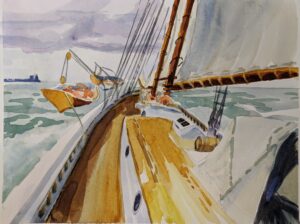
I just got off schooner American Eagle, where I was teaching watercolor. (Next year’s workshop will be September 15-19, but the details aren’t solid.) I always have a few beginning painters mixed in this group. They start not believing they can do it, and end by feeling they’re on the road to mastery. Painting is hard, but anyone can learn it.

Materials

This is an area where beginning painters can go spectacularly wrong, buying hundreds of dollars’ worth of stuff they don’t need and won’t use.

Often, beginning painters will buy cheap materials because they’re worried they might not like painting. That’s akin to buying a kazoo and deciding that you can’t make music. Bad art supplies will just frustrate you.

The inverse of that is buying lots of stuff you don’t need, because you’re not sure what is necessary. I freely distribute my supply lists for watercolorsoilspastels and acrylics. If you stick with them, you can paint for the lowest cost possible.

My online class, The Perfect Palette, is meant for oil painters, but beginning painters in any media will benefit from learning how pigments work.

The seine boat is a surprisingly comfortable place to paint.

Drawing

Drawing is the human’s basic tool of communication, and it’s never more important than when planning a painting. The good news is, anyone can learn to draw. If there’s not a class near you, start with this book.

Classes and workshops

Classes and workshops are enormously helpful, which is why I teach so many of them. But a class is only as good as its teacher, so ask around. If you’re not interested in a classical style, an atelier might not be the right place for you to study. Likewise, a loosey-goosey class will drive a serious student mad. There are plenty of good, conscientious teachers out there who steer a middle course. Wherever you go, make sure the teacher follows an accepted protocol of painting and knows how to teach it.

Don’t rule out an online class. I’ve been teaching online since the pandemic, and I believe students learn more from it than from live weekly classes, because the interaction is, paradoxically, closer.

A grisaille is a way to simplify color decisions and work out your composition before you commit to a painting.

Inspiration

Most new painters start working from photographs. However, painting from life is much more instructive. Photos distort size relationships and colors, and they do all the thinking for you. Even experienced artists can find themselves slavishly following the photo instead of using it as a starting point.

You can paint any subject for practice: the house across the street, your tree, or an old barn you love. Seek out a plein air painting group in your area to give you the courage and camaraderie to paint in public. If the weather is bad, set up a still life in a corner of your studio and paint that. Anything can be a still life, including your sleeping dog, the jacket you threw over a chair, or your kids’ toys.

Peas in a pod: painters in the seine boat, soaking up the sun.

Developing your own unique style

In short, don’t worry about style. It comes from assured brushwork and color management, and those come from practice. Seeking a style in the early days of painting just puts you in a box that’s hard to escape. Instead, let it develop naturally, over time.

Reserve your spot now for a workshop in 2025:

I haven’t got room for another painting

My painting in a town house in Edinburgh, Scotland. Isn’t that screen lovely? Ampersand Interiors, interior design; Susie Lowe Studio, photography.

I was chatting with a gallerist friend when we got on the subject of people saying, “I really love it, but I haven’t got room for another painting!”

“That drives me crazy,” she said. She pointed out to me how, over time, we inevitably stop seeing the paintings on our walls (and everything else that’s part of our day-to-day existence).

I have a lovely little landscape by Tom Conner in my living room. It’s been hanging at the foot of my sofa, where I can look at it whenever I’m curled up with my laptop. Tom’s brushwork is similar to mine, so occasionally someone will say, “I love that painting. Did you just do it?” Each time, I look up and appreciate once again the dusty grandeur and serenity of the Sedona landscape as Tom saw it. Then I’m sad that so much time has gone by without my even noticing it.

That painting is on the same wall as a still life by my goddaughter. I recently switched them around. It’s interesting how much more evocative they both are, just by being in different spaces. Moving paintings around is a simple way to rekindle your joy in your art collection.

Don’t let the serious mein of that custom-designed bookshelf fool you; the homeowner is probably curled up on that chaise longue reading Jane Austen. Ampersand Interiors, interior design; Susie Lowe Studio, photography

The joy of deaccessioning

I’m not averse to collecting something new and carefully wrapping and storing a painting that no longer catches my eye. There comes a point, however, when we just don’t want more stuff to store. Why not introduce a young person to the joys of collecting art by giving them paintings that are surplus to requirements?

Young people have studied less art history and appreciation, in general, than our generation. Because of wage stagnation, they have far less purchasing power than we did at their age. They’re buying houses, having babies, and at an earlier point in their careers. Taken together, these factors mean they don’t always have the spare cash to buy fine art, or the nous to know the difference between real art and the department-store imitations that are what they think they can afford.

You can help foster their art education by giving them a painting that is no longer important to you. That frees you up to acquire the one you really want.

The lesson I learned here is that it doesn’t really matter if the painting ‘matches’ the room; if it’s well-painted and has an emotional punch, it will fit in anywhere. (House available through Lone Pine Real Estate; paintings by me.)

Those aren’t my colors

Realtor Rachael Umstead asked me to hang some paintings in a sweet little house she has for sale in Camden, ME. With the warm floors and beautifully austere walls and cabinets, I thought something in red and orange tones would look great. Last week a client asked to see those paintings. I had to swap something else for them. I had two others in cool tones of blues and greens. I apologized to Rachael because I thought I was giving her a second-best option.

I was surprised and pleased to see that the cool paintings look just as good in that room. We sometimes get so hung up on matching our interior design scheme that we lose our perspective.

I would never have thought to put a blue painting on a blue wall, but the combination works.

I set a painting on my kitchen counter to wrap for storage. I realized it looked great there, so I put it on the wall for a while. If I hadn’t set it down, I never would have believed it could look so good in that very blue space.

This post includes two shots from an interior design project that included one of my paintings. The painting wasn’t intended for this setting; the home was significantly damaged by flooding a few years ago. A good painting can be the anchor for a series of rooms, for generations in fact. Its color scheme is almost immaterial, as long as it is well-executed and exerts an emotional pull.

Reserve your spot now for a workshop in 2025: