

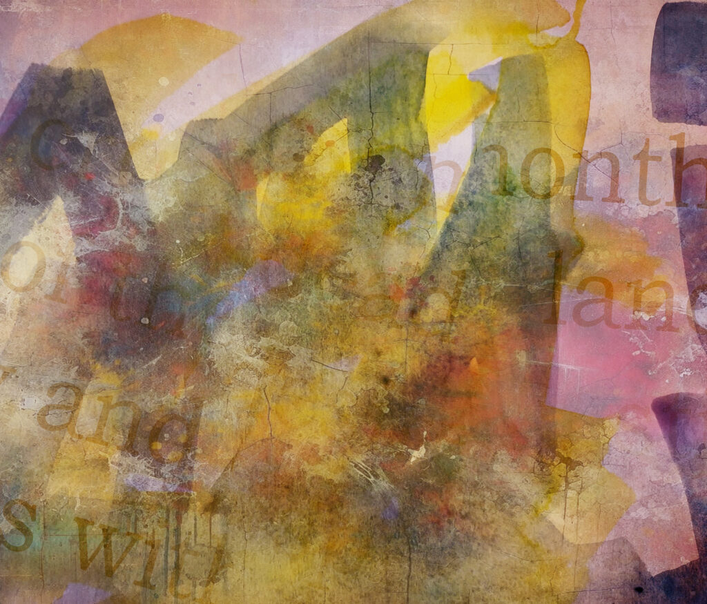
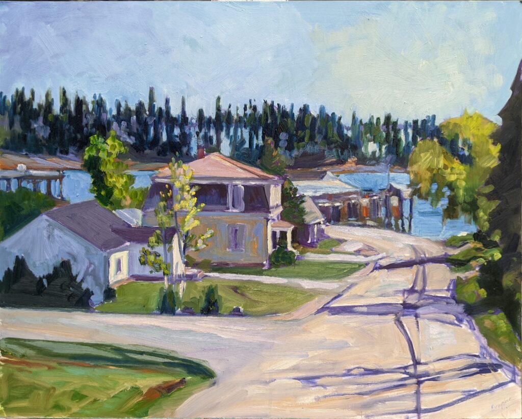
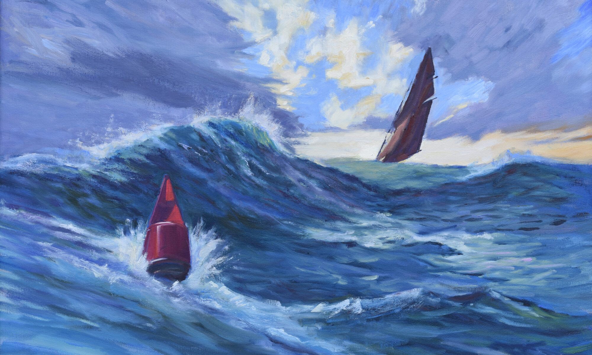
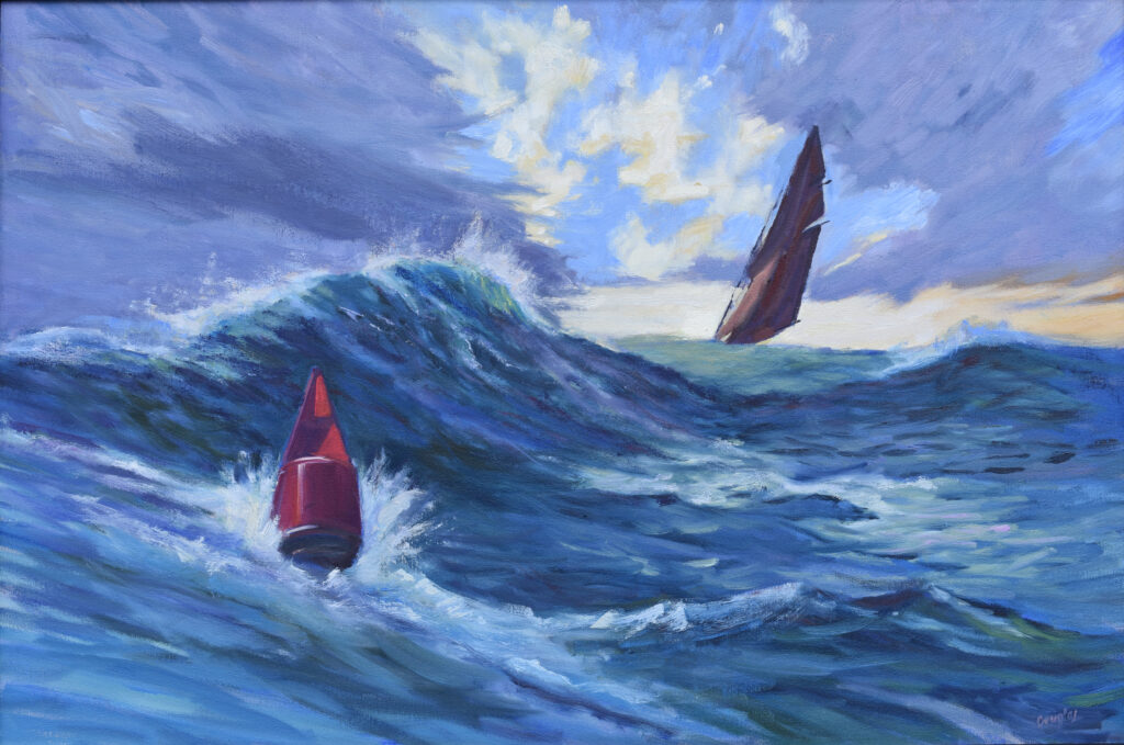
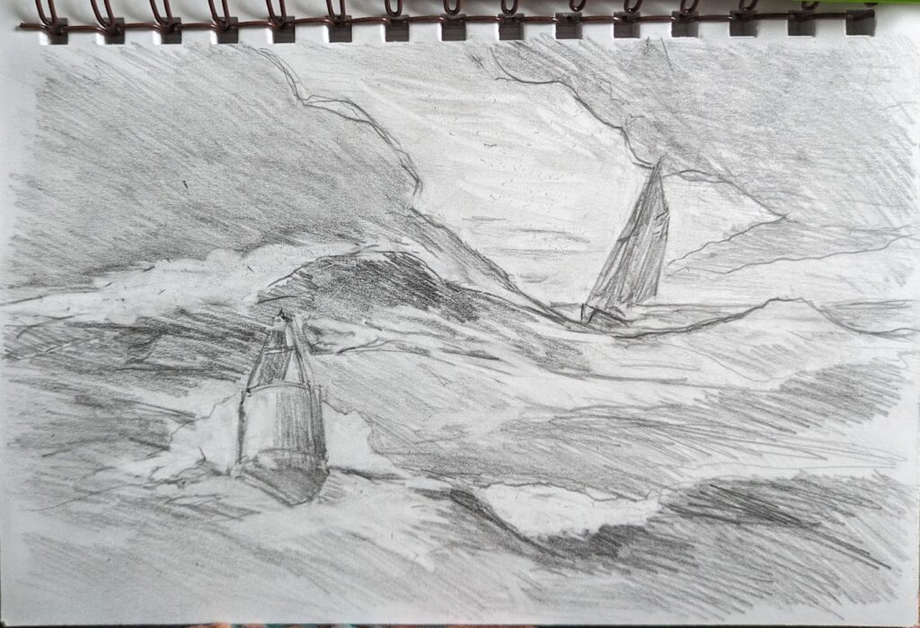
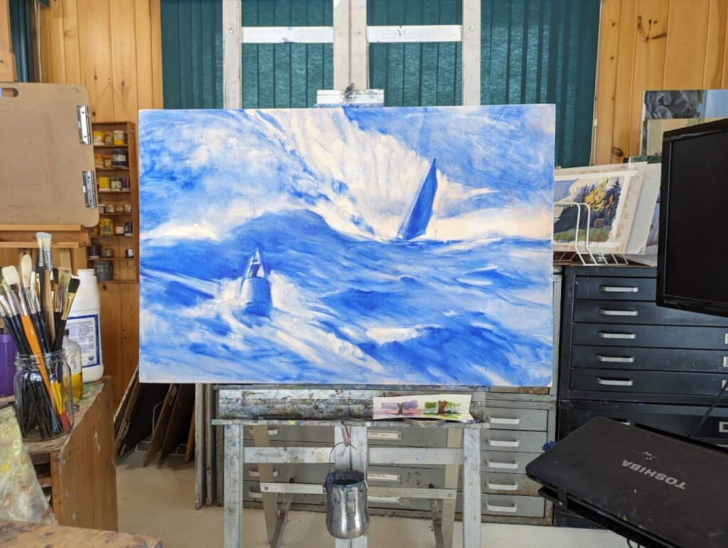
One of the nicest things about being an artist is avoiding the world of business-speak. Still, even artists must network.
Networking is sometimes described in negative terms: cronyism, the old boy network, or nepotism. But we human beings network constantly and naturally; we’re very much pack animals at heart.
It’s not what you know, it’s who you know
Like most people, my network starts with my family. Beyond that, I have three circles of friends: my art-world friends, my church buddies, and my trail buddies. Any overlap evolves naturally. I’ll invite all my friends to openings, for example, but I don’t expect any of them to buy from me. However, some of my best opportunities have come from non-artist friends.
Our networks change over time depending on our interests. I no longer run a community garden or live in a neighborhood, so those circles have quietly faded away.
What is your network? Is there overlap between your circles of friends? How much of your social interactions happen in the real world vs. on social media?
Why is networking important for artists?
From a business standpoint, the value of networking is obvious: it exposes you to opportunities like gallery representation, exhibitions, residencies, grants, and sales.
Networking also exposes you to different ideas about art, including feedback and critique on your own work. In addition to helping you make concrete changes, this can give you insights into how your work is perceived by others. I’m always keen to see how my work looks in natural settings rather than the artificial environment of a studio or gallery.
I took classes and workshops for decades. As a young mother, they were my best route to meeting other artists. As I struggled to create a professional practice for myself, those friends provided support and encouragement. (And of course I learned a lot.)
It can go wrong… or right
I once belonged to a women’s art critique group. In theory it was a safe space where we could discuss ways to overcome the art-world bias against women. In practice, it devolved into a bitch session. Groups like that poison your attitude, so they’re worse than useless.
My most helpful critics are my family. Most of them have some art background, but more importantly, they have no ego in the art world. If they tell me, “That doesn’t look right,” I listen.
Visibility
I’m always enthusiastic about attending openings (or any other public events) until the time comes to put my pants on. Then I feel a sudden, pressing need to stay home. Like many artists, I’m a recluse at heart. But supporting your peers is important. It’s also one of the best ways you can increase your own visibility within the art community.
Then there’s social media
There are people I first met through social media who’ve morphed into real world friends. There are other friends with whom I can only stay connected through my computer or phone. Quit kvetching about social media and use it to grow your following, showcase your work, connect with other artists, and engage with the public.
Show your work
Iron sharpens iron. I loathe rejection as much as the next guy, but the process of submitting work to juried shows and events expands our reach and connections… and makes us better painters.
Reach out
Remember when we used to contact each other IRL? It’s so alien to me now that I sometimes forget that walking in to a gallery or studio and engaging with the human being I find there is the first and best way to forge genuine relationships.
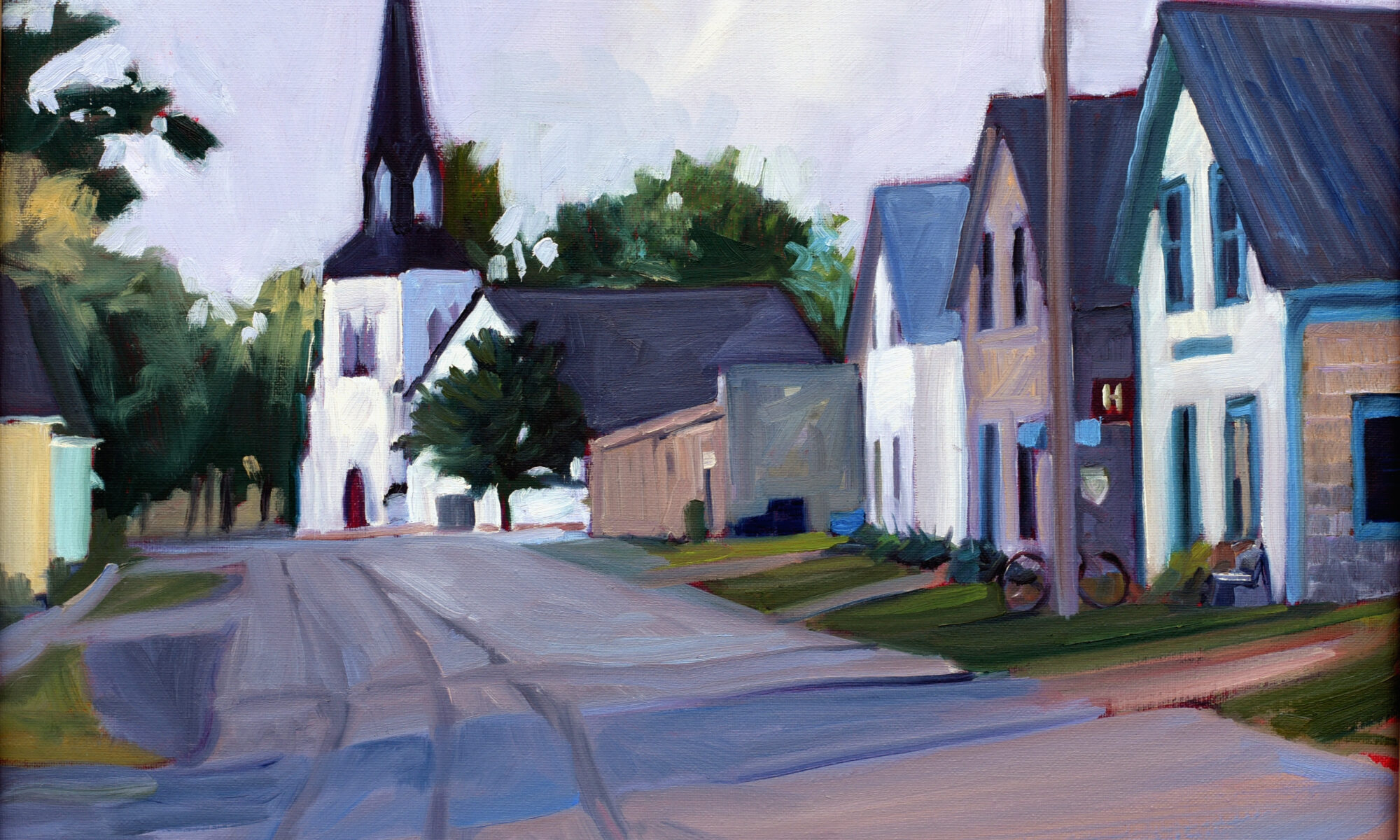
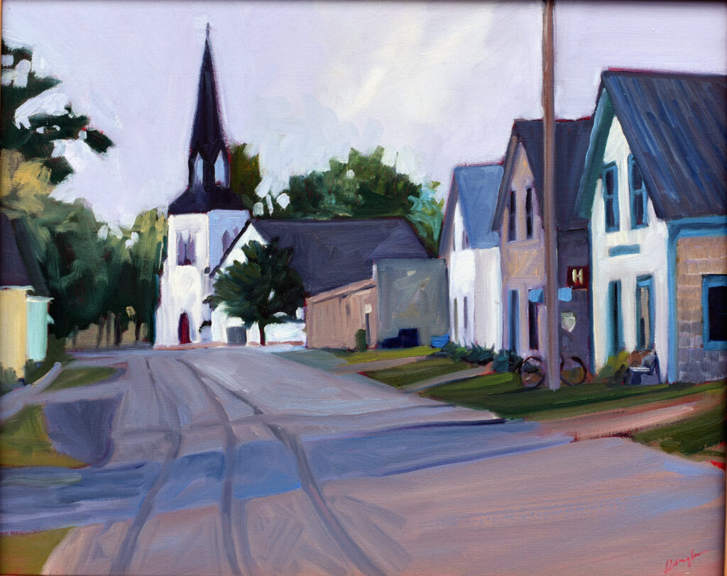
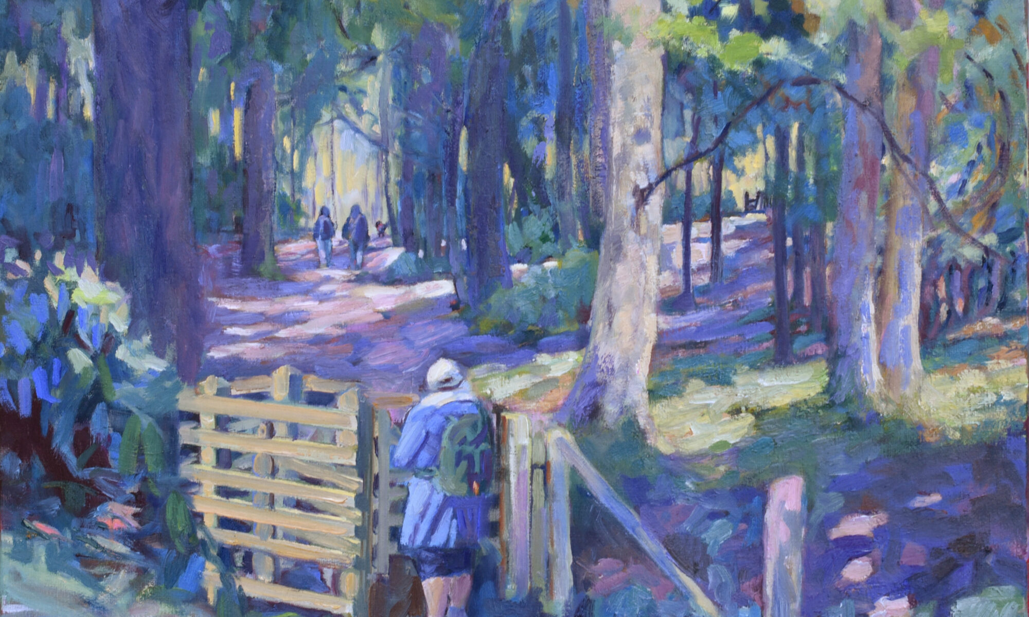
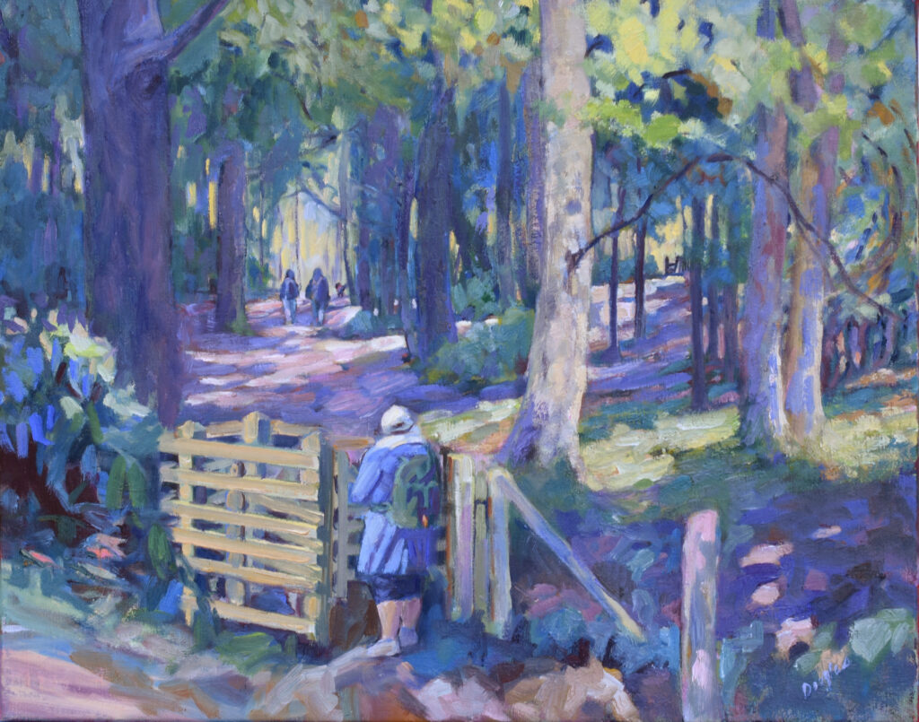
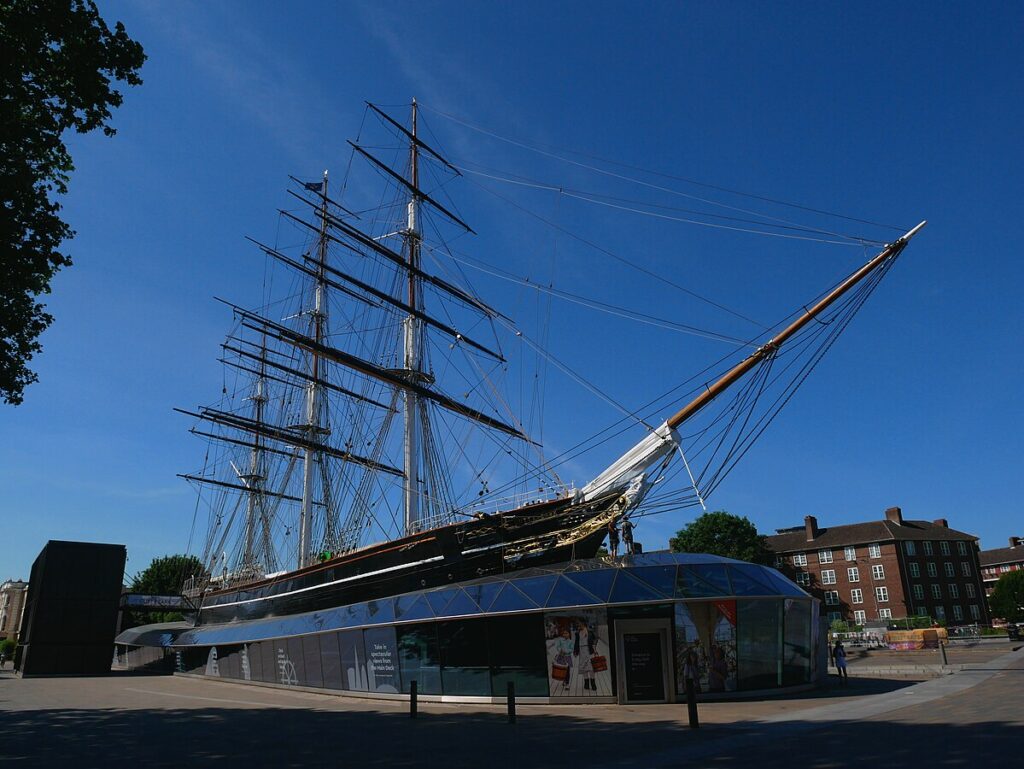
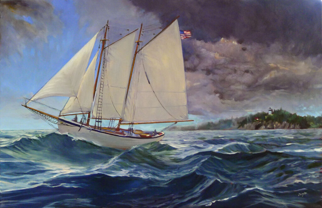
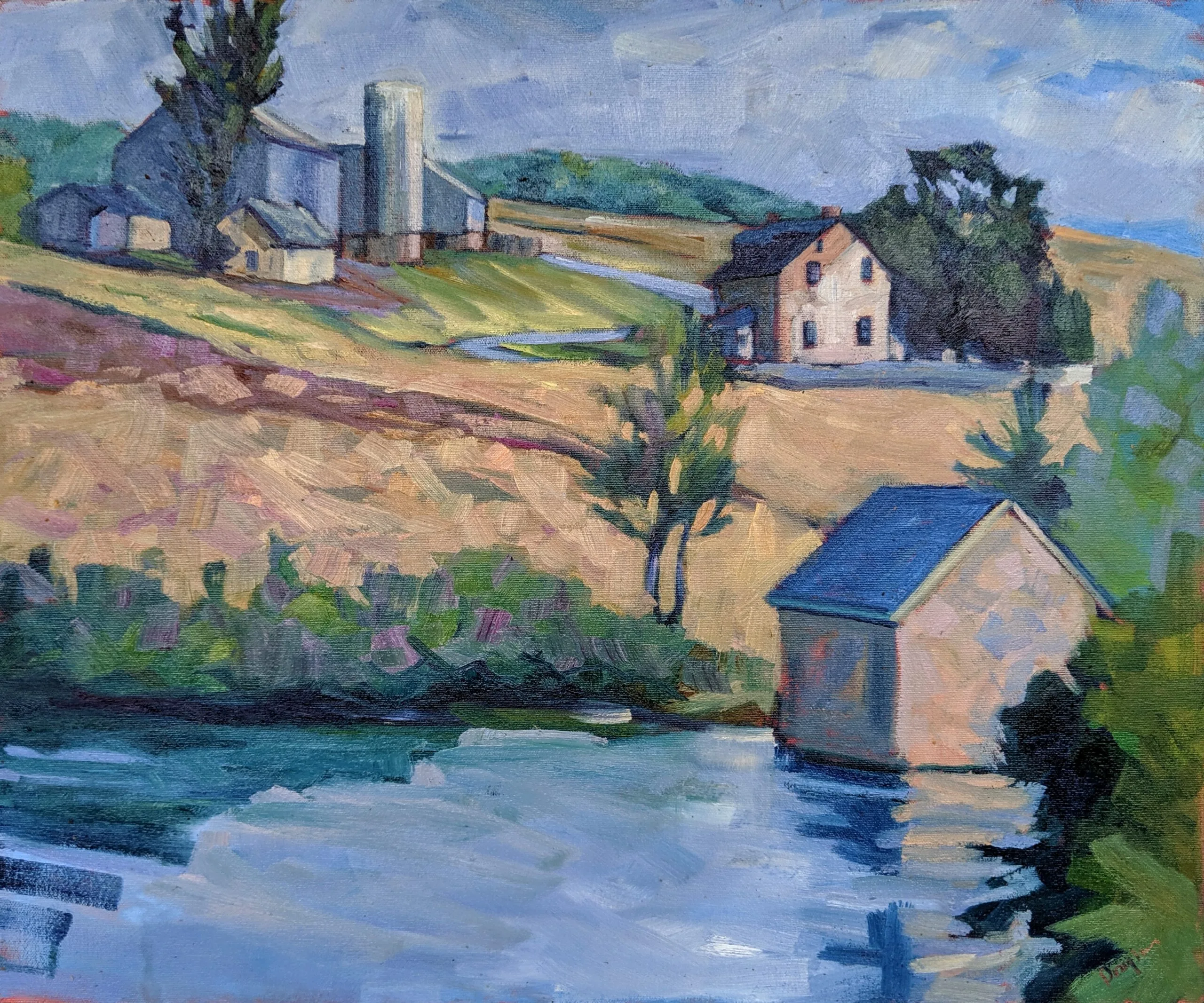
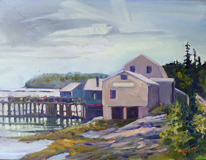
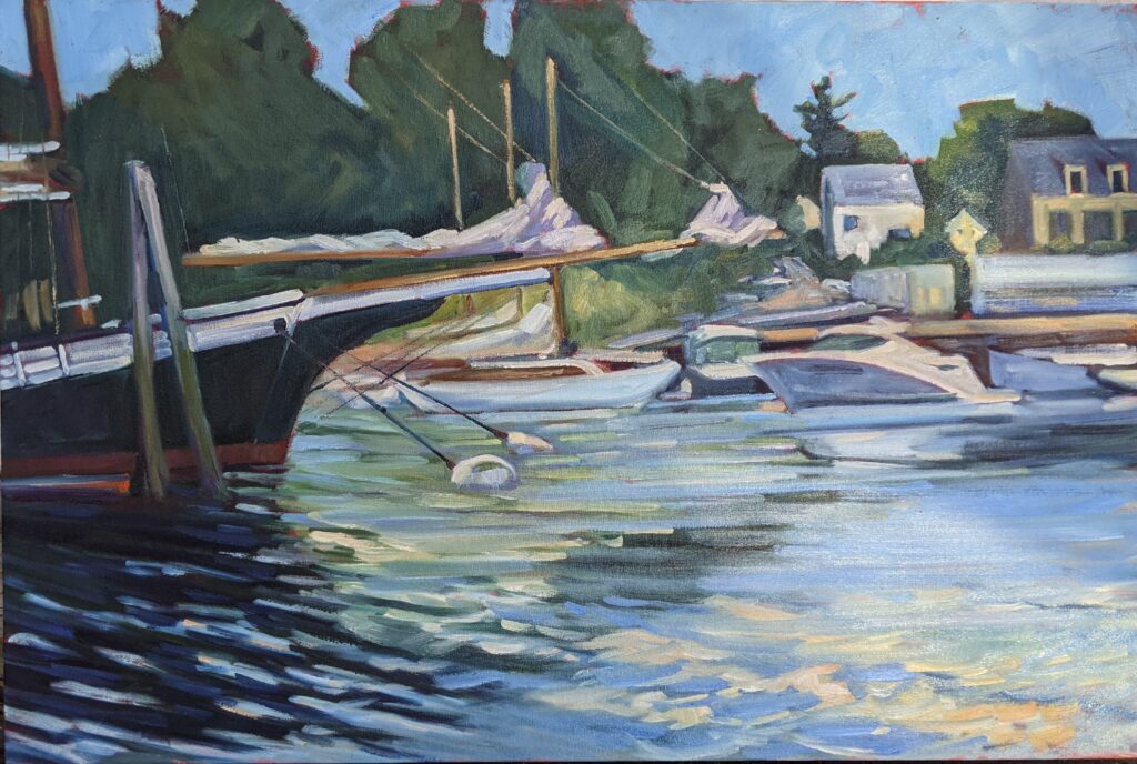
I’m in Britain on another lovely, long, blister-inducing hike. I’ve turned my phone off and while I’m gone, Laura will be running the office. Just email me as usual if you have questions or problems registering for a class or workshop. (Who am I kidding? She fixes all that stuff anyway.)
Reserve your spot now for a workshop in 2025:
- Advanced Plein Air Painting, Rockport, ME, July 7-11, 2025.
- Sea and Sky at Acadia National Park, August 3-8, 2025.
- Find Your Authentic Voice in Plein Air, Berkshires, MA, August 11-15, 2025.
- Immersive In-Person Fall Workshop, Rockport, ME, October 6-10, 2025.


