 |
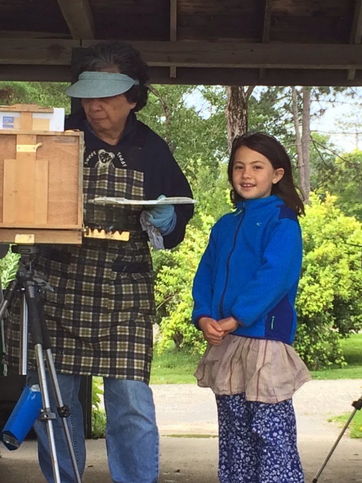
| Cecilia and her granddaughter. (Photo courtesy of Janith Mason) |
Several workshop participants are traveling with their spouses, their children, grandchildren, and a niece. Yesterday, one of my students was watching the cavorting of some of these kids and remarked, “It’s so nice to see these kids here.”
 |
| Three sprites on a rock. The Maine coast is perfect for doing nothing. (Photo courtesy of Sandy Quang) |
I agree. I’m not teaching them, but I’m enjoying having them with us. Some of them are drawing or painting along with their adults, too.
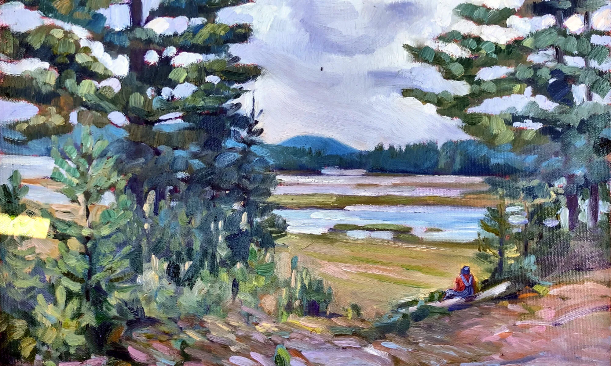
Look beyond the lighthouses and rocks and sea, and there are other parts of the landscape that are uniquely Maine. There is the light, which veers between sharp clarity and misty fog. There are the modest Maine capes of the early 19th century, with their steep roofs and gables. And there are the trees, shaped by the offshore breezes.
 |
| We started the day painting under a shelter, because it was cool and rainy. (Photo courtesy of Sandy Quang) |
Yesterday dawned cool and misty, so we started painting in Belfast City Park, which has a shelter. One would never know that there was an opposite shore on the mouth of the Passagassawakeag River, with all the mist. What a great opportunity to work on painting the traps in trees in the style of the Canadian Group of Seven painters.
Several workshop participants have asked me to post Loren’s color wheel on my blog. Loren made this as a way to teach himself how to mix the paints on his own palette. The outer ring is comprised of either the straight-out-of-the-tube paints themselves or mixes of two straight pigments. The next wheel is made of tints of the outer-wheel colors with white. Next are shades of the outer-wheel colors mixed with black. The center is the color mixed with its complement.
| Loren made this color wheel to help himself better understand the pigments on his palette. I like the idea so much I suggested it to everyone as homework. |
Today we are off to Mount Battie and Camden Harbor—a lovely end to a week that has just flown by.

