Today’s blog was delayed due to a DDOS attack on my server. I’m assuming it was by a jealous blogger. 😊

“You have three colors in this painting battling for supremacy,” I told Theresa Vincent during last week’s lesson on color. “One of them can dominate; the others need to be somewhat muted.”
“Ah,” she answered in her melodious Texas twang. “There can be only one bride; the others have to be content to be bridesmaids.”
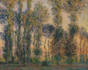
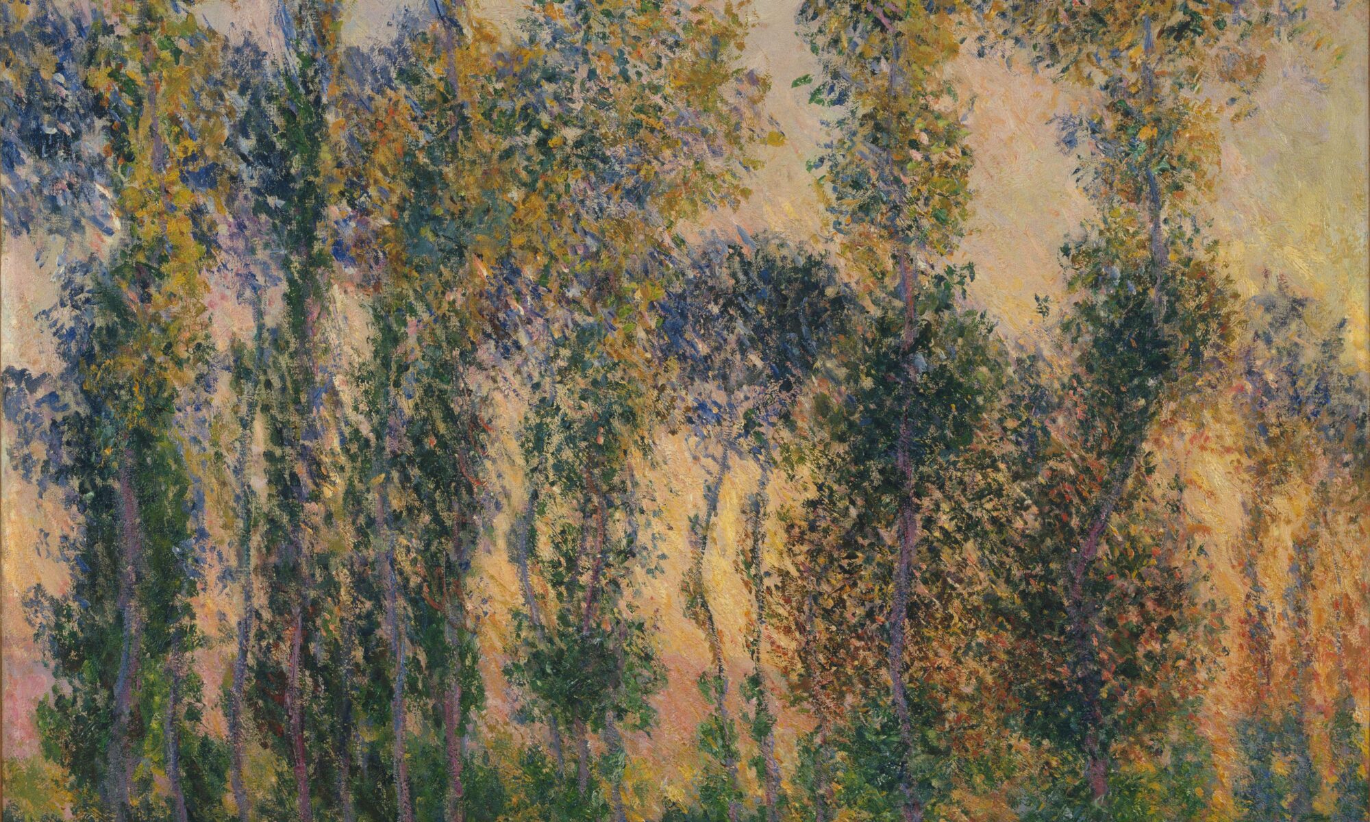
Until that moment, I hadn’t been thinking of the red gazebo roof in her painting as Bridezilla, but it worked. In a triad color scheme (which is what Theresa was working in), all three colors can’t be of equal intensity. One must lead. Consider Monet’s Poplars at Giverny, Sunrise, above, which is a triad of green, orange and purple. The green is the star of the show, followed by the orange and purple.
Monet also demonstrated that even at the most carefully-controlled event, every wedding guest should be welcome to wear what they want (within the limits of propriety, of course). His painting is dotted with hints of accidental color. There are blues and yellows, pinks, and even red at the party. A color scheme is the guiding principle, but it isn’t dictatorial. Brilliant paintings have guests from every position on the color wheel.
I’ve written about the basic color harmonies here; understanding them will help you integrate color in your painting. It’s not necessary to memorize these harmonic schemes; the greater lesson is that color harmonies matter.

Color is fashion-based
The stylish Victorian matron avoided pastels; she decorated in maroon, red, burgundy, chestnut, and dark green, brown and blue. Her Art Deco granddaughter loved bright yellow, red, green, blue, and pink. Neither would have tolerated the monochromatic grey that dominated interior design a decade ago. Our color choices are fashion-based and what looks good to you and me will probably not appeal to our kids.
Each color harmony has multiple permutations, since you can start at any position on the color wheel. Then there is the question of which color leads, to which end you could either use higher chroma or allow it to take up more real estate on your painting. By the time you’re done considering the options, you realize that just about any color scheme you can develop fits somewhere in that chart of color harmonies.

Does that mean you can just ignore color schemes? Of course not. It means you should be inventive but aware. Otherwise, you just might end up in the situation that Theresa found herself, where the bride and bridesmaids are squabbling over who’s in charge.
You should also be aware of how colors influence their neighbors. The definitive text on this is Interaction of Color, by Josef Albers. If you take away one thing from it, it will be the importance of setting values early in the process.

The same is true of focal points
I’ve written before about the importance of multiple focal points in drawing the eye through the painting. They should be intentional. But, again, only one gets to be the bride, drawing viewers into the painting. The rest, like good bridesmaids, should be quiet supporting actresses.
If focal points aren’t intelligently designed, and you’re not drawn through them with contrast, line and detail, then it’s back to the drawing board for you.
Reserve your spot now for a workshop in 2025:
- Advanced Plein Air Painting, Rockport, ME, July 7-11, 2025.
- Sea and Sky at Acadia National Park, August 3-8, 2025.
- Find Your Authentic Voice in Plein Air, Berkshires, MA, August 11-15, 2025.
- Immersive In-Person Fall Workshop, Rockport, ME, October 6-10, 2025.


I love the bride analogy! It will stick in my head as a happy reminder. Great post!
Sometimes it’s wonderful to find a new way to express an old truth, and I’m truly grateful to Theresa for coming up with it. Plus, she’s fun to paint with!