 |
|
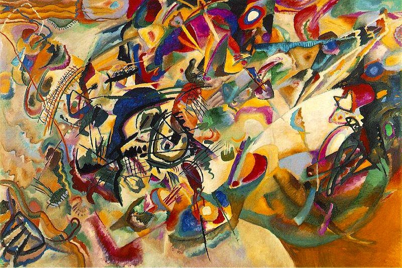
Composition VII, 1913, by Wassily Kandinsky.
|
Three artists arrived at the idea of pure abstraction at roughly the same time: Wassily Kandinsky, Piet Mondrian, and Kazimir Malevich. This was not coincidence; all three believed in the spiritual properties of abstraction, an idea they got from the rich stew of spiritualism swirling around turn-of-the-century Europe.
One of the chief promoters of the Fourth Dimension was Pyotr Demianovich Ouspenskii, a follower of G. I. Gurdjieff. Ouspenskii believed our consciousness was evolving, which would ultimately lead us to perceive the fourth dimension, and that art and music were the path to this evolution. In the fourth dimension, reality and unreality were reversed, and time and motion were revealed as illusions.
Theosophy was Madame Blavatsky’s occult movement. She described it as “the archaic Wisdom-Religion, the esoteric doctrine once known in every ancient country having claims to civilization.” Madame Blavatsky taught that color had spiritual vibrations which would awaken the dormant spirituality within a person, and that art should begin in nature, a nature that would be found in a world-birthing apocalypse.
Rudolph Steiner’s spin on theosophy was called Anthroposophy. This postulated the existence of an objective spiritual world accessible through inner development of the clairvoyance and intuition that modern man had lost as he developed rational thought. Steiner focused on the symbolic and synesthetic properties of color.
 |
|
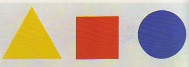
And then there are angles, which should be matched in aggression with their colors.
|
Kandinsky’s Concerning the Spiritual in Art (1912) is both turgid and broad-ranging. Let me just hit his major points about color:
- Colors evoke both a purely physical effect on the eye and a vibration of the soul or an “inner resonance.”
- The elements of color are warmth or coolness, and clarity or obscurity.
- Warmth means yellow, and coolness means blue, so yellow and blue form the first great contrast. Yellow has an eccentric movement and blue a concentric movement; a yellow surface seems to move closer to us, while a blue surface seems to move away. Yellow is a terrestrial color: mad, disturbed and violent. Blue is a celestial color, deeply calm but sinking toward the mourning of black. The combination of blue and yellow (green) yields total immobility.
- Clarity is a tendency towards white, and obscurity is a tendency towards black. White and black form the second great contrast, which is static. White is a deep, absolute silence, full of possibility. Black is nothingness, an eternal silence without hope (death).
- The mixing of white with black gives gray, which possesses no active force and is similar in tonality to green. Gray is frozen immobility; dark grays tend toward despair, but even lightening gray yields very little hope.
- Red is a warm color, forceful, lively and agitated. Mixed with black it becomes brown, which is a dull, hard, inhibited color. Mixed with yellow, red gains in warmth and becomes orange, which irradiates and energizes its surroundings. When red is mixed with blue it moves away from man to become morbid and mourning purple. Red and green form the third great contrast, and orange and purple the fourth.
In short, Kandinsky’s color theory is a magnificent exercise in hooey. Still, it has had a long-reaching influence, with overtones in fashion, industrial design, and every other area that touches our lives.
Message me if you want information about next year’s classes and workshops.

