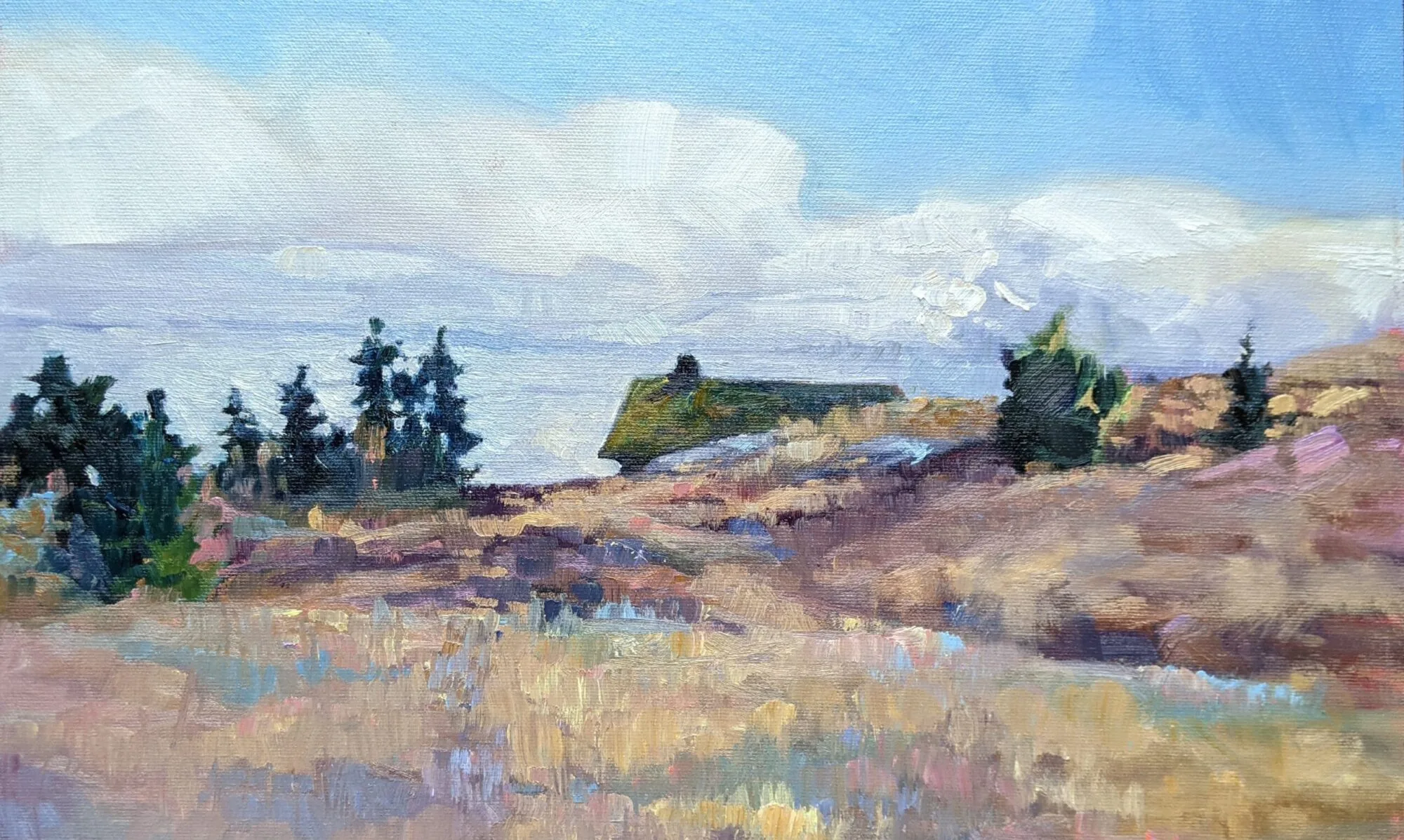
This weekend, I was on the Schoodic Peninsula to test painting sites for my August workshop. When I got back to Waldoboro, a friend showed me two books she bought at the Damariscotta Public Library used book sale. They are Grumbacher art guides: one for drawing, and one for mixing paint. Each was worth the 25¢ she paid, but the color mixing guide is particularly good.
| Best fun I’ve had for a quarter in forever. |
In 1966, thalo green and alizarin crimson were the pigments de jour, but today we aren’t keen on either of them. A good art teacher would cross them out and replace them with their 21st century analogs: quinacridone violet for the crimson, and nothing for the thalo green (which has to be the pigment I hate most in this world). But why bother? Another two generations, and archivists will be sneering at the pigments we’re using today.
| Ignore the names of the pigments on this chart, and notice instead that violet is the darkest pure pigment, and yellow the lightest. |
The principles are what matter. Look at the illustration of primary pairings. It shows an essential rule of painting—there are no pure pigments, so you need a warm and cool version of each primary color to get the greatest gamut (or range of colors). In fact, if you set up your palette with paired primaries, you can dispense with the secondaries altogether. There is no real need for orange, purple or green when you have primaries that can mix to them. (I do keep cadmium orange on my palette and dispense with cadmium red, but that’s an idiosyncrasy that I’ve arrived at after years of painting. Consider it the exception that proves the rule.)
P.S. Dressing in the dark undoes the artist’s advantage in matching his or her clothing. I have no idea if my long johns go with my turtleneck this morning.
Let me know if you’re interested in painting with me in Maine in 2015 or Rochester at any time. Click here for more information on my Maine workshops! Download a brochurehere.
