A fast, easy route to mixing plausible summer greens.
 |
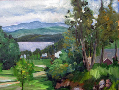
| Overlooking Lake Champlain, by Carol L. Douglas. Every green in this painting came from the matrix below. And, yes, there’s a scrape in it. It tumbled off a bluff. |
The need for green came early to class this year, paradoxically because it’s been cold this spring. There’s little green peeping out in nature, even here on the coast.
Last week in class we worked on salvaging failed paintings. That meant pulling out work from summers past. Most of them included some greens, so we had to mix a green chart.
 |
| A basic mixing chart for greens, made by my friend and student Victoria Brzustowicz. |
We are only weeks away from painting greens again, in all their light, airy delicacy. Even now, the osier and willows have red and yellow in their branches. By June, we will be wrapped in a blanket of immature foliage ranging in color from pale emerald to pink. It’s a good time to brush up on some color theory.
By August, the color will have settled into a deeper, more uniform tone. The only way to navigate this is to avoid greens out of a tube. A system of paired primaries gives you more options, avoiding the acidity of phthalo green, the weight of chromium oxide green, or the soul-sucking darkness of sap green.
If you look carefully at supposedly-uniform foliate, you will see patches where the color leans toward khaki, yellow, teal, violet and orange. They are what gives life to greens, just as accidental tones give life to human skin.
Michael Wilcox published a watercolor pigment guide called Blue and Yellow Don’t Make Green. Of course they do, but his point was that there are many routes to the same destination. One of the most useful landscape greens is black and cadmium lemon or Hansa yellow. Of all the greens I mix, this and ultramarine with yellow ochre are the two I use the most.
| The above chart, mixed in oils. It works just as well in water-based media. |
In my experience, bad paint mixing causes paintings to go wrong faster than anything else. Constantly over-daubing to modulate the paint color distorts the original drawing and makes a grey mush. If you’re confident of the color, you can apply it fast and accurately.
Above is the matrix of greens I’ve used for almost twenty years. The range of results is infinite. It depends on the proportions you choose and the brand of paint you use. However, blue/black pigments are always much stronger than their yellow mates. In any mixture, you need about half the amount of blue or black as you do yellow. This has nothing to do with color theory. It’s because darker pigments have more staining power than do lighter pigments.
 |
|
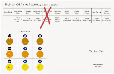
Victoria Brzustowicz made this color chart based on my workshop palette. Here is a printable PDF.I crossed out the red on the chart because, while I do use it in the studio, in most field painting it’s unnecessary.
|
Once you’ve finished mixing that matrix, it’s time to tie it to the bigger palette. I encourage students to arrange their paints as above because:
- It’s efficient;
- It allows you to mix without thinking;
- It encourages you to use the full color range in every painting;
- It prevents the beginner’s error of modulating with white or black;
You can modulate your greens using tints of your other colors. For atmospheric greens, modulate with blues and violets. For warm, lighter greens, modulate with warmer tones.
 |
| Mount Hope Cemetery in the Spring, by Carol L. Douglas |
Above is a photograph I took several summers ago. Your mission is to use the green chart I’ve made and mix tones similar to the different greens in the photo. If you get the mixing right, painting this scene will be a snap.
