Why grisaille?

Your painting should be a carefully judged pas de deuxbetween reality and your own vision. That’s best worked out before you start adding a million different color variables.

There are days when I just want to think compositionally, without any reality or detail cluttering up my mind. Monochrome is the best way I know to do this.

I have a student who has started painting in monochrome as he learns to master color. It’s a great idea; I might insist on it, except it would result in revolution. People love ‘color’ but fail to see that value is color’s anchor. However one expresses darks, their pattern is what drives a painting. It’s best seen in monochrome, before you add in hues.

By removing the hue question, Mark is doing the equivalent of practicing one hand of his difficult piano sonata at a time. It’s a time-honored technique because it works.

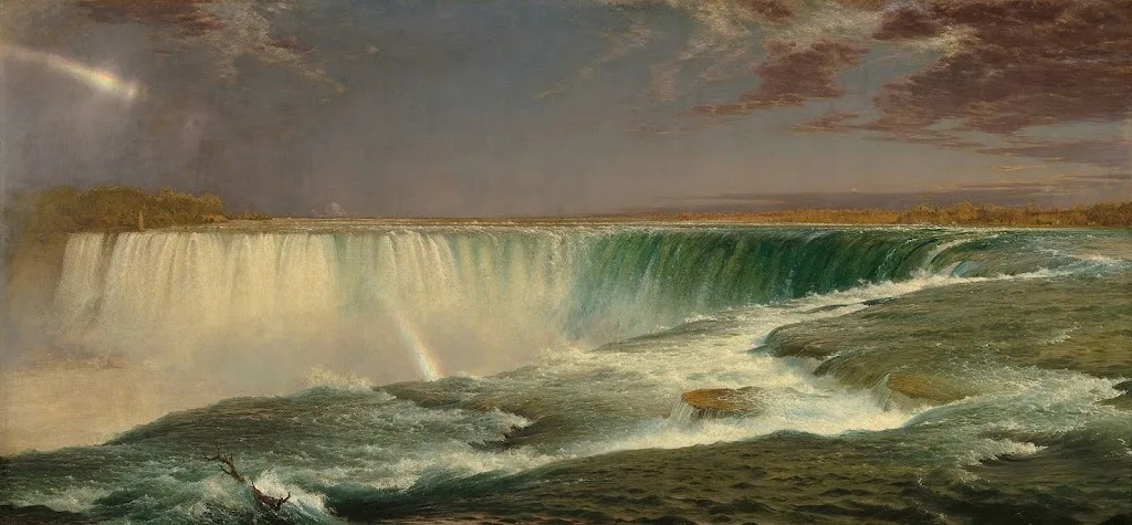
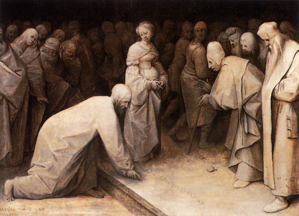
Christ and the Woman Taken in Adultery, 1565, Pieter Bruegel the Elder, courtesy the Courtauld Gallery

A grisaille (pronounced ‘griz-EYE’) is a painting done entirely in shades of grey or another neutral. It can take the form of an underpainting or can be a finished painting in itself. It’s not generally done in lieu of a pencil sketch or notan, but rather as a discrete step in the process of planning a painting.

It is possible to start a painting with just hash-marks on the canvas. Some excellent painters do this; however, for the beginner, that’s the circus trapeze without a net.

Historically, grisaille has been used for finished works of art. This was particularly true in decorative painting, where grisaille might serve as a sort of trompe l’oeilfor sculptural relief. Paint, even in the hands of a master, is cheaper than marble.

Christ and the Woman Taken in Adultery, above, was a personal painting owned by Pieter Bruegel the Elder and his descendants. It’s tiny, roughly 9X12. Its character and intimacy are enhanced by being in monochrome. In that way, it has the feel of a fine drawing.

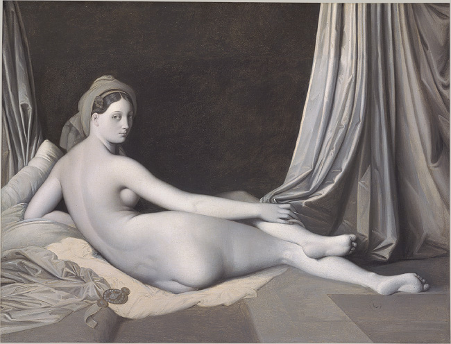
Odalisque in Grisaille, Jean-Auguste-Dominique Ingres and his workshop, 1823-24, courtesy Metropolitan Museum of Art

Sometimes popular paintings were copied in monochrome to simplify life for engravers. Jean-Auguste-Dominique Ingres’ copy of his La Grande Odalisque, above, is one such example. There lies a lesson for students: if engravers, who are skilled artisans in their own right, find it difficult to track value, how much harder is it for new painters?

Mostly, grisaille has been done as underpainting. Until the Impressionists, with a few exceptions, painting was done in what is called ‘indirect painting.’ Paint was applied in thin layers, or glazes. The underpainting was laid down in a thinned form, usually (but not always) in monochrome. This layer also served to tone the canvas. After it dried, subsequent thin washes of color were worked over the top. The underpainting was allowed to mingle with the glaze colors. It’s a powerful technique, but not as lyrical or free as alla prima painting.

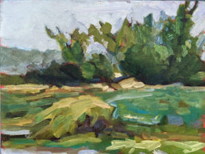
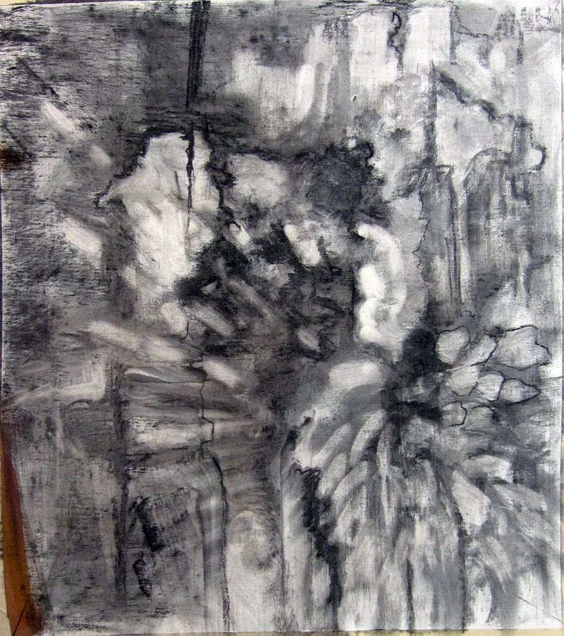
A small underpainting grisaille example I made for my students.

Alla prima doesn’t really require any underpainting, but it’s an act of incredible courage to just start daubing on a blank canvas. Few artists are that brave—or foolhardy, depending on how you look at it. So, we tend to do exactly the same thing as our predecessors—a thin wash of paint, usually in grisaille, that tells us where stuff is supposed to go. Of course, we must learn to judge that first wash to a nicety. Too stiff, and the underpainting is too thick. Too goopy, and everything above it turns to soup.

If the composition reads well at this value-study phase, the painting is almost always going to work, providing you stick with your plan. If it doesn’t, you’re unlikely to salvage it.

All value judgments are subjective. There’s no reliable way to measure the value of a color. The camera is as subjective as the human eye. Your painting should be a carefully judged pas de deux between reality and your own vision. That’s best worked out before you start adding a million different variables in the form of hues.

Chromophobia

Until you start playing and experimenting, you won’t really own your own color pathway.

Bobbi Heath once posited to me that painters learn to manage color in three phases:

  • They make everything grey;
  • They vastly overshoot the chroma;
  • They finally learn a pleasing color sensibility.

 â€œIs it even possible to overshoot the chroma?” I riposted, because I’m apparently stuck in the second phase. I was joking, of course. In being a high-chroma painter, I’m operating within my own time and place in history. High chroma is part of our current landscape painting style.

Beautiful Dream, 12X16, oil on archival canvasboard, available.

(For those of you new to the discussion, chroma is one of three aspects of color, which you can read about here. It means how intense the color is. Grey is low-chroma; fuchsia is high-chroma.)

Bobbi had it right, of course. Painters start in a world of soft greys because grey is safe. They need to blow through that safety net to master all aspects of color.

The problem is exacerbated when the painter lives in an area with grey skies. I spent 21 years in Rochester, NY, where the weather is controlled by tempestuous Lake Ontario. Those damp, overcast skies were great for gardening and my skin, but they mean indirect light. That, in turn, can lead to gloomier color and less separation between lights and darks. Beautiful, but dull in a painting—unless you take a page from the Luministplaybook and straight-up lie. Before you can do that, you have to be able to see it.

Giving birth to a brighter color palette can be painful. Brilliant color looks garish at first, often because our first experiments at high-chroma painting are garish. The question of color harmony is more important when our painting isn’t subdued by a leavening wash of grey. With chroma elevated, we can no longer ignore when color combinations don’t work.

Bracken Fern, 9×12, oil on archival canvasboard, available.

You can’t get to that phase of development until you let go of the crutch of neutrality. This is one area where a teacher or mentor can be a great help. “Leave it,” we say. “Set it aside and look at it again in two weeks.” Actually, it would be more helpful to set it aside and paint twenty or thirty paintings in this new high-chroma space until you start to see how it hangs together.

Yes, you’ll make some awful paintings. It’s a necessary phase of growth. “No mistakes, no success. Know mistakes, know success,” my buddy Ivan Ramostold me yesterday. That’s never truer than with color. I can lecture all year about color interaction but there are millions of ways to lay colors down next to each other. Until you start playing and experimenting, you won’t really own your own color pathway.

Quebec Brook, 12X16, oil on archival canvasboard, available.

I encourage my students to have tintson their palette because they help keep color clean. These premixes can save a lot of time and prevent a whole lot of dullness.

None of this is to say there isn’t room for neutrals in painting. Of course, there is, and the third phase of color management is to add those neutrals back in. (I’m still waiting.) But let’s not jump the gun here; neutrals are in some ways the apotheosis of color, a counterpoint to chroma. They come last in our color-sensibility development.

Monday Morning Art School: the power of light

In a world obsessed with rawness, you could do worse than studying the Luminists.

Lumber Schooners at Evening on Penobscot Bay, 1863, Fitz Henry Lane, courtesy National Gallery of Art. The setting for this painting is, quite literally, out my back door.

Luminism is a distinctly American painting movement of the middle of the 19th century. It was chiefly concerned with the effects of light on the landscape. Significant painters of the movement included Fitz Henry LaneMartin Johnson HeadeSanford Gifford, and John F. Kensett. The latter two you might recognize as Hudson River School painters. In fact Luminism was closely related to the Hudson River School and painters like Frederic Edwin Church and Albert Bierstadt sailed very close to the wind of Luminism.

A fascination with light is something Luminism shares with Impressionism, but the path there is exactly opposite. Impressionism is what art historians call painterly—there are visible brushstrokes in the top layer. Luminism is what is called linear—modeling and distance are created with skilled drawing and brushstrokes are suppressed.

View of the Shrewsbury River, New Jersey, 1859, John Frederick Kensett, courtesy Rutgers University

In the Luminist world, light is generally hard. The soft, ambiguous atmospherics of Claude Monetor James Abbott McNeill Whistler were inconceivable to these painters. Attention is paid to detail, which is often picked out by some larger-than-life weather event. Atmospheric perspective is exaggerated for effect.

For this reason, scenes of mountain vistas and the ocean were especially popular. They allow us to see light playing itself out in all its variations. Fitz Henry Lane was a popular painter of the Maine and Massachusetts coasts, and his work is a compendium of Luminism’s themes. There’s extensive detail, an expanse of interesting sky, and careful attention to value.

There’s often an elevated viewpoint, where we are looking down on the scene in a very personal way. It’s a viewpoint that’s not quite possible in reality. It seats us right next to God, in effect.

The Artist Sketching at Mount Desert, Maine, 1864-1865, Sanford Robinson Gifford, courtesy National Gallery of Art. 

Luminism has no meaning divorced from its themes, which were intimately related to those of the Hudson River School painters: discovery, exploration and settlement. In their telling, America is a peaceful Eden where nature and human beings coexist peacefully. The schooner rests quietly at anchor; tilled fields nestle undisturbed below the mountains; There are no blizzards, tornadoes, or wolves to disturb the balance. There is only that sublime light from the heavens.

Hudson River School artists believed that the American landscape was a reflection of God. Luminism, in particular, is connected with Transcendentalism, which saw a close link between the spiritual and physical worlds.

This has to be set against the times in which these paintings were created. It was a period of fast settlement and rapid industrialization, particularly in the east coast where these painters sold their work. Luminism was painting an America that—if it existed at all—was short-lived and vanishing.

Cotopaxi, 1862, Frederic Edwin Church, courtesy Detroit Institute of Arts. Church showed Americans the whole New World through a Luminist lens.

At the same time, there was an intense curiosity about parts of the country that most people had never seen. That’s why tens of thousands of people were willing to pay 25¢ each to see Church’s Niagaraon exhibit. The massive, glowing canvas was a proxy trip to the Niagara Frontier. And Church could, with a flick of his brush, conveniently excise all the people who lived and worked in Niagara at the time.

The tags Hudson River School and Luminist came long after both movements had ended. They were initially dismissive. Impressionism, Post-Impressionism and Abstraction had taken the western art world by storm. Careful brushwork and drawing were filed in the back of our consciousness. The cognoscenti considered them quaint. But they’ve always had their fans in Middle America.

Much can be learned from these painters in regards to light. And it hurts nobody to know how to use the brush carefully and discreetly at times, to feather, brush and model with delicacy and intention. In a world obsessed with rawness, you could do worse than studying the Luminists.

The power of the Great White North

In the solitary splendor of Canada, these painters found energy, possibility, and a national identity.

Byng Inlet, Georgian Bay, 1914–1915, Tom Thomson, courtesy McMichael Collection

Here in Maine, we import our weather from Canada. In fact, we share a lot with our Canadian neighbors, including black spruces, granite, and the spodosol soils that are good for growing potatoes, blueberries, evergreens, and not much else.

Maine has a contemporary painting style that’s driven by this sense of place. It’s curiously unrelated to our most famous summer painter, Andrew Wyeth. Instead, it derives from an earlier generation of painters, including Rockwell Kent and Edward Hopper.  Maine is just too sunny and wild to sustain Wyeth’s quiet melancholy.

Mt. Lefroy, 1930, Lawren S. Harris, courtesy McMichael Collection

This combination of influences and landscape gives us some curious parallels to our Canadian neighbors, the Group of Sevenpainters. This group consisted of Franklin CarmichaelLawren Harris, AY Jackson, Frank Johnston, Arthur Lismer, JEH MacDonald, and Frederick Varley. Later, AJ Casson, Edwin Holgate and LeMoine FitzGerald joined them.

Bright Land, 1938, Arthur Lismer, courtesy McMichael Collection

Although he died before the official formation of the group, Tom Thomson was a profound influence on them. Emily Carrwas never an official member as she lived in Vancouver, but she was influenced by them. Lawren Harris, in particular, was a support. “You are one of us,” he told her.

Shoreline, 1936, Emily Carr, courtesy McMichael Collection

Harris was one of the driving forces behind the Group of Seven, and the most able to articulate their mission. He was a very malleable painter. He went from impressionism to art nouveau realism to complete abstraction in a matter of two decades. His break with realism occurred in the early 1930s, after he visited and painted in the Arctic.

Harris believed in the arctic as a living force: “We are on the fringe of the great North and its living whiteness, its loneliness and replenishment, its resignations and release, tis call and answer, its cleansing rhythms. It seems that the top of the continent is a source of spiritual flow that will ever shed clarity into the growing race of America.”

First Snow, Algoma, 1919/1920, AY Jackson, courtesy McMichael Collection

The Group of Seven painted this ethos. In the solitary splendor of Canada, they found energy, possibility, and a national identity. That’s an idea that has become politicized in recent years. Indigenous people have argued that these areas were always inhabited. The depiction of emptiness was a de facto endorsement of the pernicious policy of terra nullius.

But for artists trained in Europe, many of whom saw duty in WWI, Canada was desolate. As AY Jackson wrote, “After painting in Europe where everything was mellowed by time and human associations, I found it a problem to paint a country in outward appearance pretty much as it had been when Champlain passed through its thousands of rock islands three hundred years before.”

Goat Range, Rocky Mountains, 1932, JEH MacDonald, courtesy McMichael Collection

I’ve painted through every Canadian province and Yukon Territory. (Nunavut and Northwest Territories remain on my bucket list.) To my American eyes, Canada is empty, and that’s its attraction. Canada is unique in having so much wilderness, untouched, in the modern world. That Great White North, which reaches down and embraces the country in an iron grip every winter, is wilderness’ fierce protector.

Everything the Group of Seven painted derives from that unique understanding of wilderness and its value. Maine artists work from the same wellspring of inspiration, so it’s no wonder that our paintings look similar to our Canadian neighbors’.

Selling paintings

What’s the next social media marketing trend?

Main Street, Owls Head, available.

Last month I spent a few hours with Kicki Storm, who excitedly told me about the potential she saw in Instagram reels. I was buried in bubble-wrap at the time and more focused on getting a mountain of paintings into a U-Haul trailer. My pal Bobbi Heath, who carefully follows social media marketing, has talked to me about lookalike audiences for Facebook paid ads. I’ve tried them, but not to great success.

Ralph Waldo Emerson is credited with saying, “Build a better mousetrap, and the world will beat a path to your door.” I doubt that was true in the late 19thcentury and it’s certainly not true today. The successful artist has always had one eye focused on self-promotion.

Apple Tree with Swing, available.

Like you, I’m overcommitted, overstressed, and overwhelmed. There are lots of people out there interested in taking my advertising dollars, and I don’t have the market savvy to measure their claims. How do I negotiate this constantly-shifting landscape and still have time to paint?

The people who work in the field recommend that small businesses spend anywhere from 7-8% of their gross revenue on marketing. In actual fact, small businesses tend to spend more like 3-5% of gross revenues on advertising. That includes everything to put out their message, such as website hosting, Mailchimp, and other recurring costs. But it also inevitably means paid ads.

Spending that kind of money when you’re starting out can seem overwhelming, and it’s tempting to fall back on organic social-media marketing, which—by the way—is invaluable. But it’s an inevitable part of growth that you’ll need to learn about paid advertising somewhere along the way. The trouble is, there’s no easily-digested textbook.

Owls Head Fishing Shacks, available.

I’m seeing a shift in my advertising results this year, a decline in response. This may be an economic problem, as there are worrisome issues that might give people pause about big-ticket purchases. But it’s enough of a shift that I’m looking at different ad platforms, including print media.

Ten years ago, I thought print advertising was moribund, but I’ve noticed that I see consistent results from the Maine Gallery Guide. That’s emboldened me to dip my toe back into other print advertising.

At the same time, the cost-per-click on Facebook continues to rise. According to Wordstream , the average cost-per-click is now $1.72. That may not be a big barrier to LL Bean, but it is to an artist.

What Facebook used to be able to do superlatively was target customers. However, a global shift toward consumer privacy has made Facebook targeting more difficult.

Belfast Harbor, available.

As Facebook has grown into the juggernaut it is today, fine artists are now too small a market-niche for targeting. There aren’t even categories of ‘landscape workshops’ or ‘plein air painting’ in their current interest groups. When we tell it to match for people who are ‘interested in art,’ that’s too broad a brush.

Where does this leave us? Looking elsewhere. And that includes niche publications directed at artists.

Years ago, Bobbi Heath told me to never neglect my own lists. This shift in marketing is a strong reminder to build up your own lists so you can market directly from them. And I’m the pot-calling-the-kettle-black on this, because I haven’t had a sign-up box on this blog since the start of the year. I’ll get to it, I swear.

Monday Morning Art School: losing your edge

There are many ways to soften an edge; the important thing is recognizing where you should do it.

Niagara, 1857, Frederic Edwin Church, courtesy Corcoran Gallery

Almost every good painting is a combination of hard and soft edges. Edges may be lost through brushwork or they can be muted using contrast or color. A variety of edges not only adds interest to a painting, they support its composition and thus how the painting is ‘read’.

Broken brushwork, or broken color, means that the artist applies paint in small or skipping strokes but does not blend them. Colors blend optically rather than literally. Broken brushwork can take the form of small, intentional marks, scumbling, or palette-knife painting. The goal is to create tension, a vibration of color. Broken brushwork is an excellent way to lose the edge in painting.

Winter Harbor Scene with City Views Beyond,Aldro T. Hibbard

Chauncey Foster Rider was admired in his day for both his vigorous, adventurous brushwork and the degree to which he pushed his landscape paintings toward abstraction. He had a particular gift for painting the feathery bare branches at the top of winter trees in both watercolor and oils. He had several ways of doing this: wet on wet, broken color created by pushing paint with a palette knife, dragging his brush through wet paint, and by making low-contrast shifts within value masses. At times he painted the middle distance in thin paint, or dry-brushed thin paint over an already-textured sky. But perhaps the most effective of his techniques was creating masses that are barely darker than the winter sky. From a distance, they read as a mass of bare branches.

Another fine painter of New England winter was Aldro T. Hibbard. He too had a variety of tricks for painting the filigree of bare branches, including dry-brush scumbling, as shown in the example above. He played these soft shapes against the hard lines of positively-painted tree trunks to great effect.

Before there was broken brushwork, there was blending and softening. In Frederic Edwin Church’s Niagara, at top, the rim of the cataract veers between sharp and blurred edges. A long bright triangle, stabbing to the right, is accentuated by the soft colors of the mist. The far shore shimmers in the spray. It’s a tour de force of a type of painting we don’t see enough of these days.

Church at Old Lyme, 1905, Childe Hassam, courtesy Albright-Knox Art Gallery 

There are indirect ways to make edges recede, too. In Church at Old Lyme, above, Childe Hassam makes the leaves and sky the exact same value. Even though their edges are sharp and the colors complements, they flow into each other, leaving no doubt that the subject of the painting is the white church.

The Bridge of Sighs, c. 1903-04, John Singer Sargent

John Singer Sargent’s watercolors of the Bridge of Sighs balance the hard edge where the sky meets the stone against the soft shadows. These are allowed to bleed into the muck of darkness, a great way to deemphasize too many hard edges. By the way, for those purists who hate white paint in watercolor, Sargent used it quite cheerfully.

Portneuf Canyon, Idaho,1879, Thomas Moran

Reducing contrast reduces the perceived hardness of the edges, as Thomas Moran’s Portneuf Canyon, Idaho, above, demonstrates. That’s how we instinctively read the far distance as receding. And, of course, watercolorists can always wet an edge to soften it, or paint into wet paper.

Two Women on a Hillside, 1906, Franz Marc, courtesy Franz Marc Museum

We know that value contrast can support or diminish a hard edge, but so also can hue. In Two Women on a HillsideFranz Marc tied the women to their setting by reflecting the greens of the grass in their skin and garb.

The important thing isn’t necessarily the way you lose your edges, it’s knowing where and when it should be done. That’s best learned by looking at great paintings and analyzing the pas de deux between hard and soft edges.

The devil’s in the details

Pam’s paints weren’t cheap; they were by reputable manufacturers. But she was caught in the maze of historic names and convenience mixes.

Spring Allee, 14X18, oil on archival canvasboard, available.

Last week my students did a green-mixing exercise. Pam Otis had a tough time getting the proper mixes out of the yellows on her palette. After class, she sent me photos of every yellow she had. I spent an instructive half-hour happily looking up each tube.

I know, generally, what’s in colors, but different manufacturers have different ways of getting to that point. If the paint tube isn’t marked (or has been crimped or damaged so you can’t read the tiny type), you must research the paint on the manufacturer’s site. Often, you’ll learn something, because paints are constantly changing.

Vineyard, 30X40, oil on canvas, available.

Some changes are due to market conditions. PO49, quinacridone gold, was a very useful color (as all the quinacridones are). However, it was discontinued by the auto industry in 2001. The fine arts market for pigments is miniscule, so PO49 disappeared. Most modern quinacridone golds are convenience mixes of quinacridone orange (PO48) and nickel azo yellow (PY150). Both are perfectly fine pigments, but they work differently in mixes than the original pigment.

Other substitutions are more inscrutable. The siennas are ancient pigments made of dirt—a mixture of iron and manganese oxides, to be specific. In its natural state, this pigment is yellow-brown and called raw sienna. Cooked, it turns red and is burnt sienna. Along with ochre and umber, raw sienna was among the first pigments ever used by prehistoric humans. It has been used ever since, because it’s cheap, plentiful, harmless, and doesn’t fade. Modern earth pigments are all manufactured analogues, but are chemically indistinguishable from the old mined ore.

I have no idea why Winsor & Newton substitutes a combination of burnt sienna (PR101) and yellow ochre (PY42) for ordinary raw sienna. But that may be why some yellow ochres and raw siennas are indistinguishable out of the tube.

Bracken fern, 9X12, oil on archival canvasboard, available.

A hue is a blend of less-expensive pigments. There is nothing inherently wrong with hues, but they don’t behave the same as the pigments they’re named after. “Cadmium yellow hue” may look like cadmium yellow coming out of the tube, but it makes insipid greens.

Then there is the stuff that watercolorists call Gamboge. The real thing came from tapping the latex of the Garcinia, or Gamboge Tree. It’s a beautiful, transparent, non-staining orange-yellow, but it’s also extremely fugitive (as vegetable dyes tend to be). So, manufacturers substitute other pigments and call the result New Gamboge. The most common ingredients are nickel azo yellow and anthrapyrimidine yellow (PY108) However, there are as many formulas as there are manufacturers, and every combination behaves differently.

Spring Greens, 8X10, oil on archival canvasboard, available.

The origins of Indian yellow have long been disputed. It was said that it was extracted from the urine of cows fed a diet of only mango leaves. 20th century, art historians doubted this, but recent chemical analysis of historic samples confirm the source as animal urine.

We now reject the idea of starving cows to create pretty pigments (although euxanthic acid can be synthesized in the lab). Today we use combinations of nickel azo, hansa yellow, and quinacridone burnt orange. It’s a terrific paint for making dark greens. The trouble, again, is that every manufacturer has its own formula for Indian Yellow.

Pam’s paints weren’t cheap; they were by reputable manufacturers. But she was caught in the maze of historic names and convenience mixes. Knowing how to read the CII code on your paint tube is important.

The CII code consists of two letters and some numbers. Most paints start with a “P” which means it’s a pigment, not a dye. The next letter is the color family:  PR is red, PY is yellow, etc. The number is the specific pigment included in the tube.

Save this link somewhere accessible from your phone. You’ll need it when you shop. This pigment guide was built for watercolors but is generally true across all media. 

Nature preaches peace

But it’s a jungle out there.

Apple blossom time, 9X12, oil on canvasboard, available.

My friend Jonathan Becker took a lovely photo of spring outside his back door in Samaria. There are poppies to the left and something that looks like flax to the right—and beyond that a chain-link fence and the desert.

Overshadowed by the cataclysm in Ukraine, Israel has sustained deadly attacks in recent weeks. They have people talking about another Intifada. My knowledge of Israeli geography is hazy, but I believe that Samaria is part of the West Bank. Jonathan is hardly sitting pretty.

Spring in Samaria, photo courtesy of Jonathan Becker.

And yet spring blooms, as it has always done so far. “Nature preaches peace,” I said to Jonathan.

“But it’s a jungle out there,” he replied. Well, he’s the one sitting on the tinderbox, not me.

I recently wrote about purpose, that indefinable goal that drives all artists. “I’d be hard-pressed to put my mission statement into words,” I said, and that remains true. But relative to landscape painting—and let’s face it, it’s primarily what I do these days—my conversation with Jonathan hit me like a bullet on the N-train in Sunset Park.

Nature preaches peace.

Blueberry barrens at Clary Hill, watercolor on Yupo, 24X36, available.

Jonathan may wake up every morning of this Pesach season wondering what fresh hell will be visited on his little community, but the flax and poppies know no such fears. They bloom as they’ve always bloomed.

I’m reading the news these days from under my security blanket, with one eye on my phone, the other screwed firmly shut. I haven’t known such a fraught period in my lifetime. There will be no blossoms in Mariupol, which has sustained scorched-earth bombings. There are reports of chemical weapons being used there, which hasn’t happened in Europe since WW2. The term Mutually Assured Destruction is back in my mind for the first time since 1980. The economic news is worrisome, and I’m sick about the shootings in Brooklyn.

But my Israeli friends? They’ve been living in such uncertainty since 1948, and they’re generally cheerful about it. I could learn a lot from their attitude. “Sufficient unto the day is the evil thereof,” says the gospel of Matthew, and it’s a good thing to remember.

Every morning on Beech Hill, the scene changes infinitesimally. Each branch is covered with tiny buds of green or pink, waiting expectantly for warmer air. The blueberry barrens are turning green in stripes, looking like a cockeyed Christmas sweater. Woodpeckers are back, as are the ticks (who aren’t really evil, merely looking for a free lunch).

Sometimes it rains, oil on archival canvasboard, 9X12, available.

Nature preaches peace.

Yes, I’m aware that under the verdancy of spring, hawks are still killing voles and fishers are stalking porcupines. Nature is red in tooth and claw. But nature doesn’t seek the wholesale extirpation of its enemies, as some of mankind seems to be doing right now.

Nature continues in its preordained courses. The Northern Hemisphere awakens from winter, its seasonal death forgotten. Life is gradually restored.

We landscape painters, in copying nature, can preach peace secondhand. That’s a mission I can wholeheartedly embrace.

Monday Morning Art School: pochade boxes for every budget

I hate to see people waste money on a cheap pochade box that won’t work.

My current system is an Open M box on a carbon-fiber tripod. It’s lightweight and puts up with a lot of abuse.

Last week I discussed how Google drove me toward inexpensive and fatally-flawed Meeden pochade boxes. I do not generally tell people what boxes to buy, as there’s a tremendous range of excellent options. But I don’t want to see students waste money on a cheap box that won’t work.

We’re a month out from the start of plein air season here in the northeast, so it’s time to research and order a box if you need one. Some manufacturers are on their seasonal hiatus, but if they make the box you want, it’s worth waiting for.

My super-light pochade box when it was new (and clean).

Unfortunately, most pochade boxes are sold on the internet, so you can’t twiddle the dials in person. You must rely on word-of-mouth. The good news is that there are some excellent products out there.

Many people have been given some version of a French box easel by loving friends or relatives. If you’ve got one, by all means use it, but don’t voluntarily inflict one on yourself. They’re heavy, difficult to set up, and you can’t slide the paint out and store it in the freezer. Pochade boxes are lighter and nimbler.

If money is an issue, make your own. I have instructions here for making a lightweight aluminum box. This was my primary box for several years and I still use it for backpacking, as it’s the lightest box I own.

Jennifer Johnson’s variation on that theme.

My student Jennifer Johnson decided to make a box like mine, but her husband ordered the wrong binder. It was a fortuitous accident, because her box is smaller and stronger. It pairs up perfectly with her Mabef M-27 field easel without any drilling or special machining. She’s used two of them—one for acrylics, one for oils—for four years now without any problems.

Or, you can use Victoria Brzustowicz’ ingenious, cheap and simple solution. She hinged two aluminum baking sheets from the Dollar Store together with a strip of duct tape. Open, it’s a paint box; closed, it goes in a plastic bag in the freezer. She also uses it with a Mabef field easel.

Victoria Brustowicz’ variation on the theme cost her all of $2.

That Mabef field easel can also be used with a plastic Masterson sta-wet palette box and disposable palette paper for another lightweight and inexpensive combination.

In all cases, you’ll have to tinker with bungee cords and clamps to secure the box to the easel, but it does work.

A few of my students have the Leder easel. At $119 (not including the tripod), it’s reasonably priced, stable, and extremely compact. You must buy your own tripod and paint box, but that, again, means you can use a sta-wet palette box. It’s also a useful system for pastels, because it allows you to use your existing pastel box.

New Wave u go pochade box belonging to Ann Clowe.

I’ve also seen several New Wave u.go pochade boxes over the past year. They’re birch and use magnets instead of clasps. They seem solidly built and have a lift-out palette.

My current everyday box is an Easy L box by Artwork Essentials. (I also use their umbrella, because it stays where I put it.) The box is durable, basic, and you can set it up so it hangs with the palette at the same angle as your canvas. That’s useful for demoing but I never do it in real life.

Another lovely box in a similar style is Open M’s panel/palette holder. It’s also well made of Baltic birch. The major difference is in the style of hardware.

Terrie Perrine using the Leder system with her own pastel box.

Guerrilla Painteris a well-known brand of extremely-robust pochade boxes. I have a 12X16 Guerrilla box that is so tough I could drive over it with my truck and then use it. That comes at a price, however; the box is too darn heavy for anything other than park-and-paint plein air.

Strada makes the only aluminum pochade boxes that I know of. That’s a pity, because aluminum is stronger and less prone to moisture damage than wood. It doesn’t result in much weight savings, however; the 11X12 Strada box weighs only an ounce less than the 10X12 Open M box.

En Plein Air Pro now has a system for oil and acrylic painters with a greyscale mixing tray. They also have a portable pastel easel. I worked briefly with the oil-palette at my Sedona workshoplast month, and it seemed quite solid and practical. I have had one of their tripod trays for years, however. It’s rigid and durable.

All opinions on these products are my own. A handful of them use affiliate links; if you click and make a purchase, I may receive a commission. 

Constant overdrive

My strategic plan for 2022 seems to be in tatters. That’s the price of constant overdrive.

Skylarking, 24X36, oil on canvas, available.

At the end of last year, pastor Quinton Self challenged us to stop with the busy work and focus on what matters. That includes moments of rest. He and I are the same psychological profile (with the test scores to prove it), so when he zings me in a sermon, I figure he’s also talking to himself. In February, when he’d just finished a fast-paced, five-week teaching program on top of his other work, I asked him: “so, how’s that Sabbath rest thing going for you, PQ?” He smiled. It’s a constitutional problem for both of us.

Every year recently I’ve said, “this is the latest I’ve ever done my taxes.” This year’s record will stand. I can’t get much later and not file for an extension. That’s a terrible idea; it just prolongs the agony. What’s scary is that I didn’t even think about taxes until I was flying back from Phoenix two weeks ago.

Breaking Storm, 48X30, oil on canvas, available.

I had coffee with my Canadian pal Poppy Balser last week. I don’t really envy our Canadian neighbors their economic system. However, when I’m calculating income tax, I wish we could streamline our ponderous system and replace it with something like theirs. As a sole proprietor, I keep records on all kinds of things that are irrelevant to the average taxpayer—household repairs, utility bills, and the cost of operating my car.

It’s time-consuming and tedious, and I’m good with numbers. I can’t imagine what it’s like for my math-phobic fellow artists.

Admin is the curse of all sole proprietors. We write our own ads, maintain our own websites, do our own strategic planning, keep books, and somehow churn out a product. I am, for some reason, drowning in admin right now.

Wreck of the SS Ethie, 18X24, oil on canvas, available.

“Did I ever send you the materials for next year’s ad?” I asked Anthony Anderson of the Maine Gallery Guide yesterday. No, he replied, but if I can get it to him next week, I’ll be fine. I could hire my student Lori Galan or my old friend Victoria Brzustowiczto lay it out for me. Either of them would probably forgive me my hair-raising lateness. However, I don’t even have a clue what I want to say. And that ad is the most important one I’ll run all year.

Being in constant overdrive is corrosive. It forces a person to be reactive, batting balls back out as fast as they come in. Instead, intelligent people are proactive, thinking out a strategy and sticking with it.

I did that at the beginning of the year, by the way. It’s in tatters.

Beautiful Dream, 12X16, oil on birch panel, available.

But help is on the way. When we’re in overload, things have a way of falling on us and slowing us down. Another Canadian artist friend, Cathy LaChance, put it very succinctly when she was diagnosed with COVID this week: “My turn to be forced to rest.”

Call it the Universe, if you want; I prefer to credit God with this good design. 

The problem with frenetic people is that we are sometimes so busy we can’t hear the “still small voice” of God. That’s why it is often accompanied by the wind and earthquake (or COVID)—to get our attention.

I’d rather not wait that long.