Monday Morning Art School: the color of light

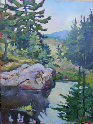
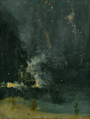
In winter, we’re in warm light from sunup to sunset, because the sun never really climbs very high in the sky. That’s our payoff for putting up with this weather.

Three photos of the golden hour, courtesy of Jennifer Johnson

The golden hour is that period after dawn and before sunset when the light is warm and the shadows are long and blue. The farther north you go, the longer the golden hour lasts. In winter in the northern United States, we’re in warm light from sunup to sunset, because the sun never really climbs very high in the sky. That’s our payoff for putting up with this weather.

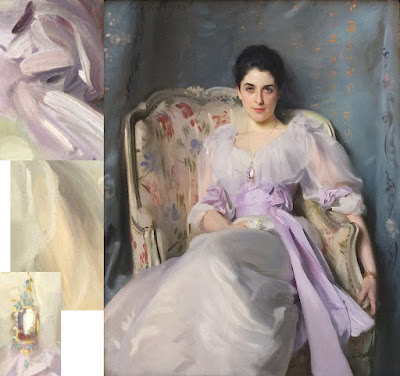
Most of us prefer to paint that winter light from the comfort of our studio, but cameras lie. That’s the same black glove, below; the image on the left is with a cellphone camera and the one on the right is with a DSLR. In attempting to correct exposure, the cellphone is interpreting that black as purple.

Two photos of a black glove, courtesy Dwight Perot

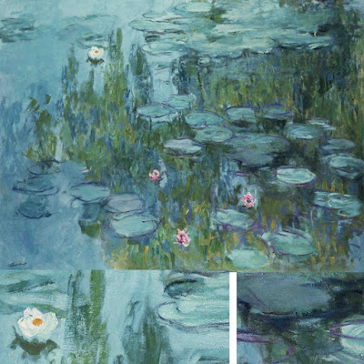
So too does your eye-brain connection see things interpretively. You may see the same blue shadows in the three photographs at top, but I’ve sampled them and they’re not the same at all. In fact, they’re not even blue, but rather three variations of a soft blueish-grey. Your mind is interpolating what it knows to be true, which is that those shadows are cool. In this case it’s better to trust your mind than the hard ‘facts’ of camera and laptop.

Looking for Shellfish, JoaquĂ­n Sorolla, 1905. A warm light comes from our side of the figure, but there are warm shadows—the result of local color reflection from the rock. Likewise the bottom half of the torso reflects strong cool tones from the water and anchors the boy into the sea.

What we call light is really the narrow band of electromagnetic waves that our retinas can perceive. This narrow band is comprised of the colors of the rainbow, or what we sometimes call ROY G BIV. (There really isn’t an indigo; it’s there so that Roy has a pronounceable surname.) Each of Roy’s color names corresponds to a specific wavelength. For example, blue is about 475 nm; red is about 650 nm.

When the whole visible light spectrum strikes your eye at the same time, you perceive white. This is not a color in itself, but the admixture of a bunch of colors. In the real world, this is never a pure mix. The atmosphere bends light just like a prism does, so what you see is always tinted. The light might be gold and peach at sunset and cool at midday. Impurities in the atmosphere also give us the energetic indigo-violet of the far distant hills.

Valencian Fishwives, JoaquĂ­n Sorolla, 1903. Here the light is cool and the shadows are warmer.

The farther away something is, the more likely dust has filtered out the longer wavelengths, i.e., the warm colors. That’s why your plein airpainting teacher keeps telling you that the reds drop out first, then the yellows, leaving you with blue.

Just as all the colors together form white light, the absence of light is total blackness. But unless you’re in a cave or darkroom, that’s a theoretical construct. There’s always reflected light bouncing around in the shadows, and that light gives the shadows its color. It’s never black and it’s unlikely to be grey, either.

Return from Fishing, JoaquĂ­n Sorolla, 1894. The light is warm, the shadows are cool, and the places where the light is going through the sails are warmer still, since they’re filtered by the off-white fabric.

If the color of the light is warm, the color of the shadows is almost always going to be cool, and vice-versa. Knowing this and identifying the color of the light and shadow is the first step to a good landscape painting.

The exception to this is an object in filtered light. Its shadows and lighter passages will be variations of the same color temperature. This is how we instinctively know that something we’re seeing is under an awning, for example.

Catalonia: the Tuna Catch, from Visions of Spain, JoaquĂ­n Sorolla, 1919. In this case, most of the painting is in shadow, and what light there is, is filtered through the yellow awning. It is the distortion of the light-dark color scheme that tells us viewers that we are in an enclosed space.

Study the Spanish painter JoaquĂ­n Sorolla to understand the color of light. He was a master at painting white fabric in a variety of circumstances, and comparing the light passages to the shadow passages will tell you much about managing the color of light in your painting.

It was the best of tomes, it was the worst of tomes

I’m flailing around in the undergrowth in this new-to-me medium.

In Control (Grace and her Unicorn), oil on canvas, 24X30, is heading to Rye Arts Center for the month of March.

Last fall, I made the commitment that I’d spend a day a week this winter writing a painting book. That should be easy; after all, I’ve been blogging on the subject since 2007 on this platform (and still earlier on WordPress). I’ve almost as much experience as a writer as I have as a painter. Writing is an ‘unconsciously competent’ skill for me, or so I thought.

I have an outline and a plan. That’s the writerly equivalent of a value sketch, right? If I continue with the model of painting, I should then rough out each chapter (my underpainting, in big shapes), and then do a final pass for details.

Saran Wrap Cynic, 24X20, is heading to Rye Arts Center for the month of March

I’m not finding it works that way. I keep forgetting where I am, so I stop to reread what I already have. I then get sucked into editing. But if I forge ahead without checking my place, I inevitably repeat myself.

I need illustrations, especially of the exercises, so I stop to paint them. That’s probably a mistake, but I’m unsure of myself, blundering ahead.

I’m not clear on how long this book should be. I’ve gotten about 9500 words so far, and you, dear student, have just learned how to transfer your sketch to canvas. Arthur Wesley Dow wrote an exhaustive painting book, but I don’t think that will work for modern readers. We like looking at pictures.

Pinkie, pastel, 6X8, is heading to Rye Arts Center for the month of March.

After major surgery eight years ago, I amused myself during my recovery by writing a novel. I had no trouble leaving the hero on the edge of a precipice, taking a nap, and then jumping back to his rescue. Perhaps it was because I was temporarily benched with few other distractions.

I realized that writing just one day a week gives me too much time to forget what I’ve done. I’ve ramped that up to two days a week—just temporarily, mind you, until I find my groove. That’s definitely helped, but it wipes out any time I have for actual painting. Teaching currently occupies the better part of two days. Marketing owns another.

Ten years ago, I’d have felt terrible about that, as if I was a poseur—someone who talks the talk but doesn’t walk the walk. Right now, I’m treating it like a necessary evil, and taking my joy in painting the examples for the book.

The paintings are nestled all snug in their beds…

But, if after this predicted Nor’easterpasses, one of my buddies texts me and says, “Carol, let’s go paint snow,” I’m outta here in a flash.

This week, curator Kicki Storm and I worked out the layout for my upcoming show at the Rye Art Center. The paintings are packed and waiting in the middle of my studio. The trailer is ready to roll. I’m chuffed to see these paintings heading down to a larger audience. If you’re on my mailing list, I’ll be sending you out the video tomorrow. If not, why not? Email me here, and I’ll fix that.

Resisting learning

Every one of us knows, in our heart of hearts, that we’re geniuses. If only we didn’t have the distractions of life, we could be brilliant at [insert discipline here].

Yesterday, my student Terrie told our Zoom class about something she’d read in a composition book. “Wow, the things I could learn if I actually read the books on my shelves instead of just looking at the pictures,” I joked, because I have the same book too.

It turns out that she was describing the ‘conscious competence’ learning model. It posits the following phases in learning a new skill:

Unconscious incompetence—the student doesn’t know what they don’t know;

Conscious incompetence—the student has figured out that they don’t know, and is making the mistakes necessary to learn;

Conscious competence—the student has figured out how to do it, but the steps require a lot of concentration;

Unconscious competence—the skill is second nature.

Fogbank, 14X18, oil on archival canvasboard, available

Every painting teacher has had the experience of the student who responds to every suggestion or criticism with ‘yes, but.” I was once that student myself, so it’s fairly easy for me to overlook, although it does take up valuable class time.

However, over twenty years of teaching, I’ve learned that if they don’t drop that attitude, they’ll take one session and then not come back. They’ve built up a protective wall around their self-image. Challenging that is too uncomfortable.

Little Village, 6X8, oil on archival canvasboard, available

Every one of us knows, in our heart of hearts, that we’re geniuses. If only we didn’t have the distractions of life, we could be brilliant at [insert discipline here]. However, it’s one thing to doodle, but another thing to drop the excuses and really challenge ourselves. All our shortcomings are revealed.

Going from dreamer to practitioner is an immensely humbling experience. That’s why—I think—so many truly-skilled artists are actually very modest people.

The instruction-resistant student can still make progress. One can teach oneself to paint with videos and books. However, that attitude is an impediment to learning, so they’ll linger in the phase of unconscious incompetence much longer than is necessary. I think I spent twenty years there, myself.

Fog over Whiteface Mountain, 11X14, oil on archival canvasboard, available

Mercifully, most of my students start somewhere in the second phase—they’re completely aware of how little they know, and how much they have to learn.

Yesterday I watched Jennifer paint a lovely red carnation in a bud vase. When she started my classes, she was doing delicate botanicals in watercolor; now she’s doing energetic, well-composed paintings across three media. She can prowl around all kinds of subjects with authority.

She’s one of my students who are in the third phase. She knows the steps and she’s refining her technique. I’m really there to stop these students from wandering off into the scrub and losing their way.

And then they’ll graduate to the last phase. These are the students I don’t mind losing, because I’m watching them fade out of my classes and into the world of their own mastery.

Monday Morning Art School: brushwork

Mark-making can be loose and gestural or very controlled. It’s personal, but it’s also something you can learn.

Dining Room in the Country, 1913, Pierre Bonnard, courtesy Minneapolis Institute of Art. Bonnard used small brush strokes, intense colors, and close values.

Brushwork is, on one hand, the most personal of painting subjects. It’s also (especially in watercolor) highly technical. Much of what is called ‘style’ comes down to what brushes we choose and what marks we make with them. I wrote about that here.

Modern viewers are immediately captivated by bravura brushwork; it’s a sign of self-confidence and competence. It comes from lots of practice. It also must rest on a firm foundation of proper color mixing and drafting. Flailing around to fix something negates the freshness and decisiveness of good brushwork.

Wheatfield with Crows, 1890, Vincent van Gogh, courtesy Van Gogh Museum, Amsterdam. The motion in the painting is created by his brush strokes.

The best, most immediate, brushwork lies on a foundation of careful planning. Continuous modification, glazing, changing color, etc., make for diffident marks.

Let’s talk about how not to do it:

  • Unless you’re doing close detail, don’t hold your brush like a pencil. It’s a baton, and holding it to the back of the center-point (away from the ferrule) gives you more lyrical motion. Your grip can still be controlled by your thumb, you can hold it loosely, or even clutch it in your fist. The important thing is to let your arm and shoulder drive the movement of the brush, rather than just your wrist and hand. The farther back you hold the brush, the more scope of movement. To loosen up, blast some music and pretend you’re the conductor and that brush is your baton.
  • Don’t dab. By this I mean a pouncing/stabbing motion with the tip of your brush. It’s amateurish in oils, anemic in acrylics, and hell on your brushes.
  • Don’t use brush strokes that go in all one direction. Learn to apply paint in the round. This is a rule that can be broken, but make sure you’re doing so intentionally, not just because you don’t know how to paint in every direction.
  • Don’t bury your line. Much of the power of Edgar Degas’ mature work comes from his powerful drawing; he was the most accurate draftsman of his age, and he let that stand prominently in his work.

Self Portrait with Beret and Turned Up Collar, 1659, Rembrandt van Rijn, courtesy National Gallery of Art, Washington, DC. Pay close attention to the economy of the brushwork in the hair, and the expressive, unfinished brushwork in the face. In this way, Rembrandt was able to create a powerful focus.

There are many painters whose brushwork I admire, but there’s little point in trying to copy them in my own work. Brushwork is as personal as handwriting. It’s where the artist expresses—or suppresses—his feelings. There’s value in attempting to copy passages by great painters, and I suggest you do so with the samples I’ve attached to this blog. But don’t try to paint like Sargent or Van Gogh or Rembrandt; use what you learn to create your own mature style.

Waterlilies, c. 1915, Claude Monet, courtesy Neue Pinakothek, Munich. Monet makes no attempt to hide his drawing in this painting. The brushstrokes are wet-over-dry.

Style is the difference between our internal vision and what we’re capable of. We often don’t like our own brushwork when we lay it down; I think that’s because it’s too personal. Don’t continuously massage your brushstrokes hoping to make them more stylish. If the passage is accurate in color, line and precision, move on. You may come back to realize it’s wonderful.

Lady Agnew of Lochnaw, 1892, John Singer Sargent, courtesy Scottish National Gallery, Edinburgh. Note that the transparent sleeves are not produced by glazing, but with direct, long brushstrokes.

Use your brushwork to highlight the focal points in your painting. Sharp, clean, contrasting marks draw the eye, where soft, flowing, lyrical passages encourage us to move through. Let there be dry-brush texture and unfinished passages in your painting.

A paean to black paint

Avoiding black keeps you from some of the most elegant colors available in painting.

Vineyard, 30X40, oil on canvas, available. Black can make a whole array of beautiful greens.

One of the absurdities of 20th century art education was the injunction to ‘never use black.’ That limits artists from some of the most elegant colors available in painting. The argument is supposedly based on Claude Monet’s palette; he never used black and you shouldn’t either. Like the so-called Zorn Palette, that’s a stew of half-truth and myth. Most artists’ palettes shift over time.

Asked in 1905 what colors he used, Monet said: â€œThe point is to know how to use the colors, the choice of which is, when all’s said and done, a matter of habit. Anyway, I use flake white, cadmium yellow, vermilion, deep madder, cobalt blue, emerald green, and that’s all.” But earlier in his career, he certainly used a wider palette, including black.

The Servant, 36X40, available. Black is invaluable in creating skin tones.

The argument went that Impressionists avoided black because it doesn’t exist in nature. Black certainly does exist in nature: in basalt, in deep shadows, and in the subtle undertones in animals and people.

Moreover, it was argued, the painterly effects created by managing warm and cool hues are richer and brighter than those created by manipulating tones and shades. They’re more brilliant, certainly, because adding black (or white) always reduces chroma. But part of painting is the dance between high chroma and neutrals.

Anyway, Monet’s buddy and fellow founder of Impressionism Édouard Manet used black paint by the bucketful.

Monet said a mouthful in that quote, however, and it wasn’t the list of colors (most of which would not be great choices in the 21stcentury). Most of us choose paint colors purely out of habit. We become familiar with them and develop deep loyalty to them. That’s smart, as long as we choose wisely to start with.

But then the painter often gets into the bad habit of only mixing colors in a certain way. And that, in the tail end of the 20thcentury, meant never using black.

Obviously, you should never make grey by mixing black and white, because it’s lifeless. But there are many subtle colors available only through black admixture.

Black admixture chart of my palette. You should make one too.

In painting:

  • Tint is a mixture of a color with white;
  • Tone is a mixture of a pigment with grey (black plus white);
  • Shade is a mixture of a pigment with black.

What we consider acceptable in color-mixing is style-driven, just like everything else. For example, see the Permanent Pigments Practical Color Mixing Guide of 1954, below. It’s all about making shades and tints. That’s a hint about why mid-century paintings looked so grey, and probably why the pendulum then swung so far in the other direction. A little shading goes a long way.

Yes, it’s a mess. It’s been kicking around various paint boxes in my family since 1954.

This antipathy to carbon-based blacks resulted in Gamblin’s introduction of chromatic black, which is a convenience mix and thus a waste of money. Like all ‘hues’ It simply doesn’t mix true.

This product was a response to market demand. It’s very hard to paint without some black on your palette, and the real stuff was banned by the cognoscenti. But when I was in school (she says with a geriatric cackle) chromatic black was something we were taught to mix. That’s a valuable exercise in complements. Buying it premixed in a tube circumvents the point.

Inside the blue line

I’ll be teaching in the Adirondacks on August 13-14. Be there or be square.

Spruces and Pines in a Boreal Bog, painted at the Paul Smith’s VIC and long since gone to a private collector.

I cut my teeth teaching workshops in the Adirondack wilderness, so it’s with great pleasure that I’ll be doing that again, August 13-14, at Paul Smiths College in the High Peaks region. (For more information see hereor contact Jane Davis.) 

My Acadiaworkshop is sold out, so this is your only opportunity to study plein airwith me here in the northeast. It’s part of the Adirondack Plein Air Festival, but you do not have to be a participant in the festival to take the workshop. 

Bracken fern, also painted at Paul Smith’s VIC. 9X12, oil on archival canvasboard, $869 in a plein air frame.

(Of course, I have other workshops that still have openings—see my websitefor the full listing.)

New Yorkers are justly proud of the Adirondack Park. It covers most of the Adirondack Mountain massif and is the largest park in the Lower 48. Unlike most state parks, about half of the land is privately-owned, with state land wrapped around towns, villages and businesses.

I’ve been visiting the Adirondacks since I was a baby, and have painted, hiked, canoed and driven countless hours within it. But nobody can know the whole park intimately. It’s just too vast.

There are 6.1 million acres with more than 10,000 lakes and 30,000 miles of rivers and streams. There are boreal bogs and old growth forests, mountain peaks and roaring rivers. I’ve visited (and painted in) many wild places, and have found none wilder or more beautiful.

The Dugs, painted in the Adirondacks near Speculator, NY. 9X12, oil on archival canvasboard, $869 in a plein air frame.

As parks go, it’s pretty old. In 1885 the state legislature designated lands there and in the Catskills to be forever wild. This would come to be called ‘inside the blue line’. Those land protections were preserved in the state constitution in 1894. In contrast, the National Park System wasn’t formed until 1916.

There are about 130,000 full-time residents within the park and another 7-10 million visitors every year. That puts tremendous pressure on the land, but the relationship between residents, visitors, wilderness and government somehow holds together.

Because the park has so much private land within its borders, there are accommodations for every budget. You can stay at the newly-restored Hotel Saranac, or you can go back-country camping at a state-owned campsite. (The popular camping sites sell out fast, so don’t dither.)

Whiteface makes its own weather, 9X12, oil on archival canvasboard, $869 in a plein air frame. Whiteface Mountain is one of the 46 High Peaks of the Adirondacks.

My workshop will be held at the Visitors Interpretive Center (VIC) at Paul Smith’s College, which is located in the hamlet of Paul Smiths, NY. Town and college are named after Apollos (Paul) Smith, who started as a humble Vermont fishing guide and ended up an entrepreneur.

The VIC is an assortment of Adirondack habitats. There’s a large pond, running streams, a boreal bog, and lots of woodlands. Mountain peaks rise in the distance. Luxurious for a backwoods workshop, there are bathrooms with running water.

This teaching gig comes with the responsibility of being juror of awards for the Adirondack Plein Air Festival. Sandra Hildreth is the grande dame of Adirondack painting and the founder of the festival. She wanted a juror who was plugged into the ethos of wilderness and plein airpainting in general. These are two things I’m passionate about.

But my intimacy with the venue is also a potential downside—I know many of the painters who participate. Could I be objective? After a point, there are just too many of my acquaintances involved for me to favor anyone. I think I’ll be fine.

Monday Morning Art School: deadlines

Sometimes it’s not fun. Sometimes it’s almost painfully stressful. What do you do then?

Home Farm, oil on canvas, 20X24, Carol L. Douglas

At my first plein air competition, I was a nervous wreck. “Come on, Carol,” my exasperated friend said. “Get a grip! You know how to do this.” At that moment, that wasn’t exactly true; I’d forgotten everything I ever knew about paint.

For some of us, commissions result in painter’s block. For others, plein air competitions are painfully stressful. Occasionally, I’ll have a student who freezes in my workshops. I used to suffer terrible performance anxiety, which is why I’m a painter and not a musician. As I’ve gotten older, I’ve found ways to cope. These strategies are also applicable to life in general.

Jack Pine, 10X8, oil on archival canvasboard, Carol L. Douglas

The first of these is to have a plan. It may seem counterintuitive to go into a painting with a process mapped out, but in fact that’s what you have to do to complete any project within an allotted time. Not having a plan is the luxury of the dilletante.

When I flew to Edinburgh to paint a portrait in 2018, I had a deadline imposed by my plane tickets. I planned how long I had for the charcoal drawings, how long for the underpainting, and how long to finish the top coat. When I did Quick-Draws for plein air competitions, I knew I must finish the drawing and underpainting in the first hour in order to finish the top layers in the allotted time.

You might think that a flow plan is inhibiting, but it’s exactly the opposite. I learned this many years ago while painting a portrait commission for my late friend Dean. It was a surprise birthday gift for his wife. That meant a precise deadline, which he never let me forget. As I worked, I found the tight schedule liberating. I couldn’t perseverate and noodle endlessly on passages. That, in turn, meant freer, better brushwork.

Evening in the garden, 9X12, oil on archival canvasboard, Carol L. Douglas

Playwright Robert More was finishing a comedy when I last saw him. “I can rewrite this ending eight times, and the last one won’t necessarily be better,” he told me. “I’ll just end up with eight different versions.”

Having a set protocol is invaluable for quelling nerves. In addition to providing consistent results, it focuses your mental energy on the doing, rather than on worry.

Once you’ve established a painting process, practice it repeatedly—not concentrating on the results, but on mastering the process. Being absolutely prepared is the best cure for performance anxiety. This is the great benefit of painting-a-day schemes; they’re not about producing great artwork, but about getting a hammerlock on your process.

As you go on, stop thinking about all the ways you can screw up the painting. Instead, think only about the phase you’re in. If something goes wrong, don’t berate yourself. Above all, ignore the voices in your head that tell you you’re no good. They’re wrong. Instead, ask yourself where in your process you made a wrong turn.

Main Street, Owl’s Head, oil on linenboard, 16X20, Carol L. Douglas

In other words, develop enough self-awareness that you can monitor your own progress. When I’m nervous, I develop a tic of constantly rinsing my brush. That’s a mud-making mistake in any medium. Because I know I do it, I can stop it before it’s out of hand—and ask myself what’s gotten me upset.

Even in pressurized painting situations, take time to eat decently and get some exercise. Exercise lifts the mood and reduces anxiety.

Above all, don’t waste time worrying about whether the client will like the work, or whether you’ll make a sale or win a prize. Focusing on the results, rather than the process, can effectively kill a painting.

This is a rewrite of a post that first appeared in 2019.

The glamorous life of an artist

It’s easy to forget I’m a painter when I’m up to my elbows in minutiae, but it has to be done. Still, so does painting or I’ve lost my raison d’etre.

Clary Hill Blueberry Barrens, Carol L. Douglas. This is one of the pieces I’ve decided (provisionally) should go to New York. Until I change my mind again, that is.

I’ve taken to carrying my to-do list around on my phone. This is probably good organizationally, but it burns a hole in my pocket. As is the way with to-do lists, it never gets any shorter. The advantage of lists on paper is that they’re easier to lose.

I had a visitor in my studio at the first of the year. “I’m drowning in admin,” I told her, as an explanation for the disorder. She’s a successful businesswoman and was, frankly, incredulous. “Admin what?” she asked. After all, I’m an artist. Everyone knows art isn’t about business.

At least they’re neat. That’s not always true.

In fact, it’s totally about business. That’s something you need to know if you’re contemplating crossing from amateur and professional status. It’s about taxes and inventory and planning shows a year or more in advance. It’s very easy to fall into a trap where your painting occupies less and less of your time, while you become more of an entrepreneur. If you want to make a living as an artist, the business of art has to be front-and-center in your consciousness.

I talked to Ken DeWaardon Wednesday. He was booting around Port Clyde looking at stuff (an important part of the plein air painter’s job, and best done with a cup of gas-station coffee in hand). I was torn. It was heavily overcast and pissing snow. On the other hand, talking to him was the closest I’d gotten to a brush all week.

There’s a queen-sized bed under all that stuff. By the time I was done, I had paintings stacked in all three bedrooms and the bathroom.

I was pulling every single painting out of my storage closets, choosing inventory for an upcoming show at the Rye Art Center in New York. It doesn’t open until March, but a good solo or duo show requires a lot of advance preparation. The paintings—which are huge—have come down to my studio, where their frames will get a beady-eyed examination before they’re wrapped for shipping.

Tom and Peggy Root have a show at Ringling College, called Parallel Visions: The Paintings of Tom + Peggy Root. “I told the art handlers that if somewhere in Georgia they are overtaken by a car with flashing lights, it just means I’ve changed my mind again about another painting,” said Tom. That indecision is a powerful impulse.

Once art gets to a certain point, ‘good’ or ‘bad’ or ‘brilliant’ is irrelevant. The real question is whether they support the narrative. Then there is the question of how the work will hang together. Paintings have to get along with their neighbors.

Meanwhile, the fiscal year has ended. People ask me why I do my own taxes. I counter that the tax preparation is the easy part (and I have Laura Turner to answer all my esoteric questions). It’s the record keeping that kills me. Today my 2019 records go up in the attic, to be replaced by pristine 2022 folders. It’s easy, but it takes time.

Sometimes all you have time for is a quick watercolor doodle, but that’s better than nothing.

It’s easy to forget I’m a painter when I’m up to my elbows in minutiae, but it has to be done. Still, so does painting or I’ve lost my raison d’etre.

After I talked to Ken, I gave myself a good shake and went into my studio, where I spent 15 minutes with my watercolors, doing a quick-and dirty-sketch for 45 Day Triple Watercolor Challenge. That’s a Facebook group my students started last year to get us out of the doldrums. If I don’t need it right now, who does?

May you live in interesting times

History runs in fits and starts. So does your artistic development.

Breaking Storm, Carol L. Douglas

“Scotch and soda, jigger of gin…” crooned my husband early one morning as we trekked over Beech Hill. That’s a Kingston Trio song from 1958. It set Doug to musing that music changed a lot more in the three decades from 1960 to 1990 than it did from 1990 to the present.

That’s how history works. It’s linear, but it runs in fits and starts. There are long periods of stasis and then periods of rapid change.

The decade I was born in gave us portable coolers, the polio vaccine and birth control pills. It also gave us the integrated circuit. That, of course, changed the world.

In recent decades we’ve been coasting, building incrementally on the gains of the Computer Age. Then, bam! COVID. Change often comes as a complete surprise. It’s also often messy, difficult and painful.

Coast Guard Inspection, Carol L. Douglas

The years 1346–51 brought the Black Death to Europe. That in turn brought the end of centuries under the feudal system. Similarly, the Chinese Cultural Revolution was a decade of brutal paroxysm that finally obliterated the rigid feudal system of old China. As bitter and awful as the two 20thcentury world wars were, they ushered in modern society. Few of the unwitting participants in these cataclysms enjoyed them, but all of us who follow have benefitted.

That’s true of artistic change as well. It can be, frankly, disheartening. We’re potting along painting in the usual way, feeling like we’re turning out good work, and suddenly something shifts. Everything we paint seems horrible to us.

Wreck of the SS Ethie, Carol L. Douglas

This is an inevitable rest-stop along any creative journey. It’s important, because it signifies growth. You have three possible paths out:

  • Scuttle back to what you were doing before;
  • Quit and do something else for a while;
  • Find ways to quiet that awful voice in your head.

Obviously, I recommend the third path, but the other two are very common (and self-limiting) reactions. How can you avoid them?

Remind yourself of a basic fact: you haven’t suddenly forgotten how to paint. Dissonance is part of growth. Even experiments that fail are valuable; they’re an essential part of the painting process.

Stop wiping out the canvases you don’t like. Sometimes a painting is uncomfortable to look at because it’s pointing the way forward. It can seem like an awkward outlier when you do it. Five years later, you realize it was a bellwether and the best thing you painted that year. You’ll blunt your development if you wipe out everything that makes you uncomfortable.

Don’t seek validation through your friends’ opinions. They’re unlikely to see the potential in an ungainly effort. In fact, group-norming of any kind can be deadly to change. This is no time to be assessing whether something is ‘good’ or ‘bad’—it’s time to simply produce a lot of work.

Beautiful Dream, Carol L. Douglas

Discomfort with change can sometimes result in paralysis. If that’s you, try falling back on strict exercises that force you to stop thinking about results and start thinking about process. That’s where “painting a day” exercises are invaluable. If you don’t feel like joining a formal one, make one up for yourself.

Monday Morning Art School: the nocturne

Forget the fairy-lights; a good nocturne follows the same rules as any good painting.

Hunter’s Supper, c. 1909, Frederic Remington, courtesy National Cowboy and Western Heritage Museum
Nocturne is a term appropriated by James Abbott McNeill Whistler from music. Whistler used it to title works that evoked the sensation of nighttime or twilight. It didn’t mean just any painting done at night. The difference was whether the absence of light plays a role in the painting’s construction and meaning.

Prior to the Industrial Revolution, the night was a more powerful force than it is today. It’s no surprise that nocturnes have always had a place in art. Giotto’s The Kiss of Judas (c. 1304) is an early example. By the 15thcentury it was a tradition to set the Nativity and Annunciation to the Shepherds as night scenes, pitting the Light of the World against darkness for dramatic effect.

Nocturne in Black and Gold – The Falling Rocket, 1874, James Abbott McNeill Whistler, courtesy Detroit Institute of Art

The 17th century brought us chiaroscuro, tenebrism and three great interpreters of darkness: Rembrandt van Rijn, Georges de La Tour, and Caravaggio. In modern terms, most of their paintings aren’t considered nocturnes, because they’re set indoors. But they are nocturnes in spirit. Darkness is palpable and part of the message; it sits in counterpoint to the main theme.

It wasn’t until landscape painting came into its own that we started to see the development of true nocturnes under Whistler’s definition. Ironically, artificial light played a big part in this; it made it possible to paint at night.

Nocturnes are particularly associated with Tonalism, which eschewed the bright colors of Impressionism and Post-Impressionismin favor of neutral colors, diffused light, and soft outlines, all of which naturally suggest low-light situations.

Frederic Remington did about 70 paintings which we might properly call nocturnes before his premature death at age 48. He was very scientific and technical in his approach, which is no surprise for an artist who started as an illustrator.

Nocturne, c. 1914, Tom Thomson, courtesy Art Gallery of Windsor

Remington’s nocturnes are filled with color and light. Their composition is complex, often involving a foreground figure in silhouette, setting off the light source. He experimented with electric lighting and flash photography to make his paintings. That’s ironic in that they’re an elegy for the rapidly-disappearing pre-technological way of life. If you’re interested in the nocturne, the National Gallery’s The Color of Night is an excellent reference book.

Study Remington’s compositions; they’re energetic and well-realized. Too many nocturnes rest on the time-worn device of reflected light. These can be part of a great painting but they won’t carry the whole construction. A good nocturne follows the same rules as any good painting: it rests on a solid composition, it has an integrated color scheme, and its brushwork engages the viewer. If you don’t have those three things, go back to the drawing board.

Painting nocturnes en plein air requires a light. I have a cheap battery-operated book light; other artists use head lamps. The level of illumination should be kept as low as possible so that you don’t blind yourself to what you’re seeing.

Nocturne, c. 1885, watercolor, John La Farge, courtesy Metropolitan Museum of Art

Plein air nocturnes are especially difficult in watercolor. Night air is damp, so paper doesn’t dry well (or at all). Watercolor is simply not designed for large masses of opaque darkness. Sometimes artists use ink instead of watercolor in the darkest passages; I’ve tried it and find it deadens the painting. In general, I’d suggest the watercolor artist start by drawing and move over to paint in the studio.

However, the above painting by John LaFarge suggests a workaround. He uses a medium blue in the place of black, and the viewer’s mind makes the substitution. It’s transparent enough that it would dry in the night air. A nocturne need not always be about the dead of night; it can be of twilight and dawn, too.

Regular readers know that I’m no longer taking beginning students, except in my boat workshops. Bobbi Heath is offering classes to new students in oils, and Cassie Sano has started her first session with watercolor (to rave reviews, I might add)

Bobbi’s classes are pre-recorded so students can go at their own pace. I am intimately familiar with her teaching style and material and know that you will be ready to paint with me when you’ve finished her program.

You can learn more here.

Granite State Gallery: New Hampshire Art and Artists through the Years will look at the history of New Hampshire’s native painters and visitors. It’s tonight at 6 PM, which means I can’t watch it live, so I sure hope they record it.