Monday Morning Art School: painting water

Water is infinitely variable, and that means there’s no one way to paint it.

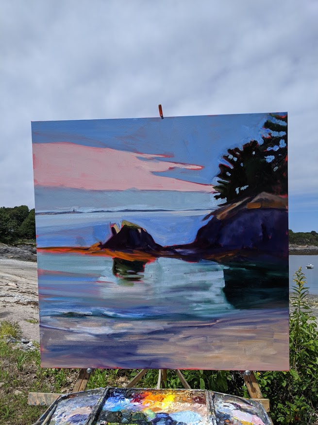
Electric Glide, by Carol L. Douglas. The length of reflections may vary, but they do need to be directly below what’s being reflected.

Artists often trip up where things have a general pattern but can’t be predicted precisely. We either ignore the pattern altogether or overstate it into rigid regularity. These stochastic processes are everywhere in nature, but most especially in the behavior of water.

Water can be utterly still, random and choppy, or it can create orderly patterns of ripples or waves. When it hits an obstacle like a ledge or the shore, its surface is distorted by what’s happening underneath. In a rainstorm, fresh water floats on the surface of salt water, adding another pattern.

Ripple pattern off the deck of American Eagle in Stonington Harbor, by Carol L. Douglas

With all that variety, there’s no one way to paint water. In my Age of Sailworkshops, we paint repeated quick studies of waves and light; none of them are ever the same.

Reflection involves two rays – an incoming (incident) ray and an outgoing (reflected) ray. Physics tells us that the angles are equal but on opposite sides of a tangent. This is immutable. It’s why reflections of a boat, lighthouse or tree must run down in a straight line to the viewer’s feet.

Parker Dinghy, by Carol L. Douglas. You can see into water when you’re looking straight down into it, or into the side of a wave.

The surface of water is not perfectly reflective, although it can come very close. Some rays of light are absorbed rather than bouncing back at us. This happens in both directions, so we can see some of the color (or objects) under the water.

Waiting to play, by Carol L. Douglas. The bands of orange are reflected light from underwater. Available from the artist.

Moreover, water is never absolutely flat. Even the slightest breeze distorts its surface. Although waves start out as regular oscillations, they are rapidly distorted by wind and current. Their surface can be rough and infinitely varied. Light rays are reflected at many different angles, radically disrupting the image. This can give the surface of the sea or its spray a solid or matte appearance.

Where we look directly into water, it’s the least reflective. That can either mean looking straight down or into the face of the wave (where it appears to be green). The tops of the waves reflect the sky, but the sky isn’t the same color in all directions. Other surfaces reflect what’s in the distance—moonlight, other boats, structures, trees.

Three Graces, by Carol L. Douglas. The closer the object, the longer its reflection.

While a reflection must be lined up horizontally with what’s being reflected, that doesn’t mean the reflection will be absolutely symmetrical if you turn the canvas on its side. Tall objects are (generally) taller, but the farther away they are, the shorter they appear in a reflection. So, a mountain may loom in the scene in front of you and be relatively shorter in the reflection.

In still water, ripples are generally elliptical, although they may join in long strings or twitch with the vibration of the breeze. As water becomes less still, it generally sorts itself into waves.

Breaking Storm, by Carol L. Douglas. Waves start as regular oscillations and are distorted by wind and current. Available through Folly Cove Fine Art, Rockport, Mass.

Most of us see waves when they’re approaching the shore. There their behavior changes radically. They tend to pile up as the water gets shallower, effectively growing taller and slowing down. As they break, all predictability ends. The spray from a breaking wave can and does go anywhere.

If you live where it’s still warm enough to paint outdoors, find a body of water near you, and draw or paint the reflections. My Zoom classes are going at this a little differently; we’re going to paint the reflections in a pie-plate of water or in a mirror. It’s not the setting that’s important; it’s the reflections that we must master.

New Zoom classes start December 7-8; current students have priority, but if you want to be added to the list, email me. And it’s that time of year when you can get Early Bird registration discounts for my workshops—for Age of Sail, Pecos, and Sea & Sky.

This weekend I got one of the best endorsements imaginable, from student Beth Carr. “I kept saying ‘in my retirement’ but one never knows. I figured I’d better not wait! Carol’s Zoom class is helping save this pandemic period from being a total bust. And I’m SO glad I came to Schoodic and met you all.”

Have yourself a very educational Christmas

Four options for advancing your skills in 2021.

Painting aboard schooner American Eagle.

A workshop or a class is a great gift for someone who’s working toward better painting skills. If you register for any of these workshops or classes prior to January 1, you’ll get an early-bird discount.

All my workshops and classes are strictly limited to 12 participants. Partners are welcome; these locations are fantastic destinations in their own right. And, of course, you can register after January 1, but it will cost you more.

I’m assuming that COVID will be just a bad memory by 2021, but if not, all workshops are refundable for COVID cancellations.

All supplies are included in the schooner workshops. Also a healthy dose of color theory.

PAINT ABOARD SCHOONER AMERICAN EAGLE—June and September

We’re offering Age of Sail aboard schooner American Eagle twice in 2021. It’s an all-inclusive (including materials) rollicking sail-and-paint class aboard the finest windjammer on the Maine coast.

The June sail coincides with the Gam, a rendezvous of all the boats in the Maine windjammer fleet. There’s live music and visiting between boats. The lobster fleet is hard at work, and we’ll see lupines in bloom as we poke around Penobscot’s quaint harbors.

On the other hand, September is a delightful time to sail on the Maine coast. The ocean is still warm, and the colors are spectacular.

All the information you need about both trips can be found here.

Painting at breathtaking Schoodic Point in Acadia National Park.

SPEND A WEEK AT INSPIRATIONAL SCHOODIC INSTITUTE IN ACADIA NATIONAL PARK—August

My Sea & Sky workshop is a perennial favorite and one of the high points of my year. We paint in the splendor of America’s first national park, but far from the madding crowds.

Schoodic Peninsula has dramatic rock formations, windblown pines, pounding surf and stunning mountain views that draw visitors from around the world. You might see dolphins, humpback whales or seals cavorting in the waves. Herring gulls visit while eiders and cormorants splash about.

A day trip to the harbor at Corea, ME is included. Far off the beaten path, Corea, ME is a village of small frame houses, fishing piers and lobster traps. Its working fleet bustles in and out of the harbor.

 Again, it’s designed to be all-inclusive so that you don’t have to stop and figure out meals or drive in from your hotel. (They’re in short supply in the high season here in Maine.)

Information about this trip can be found here.
 

Painting in an historic settlement near Pecos, NM.

VISIT THE PRISTINE WILDERNESS OF PECOS, NM—September

A fast-moving river, high mountain vistas, hoodoos, dry washes, tiny settlements and the colorful skies of New Mexico all beckon us to this very special place.

The village of Pecos, NM lies below the Santa Fe National Forest. Nearby, Pecos National Historical Park, Glorieta Pass, and Pecos Benedictine Monastery provide superb mountain views. Ranches and small adobe settlements dot the landscape. This is a landscape of pine wildernesses, horses, and pickup trucks. Yet it’s within commuting distance of Santa Fe, so accommodations, necessities and world-class galleries are just a short drive away.

Information about this workshop can be found here.

We have almost as much fun on Zoom as we do in real life, except nobody falls in the water.

Or PAINT FROM THE PRIVACY AND SAFETY OF YOUR HOME

Zoom classes are offered Monday nights and Tuesday mornings. They resume the second week of December. The six-week session stresses all the elements of painting we cover in workshops and plein air classes, but you can access them from anywhere in the world. Returning students have priority, so seats are limited. If you’re interested, contact me soon.

NEED MORE INFO?

First, read the links on my website. Registration is fast and easy and can be done by mail or phone. Of course you can always email me with specific questions. And happy holidays, my friend!

Books for the art lovers on your Christmas list

A student asked for book recommendations for Christmas. I’ve gone over my own bookshelves in my mind’s eye. If the binding is worn from overuse, or it’s a new acquisition I’m excited over, I’m recommending it.

I frequently recommend Art & Fear: Observations On the Perils (and Rewards) of Artmaking, by David Bayles and Ted Orland. It lays out the fundamental rule of artmaking: if you want to be an artist, you have to make art, lots of it, over and over again.

Drawing is a skill, not a talent. Not being able to do it holds you back as a painter. Sketching from Square One to Trafalgar Square, by Richard Scott, is a series of exercises that will take you from simple measurement to complex architecture.

Art of Sketching will help you expand your drawing to be more intuitive and spontaneous. The Practice and Science of Drawing is a classic Harold Speed text from Dover Art Instruction. It’s dated (especially in its opinions of ‘modern’ art) but contains much useful information on drawing technique.
If you’re looking for similar exercises in figure drawing, I recommend Drawing the Human Form, by William A. Berry. It’s based on anatomy, not style.

Every art studio should have one anatomy textbook. I love Atlas of Human Anatomy, by Frank H. Netter. Netter was both a doctor and an artist, and he did his own beautiful illustrations. There are other, art-targeted, anatomy books, but this provides all the information I need. Since you’re not practicing medicine, you can buy an outdated copy.

Landscape Painting Inside and Out, by Kevin Macpherson, is a clear, concise guide to getting paint from the tube to the canvas.

I have a shelf full of watercolor books, but my primary pigment reference is a website, Handprint, by Bruce MacEvoy. This has replaced the classic Blue and Yellow Don’t Make Green, by David Wilcox. There are many different ways to get watercolor on paper. If you want to buy only one book on the subject, try The Complete Watercolorist’s Essential Notebook, by Gordon MacKenzie.

There are two color books I love. The first is Josef Albers’ Interaction of Color, which is filled with exercises to understand how color works. It’s fifty years old. The writing is dense to our modern sensibilities, but stick with it.

Bright Earth: Art and the Invention of Color, by Philip Ball, is a brilliant, readable treatise on how chemistry and technology have combined to influence art. (It’s far better than Victoria Finlay’s Color, which is merely a travelogue.) When you’re done reading it, you should have a firm handle on the differences between earth, organic and twentieth-century pigments.

I have shelves full of catalogues raisonné, museum guides, and other illustrated histories of art, but following are a few of my favorites:

The Group of Seven and Tom Thomson, by David Silcox, deals with the painters who’ve most influenced me as a landscape painter. Growing up in the shadow of the Albright-Knox Art Gallery, I had no concept of twentieth-century realism, but there it was, being made right across border from me.

John Constable: The Making of a Master, by Mark Evans, illustrates a simple truth of landscape painting: it all starts outdoors. I also have Constable’s Skies by the same author. It’s a beautiful picture book.

America after the Fall: Painting in the 1930s, by Judith Barter, et al, is a catalog of Depression-era paintings by some of America’s most important painters. If you’re a fan of Regionalism, you’ll like it.

William Blake’s Watercolors to the Divine Comedy, 2000, by David Bindman is only available on the used-book market now, but it’s one of my favorite books. Of course, I’m energized by Blake and Dante; if you’re not, you won’t care.

I keep returning to Dover Publications’ Albrecht Dürer woodcut and engraving books. They should be subtitled, “so you think you can draw?”

F.C.B. Cadell by Alice Strang, is a book I refer to for composition inspiration. He’s my favorite of the Scottish Colourists.

Frederic Remington: The Color of Night, by Nancy Anderson, et al. One could argue that Remington invented the nocturne. Certainly, nobody did it better.

Vital Passage: The Newfoundland Epic of Rockwell Kent with a Catalogue Raisonne of Kent’s Newfoundland Works, by Jake Milgrem Wien, is a book I just purchased and love. My buddy Stephan Giannini tells me I should also read Kent’s own travel memoirs, which are extensive. I just haven’t gotten around to it yet.

N. C. Wyeth: New Perspectives by Jessica May, et al, is a catalog for a show originating at Portland Museum of Art and Brandywine Museum. Wyeth was, of course, much more than an illustrator.

(As ever, I am not getting a spiff for these recommendations. I used Amazon links for convenience, but by all means order these from your local bookseller instead.)

Monday Morning Art School: gifts at every price point

As ever, these are arm’s length recommendations; I don’t receive a spiff.

Mary Whitney with a Strada micro easel.

Easels: beginners often buy French easels, but please don’t do that. They’re heavy and tough to set up. Instead, choose a smaller, lighter, more efficient easel—the Mabef field painting easel M27. The pivot head makes it useful for both oils and watercolor. It comes with extension arms on which you can set a palette. I’ve had an earlier version of this for two decades. It’s my number one choice for watercolor, and I’m constantly loaning it to new painters.

More advanced painters would love a good pochade box. There are many fine ones on the market, including Open Box M, EASyL, and Strada. If your painter has a nice pochade box but complains about the weight of his kit, consider getting him a carbon-fiber tripod. They’ll need a pivot head and quick-release plate.

A Beauport easel can handle a big canvas. This is 40X40.

Occasionally, one needs a larger easel for the field. The Beauport is a variation of the traditional Gloucester easel. One of my tasks this morning will be to order a replacement, because I finally snapped mine in the wind at Cape Elizabeth this season. But don’t let that mislead you; it’s had decades of hard use. 

Stanrite #500 studio easel is the teaching easel I use in my studio. Aluminum is light, easy to move, and easy to stow. Want a larger version? Try its big brother, the Stanrite #700. These easels get daily use and never need maintenance.

Dorothy Shearn demonstrates the proper use of a sketchbook. The grapefruit tree was a completely gratuitious extra.

Brushes:

Alla prima oil painters use hog bristle brushes; indirect painters use softer brushes. Over the years, Princeton has provided great value for money. In watercolor, their Neptuneline remains my go-to demo brush, even though I have a lot of pricier brushes in my kit. They’ve rebranded their old-reliables as SNAP but the quality remains. Series 9700 is a natural bristle brush made for oil-painting. Series 9800 is a synthetic for oils. Series 9650 is made for watercolor and acrylic.

If you really want to surprise someone with your inside knowledge and impeccable taste, choose Rosemary & Co. brushes for watercolor or oil, or New York Central for oil painting brushes.

Nancy Holland and Gwen Mottice demonstrating proper kit for oil painters at Goodwood Plantation in Tallahassee.

Pigments and paints: QoR watercolor kit: QoR (allegedly pronounced “core”) is a product of Golden Artist Colors, so they’re high-quality paints. I use QoR myself, and for my workshops aboard schooner American Eagle. You can easily buy ready-made sets of 6-12 pigments from any large paint dealer online. For acrylics, I recommend a Golden starter set . For oils, buy Robert Gamblin, Gamblin 1980 (student grade), Winsor & Newton, or Winton (student grade).  It’s harder to make a one-size-fits-all recommendation for pastels, but anything sold by Dakota Art Pastels is a good product.

If your artist has all the paints he thinks he needs, why not surprise him with some gouache? Turner, M. GrahamWinsor & Newton and Holbeinare all good brands.

In every case, less is more. The artist typically needs no more than a dozen colors, and it’s better to get a better brand with fewer pigments than a large assortment of cheap paint.

Sketchbooks: I buy Strathmore 300 series Visual Journals and consume them like candy. They’re available for cheap at my local odd lots store, so don’t overpay at an office supply store. For fast outdoor sketching, I like the Strathmore 400 watercolor series. They’re so affordable, I have no worries about wasting paper.

Miscellany: A Quiller wheel is an indispensable tool for any beginner painter. It tells you where real-world pigments fall on the traditional color wheel. Every oil painter needs a stainless steel airtight brush washer. If your painter is interested in plein air, make sure it’s small and can hang. Brush soapis always useful.

The Aqua Toteis a collapsible water tank/brush holder for water media. Or surprise your painter with a Cotman Compact watercolor set; it can slide into a purse and travel anywhere. [AUTHOR’S NOTE: See Bruce McMillen’s comment, below; I agree with his comment about Cotman. What was I thinking?]

Reflecting on water

At 5 PM today I’ll be participating in an artist’s talk on A Reflection on Water for Maine Farmland Trust Gallery. (It’s online, so feel free to sign up and heckle).

Beaver Dam, by Carol L. Douglas. Available through Maine Farmland Trust Gallery.

People who don’t know me well are sometimes surprised to realize just how ‘green’ I am. I was raised along the Great Lakes in their worst years, when we couldn’t eat the fish or even swim in some places. I’m aware of just how much we humans are capable of fouling our own nests (or in the case of moving manufacturing offshore, fouling the nests of others). I’d prefer that we all consume less, and my family will tell you that I’m quite capable of hectoring on the subject.

I don’t paint didactically, however. I hope my work speaks to my awe at and respect for God’s Creation, but I’m not called to lecture with paint.

Fog Bank, by Carol L. Douglas. by Carol L. Douglas. Available through Maine Farmland Trust Gallery

Water is a loaded and contradictory image. It is both the wellspring of life and its destroyer. Without it, life as we know it can’t exist. Christians are baptized with it; Jesus walked on it and turned it into wine. But on the flip side, water has great destructive potential. I only need to walk down to the harbor to see the power of the North Atlantic against seemingly-immutable granite. When God wanted to destroy civilization, he did so with a flood.

Why is water painted so frequently? Obviously, it’s beautiful and difficult to render in all its complexity. But it’s also a powerful metaphor for life. We humans are fragile vessels navigating seas that are sometimes serene, often tempestuous. In the end, no matter how many people we surround ourselves with, we sail alone.

Home Farm, by Carol L. Douglas. Available through Maine Farmland Trust Gallery

Only one of the three paintings I have in this show is about the sea. In Fog Bank, water obscures our vision. That can be very dangerous here where the ocean and land intersect. In Home Farm, water has been tamed and collected for agricultural use by a prosperous farmer. In Beaver Dam, the watercourse has been altered not by man, but by wild beasts.

Last Saturday I potted around the Steinhatchee River in a pontoon boat with Natalia Andreevaand Mary O. Smith. It’s a short, pristine and very southern river. A large oak was down in the channel ahead of us; we were forced to backtrack and choose a different route. My hydrologist friend Ken Avery told me something interesting about these big snags in waterways: if someone doesn’t remove them, they will ultimately change the course of the river. That’s clear from looking at beaver dams, which are collections of fragile sticks that nonetheless alter streams forever.

Deadwood, 30X40, oil on canvas, by Carol L. Douglas. Available.

It’s also a great life lesson and what I was trying to say in my painting Deadwood (which is too big for this show). Remove the detritus from your life or it will change the course of your existence.

I’ve been working so hard that my house is filthy, so I’m going to take the day off and use water—in a bucket, with a little Murphy’s Oil Soap—to do some fall cleaning. But at 5 PM sharp, I’ll be participating in an artist’s talk on A Reflection on Water for Maine Farmland Trust Gallery. (It’s online, so feel free to sign up and heckle). See you then.

The meaning of (some) art

Still life occupies the lowest rung among genres, but it’s also invested with deep meaning—whether or not the artist intends it.

Roses dans un vase de verre, 1883, Édouard Manet, private collection

If archeologists are correct, the objects painted on walls in Egyptian tombs are grave goods meant to go with the deceased into the afterlife. Their meaning is clear. You take into the afterlife what you valued and needed in life.

Still-Life Found in the Tomb of Menna, c. 14thcentury BC, courtesy The Yorck Project 

In western art, there has always been a spoken or unspoken hierarchy of genres, with still life occupying the lowest niche. In Greco-Roman villas, ‘vulgar’ subjects like fruits and vegetables adorned walls and floors. By the Middle Ages, still life was beginning to appear as side notes in more serious paintings. The Northern Renaissance painters treated still life as its own form, with fantastical flower paintings. These pieces seem like overblown bouquets to us, but they in fact depicted flora from different countries at peak bloom. They reflected the dawning European interest in science.

Flowers in a Wooden Vessel, 1606-1607, Jan Brueghel the Elder, courtesy Kunsthistorisches Museum

The Dutch Golden Age painters did much to improve the reputation of still life painting. Still life’s job was to reinforce social values. Vanitas painting expounds the futility of worldly pleasures. There is much overlap in symbols with memento mori, which reminds the viewer of the inevitability of death.

Vanitas with a skull, c. 1671, Philippe de Champaigne, courtesy Musée de Tessé 

Common symbols included skulls, time pieces and flowers, as in Philippe de Champaigne’s stark Vanitas, above. Rotten fruit and insects meant decay. Musical instruments told us that life is ephemeral. Fruit, flowers and butterflies spoke to the same truth. My favorite symbol is the lemon, which, like life, is beautiful to look at but bitter to the taste. (Oddly, coffee—which was brought in large scale to Europe by the Dutch East India Company—played no part in still life iconography, despite its addictive qualities.)

Take Your Choice, 1885, John F. Peto, courtesy National Gallery of Art

Trompe-l’œil (‘deceive the eye’) has been with us as long as artists have painted, but a specific subset of it—objects on a wall or within a frame—were painted for narrative effect. Books, letters, guns, tools, dead game, playing cards and other art ‘tacked’ up on a wall were popular themes through the 19th century.

Les Anemones, c. 1900-1910 Odilon Redon, courtesy Minneapolis Institute of Art 

In the twentieth century, meaning took a radical turn. It stopped being about symbols and became about the artist’s own psyche. Odilon Redon, for example, wrote that he wanted to place “the logic of the visible at the service of the invisible.” Pablo Picasso famously said, “I paint objects as I think them, not as I see them.” Everything Picasso painted was autobiographical.

Still life, 1938, Lee Krasner, courtesy National Gallery of Australia

From there it was a short jump to the position of the later 20th century, when meaning was banished from art entirely. It became about form and color, rather than anything the artist wanted to say.

Despite this, the artist’s own viewpoint inevitably creeps in. Édouard Manet was unfortunately afflicted with syphilis, which was in his time incurable. In his mid-forties, he developed what he thought were circulatory problems, but which was really the locomotor ataxia of end-stage syphilis. Confined to his bed, he could only paint the smallest still lives, but these are exquisite. The one at the top of this page is believed to be his last painting. Nominally a simple vase of roses, it is redolent with the grief and questioning of the end of life.

Monday Morning Art School: know your trees

To paint trees, you need to understand them. That doesn’t mean you need to memorize species, but you do need to be able to spot the differences.

Palm, by Carol L. Douglas, available.


When I first posted this back in 2018, I wrote, “There is a major division in the forest world between conifers (the trees with needles) and broadleaf trees.” I should have added a third class of trees—the palms, since there are 2,600 known species, generally in the tropics and sub-tropics.

Palms are distinguished by their large, compound, evergreen leaves, called fronds, which are arranged at the top of an unbranched stem. Most (but not all) conifers are evergreens; the biggest exception being the larches, which turn a delicious yellow-gold in autumn. Broadleaf trees are always deciduous in the north, but not in the south. Every landscape has a combination of deciduous and conifer trees, but palms grow only in the tropics and subtropics and conifers dominate in the far north. Which are dominant in your landscape? In the Pine Tree State, the distribution of conifers to deciduous trees is about 50/50.

That matters even if the trees in your painting are not much more than silhouettes, because different types of trees have different shapes and traps (sky-holes).

Old Bones, by Carol L. Douglas, available.

For broadleaf trees, the most important distinguishing characteristic is the branching pattern, which defines the shape of its canopy. Silver maples are large trees with open, vase-like canopies. Oaks have large spreading crowns; beeches have similar crowns that appear to have melted. Most broadleaf trees branch alternately but maple, ash, dogwood and horse chestnut branch in opposite pairs. Here’s a tip: whatever pattern the twigs have, the major branches will also have.

Watercolor study of the branching pattern of a live oak, which can seem pretty inscrutable to a Northerner.

Pines have fewer branches than spruces or firs, and their branches grow in circular whorls on the trunk. As they age, they develop an open, jagged canopy. Spruce branches grow in an upturned direction; as youngsters, they look the most like ‘Christmas trees’. In their dotage, they turn a fine, weathered figure to the wind. Firs have wide lower branches and a downcast mien. Notably, their cones point upward.

The beginning artist usually errs in drawing trees in two dimensions, as if they only branched on two sides. In fact, there will be branches coming straight at you and straight away. Perspective is muddied by the diminishing size of branches as they arc toward you. The only solution is to draw carefuly and check angles.

Conifers are most easily identified by their needles. Pine needles grow in clusters of two, (red pines), three (yellow pines), or five (white pines), held onto the stem with a tiny papery wrapper. Spruce needles are short, stiff and grow individually from twigs. Fir needles are soft and flat. Cedars have flat, scale-like leaves and stringy bark. Junipers (including, confusingly, the Eastern Red Cedar) have berrylike, bluish cones on the tips of their shoots.

Many people can identify the common broadleaf trees by their leaves, and I’ve included a chart to help you. It’s more important to see and understand the differences in color. Silver maples have a lovely grey-silver color. Sycamores are garbed in military-fatigue green. Black spruces are dark while Eastern White Pines are fair and soft in their coloring. This is why I discourage my students from using tube greens and encourage them, instead, to mix a matrix of green colors.

The sycamore is a successful urban tree because it’s pollution-resistant. It has peeling, multicolored bark. Maples are grey and deeply grooved in maturity. Oak bark is dark. Cherry has a lovely red, shiny bark in its youth, but becomes furrowed and grey with age, like most of the rest of us. Only beeches maintain their smooth skin into great old age.

Spruces and pines on the Barnum Brook Trail, by Carol L. Douglas

Too often, we painters ignore young trees. Young trees often look radically different from their aged ancestors, but they have a beauty of their own.

To be a convincing painter, you don’t need to memorize tree species, but you do need to learn to distinguish between them. Any plausible landscape will contain a variety of them, with different bark, branch structures, and leaf colors.

Happy Friday the 13th!

We’re painting at Goodwood Plantation today. It has more than enough history, mystery and tragedy for any creepy holiday.

Goodwood Plantation, by Natalia Andreeva

In 1837, Hardy B. Croom, his wife, three children and maternal aunt perished on a steamship in a hurricane on the Outer Banks. Croom left no will; that created a legal mess that took twenty years to untangle. Croom’s business partner was his brother, Bryan Croom. Bryan assumed that, as the closest male heir to his brother, he automatically netted the spoils. 

His former sister-in-law, however, had left behind a mother and other relatives. Contrary to modern belief, 19th century women did have some property rights, at least in North Carolina, which the courts determined was the Hardy Croom family’s legal residence. At first, Mrs. Smith meekly asked Bryan Croom for some compensation. Croom refused. She went to court; twenty years later, she prevailed. Much of the estate reverted to her.

Awful wreck of the Steam Packet Home: on her passage from New York to Charleston, hand-colored lithograph, showing the wreck in October 1837 during the Racer’s hurricane. The entire Croom family perished.

The property was by then known as Goodwood Plantation. Hardy Croom had started a modest frame house on the site, but it was primarily a working cotton plantation. Bryan Croom had built a 10,000 square foot antebellum mansion. Mrs. Smith, having no interest in moving to the Florida panhandle, sold the whole kit-and-caboodle. It was purchased by a transplanted New Yorker, Arvah Hopkins. He and his wife paid an eye-watering $52,862 for the estate, 1576 acres of land and 41 slaves.

Hopkins had settled in Tallahassee as a young man. He must have done well at a young age, because he married the daughter of Florida’s last territorial governor and took his place among Tallahassee’s elite. The Hopkins family brought Goodwood to its peak as a slave-holding estate. Ultimately the Hopkins family farmed 8,000 acres of non-contiguous land on the backs of 200 slaves. Sadly, almost nothing of their history was recorded.

The Civil War changed the labels and little else. Former slaves were now known as tenant farmers or sharecroppers. Goodwood carried on.

Mrs. Tiers’ watertower and other outbuildings.

In 1885, the estate was sold to Fannie Tiers. Although she spent only a few months a year in the Deep South, Mrs. Tiers remodeled and renovated the house and outbuildings to her own New Jersey taste. It became less antebellum and more Mount Vernon. She added a water tower, an amusement hall, guest cottages, servant quarters, a heated swimming pool, tennis courts and a carriage house. All of these cluster around the elegant old main house like importunate chicks around a hen.

The plantation that once supported Goodwood is long-gone; it’s surrounded now by the very modern campus of Tallahassee Memorial Hospital. Still, it is elegant, quiet and graceful under its canopy of ancient live oaks.

I added the shack to give some structure to yesterday’s demo painting, but I suppose the long-lost sharecroppers’ cottages probably looked more or less like this.

We’re painting there today, in our last class of my Find Your Authentic Voice in Plein Air workshop. It’s Friday the 13th, which somehow seems fitting. Goodwood has more than enough history, mystery and tragedy for any creepy date.

Incidentally, the only other Friday the 13th in 2020 was in March. That was the start of our ill-fated trip to Argentina, which was, coincidentally, where I met Natalia Andreeva. It’s a good thing I’m not superstitious.

Natalia, by the way, has continued to make videos of our workshop. I’ve put the most recent above; the rest can be seen here.

In the deep south

You might wonder what a painter from Maine has to offer to students in the Florida panhandle, but the basic principles of painting are universal.

By Gwen Mottice

One of the best things about teaching workshops is getting to visit places I’ve never been before. Tallahassee is one of them. There’s a saying that Florida is not the South, I presume because of the number of northerners who have relocated there. However, that doesn’t seem to the case in Tallahassee. In its suburban parts it’s interchangeable with any other mid-sized city, but that’s true everywhere in the world. I’m staying in the historic district. There the South is still in flower, with distinctive architecture, live oaks, palms, and palmettos.

Plants are more adaptable than we give them credit for, because many species that thrive in the North are also in Southern gardens—azaleas, daisies, and liriope, to name just a few. That may not be our northern white pine, but surely it’s a first cousin. And that’s pickerel weed along the edge of Lake Hall.

By Nancy Holland

Yesterday we painted at Lake Jackson. It’s a shallow prairie lake with two drains in the form of sinkholes. Periodically, the plugs get knocked out and the lake completely drains. We might be entering one of those phases now, because a fisherman turned to us and asked, “What happened to all the water? I was here last month and it was full.”

By Debbie Foote

A young man, still wet behind the ears, pulled his bass boat out into the narrow channel and got stuck in the mud. Apparently, this is a common occurrence, because he had a special tool for it, a pole with a flat end. He pushed with it, occasionally gunning the engine, until he was loose. Then he cranked country music, turned up the gas, and with a rooster-tail of water behind him, sped out into the lake.

“I feel like I’ve just visited a foreign country,” I said in awe.

By Wendi Lam

The weather was unsettled and beautiful. It went from mist to sun and back again several times. The importance of a value sketch has never been more beautifully demonstrated, because the scene shifted and changed before our eyes.

Natalia Andreeva is the host of this workshop, and she’s making daily videos. I’ll be sharing them on social media, but here’s day one:

You might wonder what a painter from Maine has to offer to students in the Florida panhandle, but the basic principles of painting are universal. We started with basic process, and moved on to color theory. I have a five-day plan, and it’s exhaustive.

By Samantha East

My goal is to develop students who can complete a good painting in three hours. We’re already at the point where they can easily finish one in a day. These painters came well-prepared to start with, which is a credit to Natalia. I’m deconstructing and reconstructing their method, they’re keeping me hopping, and that’s keeping me happy.

As we were left Lake Jackson, it started to rain, great gouts of water that obscured our vision. Since they’ve been talking about a tropical storm this week, I asked Natalia, “Is this normal?”

By Dorothy Shearn

Apparently it was, because it cleared in a few minutes. Lacy gold-and-peach clouds hovered over a turquoise sky. What a place!

Monday Morning Art School: composing a good still life

It’s almost winter. Don’t despair. Still life is a great way to tell a story, especially the story of you.

Merry Christmas (blonde Santa doll), oil on canvasboard, Carol L. Douglas. I often paint small still life as warm ups for a day in the studio; all four illustrations in this post are from that exercise.

For many of us, it’s time to move into the studio for winter painting. For students, painting from life is always more instructive than painting from photos. The composition and spatial questions are largely answered for you when working from pictures, often not in a good way.

A still life is any collection of inanimate objects. Don’t limit yourself to flowers, fruit or glassware. I’ve painted toilet paper, Christmas ornaments, a tin-foil hat, money, empty beer bottles—in short, anything that struck my fancy at the time. Be playful, and don’t shy away from patterns; they can enliven and unify the most routine academic exercise.

New hard drive, oil on canvasboard, Carol L. Douglas. Reflection, transparency, composition; it’s deceptively simple, isn’t it?

Still life can be deceptively simple or highly complex, as it was in the hands of the great Dutch Golden Age Painters. There is no right number of items to put in a still life, nor must they add up to a primary number. But keep one eye on your level of experience and the amount of time you have for the project. A beginning painter would do well to keep it down to just a few objects. An experienced painter with lots of time can get as exuberant as he wants.

Side light is generally preferable to overhead light, and slight back-lighting gives delicious atmosphere. I strongly prefer natural daylight, but that isn’t always possible. If you must use artificial light, a spotlight isn’t the best thing; it makes harsh, unnatural shadows and narrows the visible color spectrum. Instead, a color-balanced bulb at least six feet away will give you more subtle light. Multiple light sources are fine, as long as they don’t completely cancel each other out. You don’t need intense light to paint; until the 19th century, painters worked beautifully in very dim illumination. As a general rule, it’s best to work on a painting in similar light to where it’s going to be viewed.

Mary’s prom shoes, oil on canvasboard, Carol L. Douglas. Still life is a great opportunity to practice leaving things out.

Your still life does not need to be at eye level; looking down into objects is an equally-natural viewpoint.

The arrangement of the objects is more important than the objects themselves. Your goal is a compelling composition. The same compositional elements that make a good painting make for a good still life:

  • Is there a pattern of shadow (lights and darks) unifying the objects?
  • Is there interesting rhythm, repetition and motion?
  • Is the composition pleasantly balanced?
  • Are there a variety of textures?
  • Is there spatial depth?
  • Are there unifying lines and interesting arcs? Look carefully at your diagonals and be sure that they carry you around the composition, not out of the frame.

I generally start with more stuff than I need, and winnow the selection down as I go. I often end up not including all the elements in my still life, because it’s an opportunity for inventive cropping and judicious editing. The background doesn’t need to be concealed behind a drape, unless you have one conveniently located; this is a chance to learn to leave things out.

Objects can be unified by their shadows, by the pattern of the object on which they’re placed, or by overlapping. Have you achieved that? If not, it’s time to tinker some more.

Toilet paper and hiking boots, oil on canvasboard, by Carol L. Douglas. My two preoccupations when working in the field.

In the modern era, meaning has taken a back seat to composition, but from the Middle Ages to the Renaissance, still life conveyed religious, moral and allegorical truths. Memento mori and vanitas painting dealt with the impermanence of life. The Dutch had their pronkstilleven, which were lush morality tales. None of that appeals to us today, but still life remains a great way to tell a story, especially the story of you.

I often refer to Frances Cadelland Édouard Manetas design mentors But painters should also look at 17thcentury Dutch and Flemish and Impressioniststill life for ideas on composition.