Wasting time was the best thing I did as a child

Halloween in my youth was mysterious and moody, dangerous and exciting. But adults can take the fun out of anything.

TĂȘte-Ă -tĂȘte, by Carol L. Douglas, 12X16, oil on Russian birch, sold.

I’m from Buffalo. It never gets bitterly cold or oppressively hot there; it just snows a lot. Buffalo-Niagara is a USDA Zone 6 region, more or less the same as the Mason-Dixon Line. It’s kept temperate by the Great Lakes. Today I live very close to the ocean in Maine. We have the same weather pattern—warm in autumn, cold in spring.

Growing up, we made our own Halloween costumes. Our repertory was extremely limited: we were tramps (sorry), ghosts, cowboys, Indians (sorry), or witches. This wasn’t by design but by necessity. Unless one of us had a daft and indulgent mother, we had to scrounge the makings from scraps and hand-me-downs.

The Last of Autumn, by Carol L. Douglas, oil on linen, 11X14.

We started thinking about this in mid-October, when the Northeast is wrapped in the balmy warmth of Indian Summer. “Season of mists and mellow fruitfulness, Close bosom-friend of the maturing sun,” John Keatscalled it, and nobody ever said it better. Sweater weather is idyllic and it seems like it will last forever.

That was dangerous for Halloween planning. We would get fanciful about what we could pull off. Our grandmother’s old nightgown, a dance leotard; any of them could be called into service. But diaphanous doesn’t work when the temperature drops. When Halloween night actually arrived, we would inevitably be bundled up in winter coats, shivering in a howling wind laden with sharp pellets of snow and dried leaves. With rare exceptions, November 1 is the death knell of warm weather in the Northeast.

Thicket, by Carol L. Douglas, oil on Russian birch, 10X10

This year, I’m not bothering to buy Halloween candy (although my friend Sue suggests stockpiling it ‘just in case’). Although Halloween is a huge deal in the United States, Trick-or-Treating is on its way out. It’s been replaced by Trunk-or-Treat, where kids go around a parking lot getting candy from nice safe adults. COVID-19 will be the nail in the coffin for the older tradition. But it doesn’t matter; adults had already ruined it when they started buying elaborate costumes for their kids. All the fun was in the imagination and the preparation, and now that’s lost.

My siblings and I knew everyone in our neighborhood, but Halloween was still mysterious and moody, dangerous and exciting. Our mischief ran as far as lobbing a roll of toilet paper over Aunt La’s house, only to see it get stuck in the branches in her front yard. We talked about soaping windows, but none of us ever did it.

Goat shed, by Carol L. Douglas, oil on linen, 9X12.

One of my best memories as a kid was building a fort with my friend Beth. We were quite young; we had nothing more than sticks, grass and moss. We were blissfully absorbed for days. No adult shagged us back out of the woods so they could watch us; no adult offered to help with power tools. Today both Beth and I are ‘makers’. I’m sure that being allowed to waste lots of time in unsupervised play contributed to that.

My friend Marjean recently sent me this story about a man who built a pirate’s cove in his backyard. Whoever it was for, it wasn’t for children—or for the likes of me. Where is the opportunity to imagine? It’s all laid out for the visitor, in much too great detail. Adults—with their overscheduling, planning, helping, and monitoring—can take all the fun out of anything.
What can you learn from a pumpkin?

The inner self emerges, despite our best efforts to keep it stuffed down.

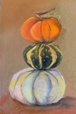
Pumpkins by Maggie Daigle.

If the weather holds today, I’ll be painting with my pal Ken DeWaard. We don’t worry about painting the same subject. He doesn’t want to paint like me, and—because he won’t let me copy off his paper—I don’t paint like him.

This week I assigned my Zoom classes to paint pumpkins. They’re in season, after all. After I’d had that brilliant idea, I had to figure out something interesting to say on the subject. That was harder, but I eventually managed to marry pumpkins to a Big Idea in Painting.

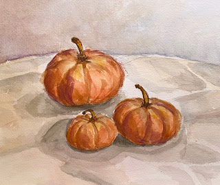
Pumpkins by Mary Silver.

Color temperature is especially complicated on an orange (or blue) object, because they’re at the outside edges of that useful artistic convention we call “warm and cool.” If you’re managing the color of light by simply modulating all your colors with the same tinted white pigment, it’s no great problem. But if, like the Impressionists, you’re dialing around the color wheel to control the color of light, you run into a problem. There’s simply nowhere warmer than orange or cooler than ultramarine blue. That gave me a subject to talk about regarding pumpkins.

My students then proceeded to paint. And that’s where the real learning started
 for me.

A leaning tower of pumpkins by Kathy Mannix (unfinished).

I wasn’t optimistic about the results. After all, how interesting could two dozen still-life paintings of pumpkins be? It’s not as if the gourds were out in the field waiting to be gathered up, on plants, buried in leaves, or stacked in innovative ways. Shorn of context, they would be plopped on tables from Maine to Texas. I expected to harvest a crop of very similar paintings.

Instead, there was as much variety as there would have been if I’d suggested self-portraits.

Pumpkins by Patricia Mabie.

Kathy Mannix stacked hers in a leaning tower. Samantha East added a large squash to break up the composition. Lorraine Nichols laid her gourds out on a textile printed with pumpkins; Maggie Daigle and Patricia Mabie played the stripes of their gourds against the stripes of textiles. Carrie O’Brien’s pumpkins were reflected in the bowl of a silver spoon. Somehow, each painting was reflective of each artist, “warts and all,” as Lori Galan joked about her own painting.

Pumpkins by Yvonne Bailey.

The arts are the voice of our inner self, but painting is uniquely self-expressive. It’s influenced fairly equally by both our conscious and subconscious minds. Contrary to what you might think, our subconscious expression gets stronger the more we gain technical skill. When our process runs quietly in the background, there’s space and time for our souls to start speaking.

For example, it’s impossible to mistake a Caravaggio for an Artemisia Gentileschi, even though both painted Biblical subjects, belong to the same general broad movement in art and underwent similar training. It’s not just the lighting or drafting that immediately tell us which is which, either. The very personality of their work is different.

One very warty pumpkin by Lori Capron Galan (unfinished).

There are many reasons for a teacher to avoid trying to create mini-me painters in the studio, but it’s a pointless exercise anyway. The inner self emerges despite our best efforts to keep it stuffed down.

I’m also reminded—again—that there’s little point in trying to predict the outcome of my ideas. Sometimes I’ll put something out that I think is dreck, and it catches the public imagination. Sometimes, I’ll labor long and hard on something I think is brilliant, but nobody else much cares. I’ve learned to just cast my bread upon the waters and let the results take care of themselves.

Monday Morning Art School: take a walk on the wild side

We’re products of our times, which are shifting rapidly. Why not cross the direct-indirect painting line and see if the other side speaks to you?

Bluebird and Cottonwoods, 1917, Charles E. Burchfield, is a direct water-media painting. Done with watercolor, gouache and graphite on joined paper mounted on board. Courtesy Burchfield-Penney Art Museum.

There is nothing inherently wrong with indirect painting; it’s how I initially learned. Indirect painting is useful in portraiture, still-life, or the big tableaux of Peter Paul Rubens. It’s less useful in plein air because it’s so slow. Moreover, the same dark shadows that are mesmerizing in Rembrandt’s self-portraits can be stultifying in landscape.

In every medium, the major division in technique is between direct and indirect painting, although that line is porous. Modern alla prima oil painters still lay out their paintings as a grisaille; we work thin in the underpainting, reserving thicker paint for the top layers. Except in plein air, few of us are fast enough to finish a painting entirely wet-on-wet. We sometimes glaze to correct color or deepen shadows. Conversely, masters of the Renaissance like Jan van Eyck  Rogier van der Weyden and Rembrandt used wet-on-wet passages in their paintings. Frans Hals worked almost entirely alla prima.

Study of clouds above a wide landscape, 1830, John Constable, is an example of a transparent watercolor. Courtesy Victoria and Albert Museum.

In direct painting, the artist attempts to hit the proper color (hue, saturation and value) on the first stroke. We sometimes call this alla prima or au premier coup. Regardless of the name, the goal is minimal modification and correction, leading to fresh, open brushwork. That’s true in oils, watercolor and acrylics.

Direct painting is largely the legacy of the 19th century, facilitated by a dizzying array of factors including paint tubes, railroads, modern chemistry, and the mindset of the Impressionists. Modern chemistry also brought us alkyd and acrylic paints. These are tailor-made for indirect painting, but the technique still sits on the sidelines. That’s largely because of our collective temperament.

Indirect painting is done with multiple thin layers of paint. Each subsequent layer is intended to modulate, rather than cover, what’s below. These layers usually dry between coats, but not always; you can achieve remarkable effects by painting into wet transparent passages with opaque paint. But in general, indirect oil painters start with a dark transparent layer, followed by a middle layer of opaque color. These are allowed to dry and the final modulation of color is done by glazing thin layers of color on top. At the very end, the artist will add highlights and opaque or semi-opaque scumbling in some passages. The contrast between opacity and transparency can be very beautiful.

Self portrait, 1659, Rembrandt, courtesy National Gallery of Art, is an example of indirect oil painting.

In watercolor, the order of operations is somewhat reversed: traditionally, watercolor starts with light glazes and then adds darks at the end. But watercolor need not be applied in a series of discreet glazes any more than oils must be.

Glazing, however, allows the artist to work thin, slowly, and thoughtfully. Indirect painting allows for meticulous detail that can never be achieved in direct painting.

Self-Portrait with Two Circles (detail), c.1665–1669, Rembrandt, courtesy Kenwood House. This shows the scumbling, impasto, and opaque painting that the best indirect painters used on their top layers.

A glaze is just a thin, transparent layer of paint. It gets thinned with medium (oil) in oil painting, with water in watercolors, and with a combination of water and medium in acrylics. It’s hardly worth taking a class to learn to do it, although I can certainly show you. Here are the general rules:

  1. The fat-over-lean rule is imperative in solid media. Scale up the amount of medium in each successive layer, and keep it as lean as you can;
  2. Glazing works best with transparent pigments;
  3. If you must glaze with white, use zinc white instead of titanium (and it’s the only application for zinc white in oil painting);
  4. Glazing over impasto gives you a very irregular finish. Unless that’s your goal, avoid it.

In good glazing, light is able to bounce back from whatever is below the surface—the substrate or opaque layer in oils and acrylics, or the paper in watercolor. That’s why opaque pigments—especially titanium white—don’t work well. What remains visible at the end is a combination of all the layers. The colors in all layers appear to mix, although they are, in fact, physically separate.

Stag at Sharkey’s, 1909, George Bellows, courtesy Cleveland Museum of Art, shows the immediacy and power of direct painting.

Mainstream oil painters have been painting directly for nearly 150 years. Mainstream watercolor painters, on the other hand, sometimes seem stuck in a sea of indirect glazes. We’re in a rapidly-shifting period in history. Why not experiment with the other side and see if it speaks to you?

Look in your own backyard

I don’t need to go anywhere to see the beauty of autumn. It’s right here.

Thicket, by Carol L. Douglas

Maine’s official state motto is Dirigo, which means, “I lead
 slowly.” Or, as our unofficial state motto reads, “35 mph was good enough for my grandfather, and it’s good enough for me.” Route 1, the state’s major north-south (or east-west, depending on how you look at it) road, is mostly a twisty two-lane highway. For the most part, you can’t pass. It’s pointless to try, because there’s another slowpoke a mile ahead. Except when you get to Portland, where 55 means 77. Sometimes I go there just to remember how to drive fast.

As a recovering New Yorker, I’ve learned to slow down. In the summer, there will be out-of-staters bearing down on my bumper, and a few local idiots as well. They are often boiling more merrily than a lobster boil, waiting impatiently for their chance to pass.

Autumn Farm, by Carol L. Douglas. Available through Maine Farmland Trust Gallery.

In the early stages of pandemic, my car went weeks without a fill-up, but recently I’ve been driving more—up to Schoodicto teach, and down to Portland for doctors’ visits. This week I painted with Plein Air Painters of Maineat a roadside rest stop in Newcastle. It’s about 45 minutes from my house. Alas, it was a misty, overcast day, and the marsh grasses’ color was muted. I painted a wild apple tree instead.

Engine lights came on as I headed home. I stopped and read the codes. There were twelve of them. My poor old Prius has 276,000 miles on it, and it’s getting fragile. No more long trips until I figure this out.

The Dugs, by Carol L. Douglas. Available.

We’re at a glorious moment in the seasonal pageant. The maples have stopped flaming red and yellow. Now the oaks are doing their star turn, arrayed in burnished gold. The other reticent tree that shines this time of year is the wild apple tree. They don’t have much color in their leaves, but they’re covered with bright red fruit. Johnny Appleseed may never have visited Maine, but his influence was certainly felt.

I usually don’t have red on my palette for landscape painting, since most reds in nature can be approximated with cadmium orange and quinacridone violet. However, there was a small ironwood tree in Wednesday’s painting. Its foliage was so intense that I couldn’t hit that note without a spot of naphthol red.

Annie Kirill doing a value study in plein air class at Thomaston. It’s been a spectacular year, weather-wise.


This week, my plein air class went to an unofficial pocket park in Thomaston. It’s not on any maps, but it’s behind the Maine State Prison Showroom It has a lovely view of the St. George River, but you would never know about it if you didn’t have inside information.

The gold of the oaks is gorgeous, but it’s the last player on the autumn stage. In a few weeks, empty branches will be rattling in a fierce November wind, and these beautiful days will be a memory.

Autumn is my favorite time of year, but I never seem to get much painting done. I’m committing myself to being out there on every good day from now until the snow flies, capturing the last glimmers of summer beauty before it goes. And not wasting my time driving, either, but setting up in my own backyard.

A side note: with all the conversation about COVID, we forget the very real threat of Lyme Disease. This morning my husband found a tick embedded in his leg. Even after the first frost, they’re still hanging around. Have a care.

Things I didn’t know, or can’t figure out

Some days I feel like the Oldest Living Member of this club; other days, I’m shocked at the things I don’t know.

Home Farm, by Carol L. Douglas, is available through the Maine Farmland Trust Gallery.

There’s a rule for mixing acrylics and oils:  you can go over acrylic with oils, but you can’t go over oils with acrylics.

Acrylic paints and gesso have been available since the 1950s. In art-conservation terms, that’s no time at all. However, thousands of oil paintings have been done over acrylic gesso and imprimatura. Since these bottom layers are separate, future conservators will be able to peel off the acrylic and reline the paintings.

Fog Bank, by Carol L. Douglas, is available through the Maine Farmland Trust Gallery.

I’m more dubious about underpainting in acrylics and doing the top layers in oils. I used to see this in the last millennium but then it fell out of style. I was shocked to see a student doing it this summer. I think it’s bad practice on two counts:

  1. Good painting technique is intended to last for centuries. We don’t really know how those two paint systems will interact over the long haul.
  2. There’s no reason for it. Proper alla prima technique will give you good, clean, immediate color using conventional oil paints for all the layers.

But that’s based on my gut, not on science. If anyone has a scientifically-based opinion, I’d love to hear it.

Beaver Dam, by Carol L. Douglas, is available through the Maine Farmland Trust Gallery.

Most of us paint on acrylic-primed canvas these days, but Centurion(and others) make excellent oil-primed canvases and boards. These must be toned with oils because of that no-acrylic-over-oil rule. This year, a student at my Schoodic workshop primed her boards with Gamblinnaphthol red. Luckily, she also brought other boards, because the oil-primed ones never dried in time. This week, she showed me that they were still tacky.

It wasn’t the weather; Maine has been in a drought all summer. And her paint application looked fine to me. An internet search gave me no clues. Readers, if you have any ideas, please share them.

Over the summer, two students pointed out that they can’t buy Prussian Blue in acrylics; it’s only available as a hue. I contacted Golden Paints. Their expert told me, “Prussian Blue pigment is highly alkali-sensitive. Waterborne acrylics are alkaline by nature. So, this pigment is not stable in waterborne acrylic binders. This is why we make a Prussian Blue Hue in our acrylic lines. The same is true of Cobalt Violet.” Since I eschew hues, I now recommend phthalo blue instead. I’ve been painting for longer than Golden has existed, and I never noticed that.

On Monday, I challenged readers to a water-media exercise over the next 45 days. One of my oil-painting students asked me for recommendations for gouache. I use Turnergouaches, but never thought about why, since it’s not my primary medium. I texted a few painter friends for recommendations. Among their suggestions were M. Graham, Winsor & Newton and Holbein, but nobody was passionate about it. If you are, I’d love to hear from you.

Sea Fog, by Carol L. Douglas, is available through Folly Cove Fine Art.

Meanwhile, I suggested a limited palette of colors and hog-bristle brushes. The beauty of gouache is that you can use it on almost any substrate. I just paint in my sketchbook.

Speaking of that challenge, several people asked where they should post their resulting paintings, so I created a group on Facebook. This is an open group and you don’t need to be my FB friend to join. I invite you to post your paintings and comment. We all learn from each other.

Jennifer Johnson (who started this) told my Tuesday Zoom class that she had been doing these exercises over the weekend. “I’m already seeing a difference,” she said. Her brushwork is freer, and she feels more confident about her colors. I knew it would make a difference!

I have one more workshop left this season: Find Your Authentic Voice in Plein Air in Tallahassee, Florida, November 9-13. There are enough students to go, but there are still openings, so I’d be excited if you signed up.

From there on in, it’s all Zoom, Zoom, Zoom until the snow stops flying. My Tuesday morning class is sold out; there are still openings for Monday night Zoom classes.

Monday Morning Art School: working in triplicate

A 45-day challenge to make you a better painter.

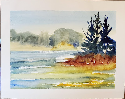
A quick watercolor sketch by me. You become a better painter through
 consistent everyday practice, not in great fits of genius.

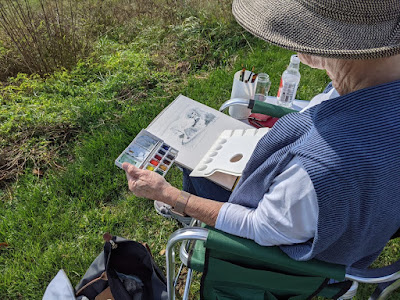
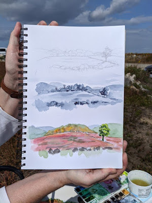
My workshop monitor, Jennifer Johnson, has spent several winters in Australia. There she bought watercolor paper in an A4 size, which is long and narrow. She’s been bringing it to class. One day she decided to do all three phases as thumbnails on the same page. I immediately saw the value in her idea. I’ve been introducing it to my watercolor students at workshops and classes.My students follow a strict protocol. It starts with a pencil sketch. Oil painters then move that to their canvases as a grisaille; watercolor painters have an intermediate step of a greyscale (monochrome) painting. This helps them make stronger compositions, and allows them to experiment early in the process, when bad choices are easy to reverse.

Jennifer’s field notebook that started this all.

One of these is Becky Bense, who’s a crackerjack watercolorist. She’s also a friend, so we made a pact at the end of my annual Sea & Sky workshop. We will each do thirty of these three-part compositions over the next 45 days. It wasn’t 30-in-30 because Becky’s more realistic than me. That’s a good thing, because my surgery last week has set me back rather sharply. I’m going to be lucky to finish the thirty by Thanksgiving.

I frequently recommend the book, Art & Fear: Observations On the Perils (and Rewards) of Artmaking, by David Bayles and Ted Orland. Their takeaway message is that art gets made through consistent everyday practice, not in great fits of genius. Do a little every day, and you’ll get better and better. As a teacher, I see tortoises and hares among my students. The ones who succeed are the persistent ones. Even if you only draw for five minutes a day, you’re advancing your skills.

An example by me. Note that I’m testing the colors on the margins before I lay them down. And I also knocked the garlic bowl over before the last step. Don’t do that.

Less-experienced painters tend to perseverate, “licking the paint,” as my pal Poppy Balser calls it. That’s because they think their errors can somehow be undone at last minute. They bury their own beautiful brushwork in these last-minute corrections. Working fast, with no great investment in time, prevents that.

Facing a blank slate every day can be daunting. Why not dial it back a little by experimenting with this process? So, without consulting Becky, I’m inviting you to join us. Oil painters can play this game too: all they need is an inexpensive gouache kit. Everything else works the same as for watercolor.

You will grasp the process by looking at the pictures, but I’ll spell it out: do a sketch at the top, a greyscale in the middle, and a small, color painting at the bottom. Ignore the idea of cropping; these are by definition thumbnail sketches. Don’t belabor any of it; half an hour is a good amount of time to do the whole thing.

Sadly, we can’t buy watercolor paper in A4 in the US (at least not easily). You can either buy 12X16 sheets and cut them in half, or buy 9X12. Either is close enough.

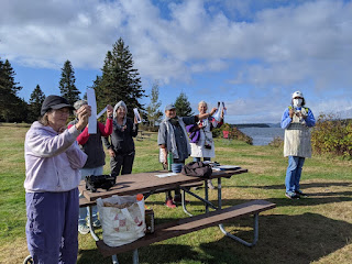
It’s all about value. Here are some of my students looking at value at Sea & Sky earlier this month.

From beginning to end, you’ll be concentrating on value. The sketch is simple, just a drawing with a #2 pencil, but it still should be a value sketch, not just a line drawing. For the monochrome (greyscale) middle picture, mix two complements. I suggest burnt sienna and ultramarine, but you can experiment. Your goal with the final, color, painting is to lay down the paints as immediately, and freshly, as you can. That means hitting the values right on the first try. To do that, mix and check them against your greyscale painting.

I have one more workshop left this season: Find Your Authentic Voice in Plein Air in Tallahassee, Florida, November 9-13. There are enough students to go, but there are still openings, so I’d be excited if you signed up.

From there on in, it’s all Zoom, Zoom, Zoom until the snow stops flying. My Tuesday morning class is sold out; there are still openings for Monday night Zoom classes.

Be merciful to yourself

We are civilized people when we govern our bodies with our minds and emotions. Still, there are times when the body is not to be ignored.

Skelly in costume, by Carol L. Douglas. If you have to hang out in medical offices, you might as well bring a sketchbook.

I had a two-part surgical procedure on Tuesday and Wednesday. I imagined I was being clever by writing Wednesday’s post on Tuesday evening and slipping it into the media stream very early Wednesday morning. I thought I could get through the procedure without casual observers noticing I wasn’t all there.

I’ve lost count of how many times I’ve had surgery. It holds no terrors for me. But there’s a part of the process I always seem to forget. That’s the mental low that follows the physical assault on the body.

Let’s just call this Self-Portrait, naked.

I’d scheduled myself to teach on Thursday. Nobody had told me I shouldn’t work. I understood I was in trouble when I sketched a barn for a student. I couldn’t measure; the part of my brain that does that kind of reasoning was still checked out. I realized with a jolt that I probably shouldn’t have been driving, either, although I was following my release instructions to the letter.

One of my students, Mary Whitney, is a retired army nurse. “General anesthesia doesn’t leave your body for 24 hours,” she told me. “Be merciful to yourself.”

The ability to keep pushing through is important to me. I work hard and I’m generally chipper. The problem with this approach is that I tend to ignore signs of trouble. They were here even before this surgery. This has been an unusual year, and I’ve responded by working harder than ever. My house—usually neat—is a cluttered mess, as is my studio. The patio furniture is still outdoors, and the firewood hasn’t been brought up yet. There are weeks of invoices waiting to be dealt with on the dining room table.

If I knew more, I could tell if Skelly was male or female from its pelvis.

After Thursday’s class, I rumbled to a complete stop. This morning I awoke at 5 AM in a panic. In that twilight between sleep and wakefulness, I was reviewing my list of undone tasks. An unpaid bill I’d promised to take care of yesterday. Supply lists for students for a class starting Monday. A refund. All, perhaps, trivial to an observer, but not to me.

For the first time in a long time, I wish I’d cut myself some slack.

When I had my first cancer in 2000, I went into a severe depression. Most of it was simple physical exhaustion. We joke about ‘taking a nap’ during surgery, but it’s terribly stressful to the body, as are all serious medical procedures.

I know enough to know these are called metacarpals. And that’s about all.

We are civilized people when we govern our bodies with our minds and emotions. If you scoff at that, just imagine what life would be like if we all indulged in urine sauvageor le pipi rustique. Still, there are times when the body is not to be ignored. I try to not be too hard on myself when I fall into a post-treatment slough of despond. It’s natural.

That doesn’t mean I like it. But it can’t be fought off. Mary’s advice was very wise, and I’m taking it, belatedly—I will be merciful to myself.

Cheap paint is a false economy

Don’t skimp on paint quality, or you’ll defeat yourself from the outset.

Ogunquit, by Carol L. Douglas. If the pigment isn’t in the paint to start with, you can’t magically enhance it. 

When I send supply lists, I suggest brands. These are Golden for acrylics, QoR for watercolor, and RGH or Gamblin for oils. In pastels, there is too much variation in hardness for a blanket recommendation, but I like Unison myself. Of course, nobody’s paying me for these endorsements; they’re just my preferences.

That doesn’t mean these are the only good art supplies out there. They have a combination of pigment load and handling characteristics that I like. There are many excellent makers of paint out there. They come in a variety of price points, but price is not the sole indicator of quality.

Late October, Beauchamp Point, by Carol L. Douglas

There are an equal number of horrible paints on the market. You might think you’ve saved a few bucks, but they’re an expensive mistake, one that will cost you time in learning. Don’t skimp on paint quality, or you’ll defeat yourself from the outset. Instead, cut down on the number of colors you buy.

All paints (and pastels) consist of pigment and a binder. There are differences in the quality of binders, in the amount of pigment the manufacturer uses, and how the pigments are stabilized. There may be filler added, or drying agents.

Most major paint brands in the US subscribe to voluntary associations of quality control. (RGH is an exception; that’s too bad, because their paint is excellent.) The most well-known is Colour Index International (CII), a database dating back to 1925. It contains over 27,000 individual products sold under 13,000 different product names. This standard classification system gives you the facts about the pigments in your tube.

Autumn Farm, by Carol L. Douglas

Just as Benjamin Moore uses names like Yukon Sky to peddle grey paint, art paints are often marketed with evocative names. These names appeal to our sense of tradition, even when the old paint has no relationship to its namesake. If you buy Naples Yellow thinking you’re buying an historic pigment, think again: the modern paint is a convenience mix replacing the historic (and toxic) lead antimonate.

Expect to find, at minimum, the following information on the label of your paint tube:

  • Manufacturer’s name or common name for the color.
  • The CII number and, sometimes, the name of the pigment(s).
  • The manufacturer’s lightfastness or permanence rating.

The CII code consists of two letters and some numbers. Most paints start with a “P” which means it’s a pigment, not a dye. The next letter is the color family:  PR is red, PY is yellow, etc. The number is the specific pigment included in the tube.

Save this link somewhere accessible from your phone: https://www.handprint.com/HP/WCL/waterfs.html

You’ll need it when you shop. This pigment guide was built for watercolors but is generally true across all media. (Watercolor is the canary in the coalmine of pigments). All painters should understand lightfastness, transparency, and color shift. Granulation, bloom and diffusion, however, are watercolor-specific issues. 

Winch, by Carol L. Douglas

When you compare paints with the same names, check their CIIs. Are they the same or different pigments? A “hue,” is made of a blend of less-expensive pigments. There is nothing inherently wrong with hues, but they don’t behave the same as the pigments they’re named after. For example, “cadmium yellow hue” may look like cadmium yellow coming out of the tube, but it makes insipid greens.

There’s little to be gained by buying a hue mimicking a more expensive pigment. If you are comfortable painting with a hue, then learn what’s in it and mix it yourself. You always have the greatest flexibility by working with pure pigments (rather than mixes) out of the tube.

Most manufacturers include their own lightfastness ratings on the tube. This is a measure of how quickly the color fades. If it’s not listed, look it up.

The series number tells you the price. Are pricier pigments better? Not by a long shot. Twentieth-century manufacturing gave us a new world of inexpensive pigments, which tend to be less toxic, higher in chroma and lightfast.

I’m thinking about supply lists because it’s time to send them out for Find Your Authentic Voice in Plein Air in Tallahassee, Florida, in early November. There are enough students to go, but there are still openings, so I’d be excited if you signed up. s

From there on in, it’s all Zoom, Zoom, Zoom until the snow stops flying. The Tuesday morning class is sold out; there are still openings for Monday night Zoom classes.

Monday Morning Art School: when you lose your drawing

You do a lovely underpainting and you lose it in the top layers. Why does that happen?

Fog Bank, by Carol L. Douglas. This will be on display at Maine Farmland Trust Gallery later this month.

The human mind loves complex, irrational space divisions. The same mind perversely regularizes what it paints and draws. A split-rail fence, where the gaps between posts diminish haphazardly into infinity, attracts us when we see it. However, unless we’re mindful, when we paint it, we regularize the spacing. The same thing happens with trees, flowers and clouds. In nature, they’re artfully erratic. We too often space them in neat lines. Bobbi Heath calls this anti-entropy. It’s a good description of the brain’s powerful impulse to push ideas, images and tones into patterns.

We’re best at drawing when we’re fresh. The challenge is to keep that freshness throughout the finished layers of a painting.

Visan Vineyard underpainting, by Bobbi Heath.

Bobbi graciously allowed me to share an example for this post. She painted the underpainting above last year in France and finished the work this month in her own studio. That in itself is a challenge. No matter how good your visual memory is, it diminishes over time. You’ll always be most accurate if you finish work quickly.

Bobbi made significant changes between the drawing and the final work. The far hill doesn’t rear up as energetically. The ends of the rows are lower on the canvas, and thus less important. More critically, she reduced the contrast, softened the perspective lines, and the ends are less incisive. She also changed the value of the midfield. In my opinion, the painting was weakened by these changes (although it’s still beautiful).

Visan Vineyard, by Bobbi Heath.

I stress drawing on paper before painting, instead of going straight to the canvas. It’s important to work out the compositional questions before you pick up a brush. It’s just as important to have reference to consult when the light changes or your painting gets distorted. A photo on your phone will just tell you what was there, not how you drew it.

Avoid too much solvent in the bottom layers. In alla prima painting, the bottom layer should have enough OMS in it to move fluidly, but not enough to run. You cannot keep a tight drawing if you’re painting over mush, nor can you keep the colors separated and bright. If you have laid down too much pigment (and it should be thin) lighten it up with a rag, not an OMS-soaked brush. If you can see reflections in your underpainting, it’s too goopy for clean alla prima painting.

It’s a fallacy to think that you draw first and paint second. Painting is continuous drawing, and the initial drawing must be restated constantly. I leave important lines showing until I’m certain I have finished the passage, and sometimes I don’t obliterate them at all. You can’t cover up your drawing and expect to reiterate the freshness of the original line. That early drawing will always be your most delightful.

Home Farm, by Carol L. Douglas. This will be on display at Maine Farmland Trust Gallery later this month.

I prefer to work large in general. It’s easier to be accurate and poetic with a large sweeping line. The smaller the canvas, the more jarring small errors of measurement become. For most brushwork, I recommend holding the brush at a point more than halfway back from the ferrule. That gives your brushwork bounce and grace. But for accurate fine drawing, hold it like a pencil.

Kudos to Bobbi for offering to let me critique her painting publicly. “I wish I’d showed it to you earlier so you could have told me to restate the drawing,” she said. That’s a pal.

A version of this post first appeared in October, 2019.

Speed and confidence

They’re a feedback loop—speed creates confidence, and confidence in turn generates speed. Once you enter that loop, your painting will change very fast.

From behind Rockefellar Hall, by student Carrie O’Brien (all photos courtesy of Jennifer Johnson, and I apologize for the color; they were taken indoors).

The ferocious winds yesterday kicked the surf up and blew the last remaining clouds out to sea. Unfortunately, it also blew the last warmth away. It’s a chilly 42° out there this morning. However, the beauty of autumn is cold nights and warm days, and it will be sweater weather by the time we lift our brushes.

From Frazer Point, by student Rebecca Bense.

I have a location in mind for each day’s lesson; yesterday’s was to be the Mark Island overlook. This gives us a beautiful view of the Winter Harbor Lighthouse and the islands of Mount Desert Narrows. Unfortunately, it’s on the west side of the peninsula, backed by a mountain. The winds were roaring in from the northwest. Becky and Jean, who got there first, told us it was an untenable situation; something or someone was bound to be blown down the rocks.

From Blueberry Hill, by student Ann Clowe.

Instead, we sheltered in the leeward side of Rockefeller Hall, which is a massive faux-Tudor pile that houses Schoodic Institute’s offices. That gave us a shimmer of water through a screen of trees—a classic Canadian Group of Seven subject, and one that is ripe for personal interpretation. Lesser artists might look at that deceptively-simple screen of trees and lawn and decide there was nothing there. My students embraced the idea that they were certain timeless forms waiting to be rearranged in any order they chose.

Surf by student Linda DeLorey.

The greatest impediment to good, clean painting is flailing around—not having a well-thought-out plan, or not sticking to it. A consistent painting process not only gives you a bright, clean result, it also allows you to paint a good field sketch in three hours. That’s not important because you can churn out more paintings, but because the freshness of alla primapainting lies in its immediacy. I have several students in this class who are at that point already, and the rest are getting close.

From Frazer Point, by student Beth Carr.

Speed and confidence are a feedback loop—speed creates confidence, and confidence in turn generates speed. Once a student enters that feedback loop, his painting will change very fast. It is more important to concentrate on painting a lot than on painting perfectly, a point drilled home by David Bayles and Ted Orland in their classic Art & Fear: Observations On the Perils (and Rewards) of Artmaking.

From Blueberry Hill, by student Jean Cole.

Because these students have embraced process so avidly, we’ve been able to move beyond questions of paint application to more advanced issues like pictorial distance and the lost-and-found line. We’ve spent a lot of time working on clean traps and edges and avoiding mush. Today, we’ll be painting boats, which are the maritime equivalent of architecture.

And like that—boom!—another week at Schoodic is done. Dang.

Jack pines by student Jennifer Johnson.

After this, there’s Find Your Authentic Voice in Plein Air in Tallahassee, Florida, in early November. Today’s the deadline to register, but Natalia Andreevais painting in Apalachicola and has no signal, so you’ve got the weekend. After that, I have a few more plein air classes in Rockport, ME. From there on in, it’s all Zoom, Zoom, Zoom until the snow stops flying. For a year when nothing was happening, time has sure flown by.