Monday Morning Art School: know what you’re doing

If you don’t have technique, nobody’s going to notice your emotional content.

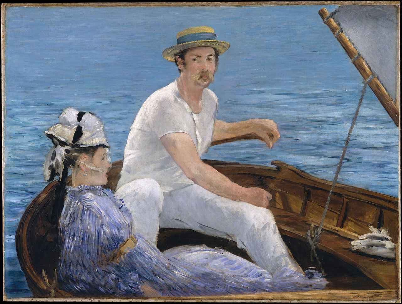
Boating, 1874, by Édouard Manet, courtesy Metropolitan Museum of Art. It’s beautifully composed, serene and yet energetic.

In one of my classes, an advanced student (who has probably won more awards than me) asked why I focus on systematic painting. “What about emotion and feeling?” she asked.

Oddly enough, for all that we’re social beings, our souls are insulated. We are born alone, and we die alone. At times in between, the lucky among us carry on conversations with each other or with God. But our emotional intelligence is very personal and private. We can share it if we choose to, but I doubt others can influence it. The best we can do is encourage others to be moral and empathetic.

Self Portrait at 28, 1500, by Albrecht DĂŒrer, courtesy the Alte Pinakothek. Is it possible to have a crush on a man who’s been dead for 500 years?

That doesn’t mean I can’t teach students to see and recognize beauty. This is why I often have my students look at and learn to analyze great paintings. I’m a firm believer in the non-linear, associative, synthetic mind, and our sympathetic intelligence. “Think with your gut” is not just an expression. If you’ve ever been truly terrified, you know that only a small part of you is controlled by your rational mind. Beneath that, we run on very primitive lines. The interchange between that and our rational minds is what drives creative expression.

The Census at Bethlehem, 1566, by Pieter Bruegel the Elder, courtesy Royal Museums of Fine Arts of Belgium. I love how Brueghel always pushes the main action into a corner. Just like life.

But art—no less so than mathematics—is an intellectual discipline. Most great painters approach the problem in the same way: they make design decisions, color decisions, and lay their paint down in the prescribed manner handed down to us over centuries.

Why do they do that? Because it works.

Late Afternoon, Monhegan Island, by Rockwell Kent, courtesy Jamie and Phyllis Wyeth Collection. It’s always a toss-up between Lawren Harris and Kent. The light is spectacular, the colors are the essence of sunset.

System is liberating. If you doubt that, consider the last time you flailed around trying to make a picture and ended up with mush. It happened because you either forgot what you were doing or changed your mind in mid-painting.

I used to write music. It sometimes shocks me to sit down at the piano and realize I no longer can run through chord progressions automatically. How did I ever learn that? By learning lots of music by rote. I read it, I regurgitated it, and occasionally, I managed to be lyrical with it. Now that I’ve forgotten it all, I can’t express any emotion through the keyboard.

Moonrise, 1894, by David Davies, courtesy National Gallery of Victoria. It’s simple, austere and powerful.

On the other hand, I’ve painted more than a thousand paintings. Occasionally I surprise myself by being brutally honest, as I was with The Dooryard, painted last week. Its emotional kick wasn’t conscious but it comes from a deep and real place: that’s my darkened bedroom window.

I don’t have to ask myself, “can I do this?” I know the process and I approach a painting the same way every time. Knowing the limits means I know where I can push. I can rise above the technical issues to occasional lyricism.

Haymaking (Les Foins), 1877, Jules Bastien-LePage, courtesy MusĂ©e d’Orsay. Exhaustion is something I understand intimately, and he has expressed it so poignantly.

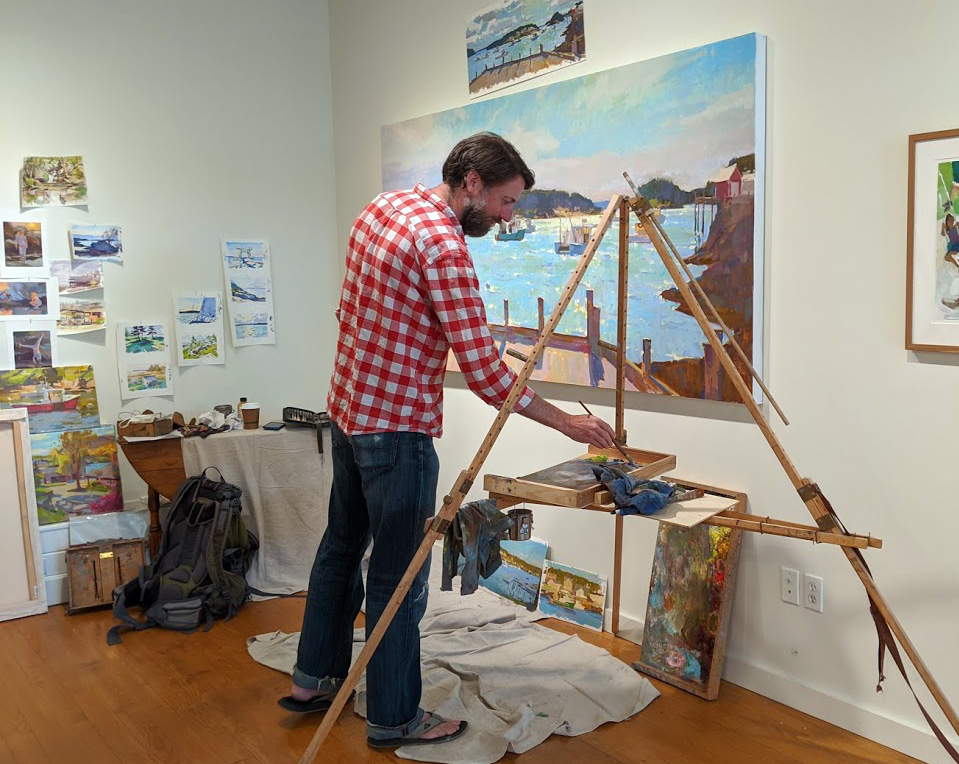
Does that get stale? Of course not. There is enough mystery in painting to keep me working until I die. Recently, Colin Page told me he was studying John Singer Sargent boat watercolors. Colin certainly knows how to paint, and he has a process that works. But that doesn’t mean he’s stopped searching.

Your assignment is to identify your current five favorite paintings and tell me why you love them. Since I’ve demanded that of you, I gave you mine as illustrations for this post. Don’t get too excited. The list might change tomorrow.

How much is that painting worth?

For some artists, the hardest thing in painting isn’t drawing or color-mixing but how to price their work.

The Dooryard, 11×14, oil on birch panel, is available through Parrsboro Creative’s PIPAF in Isolation, here. Don’t panic; the prices are in Canadian dollars.

A student has someone interested in one of his paintings. “How do I know how much to charge?” he asked. That’s a difficult question in normal times and an impossible one right now.

A British study says that the arts are being hit twice as hard as the overall economy. Meanwhile, other sectors of the economy are booming. The stock market rebounded quickly. Housing remains a seller’s market, with demand outstripping supply.

Nobody knows how this will affect painting sales, least of all me.

A proper price is the meeting point between how much you can produce of the product and how much demand there is for it. If you can’t keep your paintings stocked, you’re charging too little. If your studio is full of unsold work, you’re either charging too much or not putting enough effort into marketing.

Summer Home, 11×14, oil on birch panel, is available through Parrsboro Creative’s PIPAF in Isolation, here

Art sales are regional. If you live in a community with an aging population and a prestigious art school, you’re going to have low demand and high supply. If you live in a booming new city, you will have more demand and prices will be higher.

A painting’s value depends on the artist’s prominence. Most artists are terrible judges of their own work, seesawing between believing they’re geniuses and thinking they’re hopeless. Such subjective judgments hinder their ability to price their work.

You can simplify the problem by setting aside your emotions and basing your selling price on your selling history. How do you do that if you’ve never sold anything before? Survey other artists with the same level of experience and set your first prices in line with theirs. Visit galleries, plein air events and art fairs. If you see a person whose work seems similar to yours, find his resume online and check his experience. Know enough to be able to rank events. Painting in Plein Air Easton is not the same as painting your local Paint the Town.

Charitable auctions are a good way to leverage your talent to help others. They provide a sales history to new artists. (But they aren’t tax deductible contributions.)

Six Bucks a Pound, 12×16, oil on panel, is available through Parrsboro Creative’s PIPAF in Isolation, here

Let’s say you gave an 8×10 watercolor to your local historical society, which turned around and sold it for $100. Great! You have a sales history (albeit a limited and imperfect one) from which to calculate prices. Just figure out the value per square inch and calculate from there.

Square inch is the height times the width. That means your 8×10 painting is 80 square inches. Dividing the $100 selling price by 80 gives you a value of $1.25/square inch.

To use this to calculate other sizes, you would end up with:

6×8 is 48 square inches. 48 x $1.25 = $60
9×12: $135
11×14: $240
12×16: $315

In practice, my price/sq. inch gets lower the larger I go. This reflects my working and marketing costs, some of which are fixed. If you started with my example, above, a 3×4” painting would more reasonably sell for $3 a square inch or $36, and a 48×48” painting for $.75 a square inch, or $1700.

Fogged in, 8×10, oil on birch panel, is available through Parrsboro Creative’s PIPAF in Isolation, but it’s not on the website. Contact them directly if you’re interested.

Charity sales are known for seriously underpricing work, but it’s better to start low and work your way higher. Periodically review your prices, and make sure you have a copy with you at all times.

Once you have a price guide, it should be absolute. Adjust it fractionally for family members (or just give them the painting), but use the same prices everywhere you sell.

Once you’ve created a price list, keep it handy and updated.

Continuously update your prices based on your average sale prices for the prior year or two. The goal of every artist ought to be to sell at steadily rising prices. When you find yourself “painting on a treadmill” to have enough work for your next show, it’s definitely time to charge more.

And don’t explain your prices. Does anyone ever tell Christian Louboutin that $1695 is a ridiculous price for a pair of mesh ankle boots? No; they either understand Louboutin’s market or they don’t buy designer shoes.

Parrsboro Creative’s PIPAF in Isolation is online! Vote for your favorites here.

Argentina in Quarantine: a plein air show

Argentina in Quarantine will open on Saturday, July 11 from 2 to 6 PM, 394 Commercial Street, Rockport.

Glacier Cagliero from Rio Electrico, by Carol L. Douglas

In March, 2020 I traveled to Patagonia to paint with a small group of fellow artists. COVID-19 was still a distant threat on the world stage. That didn’t last. Within 48 hours, the Argentines closed down all internal flights. We were effectively stuck in the tiny village of El ChaltĂ©n.

At first, that just meant no contact with the locals, but as the days went by, the cordon sanitaire tightened. By the end, I’d spiked a temp and was confined to my room. (It turned out to be a parasite.)

Meanwhile, it was getting colder in Patagonia. Termination dust—the first snow of the year at high elevations—appeared on the mountains. Our hostel was not built for winter habitation. They grow no food at these elevations. We had to move on.

El Calafate, by Carol L. Douglas

There was no travel within Argentina without a government-issued pass and a very good reason. We learned there would be a last flight from the provincial capital, Rio Gallegos, to Buenos Aires, intended to get foreign nationals out of the country. Rio Gallegos was about 300 miles distant. Much of the drive was through open desert, where guanacos, rheas and jackrabbits bid to become road kill. Armed with a jerry-can of gasoline, we departed at four AM. At each checkpoint, soldiers carefully scrutinized our papers. The road was unmarked and dark.

We arrived at the airport in ample time, but the line was excruciatingly slow. The airline wasn’t honoring our tickets. The terminals were not working. I checked through a half hour after our scheduled departure. The plane taxied as we were escorted to our seats. In Buenos Aires, any hope of a quick flight to the US was dashed. We were escorted out of the airport by a soldier and spent a week in a hotel, under the watchful eye of military guards.

You can read the full account of our trip starting here.

Carol Douglas painting in El Chaltén, Patagonia, photo by Douglas Perot

I did not return with the paintings I’d intended, but I did return with paintings of a strange and wondrous part of the world—paintings I’d love to share with you. Meanwhile, a traditional opening is impossible right now.

Ken DeWaard and I were kicking this problem around recently. It’s not about the viewing space; I’ve figured out how to move my whole gallery outside into a tent for the duration of the crisis. It’s serving refreshments that has me flummoxed. “I can set them on a table and people can serve themselves with little toothpicks,” I said. “But what about the glasses?” It seems like dirty glassware is a potential disease vector.

“Make it a BYOW party,” he suggested. “Bring your own wineglass.”

Brilliant, Ken! Bring your own wineglass or coffee cup or tin cup, and I’ll gladly pour your refreshments. And, of course, bring your mask.

I’ve extended the hours to 2 PM to 6 PM to avoid crowds. Instead of a talk (and the danger that people will queue) I’ll just tell you all about the experience one-on-one.

Monday Morning Art School: fast, efficient color mixing

To paint with assurance, you need to be able to mix colors effortlessly. These tips will help you get there.

Peppers, by me. Cool light, warm shadows.

Start with an organized palette. I paint with my pigments moving from blues on the left through reds and yellows, followed by the three earth pigments to the far right. White is at the bottom. My particular system isn’t what’s important. But always put paints in some kind of logical order and in the same spot.

These basic rules make mixing easier:

  • Never try to paint with hardened paints;
  • Squeeze out enough paint;
  • Put out every color, regardless of what you think you’ll need. Every painting should have a broad range of colors in it, regardless of the subject;
  • Put out more of each color when you use it up, not when you think you’ll need it again;
  • Start mixing each color with the closest match on your palette, and adjust from there;
  • Add smallamounts of paint as you adjust the mixture.
Jamie Williams Grossman‘s lovely painting and palette in the Hudson Valley style, showing color strings. Photo courtesy of the artist.
A color string is a set of premixed paints, usually modulated with white or another light color. Artists sometimes mix a series of these starting from each base color. In the Hudson Valley, you’ll sometimes see artists working from vertical palette boxes containing a slew of these premixed colors.

I use a simpler variation of that idea. I make mid-tone tints of each pigment. Different pigments may look the same when squeezed out of the tube, but there the similarity ends. Knowing how a pigment works when tinted with white is critical. Moreover, these tints become the backbone of a bright finished painting. 

A matrix is a color string in 3-D.

In watercolor, the equivalent is tonal steps, or how the pigment acts in different dilutions. You can’t premix them, but you should understand them.

Before you lift a brush, premix three colors for each major object:

  • A light tone, the color of the lightest side of the object;
  • A mid-tone, which is the local color of the object;
  • A dark tone, which is the deepest color.

These should be fairly close in value. For the extremes, you’ll use your global shadow and highlight colors.

In the example at top of the page, the light is cool—you can tell by looking at the tray. There is a warm dark shadow, a ‘true’ mid-tone, and a cool light color for each pepper. The tray is black. Since the shadows are warm, they’re a reddish black. They were made by tempering burnt sienna with ultramarine blue. The highlights are pale blue.

Start by getting the value right first. That’s usually the most difficult part. You can’t raise the chroma of a paint, so if you get it too neutral, set it aside and start again. If it’s too intense, mix in a bit of its complement.

My palette, diagrammed by Victoria Brzustowicz. I generally don’t use red in landscape painting.

Black has a role in painting, but it’s not in making grey. If you need grey, make one by mixing two complements. Greys are never totally neutral in real life; they always have overtones of color. Start by figuring out what that is. Then start from that color, and add its complement until you hit the perfect neutral note.

Once you’ve mixed your color ‘puddles’, look at them as a whole. How do they go together? Which do you want to emphasize?

Keuka Lake, by Carol L. Douglas. Available.

I use a green matrix for painting foliage. Otherwise, greens can be oppressively monochromatic in high summer. Remember those tints I had you mix? You can use them to modulate these greens into hundreds of different shades. Just use blues and violet tints to drive the greens back in space, and yellows and oranges to bring them forward.

By thinking through color relationships before you start painting, you can keep them consistent and unified. As time goes by, you’ll learn to do this intuitively. However, when I muck up a painting, it’s almost always because I haven’t really thought the light and color structure through.

Ten tonal steps of ultramarine blue

Your assignment is to make some color swatches:

  • A chart of ten tonal steps, starting with ultramarine blue. In watercolor, you will make the ten steps by increasing dilution. In oils or acrylics, you’ll add white.
Blue to sienna color variation
  • A color variation from burnt sienna to ultramarine. In watercolor, you’ll just go from straight-up burnt sienna to ultramarine in ten steps, at a moderate dilution. In oils or acrylics, mix each of those pigments with a small amount of white, so that you can more easily see the color shift.
  • A color variation from lemon or Hansa yellow to black. Do a straight-up scale in ten steps. There is no need to add white to your oils. Note: if you have a cadmium lemon “hue”, this is where you’ll find out just what a false economy buying hues is.

The power to enrage

When art infuriates, it shows us how much art has engaged.

Aunt Jemima now and then. Her image has changed as American attitudes toward blacks have changed.

One of my regrets is that I never bought a Lenin statue when the Soviet Union collapsed. If they weren’t destroyed on site, they were sold as scrap metal.

Iconoclasm—the tearing down of art and symbols—happens with every great social change. During our own Revolution, we pulled down the statue of King George in Manhattan, melting it for lead shot.

That tells us how important art really is. “Watching the videoed scene of the mob toppling the bronze Sir Edward over the quayside last week, I felt a kind of thrill at the beating heart of human beings responding viscerally to a piece of art,” wrote Matthew Parrislast week.

Empty pedestal of Edward Colston’s monument in Bristol, courtesy of Caitlin Hobbs.

“Just as it is good when art lifts, inspires, ennobles and pleases us, it’s good too when art infuriates, hurts or inflames. Good in both cases because art has engaged.”

I can’t entirely agree with Parris’ enthusiasm. History has shown how indiscriminate the mob can be. The iconoclasm of the Protestant revolution destroyed more great religious art than it left; the great Ghent Altarpiece only survived because citizens defended it. Iconoclasm is traumatic and divisive. It inflames wounds, rather than healing them.

Memorial to Robert Gould Shaw and the Massachusetts 54th Regiment, 1897, by Augustus Saint-Gaudens, courtesy Rhododendrites.

But it does point out just how important art is to advanced society. The symbols we’re discussing today—caricatures of Uncle Ben, Aunt Jemima, statues of Robert E. Lee—all started out at the nib of an artist’s pen. Their power to infuriate is tied to their former power to motivate.

I have no problem with rolling the statue of a former slaver into Bristol Harbor, but I’m often shocked by the cultural illiteracy of the mob. Among the monuments defaced this month was Boston’s Memorial to Robert Gould Shaw and the Massachusetts 54th Regiment. Luckily, it’s shrouded in plywood for restoration, but it’s not the first time it’s been vandalized: it happened in 2012, 2015, and 2017.

The memorial is a masterpiece by Augustus Saint-Gaudens, and it features both Shaw and his soldiers. Shaw himself was a staunch abolitionist, as woke as anyone in his time. Attacking the memorial confirms our worst fears about rioters, that they are nothing more than ignorant, dangerous thugs.

Robert the Bruce’s statue, defaced in Stirling, courtesy STV.

There’s a slightly different problem with spray-painting “Racist King” on a statue of Robert the Bruce at the site of the Battle of Bannockburn.The concept of race, as we understood it in the 19th century and as we understand it today, meant nothing in 14th century Scotland.

It’s in this small story from Red Hook, NY that I see the most danger. Slavery was abolished in New York starting in 1799. There is no way this woman, based on an image from 1899 and painted in 1996, was meant to be a slave. Nor does she even look black.

Mural in Red Hook, NY, that’s stirring cries of racism, courtesy John W. Barry/Poughkeepsie Journal.

But she’s clearly not white. If protesters have their way, she won’t be on that wall much longer, either. Therein lies the greatest danger of the current round of iconoclasm. In their zeal, protesters risk erasing people of color from our shared history.

Meanwhile, slavery is at historic high levels right now. Some 21-46 million people are currently enslaved worldwide. We’re largely silent on the subject.

“If people put the same energy into tackling modern slavery, I’d be more impressed,” said my pal Kenneth Barker. He recommends Anti-Slavery International. How about the next time you are moved to comment on race and racism, you put a hundred dollars in their kitty instead? I just did.

Going live, virtually. Or virtually, live

Organizations like Parrsboro Creative are pioneering new ways to connect with art audiences.

Morning on the Bay of Fundy, by Carol L. Douglas. I had hoped to reprise this view in the other direction this year.

In the normal course of things, I’d have nothing to do with video, despite it being the hottest way to connect with viewers. I don’t watch TV or movies, not because I’m a culture snob, but because I just never got in the habit.

But this is a year of change. This weekend, Parrsboro International Plein Air Festival (PIPAF) goes live, virtually. Or virtually live. When there’s no established language to describe what you’re doing, you’re on the edge of a whole new world.

At a time when many of us are hunkering down, Parrsboro Creative decided to push. They brought in a new communications director and designed a virtual auction. “I’m really excited and, yes, nervous to see how this is all going to work out,” board member Michael Fuller said.

Me too, Michael. I’d normally be packing and checking my gear and frames right now. Instead, I’m trying to master video so I can pull my weight this weekend.

Breaking Dawn, by Carol L. Douglas, painted at PIPAF. With typical perversity, Mother Nature has promised Parrsboro a perfect weekend this year.

I cut this short videofor PIPAF at the harbor, doing it in one take because I had no idea how to trim or splice. Then I made a time-lapse video of oil painting for my students. It was in three pieces so I was forced to learn to splice the sections together. ‘Terrible’ is an understatement, but I could at least show them the oil-painting process without using up an entire class. I was surprised to find that it was an effective teaching tool, despite the poor quality.

Although I quickly learned there’s a reason TV stars wear makeup, I haven’t time to master that too. Also, I need my hair trimmed. 

I made a similar tape for my watercolor students. I’d noticed a ‘pause’ button, so decided to try it. I didn’t understand that it was pausing the video but continuing the audio. It gobbled up the most important parts of the demo. The camera shook in the wind; the lighting was terrible. Worse, I recorded it sideways. I had no idea how to turn it right-side-up.

I did a value study and painting before realizing the camera was sideways.

In other words, I’m pretty bad at this. But if they can design a whole new event up there in Parrsboro, I can master an itty-bitty phone. In a normal year, I could go to Maine Media Workshops and take a class, or perhaps ask my talented pal Terri Lea Smithfor help. But we’re all on our own right now, so I’m teaching myself.

I set up again. I’d figured out how to get the twist out of the camera angle, and corrected the lighting. For a few minutes, I forgot about the camera and just enjoyed drawing. It was a glimpse of possibility. But when I looked at the finished tape, I’d recorded it upside down.

Upside down. Sigh.

Each time I start anew, there’s rebellion deep down in my psyche: “I’m too old for this!” But I’m appreciating the kick in the pants more than I’m resenting the inconvenience. On one level, coping with lockdown has breathed new life into my routine.

This is one of three virtual shows I’m participating in this summer. The others are Two Hundred Years of Farming: a Bicentennial Celebration by Maine Farmland Trust, and the 13thAnnual Paint for Preservation by Cape Elizabeth Land Trust. These organizations are using this time to develop new ways to connect with audiences. They are pioneers, and what they discover will long outlast the pandemic. They deserve our support.

Monday Morning Art School: Analyzing Colin Page

Studying a contemporary master painter’s method and technique is a great way to learn.

Columns, Colin Page, courtesy of the artist

Last Thursday I stopped by The Page Gallery in Camden to see Colin Page’s current work. You can visit if you’re careful to mask and observe social distancing. Colin’s work is always worth the effort.

I was drawn to two plein air studies of the pinky schooner Prophet. The brushwork on these paintings is lyrical and loose. Colin told me he has been studying John Singer Sargent watercolors of schooners. A great painter never stops striving to be a better painter.

Italian Sailing Vessels at Anchor, c. 1904-07, John Singer Sargent, courtesy the Ashmolean Museum.

Colin has a massive half-finished commission on the wall. He was taking swipes at it between visitors. It is a rare opportunity to look at his process. Above the painting is a study, perhaps 24” long, in which he mapped out the composition. At his feet are two smaller studies of related materials. His palette is neatly organized by color.

Colin Page at work.

In these lower layers, he keeps the paint very thin, except for the dappled sunlight passages. That means he doesn’t have to deal with pentimento when he changes his mind. Despite his preparation, he didn’t have all the answers before he started. Paintings actually benefit from the struggle being, to some degree, manifest in the surface.

Somewhere mid-stream, he decided to add rolling fog, which is a difficult technical problem. That meant changing the point at which the sunlight enters the work. When I left, he was outlining a new cloud shape. Great painting is based on great drawing.

Above It All, Colin Page, courtesy of the artist.

Before the 19th century, artists used value (the relative lightness or darkness of a color) to model volume. The Impressionists—particularly Claude Monet—introduced the idea of modeling with color temperature. Artists have been experimenting with it ever since. In Above It All (above), Colin demonstrates his mastery of color temperature. Blue stands in for the dark shadows; the light is creamy and warm. Yes, the blues are still darker than the light passages, but they’re not as dark as a traditional painter would have made them.

That doesn’t mean he never uses darks. When he does, they are limpid pools of gemlike color, rather than flat gloom. His anchor huesare reiterated throughout the canvas. In the end, his paintings always have a coherent hue structure that’s as important as the value structure.

Sunday Morning, Colin Page, courtesy of the artist.

Colin paints still lives of great complexity. These are, fundamentally, abstractions that use line and repetition to drive the viewer’s eye. In Sunday Morning, above, there are two triangles of circular objects that anchor the composition. The first is made by the two cups and the muffin. Being dark, it draws our eyes first. The second triangle is created by the sugar bowl, empty plate, and blueberries. These two triangles are mirror images of each other. A third, vertical, triangle is created by the diagonal folds of the fabric and crossword puzzle. 

There is a dazzle of repetitive motifs and myriad other objects thrown in, but the structure of the painting lies in that overlay of triangles. Underneath any great painting, you’ll find a carefully-considered structure.

A visitor stopped to look at the progress on that big canvas. “Only about half of these end up working,” he told her. That’s a comfort for anyone who, like me, is surrounded by failed painting ideas.

Watercolor study for Columns, Colin Page.

On another wall are taped color studies in watercolor. These are beautiful little paintings that most watercolorists would be happy to call finished. Watercolor is a great, fast way to see if a Big Idea works. The more you understand about all kinds of painting, the more you’ll be successful at your primary medium.

Your assignment for this week is to subject one painting you love to the following analysis: how is the artist modeling volume? Through color temperature or value? How is he or she using line and repetition to drive you through the painting? The painting can be by an Old Master, but I think you’ll learn more if you choose one from a contemporary artist.

The Page Gallery is at 23 Bayview Street, Camden, Maine. Contact Kirsten Surbey for an appointment or more information.

A delicate balance

I do not want to be a teacher who paints, but a painter who teaches.

Student work on Clary Hill. Plein air will always be my first love.

My friend occasionally acts like a break on my reckless ambition. I whine, “I’m tired,” and she reminds me that artists need balance or the creative impulse goes phut.

Having done both, I know that creativity requires more (or different) energy than putting up hay. I can force myself to mow or clean when I’m dead tired, but if I sit down at the easel in that state, nothing’s happening. We need rest and solitude to be makers, whether that takes the form of pottery, poetry or software.

With a Maine student who prefers to remain nameless (but not faceless).

Still, there are those who take that too far. The world is littered with people who endlessly chatter about the art they no longer do. Painting requires the discipline to sit down at your easel every day and face the blankness of unrealized thought. This is something I admire about my friend and long-ago student Cindy Zaglin. She’s had many distractions in life, including two bouts of cancer and Hurricane Sandy wrecking her workplace. But she is devoted to painting, and she never stops.

Writing, teaching, and marketing are distractions from our core work. The irony is that they also part of our core work, because art has to be put in front of viewers in order to sell.

Kamillah Ramos painting with me in the ADK. One nice thing about Zoom classes; you never need to brave the weather.

I do not want to be a teacher who paints, but a painter who teaches. And yet I now have two online classes, both with students I love. More importantly, I promised my local students that we would resume live plein air classes as soon as the state allowed it. We’re at that point now.

You don’t need to be in Maine to take my online classes, by the way. We have students from Texas, Indiana, and New York joining us. That diversity more than makes up for our cancelled workshops and events this summer.

Victoria Brustowicz and Teressa Ramos at my last class before I moved to Maine. It’s great having sme of my Rochester friends in my classes again. Note the mask; it was pollen season. I was way before my time.

Starting June 23, Tuesdays, 10-1, ZOOM session:

June 23

June 30

July 7

July 14

July 21

July 28

Plein air local class, starting June 25, Thursdays, 10-1, meeting in and around Rockport, ME:

June 25

July 2

July 9

July 16

July 23

July 30

Continuing ZOOM evening Session, Mondays, 6-9 PM, three dates left (There are a few seats left; I will prorate the fee):

June 15

June 22

June 29

Painting is so often a family affair. I miss young Sam Horowitz, and I also miss his mum and brother, both of whom I’ve had in my classes.

We cover the same subjects indoors and outdoors:

  • Color theory
  • Accurate drawing
  • Mixing colors
  • Finding your own voice
  • Authentic brushwork

We stress painting protocols to get you to good results with the least amount of wasted time. That means drawing, brushwork and color. I’m not interested in creating carbon copies of my style; I’m going to nurture yours, instead. However, you will learn to paint boldly, using fresh, clean color. You’ll learn to build commanding compositions, and to use hue, value and line to draw the eye through your paintings.

Watercolor, oils, pastels, acrylics and—yes, even egg tempera—are all welcome. Because it’s a small group, I can work with painters of all levels. The fee is $200 for the six-week session.

All my classes are strictly limited to twelve people.

Email me for more information and supply lists.

Buying local is harder than it should be

Empty shelves in our stores are a warning to us all, but will we listen?

Captain Linda Striping is one of the works now available in my outdoor gallery, open Tuesday-Saturday, noon to five.

I like to buy local, but we haven’t been able to do so. Refurbishing my husband’s office was always on the docket for April. It got done, but not necessarily in the way I envisioned.

The only major purchases I was able to make locally were the paint and ceiling fan. His sit-to-stand workstation was always going to be special-order, but the printer stand, cabinet and area rug would have come from stores near us, had they been open. Roughly a thousand dollars that could have been spent locally went instead through Amazon and Wayfair directly to off-shore manufacturers. I wonder how much of our ‘stimulus money’ took the exact same winged path out of the United States.

Quebec Brook, oil on canvas, by Carol L. Douglas. Available.

Once I was sure my outdoor gallery idea would work, I realized I needed a tent. To me, this has emotional shading, since I spent years on the art festival circuit. Last week I wrote about Wegmans and how they’re weathering COVID-19. I realized that Wegmans is not afraid to go back to selling bulk pasta. I can feel okay about raising a festival tent again.

My previous tent was a 10X10 E-Z Up. I was happy to find it for $200 twenty years ago. That $200 is now worth $300 with inflation, but I can buy the same model online now for $168.43.

There is nothing shoddy about this tent, despite its price.

I need twice as much tent now, so I paid $200 for a vinyl carport at a local store. I winced when I read “Made in China” on the box, but it was the only option I could find. Just like all that flat pack furniture in April, it’s surprisingly well-made.

Three Peas in a Pod, by Carol L. Douglas. Available.

What if I’d wanted to buy an American-made tent? As far as I know, the closest purveyor is Fred’sin Waterford, NY, but I couldn’t just go to their showroom and pick one out. They’re handcrafters of specialty tents. That’s where American manufacturing has been trending for the last fifty years—we make beautiful, expensive things, rather than the cheap, utilitarian stuff that everyone needs.

Teaching online, I’ve realized I need a headset to be audible to my students. I ordered one on May 27. As of yesterday, it hadn’t shipped. That tells me that our supply lines are as stretched for Amazon as they are in my local grocery store.

Autumn Farm, by Carol L. Douglas. Available.

Buycott is a phone app that purports to be your moral shopping guardian. Scan a barcode and it will tell you whether the maker violates moral issues that concern you, like slave labor or fair trade. It’s a good idea, but I just want to know where things are made. “Made in the USA” on the box means very little; it can mean that the items were assembled and packaged here from raw materials that were sourced entirely overseas. (Since there are no American pigment manufacturers anymore, the same could be said of my paintings.)

I can buy local produce and with some effort, locally-grown meat. But I can’t buy locally-made tents or vinyl signs. The empty shelves in our stores should be a warning to us all. Fixing this problem will require both political will and the willingness to pay a fair price for goods. Will we just forget about it as soon as the crisis is over?

Monday Morning Art School: Restate the darks

The dark passages in a painting are what anchor it and drive our eyes through it.

Bend in Harkness Creek, 10X8, by Carol L. Douglas.

“A painter should begin every canvas with a wash of black, because all things in nature are dark except where exposed by the light,” Leonardo da Vinci wrote. Well, he would think that way, being a Renaissance man. We haven’t painted with chiaroscurosince art was upended in the 19th century by the Impressionists.

That doesn’t mean light and dark are unimportant. We must still find ways to anchor ourselves in the darkness that defines the light. These “dark” passages may not be literally dark; they may be defined by color temperature, as Claude Monet demonstrated.

It was a very dreary day so I started by amping up the color.

A ‘passage’ means the same thing in painting as it does in literature: a short excerpt that’s meaningful in itself. There’s an overtone of the word’s roots in this, because an artistic passage often takes us from one place to another. Painting is all about motion on the canvas. When you stop seeing painting as the business of copying objects, and start seeing it as creating passages, you will have advanced from being a student to being a painter.

The dark passages in a painting are what anchor it and drive us through it. I drill my students constantly on the importance of value studies before they pick up their paintbrush, so they know how to make a thumbnail and then either a grisailleunderpainting (oils or acrylics) or a monochrome study (watercolor) before they move to color. But the most common problem among student painters is that they make these value studies and then ignore them.

I had less than two hours to paint this, so by necessity, it was blocked in roughly.

Watercolor painters—assuming they’ve reserved enough light—can add darks at the end. It’s not quite so easy in oils. Oil painters must periodically check to see that they’ve not obliterated the dark passages. In practice, that means continuously restating the darks.

My diagonal doesn’t follow the creek bed, but the shadow pattern.

This is particularly true in plein air painting, where the light shifts and the painter can be led astray. There are only two imperfect solutions:

  1. To work on the painting in a short time-frame over a period of several days;
  2. To keep your value study right next to your painting on the easel and consult it repeatedly.

For practical reasons, I prefer solution number 2.

Restating the darks just means going over the dark passages to firm them up and regain some of the initial shapes that first attracted you to the subject. Even advanced painters need to restate the darks periodically.

In oils, it’s hard to paint dark over light, which is one reason to restrain ourselves from heaping on too much paint in the beginning. You might need to scrape back to get any kind of power back into your dark passages. Don’t hesitate; scraping is one of the oil painter’s best tools. It often reveals things we’ve completely forgotten.

Almost done, and a neighbor stops to say hello.

It’s a traditional axiom of oil painting that dark passages should remain translucent, and light passages should get the heft of impasto. Rembrandt’s self-portraits are the archetype of this technique. It’s wonderful when working indirectly, but it’s difficult in alla prima painting. Nor is it necessary.

Consider restating the darks as an opportunity to add color into shadows. A small bit of white in these darks will make them sing if they’re well-mixed, but will be brutally honest if you were just plopping down boring neutrals in the shadows.

The readability of your painting relies on a good pattern of darks and lights. I’m assigning you three paintings to analyze this week. Your job is to sketch out the patterns of darks and lights and tell me how your eye is being driven through them. They are:

Miss La La at the Cirque Fernando, 1870, Edgar Degas

London, Houses of Parliament, the Sun Shining Through the Fog, Claude Monet, 1904.

Winter, Monhegan Island, 1908, Rockwell Kent