
If you’re fidgety, it will help you hear better.
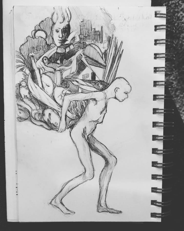
 |
| Church sketch by Carol L. Douglas |
“I just heard on the news that Rand Paul has been sketching during the impeachment trial. One of the reporters added that Paul was really good at drawing,” my pal texted me last week.
Paul has been good at keeping his drawing on the low-down, however. Neither my friend nor I could find any examples online. (Perhaps that’s because there was a mid-century advertising art director named Paul Rand, whom Google likes better for art.)
Drawing is much better than a fidget-spinner, I said to a friend. He strongly disagreed. “They should be paying attention!”
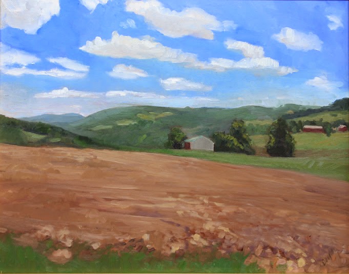
 |
| Church sketch by Carol L. Douglas |
As a former hyperactive student (they hadn’t invented ADHD back then), I know that not all of us are wired to sit still and listen. I’m married to a church musician, which means that occasionally I sit through two services. I can do it because I also draw in church. I’m paying enough attention that I could tell you—in some detail—how the pastor changed up his sermon between the two services.
That’s a little different from Sen. Marsha Blackburn (R-Tenn.), who read a book during the trial. “Busy mamas are the best at multi-tasking. Try it,” she tweeted.
She’s flat-out wrong. You can’t hear and read words at the same time and process them both. They’re using parallel channels in the brain. To some degree, multitasking is a myth. Yes, you watch TV while folding laundry, but when you try to do two high-end brain tasks at once, you’re overflowing your working memory, inhibiting creative thinking, and reducing productivity.
 |
| Church sketch by Carol L. Douglas |
Occasionally, my students will mention that they see things differently once they start to draw or paint. That’s because drawing changes how the brain works, as surely as studying music or language does. This is neuroplasticity in action.
Before the invention of the camera, all educated people were expected to know how to draw. Being able to depict something was almost as important as writing. Nobody had the luxury of saying, “I can’t draw a straight line.”
 |
| Church sketch by Carol L. Douglas |
That’s why I still love this old news from Scientific American. Dr. Jennifer Landin of North Carolina State University expects and gets beautiful drawings from her biology students. “Drawing is merely making lines and dots on paper. If you can write your name, you can draw,” she wrote. “But we all take shortcuts when we see; often our brains fool us, and we skip over most visual details.”
Kids draw all the way through childhood until they reach adolescence. Why they stop is not well-studied, but cultural factors surely play a part. Not only do we devalue the arts in our culture, but we believe that only people with talent (whatever that is) can do them. As Dr. Landin so wonderfully demonstrated, talent is mostly about doing the work.
 |
| Church sketch by Carol L. Douglas |
I sketch in church because I process words better when my hands are in motion. I’m not alone in that; it’s why so many people knit. But try applying that principle to school or some workplaces, and rationality breaks down. The modern answer to restlessness and anxiety is drugs. That’s criminal.
Dr. Landin knows that drawing an object cements it in the mind in a way that simple observation cannot do. My experiences drawing in church tell me that the same thing is true about abstract concepts like grace or community.
“Real life isn’t neatly divided by subject,” wrote Dr. Landin. Society would do well to remember that.


