Beautiful boats and how they stay that way

Invented by a Scottish shipwright, the marine railway operates almost unchanged two hundred years later.
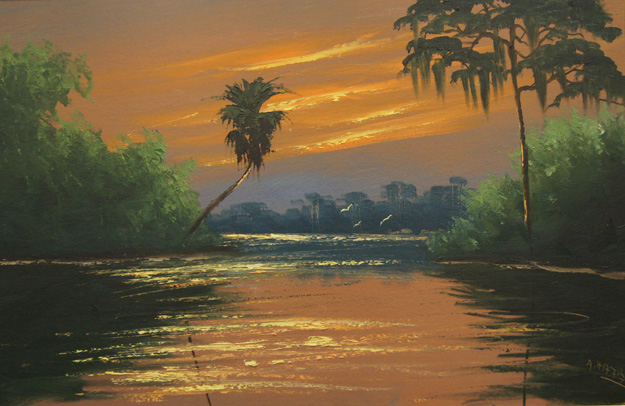
Packing oakum, by Carol L. Douglas
This is the first year in a while that I won’t be painting through fit-out, the annual renovation of the Maine windjammer fleet. I leave for Scotland on Monday. By the time I return they’ll be mostly finished.
The windjammer fleet is annually hauled out of the water according to a very loose schedule, written in longhand and pinned to the wall of the office at North End Shipyard. These boats are very big and very old. They spend nearly all their lives in the water, where they’re prey to worms, barnacles, and other underwater stinkers. They need regular repainting and occasional replanking. The Coast Guard carefully inspects their nether regions as well.
Setting blocks, by Carol L. Douglas
The marine railway, or patent slipway, was invented by a Scottish shipwright in 1818. Thomas Mortonwas looking for a cheaper, faster way of dry-docking boats in his Leith boatyard. As with so many brilliant ideas, his plan was deceptively simple. A boat would be secured to a wooden cradle while still floating in the water. This cradle would then be raised up a set of rails—the slipway—to dry land. A block and tackle arrangement would give a mechanical advantage, but the hoisting power came from men and mules.
Big-boned (Heritage), by Carol L. Douglas
With the advent of steam power, a donkey engine replaced the living horsepower. Today it’s an old, repurposed diesel engine. Other than that, however, the railway at North End Shipyard could be from anytime in the last two hundred years.
While some of the work now involves air compressors and Bondo, there’s a lot of it that’s straight out of the past as well. Hulls are still caulked with oakum and a long caulking mallet. Paint is scraped away and then replaced with brushes, and the Coast Guard laboriously walks the length of the hull pinging every plank with a hammer to search out rot.
Striping (Captain Linda Lee), by Carol L. Douglas
In most cases, the boats are out of the water only a few days. Sometimes the work they need barely outlasts a tide cycle. Conversely, the crew can find work that’s so extensive that they can’t get back in the water for a week or longer. Or weather can prevent hauling. Hence the vagaries of the schedule.
Those few days out of the water are hardly all the work that’s done every year on these boats. Their tenders were repaired and refinished in sheds over the winter; so too were the wooden blocks (pulleys) that the lines run through. Under their plastic covers, decks have been refinished, and repairs have been made to the below-deck accommodation for passengers. The masts are greased so the hoops can travel freely, and ratlines are retarred.
Coast Guard Inspection, by Carol L. Douglas
Everything above the waterline will be painted from floats. The Coast Guard will make sure that all the lifesaving equipment works and that the crew knows how to use it. It’s an intense, laborious process, all so these beautiful vessels can parade proudly for five months a year.
Despite the immense usefulness of his invention, Thomas Morton did not get stinking rich. He earned a total of £5737 in royalties and a lump sum of £2500 from the House of Commons. That made his total profit around a million modern US dollars—not much, considering how widely the marine railway is still used today. Perhaps when I’m in Edinburgh, I will search out his old shipyard and give a nod to one of the many inventions through which the Scots changed the modern world.
There are still a few openings in my sketch-watercolor workshop aboard the schooner American Eagle, June 9-13, 2019. This is a class to learn how to catch landscape quickly and expressively in watercolor, pen and pencil. And my annual Sea & Sky workshop at Schoodic Institute in Acadia National Park has had a cancellation; I’m dying to know who’s going to take that last spot. For more information, email me.

White on white

The color of white is the color of light. Mastering that will make all your paintings more exciting.
Girl Arranging Her Hair, 1886, Mary Cassatt, courtesy National Gallery of Art
The colors in her chemise.
White is, in theory, a reflection of all the visible light spectrum. But that is never true in real life. Inevitably, all light shifts to either the cool (blue-violet) or warm (golden) side, depending on the time of day, season, and atmospheric conditions. Artificial light is even more limited in spectrum than sunlight.
At the end of the 19th century, the Impressionist revolution in color had spread to painters like Anders Zorn, JoaquĂ­n Sorollaand John Singer Sargent. Nowhere does this show more than in their handling of white. Sorolla was painting in the brilliant light of his native Valencia. Zorn lived in Sweden, and many of his scenes have flat light. Sargent lived most of his life in western Europe. None were working in the same lighting conditions, but all of them adopted the same approach to color and light. It was a marriage of Impressionist color theory to more traditional brushwork. The combination still works today.
Mending the Sail, 1896, JoaquĂ­n Sorolla courtesy Museo d’Arte Moderna di Ca’ Pesaro. This is a warm-light, cool-shadow combination.
The colors in Sorolla’s sail.
By adding color to white, these painters were able to give their subject the sparkle and truth of natural light. To have painted their whites with just white or grey would have resulted in flat, dull canvases. This is because convincing whites, in the real world, are actually quite colorful.
Helen Sears, 1895, John Singer Sargent, courtesy Museum of Fine Arts, Boston
The colors in her dress.
Sargent’s portrait of Helen Sears was painted under gaslight. The little girl is thrown into stark relief by the dark interior, and the whole painting is drenched in warmth. What we perceive as blue is mostly a cool neutral. (Hereis a photo of the girl taken by her mother, so that you can see Sargent’s liberal editing.) Even the blue-and-white hydrangeas are actually comprised of mostly warm tones. In this painting, the whites are influenced primarily by the light source.
A Portrait of the Daughters of RamĂłn Subercaseaux, 1892, Anders Zorn, private collection
The colors in the older girl’s dress.
Zorn’s portrait, on the other hand, is mostly influenced by reflected color. It is set against a rich orange floor that influences everything in the foreground. The older girl’s dress is washed in its pinkish tones. The younger daughter recedes in space because of the less-saturated color in her clothes and the grey drapes. Despite all the warmth in the painting, we understand it’s under natural light by the cool highlights. It’s a masterful composition, a brilliant use of color, and above all, an insightful glimpse into the childish mind.
Sita and Sarita, 1896, Cecilia Beaux, courtesy National Gallery of Art
The colors in Sarah’s gown.
I’ve picked six random ‘whites’ from each painting to show you just how varied whites could be in the hands of accomplished painters. Had I used Impressionist paintings, the tints would have been clearer and brighter.
I strongly encourage my students to premix tints(the tube pigment plus white) of every color except black on their palette, and then to ignore pure white. Their assignment this week—and now it’s your assignment too—was to paint a white object without using any straight white paint at all. It should go without saying that your neutrals (greys) should not be mixed with black, either. Everything in this exercise should have color.
The tints in the second line drive this exercise. Graphic courtesy of Victoria Brzustowicz.
The addition of white makes any other pigment opaque and somewhat cooler, since titanium white is cool in its pure state. Add too much white, and you’ve got a bleached, dull image. When you start this exercise, it’s best to err on the side of too much color, rather than too little.
What are some good white objects to paint? Eggs, roses, china dishes, clothing or sheets on the line are all options.

Painting is a game of psych-out

The worst painting I’ve ever done is the one I just finished, always.

The road to Seward, by Carol L. Douglas. One advantage to painting on the road is that you don’t have time to second-guess yourself.

I’m not going to show you what I painted yesterday. I hate it. There are many reasons for its failure, not least being that the lobster smack Joseph Pike, its focus, left before I’d finished my transfer to my canvas. Faced with the choice of working from my sketch or editing my composition on the fly, I did the latter, with disastrous results. I hate the colors, I hate the composition, and as soon as I finish this, I’m going to scrape out the canvas to reuse it. (I seldom do that, but I’m woefully short of 11X14 canvases right now.)

Is it really so bad? I texted an image to a painter friend who responded, “Not your best.” Later, another artist saw it and said, “That’s not too bad. I think it’s redeemable.” So perhaps I’ll take another look before I scrape it out. Or not. I’ve still got an hour to decide.
Dry wash,  by Carol L. Douglas
What was foolish is that I could probably paint Joseph Pike from memory, having painted her hauled out last winter. I berated myself over this choice for a while, until I decided to go home and drink a warm beverage and warm up from the cutting wind.
I often say that my worst painting ever is the one I just finished. I can see only its flaws, not the many ways it works. On the rare occasions when I do like a painting the moment I put my brush down, my judgment is equally bad. A month down the road I’m bored with it. Those paintings seemed fine at the outset because they demand nothing from the viewer.
Minas Basin on the Bay of Fundy, by Carol L. Douglas
Other artists have told me they feel the same way. Why? The moment a painting is born, it’s measured against our expectations, not its own virtues. We mean to paint about one thing; instead, our subconscious minds lead us to explore a different issue altogether. Later, we’ve forgotten what was in our imagination, and the painting stands or falls on its own merits.
Yesterday’s painting was supposed to be about the sheet of water coming forward from the boats. Instead, it’s about the seawall behind. Doesn’t my subconscious know that I’m tired of bouncing up against walls and want to feel the depth of space instead? No, because my subconscious apparently knows me better than my conscious mind does itself.
Spring thaw on the Pecos River, by Carol L. Douglas
This is the game of psych-out, and every creator plays it. There’s always a gap between our inner vision and what we produce, and it’s a space where we can do a lot of psychic damage. In a world of Instagram and Twitter, our full range of failures and successes are competing against everyone else’s best work. It’s easy to feel like an incompetent. But if you go into any working artist’s studio, you ought to see a slush pile. That’s the place where unsuccessful paintings go to die.
What’s the solution? It’s to go out today and paint another painting. Either it will be much better, which will make me happier, or it will be so bad that yesterday’s looks good in comparison.

Men and women of the waves

Few figureheads survived the harsh environment of the ocean, but those that have give a glimpse of a lively art form, lost today.
Twinned figurehead of SS Great Britain, courtesy Mike Peel
From pre-history, ships have had some form of bow decoration. These may have been apotropaic (meant to ward off harm), intimidating, or simply beautiful, but they’re found everywhere old wrecks are raised. Maori war canoes carried carvings, as did boats of Pacific Islanders and Native Americans. The prows of Viking long ships reared up into dragon’s heads. The Romans honored swans; Greeks used bronze boars; Phoenicians decorated with horses, and Carthaginians used Amun the ram. Ancient Egyptians painted eyes to see across uncharted waters.
Figurehead Hiawatha, charcoal on paper, by Sir William Russell Flint, private collection. The joke’s on that ship-builder; Hiawatha was a man.
It was with the development of the galleon in the 16th century that the figurehead took its modern form. Galleons were large ships with lots of real estate above the waterline. Critically, they have a stem protruding forward in space. That meant there was room to pin a statue (or two) under the bow. At the height of their popularity, figureheads were enormous and extremely heavy.
Figurehead of HMS Black Prince, 1861, named after Edward the Black Prince, victor over the French at Crecy and Poitiers. Imagine seeing that come at you in the English Channel.
The British navy realized fairly quickly that all that weight way up front affected the steering. An outright ban wasn’t feasible, because figureheads were popular. But by the Napoleonic wars, figureheads had been reduced to manageable size. They survived throughout the Age of Sail. Even the fast, light, and economical clipper ships of the 19th century carried them.
Figurehead Lalla Rookh, charcoal on paper, by Sir William Russell Flint, private collection
Figureheads weren’t just female; they covered a wide range of persons, deities, saints and animals. Caryatids, allegorical figures, putti, gods, and warriors were all borrowed from high culture. The carvings were sometimes portraits of the person the boat was named after. But above all, figureheads  represented the interests of their times, often in a lighthearted way.
Eagle figurehead from the USS Lancaster, circa 1880 by carver John Haley Bellamy, courtesy Mariner’s Museum. Any sailor would know instantly that this was an American ship.
The purpose of a figurehead—as with all naval heraldry—was to identify vessels through symbols. Much of the navy during the Age of Sail was illiterate. It was extremely useful for the man on watch to be able to tell whether the boat bearing down on them was friend or foe.
Figure head of the witch Nannie Dee on the clipper ship Cutty Sark. She’s carrying a mare’s tale, and the boat is named after her chemise.
A few efforts were made to attach figureheads to steamships, but the custom didn’t really survive the Age of Sail. Twentieth-century warships needed battering rams at their bows. The curved stem and bowsprit, so useful for hanging sculpture, were obsolete.
Inca warrior figurehead from BAP Union, training ship of the Peruvian navy. Courtesy Gallery of the Ministry of Defense of Peru.
Today, few examples of figureheads remain, as they were constantly subjected to the battering of the sea. And, with few exceptions, the men who carved them remain anonymous. But poke around a maritime museum and you’re bound to find a few examples of this folk art form, sadly lost forever.

Florida Highwaymen

Given a choice of picking oranges or painting, these black artists chose to be artists.
Landscape by Harold Newton, courtesy Authentic Florida
Back in the 1960s, it was not uncommon to see people hawking paintings at the side of the road in tourist destinations. That’s a way of life that has, for the most part, died out, but Bobbi Heath and I did run into a car-trunk art gallery in Round Pond last year.
From the 1950s into the 1980s, twenty-six African-American painters from the Fort Pierce, FL area created and sold an enormous body of work from the trunks of their cars. Estimates range up to 200,000 pieces. They hawked their paintings on roadsides, thereby earning themselves the belated sobriquet, “the Florida Highwaymen.” All of this was under the radar of the art establishment, of course.
Landscape by James Gibson, courtesy Authentic Florida
The Highwaymen were selling to newly-arrived Floridians and tourists, so they painted iconic scenes of Florida: beaches, palm trees, billowing clouds, and mossy live oaks. This not only made monetary sense; it was a safe subject for black painters in the Deep South. As most of the painters came from the Indian River region, rural Florida was imprinted in their memories.
The Highwaymen were not plein air painters, rather, they gathered together in carports, shaded yards or sheds and churned these scenes out from memory. It is unlikely that any of them had much art education, but the founders operated loosely under the mentorship of A.E. Backus, a Florida landscape painter with a genius for fostering young artists.
Landscape by Sam Newton, courtesy Authentic Florida
Harold Newton was painting religious scenes when he met Backus. Backus encouraged him to take up landscape painting instead. Newton did, and began selling his paintings door-to-door, creating the model that his peers would eventually follow. Newton worked in the traditional way, creating his own compositions and marketing them.
Landscape by Alfred Hair, courtesy Authentic Florida
Meanwhile, another young man with radically different ideas had been introduced to Backus. Alfred Hair was a mercurial, charismatic teenager who quickly drew others into his orbit. His goal was never to make great art, but to make as much money, as fast, as he could. He set up an assembly line in a back lot, tacked a sample painting to a tree, and recruiting other young artists to paint. Artistic expression was never his first consideration; he and his painters were working to survive.
What were the options for the Florida Highwaymen in a Jim Crow state? Migrant farm labor was their expected path. Instead, the Highwaymen painters chose the risks and rewards of entrepreneurism.
Unfortunately, Hair’s character was his undoing; he was shot to death in a popular local bar at the age of twenty-nine. Without his leadership, his group slowly fell apart. 
Landscape by Ellis Buckner, courtesy Authentic Florida
The Highwaymen’s palette seems bizarrely bright to us today, but it was fashionable in mid-century, when inexpensive art flooded the country for the first time. They used oil-based paints on Upson-board, an inexpensive pressed-paper sheeting product that is thick and relatively spongy. The finished work was framed using crown moulding spray-painted silver or gold. Their goal was fast, inexpensive production. They sold the resulting art on A1A and US 1 from Daytona Beach to Miami.
As the state population boomed, some of the Highwaymen moved inland. New Floridians were eager to decorate with art that looked like their new paradise. And the Highwaymen’s paintings were very reasonable: around $25 for a nice big canvas. That’s about $215 in today’s money.

Why were gargoyles so hideous?

The medieval churchgoer was laughing at devils and spirits that he knew were vanquished. Today we chuckle nervously at devils we’re not quite sure aren’t real.

A comic demon gargoyle at Visby Cathedral, Sweden. Courtesy Alexandru BaboƟ Albabos
After last week’s post on Notre-Dame, a reader asked, “I just learned that gargoyles are functional art. Any idea why they tend to be hideous?”
The word gargoylecomes from Medieval Latin and Old French, and means ‘throat’ or ‘gullet.’ It’s certainly more poetic than ‘downspout,’ which is what a gargoyle actually is. In English, gargoyle has come to be used for what are more properly known as chimeras or grotesques. These are the fantastic or mythical figures used for decoration in architecture.
Gargoyles are usually elongated to divert water from the wall. That’s why they’re the most visible of all the grotesques. We think of them as medieval, but water deflection has been a part of architecture forever, as has whimsy. The Egyptians and Greeks both used lions’ heads as gargoyles.
Waterspouts and other sculptured figures on the Freiburger MĂŒnster, Germany. The top waterspout is defecating. Courtesy Rebecca Kennison
But it was with medieval Catholic architecture that the gargoyle reached its highest art form. Sculptors of the Gothic cathedrals were expected to be ‘preachers in stone’ to the mostly-illiterate population of the time. They told the stories of the Bible, but also portrayed the animals and beings of popular imagination. Since their society was earthy, these figures can sometimes be doing things we think aren’t appropriate for church, like defecating.
Grotesques were not universally popular. Abbot Bernard of Clairvauxrailed against them in his monastery:
“What are these fantastic monsters doing in the cloisters before the eyes of the brothers as they read? What is the meaning of these unclean monkeys, these strange savage lions, and monsters? To what purpose are here placed these creatures, half beast, half man, or these spotted tigers? I see several bodies with one head and several heads with one body. Here is a quadruped with a serpent’s head, there a fish with a quadruped’s head, then again an animal half horse, half goat… Surely if we do not blush for such absurdities, we should at least regret what we have spent on them.”
Le Stryge is a 19thcentury Gothic Revival strix on the North Tower at Notre-Dame and reflects Victorian sensibilities. Courtesy Prosthetic Head
One of the most famous grotesques at Notre-Dame is not medieval at all, but Victorian. Le Stryge is a brooding demon who (until last week, at least) perched atop a buttress on the north tower. Nineteenth century Paris was obsessed with occultism; the grotesques added to Notre-Dame during its renovation reflect that.
Medieval society was less preoccupied with sin. “Whatever they may have lacked, the Middle Ages were a time when fun was ‘fast and furious,’ certainly in no respect behind our own day,” wrote architect Ralph Adams Cram in 1930. “Just because they were sincerely religious people and involved in the sacraments
 of their religion from the day of birth to that of death—and after—it is assumed they
 must have been sad, terror-stricken and morose.”
This dear little reading monkey grotesque is Bavarian. Courtesy )o(Medousa)o(.
It’s been theorized that the grotesques of medieval architecture were to ward off sin or were pagan representations slipped into Christian art. That theory would have seemed absurd to the churchmen who oversaw construction of these churches. They were, in general, far more sophisticated theologians than we are today.
What they had that we don’t, is an ability to laugh at cosmic jokes. The greatest of these is the death and subsequent resurrection of Jesus Christ, which puts Satan firmly in thrall. The medieval churchgoer was laughing at devils and spirits that he knew were vanquished. Today we chuckle nervously at devils we’re not quite sure are real.

Monday Morning Art School: painting the details

It may seem like a fine brush is better, but that’s not true in wet-on-wet painting.

The Halve Maen passing Hudson Highlands, by Carol L. Douglas
One of the things painting teachers repeat over and over is, “use a bigger brush.” Students think they have better control with a smaller brush, but in many cases, the reverse is true. Smaller brushes hold less paint, and they waggle more when we tremble. To draw a juicy line, a brush has to be big enough to hold enough pigment.
It’s relatively easy to lay fine lines down in thin paint, either water-based or when glazing with oils. It’s not so easy in alla prima oil painting. The style tends to be looser and rougher. A fine line added with a rigger can lie on the surface looking silly, or it can melt into the lower layers and look like a grey streak of mush.
Working backwards allows you to make clean edges without being overly fussy.
One solution is to paint edges and lines in the underpainting, and then overlap the color in the top layers to meet the edges. This allows you to create a line that’s razor thin without looking fussy.
Of course, if you’re painting big to small, you don’t have lines or detail in the underpainting. They’re not important in the big-shape phase. You need a technique to remove the excess paint before you draw. For large corrections, I take off excess paint with a palette knife. For lines, I use a wipe-out tool. I had a very old one made by Loew-Cornell that I lost last summer. I replaced it with a Kemper wipe-out tool, and it works perfectly well. These tools are also great for signing wet canvases.
Start by getting rid of excess paint.
You must get rid of excess paint before you can paint your initial shape. You can’t draw into soup. Once you’ve prepared the surface, lay the line in first, before the surrounding background. This sometimes means a line of light-colored paint is laid in before its dark surround. Don’t worry that you’ve broken the dark-to-light rule. This rule is about overall composition, not the final details of a painting.
It’s easier to paint a line with a flat on its side than with a small round.
The side of a flat brush works better than a small round for straight lines. Flats are more stable and tend to track in the right direction. Or, use a palette knife or the edge of a credit card here. Go ahead and use a ruler if you need to, making sure to keep it from dragging the paint.
Your line should be made of fairly thin paint, with just enough medium to carry it smoothly. Too much oil and it will melt into its surround.
Then push the background color right up against the line.
Next paint the surrounding area, pushing up against the line with the background color. Use enough paint and be bold. It’s best to do this edging in a single stroke, but that takes practice. However, as a general rule, the more you touch the surface, the muddier the edges will get.
American Eagle in Dry Dock, by Carol L. Douglas
In my examples, I use two different brushes. The fine flat, made by Rosemary & Co., is very precise, but as with all synthetic fibers, it doesn’t carry much paint. The bright is old and clunkier, but it carries enough paint for a good, finished line. It may seem like finer is better, but that’s actually not true. What’s most important is getting enough paint on the canvas in one pass, evenly, so that your line doesn’t look anemic. With alla prima painting, hog bristles are almost always better.

A Good Friday reflection

It turned out to be much more work than I imagined, but it has proven to be an enduring tradition.

Carrying the Cross, pastel, by Carol L. Douglas
Twenty years ago, a member of my church approached me with an apparently-simple request: could I write and illustrate a Stations of the Cross for our Sunday school students? While we used a liturgy similar to Catholics, our belief system was very much Protestant.
Catholic Stations take the form of artwork hanging in or near the nave. They are generally in the form of bas-relief. My mother’s family is Catholic (although we were not) so I’d had plenty of time to contemplate the Stations growing up.
Gambling, pastel, by Carol L. Douglas
The Stations grew from the tradition of pilgrims walking the Via Dolorosa in Jerusalem. This dates from the time of Byzantium. During the late Middle Ages, Franciscans built a series of outdoor shrines across Europe so that common people could also experience this meditation. By the 17th century, stations were being built within churches. They were a popular printed devotional; Albrecht DĂŒrer’s Great Passion and Little Passion are the Stations in book form.
Eventually, Catholic Stations evolved into the fourteen scenes that are used by Catholics today. They include scenes that aren’t Biblical; rather, they are an imagining of that bitter, difficult walk to Calvary. In my naivete, I figured I’d just ‘correct’ them to make them more Biblically accurate. That was about as feasible as making a few quick adjustments to the Book of Kells for the modern reader.
The Crucifixion, pastel, by Carol L. Douglas
No, a rewrite was in order. With the Gospels in one hand and a children’s book about the Holy Land in the other, I set out to make a new set of Stations.
And then disaster struck. I was diagnosed with a big, fat, robust bowel cancer. I spent the following year being radiated, poisoned and cut apart. Concentration was difficult. I sketched out the bones of the project, wrote the text and assembled my sketches into a first iteration. That was all I could do.
Piercing his side, pastel, by Carol L. Douglas
In all, it took two years for me to finish the Stations. The church hung the pictures in the nave during Holy Week. I moved along to an evangelical church, and ultimately to Maine.
It gives me great joy that, this many years later, they still hang the paintings every year. Each year I get tagged in a photo from one old friend or another, with a note saying, “your stations are up.” There are children in those illustrations who have now graduated from college. Many of my older models have died, but others continue to worship in that same church. I still get a kick out of looking at the pictures and remembering them.
Stations hanging in the nave of St. Thomas Episcopal Church, Rochester.
If you’re in Rochester, you can see the Stations today, at St. Thomas’ Episcopal Church, 2000 Highland Avenue. If you want to read them this Good Friday, the opening pages are here. Just hit the “newer post” button at the bottom of the page to continue. And have a blessed Easter weekend!

Maine art fans, I need your help

Our leaders need to hear how much we support art
 and how art supports us.

Ocean Park Beach Erosion, by Carol L. Douglas
On Monday morning, I will drag David Blanchard out at 6:30 AM to ride with me to Augusta. Dave is the organizer of the new Knox County Art Society and one of nine regional coordinators for Plein Air Painters of Maine (PAPME). He’s coming with me to the first Arts + Culture Day to show our legislators just how much the arts mean to our state.
You don’t have to get up that early, but I’d like it if you’d join us. The event runs from 9 AM to 11:30 AM at the Maine State House Hall of Flags. It’s free and open to the public, and there’s lots of free parking in the area.
This is a new legislature and a new administration, and we want them to know how seriously we support art, and how art supports us. It’s an opportunity to strengthen relationships between arts leaders and public officials and to discuss cultural policy here in our state. Your voice and your face, are needed.
Clary Hill Blueberry Barrens, by Carol L. Douglas
But all work and no play makes Jack a dull boy. There will be performances and presentations through the program, and many cultural organizations from across the state will be represented.

I’ll be there representing plein air painting. PAPME has about 600 members, about three-quarters of whom are Maine residents. The majority show and sell their work in commercial galleries, festivals and plein air events.
Members meet weekly in different locations around the state to paint. There are no dues and no activity requirements. Currently, there are nine chapters statewide. More are always welcome.
There are around 150 commercial art galleries in the state of Maine. The painters dotting the landscape and the galleries that represent them are key attractions to visitors to our state.
Sea Fog, by Carol L. Douglas
Arts and culture are a recognized regional development driver, one that Maine has exploited successfully.  Rockland is a great success story, but it’s not the only one. Too often, public officials think of art as a luxury, but it’s serious business. The arts in America contribute more than $800 billion a year to our economy. That’s around 4% of our Gross Domestic Product (GDP).
There is a myth that artists congregate in big cities. These may have the highest density of artists, but many artists are attracted to rural living, especially in Maine. Artists like affordable housing, vibrant art scenes, educated communities, and access to markets for their art. 
Because art is handmade, it is tied to the place it’s created. That means art can’t be outsourced. An artist is unlikely to leave for another state because the Economic Development people offer him a better deal.
If you’re an artist, a fan of art, or someone interested in economic development, your presence on Monday is vital.
Snow at higher elevations, by Carol L. Douglas
The State House is located on the corners of Capitol and State Streets in Augusta. The west entrance, facing the Cross Office Building, is open to the public.
To get there from I-95 get off at exit 109 and travel east on route 202 (Western Avenue). Continue to the first rotary where you take the first possible right turn onto State Street. Proceed to the traffic light where you will see the State House in front of you on the right. Turn right at the light onto Capitol Street for access to parking behind the Cross Office Building or in the Sewall Street garage.  Parking may also be available south of the State House, behind the State Library, Archives and Museum building.

Three basic elements that make or break a painting

What defines great art? It’s not style or beauty.

Execution, 1996, Yue Minjun, courtesy of the artist
Emotional content
Stirring a response in the viewer is the first responsibility of art. This is done by evoking ideas, memories, or a sense of place. (Even bad paintings, if they’re of someone we cherish, can be meaningful to us.) Painting is primarily a medium of communication. If there’s no content, there’s no point. If the viewer doesn’t stop and ponder, the artist has failed at his primary job.
Style has nothing to do with this. Photorealism or abstraction can make points every bit as powerful as figurative painting does. That is a question of the personal taste of the artist and his audience, nothing more.
Likewise, emotional content has nothing to do with beauty, or the lack of it. There is nothing beautiful in Execution, a 1996 painting by Chinese artist Yue Minjun. It was inspired by the Tiananmen Square Massacre and it packs a raw emotional punch. Conversely, Berthe Morisot with a Bouquet of Violets, by Édouard Manet is a lovely painting of an obviously-revered woman. It has just as much emotional content as Yue Minjun’s painting, but in a completely different way.
In some ways, simple thinking is a virtue in painting. Too many ideas, too much conflicting emotion, and the piece will be too complicated to say much at all.
Berthe Morisot with a Bouquet of Violets, 1872, by Édouard Manet, courtesy MusĂ©e d’Orsay
Technique
In painting classes, we focus on technique, because it’s the basis of painting. Technique simply refers to the protocol of producing a competent painting:  mark-making, composition, palette, building up a surface, moving the viewer through the piece, etc.
In certain fashionable circles today, technique gets a bad rap. Art has become more about making social statements and less about skill. That only works as long as the artist colors within the lines of his particular social statement. 
Imagine, if you will, that an enfant terrible artist comes across a moment of great beauty or a harrowing personal tragedy that requires great skills to depict. He is lost. Technique frees us to be emotionally responsive, but emotionalism cannot be sustained into maturity without a basis in technique. Without it, we have inchoate noise.
Ophelia, 1852, John Everett Millais, courtesy Tate Museum
Timelessness

It’s an interesting fact that we identify works of art by their creator’s names; we ask, is this a Caravaggio or a Gentileschi? Once living, complicated humans, artists are transformed into the sum of their work.
To be great, a painting must transcend the symbols and customs of its times. John Everett Millais’Ophelia (c. 1851) is in many ways a Victorian trope. To completely understand it, you’d have to be familiar with Shakespeare’s Hamlet and with the Victorian idea of the language of flowers, for the flowers in Ophelia’s garland all have specific meaning. Most modern viewers know neither, and yet the painting can still move us, because of the profundity of Millais’ understanding of despair.