Monday Morning Art School: Pricing your work

For some artists, the hardest thing in painting isn’t drawing or color-mixing but how to price their work. Charge by the square inch, of course.
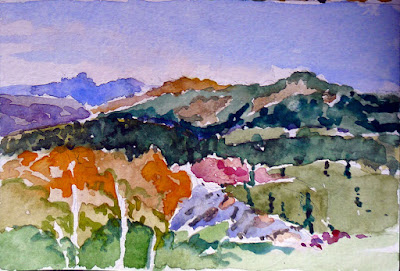
Keuka Lake Vineyard, 30X40 by Carol L. Douglas, is available through Kelpie Gallery

A proper price is the meeting point between how much you can produce of the product and how much demand there is for it. If you can’t keep your paintings stocked, you’re charging too little. If your studio is full of unsold work, you’re either charging too much or not putting enough effort into marketing. Your job is to find that sweet spot.

Art sales are regional. If you live in a community with an aging population and a prestigious art school, you’re going to have low demand and high supply. If you live in a booming new city, you will have more demand and prices will be higher.
Art is not strictly a commodity, however. A painting’s value depends on the artist’s prominence. Most artists are terrible judges of their own work, seesawing between believing they’re geniuses and thinking they’re hopeless. Such subjective judgments hinder their ability to price their work.
Art festivals are a good way to establish a price history. I don’t miss them, however.
Don’t assume that because you labored for a long time over a piece, it is more valuable. Your challenges are not the buyers’ problem.
You can simplify the problem by setting aside your emotions and basing your selling price on the size of the piece and your selling history. How do you do that if you’ve never sold anything before? Survey other artists with the same level of experience and set your first prices in line with theirs. Visit galleries, plein air events and art fairs. If you see a person whose work seems similar to yours, find his resume online and check his experience. Know enough to be able to rank events. Painting in Plein Air Easton is not the same as painting your local Paint the Town.
Charitable auctions are a good way to leverage your talent to help others. They provide a sales history to new artists. (But they aren’t tax deductible contributions.)
Striping (Heritage) 6X8, by Carol L. Douglas, is available through Camden Falls Gallery.
Let’s say you gave an 8X10 watercolor of the Old Red Mill to your local historical society, which turned around and sold it for $100. Great! You have a sales history (albeit a limited and imperfect one) from which to calculate prices. Just figure out the value per square inch and calculate from there.
Square inch is the height times the width. That means your 8X10 painting is 80 square inches. Dividing the $100 selling price by 80 gives you a value of $1.25/square inch.
To use this to calculate other sizes, you would end up with:
6X8 is 48 square inches. 48 X $1.25 = $60
9X12: $135
11X14: $240
12X16: $315
In practice, my price/sq. inch gets lower the larger I go. This reflects my working and marketing costs, some of which are fixed. If you started with my example, above, a 3X4” painting would more reasonably sell for $3 a square inch or $36, and a 48X48” painting for $.75 a square inch, or $1700. But that sweet spot between 6X8 and 16X20 are a fixed cost/inch, rounded off for convenience.
My price list is on Google Drive and I can access it wherever there’s phone service.
Charity sales are known for seriously underpricing work, but it’s better to start low and work your way higher. Periodically review your prices, and make sure you have a copy with you at all times, because people will ask you about paintings at the strangest times. I keep mine on a Google sheet I can refer to from computer or phone.
Once you have a price guide, it should be absolute. I adjust it slightly for family members (or more likely just give them the painting), but I use the same price structure in events and galleries.
You should continuously update your prices based on your average sale prices for the prior year or two. The goal of every artist ought to be to sell at constantly rising prices. When you find yourself “painting on a treadmill” to have enough work for your next show, it’s definitely time to charge more. Each time you show, your work will be better known, and over time your prices will rise.
The marketplace favors fair, consistent pricing. I charge the same amount everywhere I sell. I don’t want to undercut my galleries.
And I don’t explain my prices, for the most part. Does anyone ever tell Christian Louboutin that $995 is a bit much for a pair of platform suede pumps? No; they either understand Louboutin’s market or they don’t buy designer shoes.

This post originally appeared on December 18, 2017. How quickly a vacation rolls past! Have a happy New Year, and I’ll see you again on Wednesday.

Falling apart

A plea to use traditional materials and practices in painting, whenever you can.
American Landscape with Indian Camp, by Ralph Blakelock, showing the damage that can result from tinkering with technique.

Yesterday I mentioned the deterioration in Albert Pinkham Ryder’s paintings. He was not, by any means, the only painter whose work has suffered over time.
Prior to the 19th century, painters had a limited range of materials at their disposal: vegetable oils, waxes, plant gums and resins, and eggs, milk, and animal hides. Pigments were made by either grinding minerals or extracting dyes from plants and insects.  Some of the extracted pigments turned out to be fugitive (meaning they aren’t light-fast) but generally those old paintings are in remarkably good condition.
Holy Virgin Mary by Chris Ofili. Now, seriously, how does a conservator preserve elephant dung stuck to a canvas?
The 19th and 20th centuries were a period of constant modification of materials. Some changes have been inarguably for the better—for example, there would have been no Impressionism had there not been an explosion of new pigments in the mid-19th century.
Whenever I visit the modern collection at the Albright-Knox Art Gallery I am struck anew by how badly some of their paintings have aged.  20th century artists had no reason not to use the tremendous variety of synthetic materials that industry was creating—synthetic media, plastics, adhesives, and drying agents. As the definition of what constituted painting broke down, artists also incorporated materials the ancients would have understood to be ephemeral or beneath their calling: dung, straw, paper, urine, blood, etc.
Woman, by Willem de Kooning, 1965. He definitely experimented with obscure additives to keep his paints open longer, but so far scientists haven’t actually found any mayonnaise in his paintings.
Willem de Kooning, for example, allegedly mixed house paint, safflower oil, water, oil and egg in with his paints. Some surfaces of his paintings remain soft and sticky fifty years later, which has to present a bit of a problem for conservators. Anselm Kiefer has used lead, sand and straw in many of his paintings.
Learning to paint in the 1960s and 1970s, I used a medium made of equal parts varnish, turpentine and linseed oil, with a few drops of cobalt drier thrown in. Having seen the ghastly cracking of fifty-year-old paintings made with this medium, I decided that medium shouldn’t be a DIY project. Better to trust the scientists who work for the reputable paint manufacturers.
Mildew attacking orange paint in a Clyfford Still painting. Courtesy Clyfford Still Museum.
Another technique I discontinued is underpainting my oil paintings in acrylics. Certainly, oil-over-acrylic won’t delaminate the way acrylic-over-oil will, but who can say how the two paint systems will interact over time? I think it’s fine to paint in oils on acrylic-primed canvas, but any part of the painting that shows through (and that includes the toning) should be done in oils.
It was trendy a few decades ago to dismiss the archival aspects of painting, to embrace the ephemeral. If de Kooning is the equal of Rembrandt, why would we not want to see his works survive for the ages?
This post first appeared on October 6, 2013. I realize my use of Yupo is inconsistent with this viewpoint, but I believe it to be chemically compatible with watercolor. 

In looking for this, I came across posts about the 2013 government shutdown. The more things change…

Nobody owns technique

One can learn a lot from books, but one can’t learn everything.
This recipe doesn’t spell anything out for you; it presumes you understand how to bake. (BTW, confectioners sugar no longer weighs out at 2.5 cups to the pound. I’d guess it’s milled differently today.)
In 1954 a woman named Doris passed this cookie recipe along to my mother. Its telegraphic style always makes me smile. In the 1950s, baking technique did not need to be explained by one married woman to another. Today, those of us who learned to bake from our mothers or through 4H can follow this recipe without a problem. Those who didn’t, probably can’t. It presumes a basic understanding of baking that is no longer common today.
Once a friend was fretting about how she couldn’t find an uncomplicated muffin recipe. “But they’re all just lists of ingredients,” I said. “You always assemble them in the same order: sift the dry ingredients together, beat the wet ingredients together, and then fold the two mixtures into each other.”
I showed this recipe to Jane Bartlett, who remarked that when she teaches Shibori she frequently tells her students that nobody owns technique. This is a very apt observation for both baking and the fine arts. There is nothing one can patent about artistic technique, any more than one could patent the order of operations for baking.
Dance of the Wood Nymphs, by Albert Pinkham Ryder. It was probably a lovely painting when he finished it, but his disregard of commonly-accepted protocol meant it was an archival disaster.
Painting is so straightforward that departing from the accepted protocols is often foolish. A few years ago, some of my students attended a workshop teaching painting into thin layers of wet glaze. The tonalist Albert Pinkham Ryder did that in the 19th century, and his works have almost all darkened or totally disintegrated.
One can learn a lot from books, but one can’t learn everything.  A kid in my studio announced her intention of making an apple pie the other day. (She is an excellent cook but her food heritage is non-western.) I gave her a cookbook and the supplies and left her to it. Imagine my surprise when this was what she came up with:
Elegantly layered, but it’s not an apple pie. Not everything can be learned from books.
To make an apple pie, one needs to know what an apple pie looks and tastes like, but it also helps to have assembled an apple pie under someone else’s tutelage. The same is—of course—true of painting and drawing. Yes, one can learn something about them from books, videos, and the occasional visit to an art gallery, but a good teacher really does help.
This post was originally published on October 4, 2013. If you live in mid-coast Maine and are interested in painting classes, my next session starts January 8. Email me for more information.

A blast from the past: Joan of Arc

This post, from 2007, has the highest number of hits of anything I’ve written on this platform. Pastor Nicholson and I never ran with this project, but we’re still buds.

Jeanne d’ Arc, 1879, Julies Bastien-Lepage, courtesy the Metropolitan Museum of Art
My friend John Nicholson and I have decided to try a new project. I will choose a painting based on a Biblical theme and write about it from an artist’s viewpoint; John will write about it from a pastor’s perspective on his blog, The Shepherd’s Staff.

John is a Baptist pastor from Alabama; I am an artist from New York. Can we find enough common ground in our Christian faith to make this work?

Jules Bastien-Lepage’s portrait of Joan of Arc at the Metropolitan Museum of Art in New York never fails to make me catch my breath. I wander away from Rosa Bonheur’s gigantic The Horse Fair, which is a monumental, formal study of controlled energy, and am slapped in the face by The Maid of Orléans.

Joan of Arc was born into a bleak moment in French history. France and England were entering the penultimate phase of the Hundred Years’ War. The English had captured huge swathes of territory and secured the French crown under the Treaty of Troyes, which also declared the Dauphin Charles VII illegitimate. The French countryside was bearing the brunt of a century of fighting, depredation, and the Black Death 75 years earlier.

At about age 13, Joan began to hear voices. Eventually, she sorted these voices to be those of St. Catherine of Alexandria, St. Margaret of Antioch, and the archangel Michael. These coalesced into visions. At her trial, she said: “I saw them with these very eyes, as well as I see you.”

By the time she was 16, her heavenly counselors had become more insistent and specific. She never recounted her visions at her trial, but there is a record of them that slightly predates the relief of Orléans. A Flemish diplomat named De Rotslaer recorded “that she would save Orléans and would compel the English to raise the siege, that she herself in a battle before Orléans would be wounded by a shaft but would not die of it, and that the King, in the course of the coming summer, would be crowned at Reims, together with other things which the King keeps secret.”

The story of her initial rejection (“Take her home to her father and give her a good whipping”) and eventual triumph is worth studying. Two details touch me. The first is that the Dauphin subjected her to a careful theological examination before entrusting his troops to her. The second is that her career ended abruptly after her visions were fulfilled.

Jules Bastien-Lepage was part of a movement in European art and literature known as naturalism. This embraced realism but often was invested with an awareness of the condition of the poor, which in some cases makes the art into manifesto (see Charles Dickens as an example). At the same time, the nineteenth century saw an enormous population shift from the countryside to the cities, so there are elegiac overtones in the genre.

Jean-François Millet - Gleaners - Google Art Project 2.jpg
Gleaners, 1857, Jean-François Millet, courtesy Musée d’Orsay
Bastien-Lepage was temperamentally the heir of Jean-François Millet, who painted the incomparable Gleaners. About Millet, the Catholic Encyclopedia of 1913 said, “he has shown us how the trivial can be made to serve in the expression of the sublime, and how the Infinite and the Divine can be discerned in the humblest existence.” Vincent Van Gogh, Honoré Daumier, and Bastien-Lepage also had that sympathy, although it was tuned differently in each of them.

Bastien-Lepage painted Joan of Arc after the Franco-Prussian War. With their empire ruined and Alsace-Lorraine taken, the French identified powerfully with Joan. Bastien-Lepage’s painting is thus nationalistic, but to regard it as mere propaganda would trivialize it.

For one thing, there is the question of identification. Both the artist and the subject were from Lorraine. Joan was a peasant heroine and Bastien-Lepage was a peasant painter. She must have been an irresistible subject.

Image result for les foins
Les foins (Haymaking), 1877, Jules Bastien-Lepage, courtesy Musée d’Orsay 

Bastien-Lepage’s most famous painting was Hay Making. Because it is a smaller and simpler canvas than Joan of Arc, you can make out the technique more easily on your monitor. His technique looks peculiar to us today. He married controlled realism in the figures to Impressionism in the background. These are two radically different ways of seeing and painting. As odd as this seems now, photography and Impressionism were both new in 1877, with no rigid rules. In fact, he synthesized the two approaches beautifully.

Image result for tricoteuse bouguereau
Tricoteuse, 1879, William-Adolphe Bouguereau
To understand the academic virtues of his painting, compare Joan of Arc to William-Adolphe Bouguereau’s Tricoteuse, painted the same year (Bouguereau vies with Caravaggio as the best painter of feet ever). The figures share the same perfection of drawing and modeling. But there the resemblance ends. In his best work, Bastien-Lepage used perfection only where it advanced his narrative, and there he pushed it to a photographic clarity—Joan’s loosely-laced jacket, the muddy shoes on the reaper. Bouguereau distilled detail to an ideal. His girl is an archetype of poverty, frozen in time.

In Joan of Arc, Bastien-Lepage introduced Catholic symbolism archaically, so we can almost read this painting like an icon. Joan’s own discarded spinning wheel (covered with wool so coarse we can practically smell it) stands in for St. Catherine’s wheel. Michael’s sword (Joshua 5:13–15) hovers in the air as a portent of the sword Joan would later find behind the altar in the chapel of Saint Catherine de Fierbois.

You can easily see Bastien-Lepage’s Impressionistic brushwork in the background of Hay Making, but it is also the device that allows the three saints to shimmer in Joan of Arc (we just can’t see it online). Moreover, he shoves us into the picture with Impressionist abruptness. We sense we’ve stumbled across Joan in her back garden. Compare this to Gleaners, which is profoundly powerful, but far more classical in its structure.

Nevertheless, Bastien-Lepage was not remotely an Impressionist. It is always Joan’s face to which I first respond. Her moment is awful in the deepest sense of the word. It is not that she has shut us out; instead, she seems to have stopped completely. Today many people see that frozen look as a failure, the result of painting from a reference photo. I disagree. It is a face of transfixion, of awed intelligence. After all, the face of the tedder in Hay Making, is hardly photographic, even though the painter was using the same technique. She is loose-jawed, beyond exhaustion.

This is where Bastien-Lepage diverges from the earlier naturalist painters. Millet saw nobility in the peasants’ suffering; Bastien-Lepage looked forward to the bleakness of the coming century. In the eyes of Joan and the tedder in Hay Makers, there are glimpses of the deep psychological pain of the German Expressionist Käthe Kollwitz.

Bastien-Lepage died young (at 36) and much of his work is either schmaltz or unformed. But some of it veers into greatness. I have to wonder what he would have produced had he lived longer.

(You can peruse Bastien-Lepage’s œuvre online here. You can read the transcript of Joan’s heresy trial here, and the nullification trial here.) In researching this, I also came across the delightful and idiosyncratic Hay in Art.)

Monday Morning Art School: how to draw an angel

Angels are devilishly difficult to draw, even though we all ‘know’ what they look like.
Choir of Angels from the Ghent Altarpiece, early 15th century, by Jan van Eyck, courtesy Sint-Baafskathedraal. Ghent

The Bible is notorious for its lack of description when it comes to celestial beings. The Archangel Michael appears to Daniel and all the prophet can say is that Michael looked like a man. The angelic form also differs depending on context. Mostly, though, angels are spirit beings. You, the artist, have a lot of latitude in drawing them.

Still, we all ‘know’ what angels look like: they are infinitely sweet, sing in choirs, have wings and ringlets and wear white robes.
The gap between the Biblical text and tradition has bedeviled artists through history. For example, who says that angels have to have bird wings? I’m not the first person to note this. Jan van Eyck gave the Archangel Gabriel fabulously iridescent wings in the Ghent Altarpiece, just like a bug. William Blake, that old curmudgeon, gave the angel of Revelation no wings at all.
Wing of a European Roller, watercolor on vellum, 1510-12, Albrecht Dürer, courtesy of the AlbertinaVienna
Albrecht Dürer painted a dead European (blue) roller twice, meticulously observing its plumage and structure. His research paid off: his angels never suffer from static, limp wings.
Dead bluebird, watercolor on vellum, 1510-12, Albrecht /Dürer, courtesy of the Albertina, Vienna
If you try this at home, a Christmas turkey won’t do. They’ve had the flight bred out of them. A bird’s shoulders—or scapula—are actually part of its wings. In the wild, they’re strong and muscular. After all, most birdlife revolves around flight. If angels are to fly, their wings must be part of their structure, not just pinned on as in a Christmas play.
The Expulsion From Paradise, 1510, woodcut, Albrecht Dürer. He’d studied wings enough to know how the different coverts, or sets of feathers, move.
Human shoulders are adapted for operating our arms and hands. Winged angels must have two sets of scapula and the muscles to operate both. That’s hard to imply in a painting, but the best ones have the wings operating in parallel with the shoulders.
The Annunciation, 1474, Leonardo da Vinci, courtesy the Uffizi Gallery
For most of art history, angels were depicted wearing the luxurious robes of the high princes of their day. The Renaissance artist often didn’t give a lot of consideration to tailoring wing-sleeves into these gowns. Sometimes they look as if the wings are sprouting from the drapery.  Leonardo da Vinci (as usual) had an ingenious solution in his Annunciation. The archangel Gabriel wears feathers around the base of his wing that echo the poufs of his sleeve. Tres chic!
Angels in togas from the Basilica di Santa Maria Maggiore, Rome.
Angels were depicted in togas—the garb of ancient, pagan Rome—in the fifth century mosaic cycle of the Basilica di Santa Maria Maggiorein Rome. I particularly like the contrast with the hipsters in their modern dress at the bottom.
If you extend that to modern life, you’ll dress your angels in jeans and a t-shirt. These, however, can be unsatisfying to draw. Here is a quick lesson on drapery if you want to be traditional.
Halos were used in the iconography of many ancient people, including the Romans. Halos were adopted by early Christian artists to indicate that here was something worthy of veneration. The new naturalism of the Renaissance pretty much did away with them. If you want to add one to your angel, make sure you get your ellipse right by following the instructions here.
Song of the Angels, 1881, by William-Adolphe Bouguereau, courtesy of the Getty Center.
By the time William-Adolphe Bouguereau painted Song of the Angelsin 1881, angels had been sanitized and softened, undergoing a gender transition in the process.
Historically, angels were depicted as male and terrifying. However, the paucity of description in Scripture allowed artists wide latitude. With the Enlightenment, angels became less frightening. This is when they began to transition into females in popular culture. (A classic case of a profession letting women in after its power has diminished.)
Eastern Orthodox icon of a tetramorph cherub, depicting four essences in one being. Is there anything cute about this? 
Worse, they started showing up as infants, in the form of putti.
Putti were originally meant to symbolize the profane passions of the pagan Romans. That’s why Cupid is frequently depicted as a winged boy. In the Baroque period, however, putti came to represent the omnipresence of God. Weirder, they became conflated with the Biblical cherubim. How cherubim—the fierce, serious beings that guarded the Garden of Eden—became fat little boys is one of the enduring mysteries of art.
May you have a blessed Christmas and great peace today, tomorrow and in the year to come.

The happy pursuit of leisure

Out here in the hinterlands, we haven’t forgotten how to waste time productively.

Running, by Carol L. Douglas
I enjoyed reading Tim Wu’s reflections on why Americans don’t have hobbies, except that I don’t believe a word of it. I agree with him that leisure is the basis of culture. But I see no sign of its demise.
I teach a lot of people who are dedicated hobbyists. They pursue excellence in painting because they love to paint, and they get satisfaction from constantly improving their skills. That’s the very definition of ‘amateur,’ which derives from Latin amatus, the past participle of amare: ‘to love’.
Many of them paint as well as some professionals. The difference is that they aren’t pursuing sales. That keeps the joy in painting. Being a professional artist is as entrepreneurial as it is creative, and that is a lot like what they left behind at the office.
Hiking boots, by Carol L. Douglas.
Yes, I have hobbies separate from my work. In fact, I got thinking about Wu’s essay when I ordered a new pair of ice skates. (They are my first brand-new pair ever.) I have a canoe, snowshoes, hiking boots, three sewing machines, and a woodshop, and I use them all.
Is the problem young people, so sunk into their screen time? I don’t see it. Two of my daughters are passionate cooks, a hobby that seems to have exploded in popularity in recent years. The third has a 4X4 and miles of trails. My son is recording an album of music over his winter break. One of my favorite young people is passionately interested in aerial gymnastics. No, she’s not training for the circus; she just likes it.
Butter, by Carol L. Douglas
Many Americans pursue hobbies that were toil a generation ago. For example, my friend Toby has an inexplicable love of canning. She’s got all the best equipment and skills to make a 19th century housewife proud. It’s fun because, in our 21st century world, it’s separated from drudgery.
The same is true of small-scale animal husbandry. The backyard chicken trend has been increasing in popularity for the past decade.
Spring, by Carol L. Douglas
One of my kids loves posting photos to Instagram. She’s not trying to be a social-media sensation; she just likes to share her weird world with others. A generation ago, she might have invested in a darkroom and SLR camera. Worse, she might have invited you over and pulled out her carousel projector and 200 hundred slides of her most recent trip.
Then she would have been called an “amateur photographer.” It’s still the same thing today, even when it’s done on a cell phone. Hobbies have morphed, not disappeared.
Professor Wu’s essay falls in the category of “the sky is falling” opinion piece at which the New York Times excels. But, fear not, good sir! Out here in the hinterlands, we haven’t forgotten how to waste time.

I hate wasting money

If you’re like me, you can’t handle one more project right now, but my early bird discount expires on January 1.
Becky Bense among the rocks at Schoodic Point.
Several people have told me they’re registering for next summer’s Sea & Sky workshop but haven’t sent their deposit. It will cost you $100 more if you wait until after January 1 to register.
I was once a student, too. I clearly remember my frustration with too much theory and not enough technique. I resolved then that I’d do my best to send my students away with tangible technical help.

Students tell me that I’m the first teacher who’s ever given them a consistent system for putting paint on canvas in a way that’s bright, clean and clear. There are some basic steps in making paintings. They’ve worked for centuries. I do my best to teach them through my blog, but it’s really better to see for yourself.

You’ll see the giant lobsterman of Prospect Harbor.
I know painters at all levels. It’s sometimes frustrating to see them stuck for months or even years on the same painting problems. That’s especially true when I know the problems are easily corrected. Take the question of muddy, grey, paint. 90% of the time, it’s caused by how you lay down the underpainting, not your paint mixing.
What helps me break through problems like these is radical change, something that shakes up my routine enough for new ideas to sneak in.
And paint at this untouched Maine harbor.
Coming to Schoodic is as radical a change as you’re likely to get. You’re out of your environment, in one of the earth’s great beauty spots. You eat, laugh, and play with like-minded fellow painters. And you learn. I implore my students: “You don’t have to do this forever; just give it one week.” Usually, they incorporate those changes into their ‘forever.’
In a world of incredible atmospherics.
Here are the most common questions I hear:
How do I get there?Fly into Bangor or Portland, ME, rent a car, and drive over to Acadia National Park. It’s simple. Or, you can carpool.
I’m not very experienced. Is this workshop for me? Yes. We take such a small group that everyone gets individual attention. We meet you where you’re at.
Where are we staying? At the Schoodic Education and Research Center. You don’t just book a room there; you have to be part of an educational program.
Michael and Ellen practice their loafing skills at Blueberry Hill.
Can I bring my spouse?Please do. A non-painting partner sharing the same room is $475. That includes all meals, including our lobster feast. There’s lots to do in the area–hiking, biking, photography, birdwatching, fishing, or just quiet meditative time in nature. Sometimes non-painting spouses just like to hang out with the class, too. That’s fine with me.
Pastels are a beautiful medium for the Maine coast. And, yes, I should have been wearing gloves. (Photo courtesy of Claudia Schellenberg)
What mediums can I bring? Oils, acrylics, watercolor, pastel. And of course your drawing supplies.
Is that a good price? Even at $1600, my workshop is a fantastic deal, since it includes your meals, accommodations instruction and insider knowledge of the Schoodic Peninsula. Next year, the price is going up, since my costs rose this year.
But the Early Bird discount makes it a ridiculous bargain. So, if you’re planning on signing up, send me a check and the registration form, pronto, and save yourself $100.

Painting with meaning

The paintings that catch our eye aren’t necessarily the ones that are perfectly executed.
American Eagle in Drydock, by Carol L. Douglas

While I’ve had an Instagram account for a long time, I’ve only recently understood how it really works. I’m not talking about its mechanics, but the algorithms that drive it. It has the power to be a massive dipping net. When you use it as a tool instead of passively looking at what it throws up at you, you see a lot of art outside your own little puddle. That exposes you to style and content you wouldn’t otherwise see. It’s all at thumbnail size, so the work must compel you instantly, just as your own slides must compel a juror’s.

Obviously, high chroma wins over subtle color every time. To imagine otherwise is to think that a fruit compote could be savored by a person who is stuffed full of Christmas cookies. Some of the qualities of painting that we traditionally admire—finish and modeling, for example—seem irrelevant, even counter-productive. Such paintings can seem academic and dull on Instagram, whereas they’re the ones that would look the best in real life. The exception is composition; it’s more, rather than less, important at such a tiny scale.
Dyce Head Light, by Carol L. Douglas
Instagram is chaotic. A painting by a complete duffer will appear in your feed after something by a well-known contemporary artist. The well-known artist will have more followers, increasing his chances of being seen. But if the duffer uses hashtags properly and you’re looking for paintings of his specialty, you’ll find his work.
That’s why I’m suddenly wasting all my free time on Instagram. A whole world of painters who will never be represented in New York galleries are there, painting their hearts out. I want to see what they’re doing. I want to understand my reaction to their work.
Jonathan Submarining, by Carol L. Douglas
What moves me, overwhelmingly, is content.
I recently saw a painting of a small house decked out in Christmas lights. It wasn’t a brilliant painting, but it was accurate enough that I could see my own life reflected in it. It was a portrait of coziness and contentment. It has been on my mind all week.
Emotional content doesn’t come easily to me. It’s possible that I’ve trained it right out through my fingers. When we do plein air events in unfamiliar places, we’re not expressing anything about purpose or meaning. All we can do is paint beauty.
Fish Beach, by Carol L. Douglas
Yesterday, I confused the suffixes amity and amor in writing. At 2 AM, I was awake and restless and beating myself up about it, as we like to do during bouts of insomnia. I’d been writing about domestic intimacy, so it was easy enough to slip up between ‘friend’ and ‘lover.’
A different thinker might be able to find concrete images to convey the easy, old relationships within a happy, functioning family. If I ran across that painting on Instagram, it would be the one that would still my hand and echo in my thoughts all day.
Now how do I get some of that for me?

And that’s why we can’t have nice things

Fences protect fools from the view. Unfortunately, they also separate the rest of us from it.
Rocky, by Carol L. Douglas. 

Last summer I painted a rocky outcropping at Fort Williams for Cape Elizabeth Land Trust’s Paint for Preservation. It is a long finger of granite pointing straight into the ocean, as dramatic as any point at Acadia, but only minutes from downtown Portland. And therein lies the problem. People were constantly crawling out to the end of the rock to take selfies. I watched a couple encourage their kids to do it. The drop is easily long enough to kill, and the surf below will take what the rocks don’t.

The foolishness of all these visitors was manifest in their footwear, which ranged from flip-flops to sandals. In two-and-a-half days I saw only one properly-shod climber. He had a safety mat and was practicing some kind of technical descent.
Kaaterskill Falls, by Carol L. Douglas
It reminded me of another popular tourist spot that’s also legendary among plein airpainters. That’s Kaaterskill Falls, a two-tier, 260-foot-tall waterfall in the Catskills. This was, in many ways, the heart of the Hudson River Schooland where plein air painting in America was born. When I first visited, it was easy enough to believe you were alone in the primeval wilderness. You approached the falls the same way as Thomas Cole, Frederic Edwin Church, and other great painters did, up a steep, 2.6-mile trail with very little in the way of safety improvements.
The last time I painted there was in 2014, with Jamie Williams Grossman and other friends from New York Plein Air Painters. It was shocking to see how many people crawled around the lip of the falls and its access trail wearing terrible footwear. That summer two visitors fell to their deaths.  Access was closed for 2015 while they made safety upgrades. When it reopened the following summer, there was another fatality.
The view of that rocky promontory is now obscured by a fence. (Photo courtesy of Karen Lybrand)
Inevitably, the state of Maine had to fence off the rocky point I painted before someone falls to their death.
Artist Karen Lybrand walks at Cape Elizabeth almost every day, and sent me photos of the new fence. “I’m sure the risk-takers will still find a way to take selfies on the cliff rocks,” she commented. Someone will feel the need to get past the safety restrictions, resulting in more safety restrictions.
You can see trail wear around the rocks. (Photo courtesy of Karen Lybrand.)
Maine was projected to have around 40 million visitors in 2018. They’re not necessarily from places where people understand the risks of the natural world, or are expected to take responsibility for their own safety. Their attitude toward wilderness will inevitably affect our access to wilderness.
I’ve done that painting from exactly the low angle I wanted; I couldn’t paint it again, but I don’t want to, either. And it’s perfectly paintable from over the fence; it just won’t have the same looming presence.
A 1920s postcard showing the Marginal Way approaching Perkins Cove in Ogunquit. That was before the path was so heavily traveled.
There are any number of coastal views that would be diminished with such a fence. They’re protected only by their isolation, and even that is slowly eroding as America’s population grows.
These are stunning views from places that are perfectly safe—until you stray from the path and do something stupid. But we can’t allow people to reap the consequences of their bad decisions in our litigious society, so they will be fenced off one by one.

Monday Morning Art School: cleaning your brushes

Don’t expect brushes to last forever. But cleaning them regularly means they will last a good long time.
A constant, revolving mess.
A few weeks ago I wrote about what different shaped oil painting and watercolorbrushes were used for. A reader asked me to follow up on the care of brushes.
That’s rich, I thought, because I’m the worst abuser of my own brushes, especially when I’m on the road. There’s never a utility sink available, and it’s not nice to repay your hosts by washing brushes in their kitchen sink. I have been known to shower with them and clean them with shampoo, since they’re usually no dirtier than I am. Mostly I wrap them in plastic and hope for the best. And the best, after a week in a hot car, often isn’t very good.
Wrapped in plastic, hoping for the best.
The cardinal rule of brush care is to not let them stand in any kind of solvent—mineral spirits or water. That includes during painting, which is why a small, swinging solvent holder is such a great idea—it’s impossible to leave a brush in it.
Image result for "Carol L. Douglas" watercolor
If you paint out of a moving car, as I did here, you have to wait to clean your brushes.
Let’s start with watercolor brushes. In general, they need to be rinsed when you’re done, shaped back into their proper form, then allowed to dry flat. This is where a brush roll comes in handy. Pay particular attention to rinsing them if you paint with saltwater or use alcohol to prevent freezing.
Fine hair brushes can be washed with mild soap. However, the only situation where that would be necessary is if you’re committing the faux pas of using your watercolor brushes to paint in acrylics. If that’s the case, on your own head be it, as the Psalmist wrote.
Soap is not detergent.
Both are emulsifiers known as surfactants. These allow oil to be lifted out with water. That’s why they are both capable of cleaning your hair, although we generally use a different kind of surfactant—shampoo—for that.
Soaps are made from natural ingredients like plant oils or animal fats. Detergents use synthetic bases, and they have additional surfactants added to increase the oil-stripping. This is why we don’t generally use detergent to wash our hair—it’s too good at removing oils. The same is true for our brushes.
Soap, by the way, dates back to 2800 BC, whereas detergent was formulated during a World War I soap shortage.
Soaking them in coconut oil can sometimes loosen up dried paint.
If you left your brushes standing and they’ve started to harden up, detergent won’t work any better than soap at softening the mess. I sometimes pre-treat them with coconut oil when I can’t get the paint out. Masters Brush Cleaner also manages to soften up dried paint without using dangerous chemicals.
A few years ago, a friend sent me a sample of a product she likes for brush cleaning: War Horse Saddle Soap. This is a glycerin-based soap and is now my preferred brush soap, not least because they’re a family-based business using safe and sustainable materials.
However, I think any saddle-soap or brown soap like Fels-Naptha works. For that matter, I’ve washed a lot of brushes with the sample soaps available in hotel rooms. One product that doesn’t clean brushes well is Dr. Bronners Organic Pure Castile Soap. It’s a pity, because it smells good.
The only secret of brush-cleaning is to get to them fast. Get as many solids as you can out with mineral spirits; that will prevent clogging your sink. Thoroughly coat them with soap, inside and out, and wash them with a rag, not your bare hand. (Even the least-toxic of pigments shouldn’t be ground into your skin.) The brush is clean when the water runs clear, and not before.
Don’t expect heavily-used brushes to last forever. They’re made of hair and they wear out. In fact, most of my filberts started life as flats. But by cleaning your brushes regularly, you’ll ensure that they will last as long as is possible.