In praise of lighthouses

Lighthouses are neither kitschy nor camp; theyā€™re hardworking symbols of our maritime history.
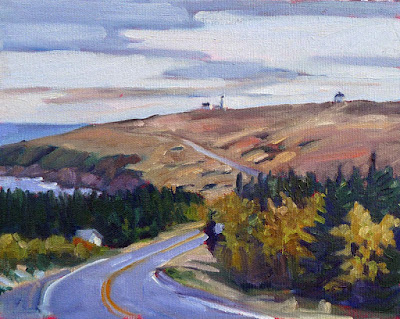
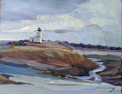
Lonely Lighthouse (Parrsboro, NS), Carol L. Douglas
This morning I am painting at Fort Williams State Park as part of Cape Elizabeth Land Trustā€™s 11th Annual Paint for Preservation. (Our locations are assigned; you can see a maphere.) This is the location of one of Maineā€™s most famous lighthouses, the beautiful Portland Head Light. It was first lit in 1791.
But Iā€™ll be looking in the other direction. The Portland Head Light is unchanged from when Edward Hopper painted it in 1927. However, it would be difficult to set up in his vantage point now, since the park road runs over it. The lighthouse has been painted many, many times, and photographed even more often. Iā€™d be hard-pressed to find anything new to say about it.
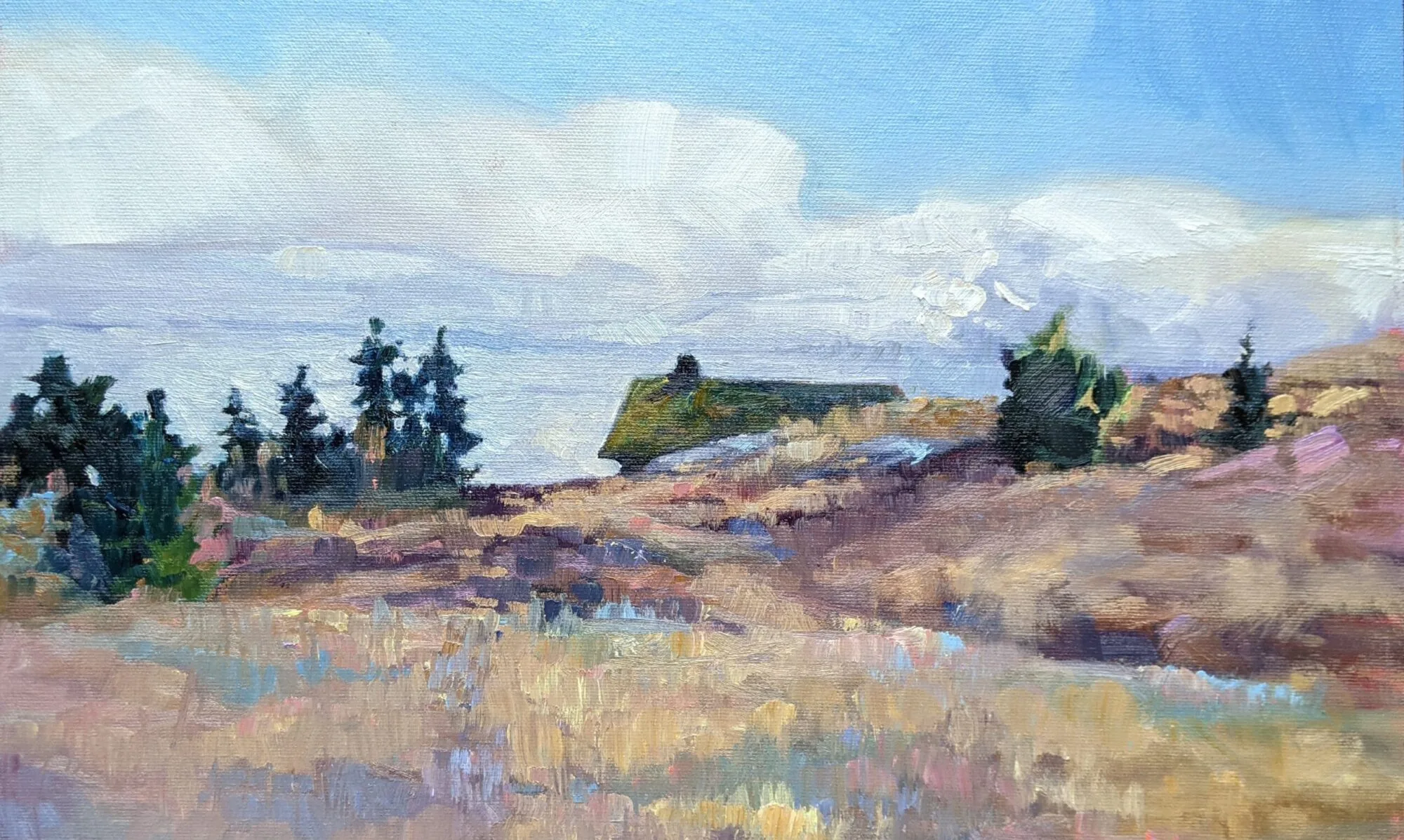
Not a cloud in the sky (Owlā€™s Head Keeperā€™s House), Carol L. Douglas
Maine’s lighthouses have been painted so often, they have become in some ways a painting clichĆ©. This is why critics sometimes sneer at lighthouse (along with lobster-boat) paintings. More fools they.
Our coastal history is both authentic and humble. There is evidence that people were building boats in Crete 130,000 years ago. Long before there were settled ports, people lit bonfires to guide mariners home. It didnā€™t take long before these were raised onto platforms. From there, the fixed tower was adopted.
Dyce Head in the early morning light, Carol L. Douglas
By the time Alexander the Greatcame along, lighthouses were an established navigational aid. Ptolemy II Philadelphus built the Pharos of Alexandriasometime around the third century BC. It was the biggest and most famous lighthouse in antiquity. It lasted through seventeen centuries and several major earthquakes. In 1480, Sultan Al-Ashraf Sayf ad-Din Qa’it Bay tore down the remains and used the rubble to build a fort on the site. The Pharos was about 350 feet tall, whereas the Portland Head Light is 101 feet.
The oldest lighthouse still standing is the Tower of Herculesin Galicia, Spain. At 187 feet, it too stands taller than the Portland Head Light. Its exact date of construction is unknown, but it was known to be standing by the 2nd century AD, either built or rebuilt under the Emperor Trajan.
Owl’s Head Light, Carol L. Douglas
Like so much ancient technology, lighthouse construction went into hiatus with the fall of the Roman empire. The modern lighthouse era began in the eighteenth century with the development of international sea trading. The more boats there were on the water, the more horrific losses were suffered from shipwreck.
Advances in structural engineering made it possible to put lighthouses on surf-scoured rocks and even underwater ledges. The Bell Rock Lighthouse, balancing on a reef off the coast of Scotland, was built with such precision that its masonry hasnā€™t been replaced since it was completed in 1810. It was painted beautifully by J.M.W Turner in 1819.
Cape Spear Road, Carol L. Douglas. Thatā€™s not one, but two, lighthouses.
The lighthouse keepers are long gone; their work has moved from oil lamps to remote operation by the Coast Guard. But they continue to serve a vital purpose on the seas.
Lighthouses come in a variety of shapes, from squat little caisson lights which look like sparkplugs, to tall, tapered towers, to the boxy little midcentury lighthouses of Nova Scotia. Theyā€™re often on remote, austere headlands, surrounded by pounding surf, lonely spruces, and great tumbles of rock.
How can anyone resist painting them?

An easel solution to an oversize problem

I saw a great retrofit of a Guerrilla Painter Flex Easel last year and have been meaning to try it. No time like the present!

A hacksaw and a file will achieve a lot.
The organizers at Cape Elizabeth Paint for Preservation give us 2.5 days to do one painting. In return, they want us to paint big. I like painting big, so Iā€™m happy to oblige. The trouble is, with the exception of the Gloucester easel, most plein airsetups are meant for fairly small work. I have a Gloucester easel, but it is missing a part. I can balance a 20X24 board on my pochade box using clips, but thatā€™s the absolute limit. And canvases need better support than do boards.
Iā€™ve narrowed it down to three possible sizes, depending on how intrepid I feel and how the weather looksā€”36X36, 24X30, or 20X24. Iā€™ve packed my big brushes and lots of extra paint. The only issue was working up a field easel that could accommodate big panels without blowing away.
My easel before I hacked at it. That’s an en plein air pro shelf on the tripod. Very useful.
Tara Will is a fantastic pastel painter from Maryland. She works large and loose in the field, using a modified Guerrilla Painter 3001 No.17 Flex Easel. This is basically an aluminum head that fits on a camera tripod. I have one, and itā€™s a good piece of equipment, but it is limited. It only extends to 20ā€. Like all Guerrilla Painter tools, though, itā€™s rock solid.
Hacksawing the easel apart.
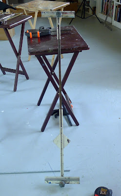
Tara sawed hers in half, inserted a piece of steel strip metal in the gap and locked the whole thing down with set screws. Genius! Iā€™ve wanted to do something similar ever since I saw it. The only issue was to find a mending plate or metal strip to fit.
I stopped at two hardware stores, a marine store and a shipyard, with no luck. I went home, discouraged. My husband suggested one more trip, to Rockport Steel, which fabricates huge things like lobster boats and dock ramps. A fellow named Tim took time off and milled me a Ā½ā€X24ā€ flat plate while I waited. It turns out that he is a darned good artist, judging by his work hanging in the office.
The steel flat strip fit perfectly.
From there it was a simple matter of cutting the aluminum stem in half with a hacksaw. Two extra screws from a Testrite easel easily locked the flat bar down. The screws were slightly too long to clear the canvas, so I cut them down with a bolt cutter. I think Tara’s might lock from the back, but no longer remember.
 Itā€™s a mite wobbly when fully extended, and I donā€™t know yet how difficult it will be to adjust the set screws on the fly. Only field testing will tell me if it will work.
I have spare screws on hand for my Testrite classroom easels. They fit perfectly in the groove and locked the steel flat strip down securely.
Solid enough for field painting? Only time will tell.

Meanwhile, Bobbi Heathtexted me, ā€œDo you want to use my Gloucester easel?ā€ Well, I thought, I just spent half a day tinkering with this thing and Iā€™d love to see if it actually worksā€¦


And then, on second thought, I answered, ā€œheck, yeah!ā€ When the pressure’s on, I’d rather use an old reliable tool than a new contraption.

You can never have too many easels

My super-lightweight pochade box has served me well, but my field paintings have grown in size. Whatā€™s next?
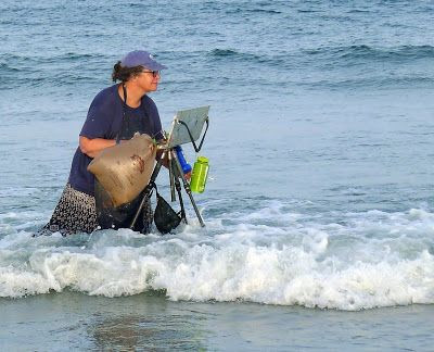
Still the best pochade box for intertidal zone painting. (Photo by Ed Buonvecchio)
Four years ago, I made myself a super-lightweight pochade box. The instructions are here; theyā€™ve been viewed thousands of times and I still occasionally correspond with people interested in making a similar one.
I built this box because I had hiked down Kaaterskill Falls with a heavier, earlier kit and developed a Bakerā€™s cyst from the tremendous pressure on my knee. I decided right there that a lighter painting kit was necessary for extreme plein air. When you hike in to your destination, a kit weighing more than a few pounds is uncomfortable and sometimes dangerous.
The box when new.
The box I made answered that problem very well. It is compact and at 18 oz., doesnā€™t add much to the weight of my checked baggage. Between trips, I slide it in a waterproof stuff sack and toss it in the freezer. It has traveled many, many miles with me by car and by airplane.
However, itā€™s no longer serving as well for my primary easel, because things have changed:
  1. The maximum size it holds without jury-rigging is 12X16, and thatā€™s become almost the minimum size I paint these days.
  2. The incessant wind along the coast causes my box to thrum. (For this reason, I seldom use an umbrella these days, either.)
  3. Because it has no frame, itā€™s gotten somewhat deformed by traveling in my checked bag on airlines.
It’s gotten a little beaten-up from traveling in my checked bag.
Kirk Larsen looked at it in Parrsboro and suggested that I have it copied in carbon fiber. I talked to a boatbuilder last week. He thought that fiberglass would do just as well. Heā€™s going to work one up for me, and then Iā€™ll field test it and see how it works.
Meanwhile, Jennifer Johnson decided to make a box like mine, but her husband ordered the wrong binder. It was a fortuitous accident, because her box is both smaller and stronger than mine. It pairs up perfectly with her Mabef M-27 field easel without any drilling or special machining. Larger canvases might be a stretch, but a clip should hold them steady. Weights can be hung as needed.

Jennifer Johnson’s box is in some ways superior.
Iā€™ve had an earlier version of this Mabef field easel for about twenty years. I heartily recommend it to students as best value for money. Adding the $30 paint box is an elegant solution to the problem of a palette.
Or, you can use Victoria Brzustowiczā€™ simple solution. She hinged two aluminum baking sheets from the Dollar Store together with a strip of duct tape. Open, itā€™s a paint box; closed, it goes in a plastic bag in the freezer. It cost her all of $2.
Victoria Brzustowicz’ $2 solution. (Photo courtesy of Victoria Brzustowicz.)
Meanwhile, Iā€™m packing for Cape Elizabeth Paint for Preservation 2018. They want us to paint big, so Iā€™m reviewing my collection of older, heavier easels to see what will suit. If youā€™re in Portland this weekend and want to stop by, Iā€™ll be at Fort Williams Park.
Iā€™ve got one more workshop available this summer. Join me for Sea and Sky at Schoodic, August 5-10. Weā€™re strictly limited to twelve, but there are still seats open.

The dubious environmentalism of modern public art

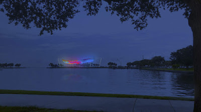
Plastic netting covered with LEDs, blowing over St. Petersburg’s old pier? Sounds more like an environmental disaster than public art.
Artist’s rendering of the proposed sculpture at night, courtesy of city of St. Petersburg, FL.

The Statue of Liberty has stood in New York Harbor since 1886. Conceived as a statement about the end of slavery, it has come to represent us as a nation of immigrants. Maya Linā€™s Vietnam Veterans Memorial in Washington, DC is another monument that speaks profoundly to Americans. The National War Memorial looms over the most important government buildings in Ottawa with its message of remembrance. Even the Eiffel Tower was designed as a symbol of modern science and industry. Such meaningful public art exists worldwide, in large cities and small towns.

Enter modernism, with its stubborn refusal to accommodate meaning. ā€œThe Kelpiesā€by Andy Scott rise 30 meters next to the Forth and Clyde Canal. They are best appreciated zooming past on the M9. They capture nothing of Scotland and certainly nothing of the shapeshifting, devious magic of the mythical beasts. There was Christo and Jeanne-Claudeā€™s The Gates. I walked through it many times, trying to catch the magic. The magic, I decided, was in the coffers of nearby stores that catered to tourists. Then thereā€™s Penetrable, by JesĆŗs Rafael Soto. These urine-colored plastic shower curtains so disfigured Frederic Churchā€™s Olana that they’ve been extended for another season.
Artist’s rendering of the proposed sculpture during the day, courtesy of city of St. Petersburg, FL.
The latest entry into the debate is a proposed sculpture at St. Petersburg, FL, by Janet Echelman. The $3 million net sculpture will be ā€œmade of the same material that is used for astronautsā€™ spacesuits,ā€ said the Tampa Bay Times. Iā€™m not sure what that means, since spacesuits contain nylon, Dacron, Neoprene, Mylar, Gortex, Kevlar, and Nomex. Another source said the sculpture would be polytetrafluoroethylene, or Teflon. Yum.

It will span about 390 feet and be high enough that it canā€™t be molested by humans waving hockey sticks, said Echelman. A member of the arts commission asked about fishing poles. Echelman hadnā€™t considered them. She should. I imagine there are fishermen quite capable of reeling in that sculpture on 130 lb. test line.  

And the sculpture willā€”of courseā€”be brightly lighted, with LEDs in various bright colors.
Artist’s rendering of the proposed sculpture at night, courtesy of city of St. Petersburg, FL.
Ironically, the park for which it is slated was created to preserve waterfront green space. Spa Beach is officially a passive park, meaning that permanent structures (anything that will last more than six months) are banned. No problem. City Attorney Jackie Kovilaritch has said that “a substantial change of use” ordinance will be introduced to fix that pesky problem.
Echelman assures the city that her work is designed to be wind-resistant and that a consortium of engineers say it wonā€™t end up as junk plastic in the ocean. Pardon me, but weā€™ve all heard that before.
Artist’s rendering of the proposed sculpture at night, courtesy of city of St. Petersburg, FL
Thereā€™s the question of light pollution and the possible impact on seabirds and sea creatures, none of which can be predicted with certainty. But mostly, to me, itā€™s a question of where people can go to get away from the endless energy, anxiety, and bustle of the ever-expanding human colony.
Let this be a monument of sorts, thenā€”to the death of any sort of real environmental stewardship, to the end of our love of green space, a funeral marker for a planet that once knew how to sleep at night. 

Monday Morning Art School: Gel Pen and a Water Brush

Everything you need for pen-and-wash will balance comfortably on your lap, thanks to modern technology.
A fifteen-minute pen-and-wash sketch.

I slipped my sketchbook in my purse before church, only to find when I got there that my pencil had apparently been eaten by a bear. It was useless. That left me scraping around the bottom of my backpack, where I found a Uni-Ball gel pen and a tiny sample card from Turner Watercolours.

Recently, pen manufacturers have started offering fraud protection technology. This is because of a new form of crime called ā€˜check washing.ā€™ Thatā€™s a kind of identity theft where ink is removed from a check and the check is reused. In response, pen makers have created waterproof and acetone-proof pens. Good luck getting the ink out of your clothes, but itā€™s a boon for artists looking for inexpensive, waterproof pens for pen-and-wash drawings.
Initial drawing.
Thereā€™s a tiny, unremarkable, ranch-style house across the road from our church. Itā€™s best to practice drawing everyday objects. If you can get the composition and pattern of lights and darks right on a prosaic little house, you stand a much better chance of getting them right at Niagara Falls or some other equally-grand place. In painting, the composition should always come first.
Without a pencil, I couldnā€™t even put hashmarks on my paper. Sometimes flying without a net is a good thing, though. Youā€™re stuck with your decisions. I laid out a simple line drawing, and then massed my dark shapes in with the pen.
More darks.
Pen drawing is supposed to be fast, and eyeing up proportions is a learned skill, just like reading. If youā€™re an absolute beginner, you might want to do a measured drawing of the building on another page first, in pencil. Then close that page and work fast on another page. Your mindā€™s eye will remember the proportions. If you have no idea where to start with that, do this exercise first.
My pal Mary Byromteaches a wildly successful weekly class in southern Maine called The Traveling Sketchbook.  We occasionally compare materials for our classes. It was Mary who reminded me of the versatility of the lowly waterbrush pen. The genius of these brushes is that they eliminate the need to carry water separately. 
I watched Richard Sneary, who is one of America’s top watercolorists, using the same waterbrush pen with watercolor pencils to do a value sketch at Parrsboro. That’s a technique I use and teach. If that kind of value study is important for him, it’s doubly important for the rest of us.
As far as I want to go with the pen. Now to find some color.
There are many makers of waterbrush pens. Theyā€™re cheap and I have a few tucked here and there, including at the bottom of my backpack.
My ‘watercolor kit’ for this project. You can do better.
I didnā€™t have a watercolor kit handy, but I could still mix paint on the sample card and fill in the big shapes with color. I really recommend that you carry a small watercolor kit instead, but it doesnā€™t have to be complicated. Everything you need for this exercise will balance comfortably on your lap. Thatā€™s a big improvement over pen-and-wash of the past. We used to need a pen holder, nibs, a bottle of ink, watercolors, a brush, a water bottle and a cup.
Voila! Youā€™ve just done your first pen-and-wash drawing. This is another simple way to make a sketch without dragging around a ton of supplies, and itā€™s a good way to work in advance of a bigger painting.

Of course, the otherā€”probably more commonā€”way to do pen-and-wash is to start with the watercolor painting and enhance it at the end with the pen. Thatā€™s a technique for creating more finished work, often used in illustration. Itā€™s usually done on a hard paper like Bristol board or hot-press watercolor paper.
Iā€™ve got one more workshop available this summer. Join me for Sea and Sky at Schoodic, August 5-10. Weā€™re strictly limited to twelve, but there are still seats open.

Group norming

Feeling out of place, like a failure? Perhaps the problem isn’t you, but your tribe.

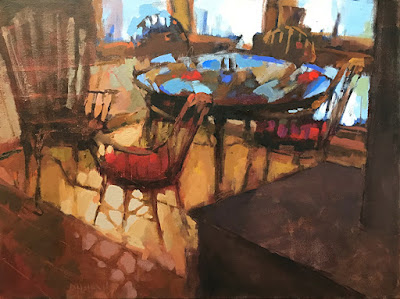
Five Chairs, by Pamela Hetherly, courtesy of Kelpie Gallery. This painting stopped me yesterday. The color is beautifully integrated, something thatā€™s lost in the photo.

I spent a few hours yesterday at the Kelpie Gallery in S. Thomaston. Iā€™d meant to drop paintings off and leave, but it is a very restful place with a clean, open atmosphere. I always spend more time there than I expect to. Susan Lewis Baines, the owner, is so interesting and interested that before you know it, the day is half over.

Itā€™s an airy, light space with grey walls, a grey tiled floor and lots of white trim. What little furniture there is, is elegant and subservient to the art. I look at Sueā€™s handmade desk (no, itā€™s not for sale) and wonder if I need one like it. Then I remember that I live in an old farmhouse and it wouldnā€™t match at all. As a decorator, Sue is light years ahead of me. Thatā€™s a great quality in a gallerist.
Sometimes I See, by Kay Sullivan, courtesy of the artist. Kay’s works are small, active, and yet somehow peaceful.
She represents a small stable of painters. These include vibrant small pastels by Kay Sullivan, the austere abstractions of Ann Sklar, mystical landscapes of Julie Haskell and Beth London, moody interiors by Pamela Hetherly, and the idiosyncratic landscapes of the late Erik Lundin. On first glance, the work is widely disparate. but the visitor notices that they all hang together well. They are united by a common color sensibility and composition. That makes it possible for high realism to hang side-by-side with abstraction and have the combination complement both paintings.
As different as the paintings are, thereā€™s definitely a group norm at work, and itā€™s bound to provoke a response from the visitor.
A crow painting by Beth London, available through the Kelpie Gallery.
I tell people I left New York because I canā€™t paint like a Hudson River Schoolpainter. It is a continuous tradition in New York, dating back two hundred years. In any other place, painting with that golden light and attention to detail would be an annoying affectation. But in New York, it has some wonderful modern practitioners, including Tarryl Gabeland Patrick McPhee.
Mary Byrom is at the Smithsonian American Art Museum this week. Yesterday, she commented about Abbott Handerson Thayerā€™s Roses, ā€œSuch a wonderful quiet stillness, from before these modern times. It makes a difference.ā€ Tarryl and Patrick can still tap into that stillness, and they have many fans because of it.
Untitled, by Erik Lundin. Courtesy of the Kelpie Gallery. His disinterest in selling made him the most unaffected of painters.
I donā€™t feel things in that way. Iā€™m thoroughly the product of my time, which means less value modeling and more color and brushwork. As long as I stayed in New York, I was subtly pushed toward painting a different way. Galleries liked it, jurors liked it. And I found it personally disheartening. I needed to seek out my own tribe. I did that by going on the road, and later by moving to Maine.*
This is where a good knowledge of art history proves useful. It allows you to see over the lip of the basket you live in, to see where you fit in the greater scheme of things. I like the basket I have moved to, but if I felt confined in it, Iā€™d be exploring other places and other representation.
————————
*An exception to this is Adirondack Plein Air, which is not style-driven. In fact, I find this true of plein air events in general. They usually attract a much wider variety of painters than from the local catchment area.

Missing the mark

Other people say itā€™s good, but you think itā€™s awful. What do you do with it?
Spruces and pines on the Brook Trail, by Carol L. Douglas. This is more or less where my mark-making is today.
Last week I listened to a fellow artist grumble about her painting. I really couldnā€™t see anything wrong with it; it was quite good, and I told her so. ā€œBut itā€™s not what I set out to do!ā€ she answered. The wind, the rain, and the changing light had robbed her scene of the vivacity sheā€™d first envisioned.
That causes a funny sort of brain cramp in artists. Our vision is so deeply overlaid with the pattern of what we want to say that the gap bothers us. We canā€™t see the strengths in our work because weā€™re focused on what is missing. In this case, my friend couldnā€™t see her strong composition and the brooding quality of the painting because she was mourning the light that had escaped behind clouds. ā€œI canā€™t even remember what attracted me to this scene in the first place,ā€ she said sadly.
Hedgerow in Paradise is from a time when I was hiding behind fraudulent brushwork. The only thing wrong with it was that it was fundamentally dishonest.
I was curious about this phenomenon so when I got home I asked a musician if this ever happens to him. ā€œOh, all the time,ā€ he laughed. He told me that heā€™d just finished composing and recording an album and to him it was totally rotten, because he hadnā€™t achieved his goals for the project. Still, he published it, and then he started something new.
A long time ago, Marilyn Fairman told me that the longer she painted, the less satisfied she was with her work. Iā€™ve noticed the same thing. If youā€™ve never been blindsided by the gap between your inner vision and the results, I suspect youā€™re not challenging yourself enough.
Spring Allee is another painting from the same period. The marks are better, perhaps because it’s a deeply autobiographical painting.
I struggled for many years with hating my own brushwork. I visualized long, sinuous lines of paint. Instead, my finish was always short, abrupt, and energetic. Because of that, I frequently overworked the finish in an attempt to obliterate my own handwriting. That invariably muddied what had started as a strong painting.
Finally, I realized this was a kind of self-loathing. It was akin to always hating yourself in photos (which, I confess, I do). I stopped fussing and forced myself to leave my brushwork alone.
Then I spent a long time in the wilderness. I eventually threw out this painting of Letchworth Gorge because it was so muddy.
If it were someone elseā€™s, I concluded, I would be fine with it. I might even love its jumping energy. But it told me something true about myself that I didnā€™t understand and found uncomfortable. I felt as if I had to hide this unexamined truth. Thatā€™s ironic, because painting is supposed to be forthright, and that was the most authentically honest thing about my work.
Middle Falls at Letchworth, by Carol L. Douglas. I spent that entire season at Letchworth Gorge and eventually came up with two paintings I thought were credible. It wasn’t until much later that I realized I’d finally cracked the problem of paint application.
What do you do with that dissatisfaction? This is where wiping out bad paintings is a bad practice. It steals the opportunity to study what has just happened. Iā€™ve learned to leave those canvases alone, carry them home, rack them to dry, and then revisit the work at a later date. By then, my memory of my ambition has faded. I can see the new painting in its own merits. Often, Iā€™m shocked to realize that I love the ones I once hated, and the ones that seemed to be easy successes now bore me.
Join me for Sea and Sky at Schoodic, August 5-10. Weā€™re strictly limited to twelve, but there are still seats open.

Jet lag from crossing back home

Time to ditch Daylight Savings Time, and move Maine to the Atlantic Time Zone
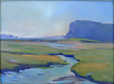
Marsh with running tide, Carol L. Douglas. These are my finished paintings from Parrsboro.
Crossing into New Brunswick, the Mainer goes from the Eastern Time Zone to the Atlantic. Thereā€™s one more time zone to the east on our continent, the little-known Newfoundland Time Zone, which is staggered on the half-hour. This is followed only on Newfoundland, its offshore islands, and the most southern parts of Labrador.
As weird as that is, itā€™s no weirder than the sprawling Eastern time zone, which starts somewhere around Grande-RiviĆØre, Quebec, and runs to Ontonagon, Michigan. Sunrise in Grande-RiviĆØre was at 4:17 AM this morning. It was at 6:03 AM in Ontonagon. Thatā€™s an unwieldy span.
Headlands, Carol L. Douglas
Our pre-clock ancestors marked the time of day by measuring with a sundial, making noon whatever time the sun was directly overhead. They werenā€™t worried that this was slightly different down the road. After all, if you walked from Winchester to Canterbury, any difference in the time would be lost along the way.
Greenwich Mean Time was established to aid navigators to determine longitude at sea. Nobody changed their clocks to match it; they just carried on with solar time right up to the 19th century.
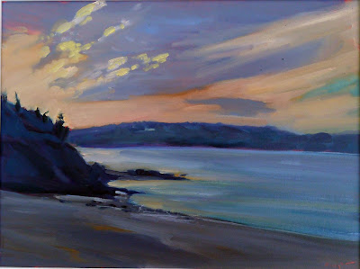
Breaking Dawn, Carol L. Douglas
Enter the railroads. It was a bit difficult to set a schedule when towns fifteen minutes apart by train used different time systems. By the middle of the 19th century, British rail companies were using Greenwich Mean Time and portable chronometers to standardize time keeping in Britain, although it was a tough sell in places. British clocks from this period sometimes had two minute hands, one for railroad time, and one for local time. But by 1880, Greenwich Mean Time was the standard for Great Britain.
Low tide, Carol L. Douglas
Here, time was confused in a uniquely American way. Every railroad company had its own standard time, based on where it was headquartered. Its schedules were printed in its own system, leaving the stationmaster at an important junction with the unenviable task of translating several different train linesā€™ timetables into local time. The solution was multiple clocks, one for each railroad.
Standardization was reached on Sunday, November 18, 1883, known as ā€œThe Day of Two Noons,ā€ when each railroad station clock was reset as it reached the standard-time noon. The western limit of Eastern Standard Time was my home town of Buffalo, NY. Thatā€™s more than 700 miles east of the current western boundary.
Fox River School, Carol L. Douglas.
Last fall, the Commonwealth of Massachusetts issued a report recommending that their state ditch Eastern Standard Time ā€œunder certain circumstances.ā€ Effectively, it would get rid of Daylight Savings Timeā€”hurrahā€”and put Massachusetts on Atlantic Time year round.
My quick-draw of Parrsboro and its mudflats.
Iā€™m all for ditching Daylight Savings Time nationwide. Itā€™s a meaningless exercise that throws our internal clocks off twice a year. Iā€™m also in favor of switching Maine to Atlantic Time. The sun rises 25 minutes earlier in Halifax than it does here. That puts our internal rhythms more in tune with the Maritime provinces than with Michigan. 
The problems of such a switch are overstated. If we can do business with Californians and Australians, we can probably figure out the time difference with New York.
A kindly carpenter made teepees for Cathy LaChance and me. Only in Canada!
It gets dark mighty early here in the winterā€”Bostonā€™s earliest nightfall is just 27 minutes later than in Anchorage. Since I live 185 miles north and east of Boston, itā€™s even worse here. Correspondingly, it gets light awfully early in the summer as well.
Have mercy on us, legislators, and let us get some rest.
Just one more workshop this calendar year, but it’s an awesome one! Sea and Sky at Schoodic, August 5-10. Be there or be square.
Not the Kardashians, but working on it

Parrsboro, NS, is working its way into being a regional arts center.

Breaking Dawn, by Carol L. Douglas. Second runner up at Parrsboro International Plein Air Festival.
This weekend there were lots of well-known faces at the Parrsboro International Plein Air Festival. Organizers snagged Richard Sneary to judge, and there were high-profile painters in the mix. It was a festival of luminaries, and the painting was first-rate. Iā€™m hoping that translates into Parrsboro becoming an arts destination for tourists and city-slickers.
Itā€™s not an impossible dream. Five miles down the road from my home is Rockland, ME. It started as a shipbuilding and fishing town, expanding to include canneries, grain mills, foundries, lumber mills, cooperies, tanneries, quarries, and other miscellany of coastal living. By the mid-twentieth century, its historic industries were moribund.
The Age of Sail workshop aboard American Eagle was scheduled to coincide with a gam, a rafting up of the historic vessels on Penobscot Bay.
Enter the Farnsworth Art Museum, established by Lucy Farnsworth in 1948. Itā€™s now the nucleus of a gallery scene that now rivals any art scene anywhere, both in volume and in quality.  Roughly 36.7 million tourists visited Maine in 2017, and weā€™re on track to break 40 million this year or next. Art is a big part of that tourism, and an important part of Maineā€™s image. I wish that for Parrsboro. If anyone can do it, the folks at Parrsboro Creative can. Theyā€™re smart, focused people.
One of the nicest things about traveling is meeting new people who tell me, ā€œI read your blog.ā€ This weekend, many added that they subscribe to two art things, my blog and Poppy Balserā€™s newsletter. Weā€™re both daughters of the Great White North and we both love boats. Poppy is a terrifically nice person, so I donā€™t mind at all being lumped in with her.
Hard at work about American Eagle, photo courtesy Ellen Trayer.
My blog is an example of that old maxim about genius being 99% perspiration. It works because I get up early every morning to write it, Monday to Friday. Other than holidays, the only time I donā€™t write is when Iā€™m out of network range, which was the case during last weekā€™s Age of Sailworkshop.
Itā€™s such a pity that I couldnā€™t share it with you because it was downright magical. American Eagle should really be called the Kindness, because the crew is so good-hearted. Any doubts as to whether a painting workshop on a boat could work were laid to rest. All participants enthusiastically said theyā€™d do it again next year.
Ellen demonstrates a paint-throwing technique to Lynn. We waited until we were off the boat before we did this.
Michael Fuller isnā€™t a plein air artist but he gamely tried the Quick Draw at Parrsboro anyway. ā€œIt makes you notice the transient things,ā€ he told me. I think thatā€™s what the boat workshop did as well. In a sketchbook done on the move, one takes away impressions, not finished pieces. The discipline will make you put away your cell phone and change how you work.
The discipline of getting up early is equally hard to break. I found myself restively trying to ā€˜sleep inā€™ on Saturday, so at 4:30 AM (Atlantic time) I quietly dressed and headed from my host billet near Fox River to the beach below Ottawa House. I stopped for coffee and a bagel at Tim Hortons and figured I was too late for the sunrise. I was wrong; the subtle pyrotechnics went on for some time.
This piece was the second runner-up, or third prize winner. I figured Richard Sneary gave it to me as a reward for being the only person nuts enough to get up that early.
Neither Parrsboro Creative nor American Eagle have set their calendar for next year, but I have every intention of doing both again. It was a wonderful week. Iā€™m just sorry that you couldnā€™t be there with me.

Monday Morning Art School: taking a reference photo

On vacation? Here are some tips for taking reference photos you can work from later.

Winter Lambing, 48X36, oil on linen, Carol L. Douglas.

My workshop aboard American Eagle included a professional filmmaker who once studied with Ansel Adams. She was taking pictures with her iPhone, a tool Adams could never have dreamed of. She used it like a ā€˜realā€™ camera, cropping, composing and controlling exposure on the fly. She wasnā€™t waiting for a scene to pass by her; she was making something magic happen. ā€œYou donā€™t take a photograph, you make it,ā€ Adams is famous for saying, and thatā€™s exactly what she was doing.

A great photograph does not necessarily translate into a great painting; in fact, in my experience, itā€™s very rare that it does. The photographer seeks to move us emotionally; the artist wants a picture that preserves information. The same spatial relationships that make a great photograph can appear contrived in a painting. High contrast blows out the details that the painter needs.

And here is the reference photo. It was a snowdrift, nothing more.
Photograph what really interests you. Itā€™s so easy to get sucked into what we ā€˜shouldā€™ take pictures of that we sometimes miss the essential object that we will need later. Go ahead and take fifty photos of the jack pine on the cove, and then put them in a folder labeled ā€œjack pine cove.ā€ On the day that you need a lonely tree for a composition, youā€™ll have it on hand. After all, film is cheap these days.
Donā€™t over-crop your photos. Often, Iā€™ve found that the information I needed to finish something was just to the left of the edge of my frame. ā€œYou need a camera with a zoom,ā€ one of my students told me. Actually, I donā€™t. Most modern digital cameras take such high-resolution photos that a small fraction of the frame can be blown up and used for painting.
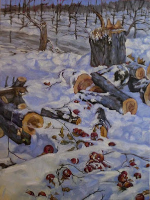
All Flesh is as Grass, 48X36, oil on linen, Carol L. Douglas.
I have a Panasonic Lumix camera with a Leica lens. It wasnā€™t terribly expensive. Itā€™s excellent in low-light situations, which means I can take even interior reference shots without a flash. Thatā€™s far more important than getting the details of the main topmast right from a quarter of a mile away. I can look those up; I canā€™t replace the details that get lost in bad light or by using a flash.
Of course, if I were a wildlife painter, Iā€™d need a totally different outfit. Then a massive zoom lens would be important.
Bracket your exposures. This means you should take one photo at a higher value and one at a lower value than what your camera chooses automatically. Even if you have the most basic point-and-shoot camera, you can do this by hovering on lighter and darker parts of the picture. If youā€™re unsure about how this works, consult your instruction manual!
The above painting relied heavily on photos I took of an apple tree being cut down across the street from me. They were wonderful pie apples, too, but the new owners wanted more conventional landscaping.
Understand the limitations of reference photos. The camera is as subjective as the human eye. It misrepresents color relationships, depth-of-field, and size relationships. It obliterates subtle differences in color temperature. Reference photos are invaluable, but they should be the slave to your sketches and field notes, not the other way around. Youā€™re under no obligation to represent every detail.
Which comes to my last and most important point: you shouldnā€™t be painting from other peopleā€™s photographs. This is more than just a question of legality (although thatā€™s a real consideration). This is a question of ideas. A well-realized photograph is a complete artistic statement in itself. You have nothing to add. Anyone who has painted a commission from someone elseā€™s snapshot knows just how much emotional information is missing when you werenā€™t there at the beginning.