Why art history is important

To be relevant as an artist, you need to understand your place in history.
The County Election, 1852, George Caleb Bingham, courtesy St. Louis Art Museum.

“If she only knew some art history, she could go from being a good painter to a great painter,” a fellow teacher once mused as we wandered through a show. The artist was a superb technician, but painting in a style that was in vogue 150 years ago.

Art history is an extension of straight-up human history. The little I learned in school, I learned in history class. Most of what I know, however, is self-taught, through reading and visiting museums and galleries. Over the years, I’ve gotten pretty good at it.
I think it’s possible to understand most of history by just looking at the pictures. Art, after all, is an expression of the cultural values of the society it was created in.
Consider The County Election, by Missouri artist George Caleb Bingham, above. Starting in the late 1840s, he began a series on American democracy. He critiqued the political process as he saw it. That in itself is historically interesting. But looking back on it through almost two centuries of history, we first notice the lack of women or minorities in 19th century democracy. By being true to his time, Bingham is able to talk to us today.
California gold diggers. Mining operations on the western shore of the Sacramento River, undated, Kelloggs & Comstock, New York, courtesy Beinecke Rare Book & Manuscript Library, Yale University. This tells us who the heavy lifters were in the early goldfields.
American public high schools offer no concentration in art history, although it’s possible to take an AP exam in the subject. In Britain, one can do an A-level in art history (the exam was nearly scrapped in 2016). That puts us at a disadvantage to our British cousins, right?
Not entirely. Bendor Grosvenor is an art dealer and BBC presenter who recently guest-lectured to a group of graduating art history majors at an unnamed university.  â€œ[W]hen I put an image of a well-known Titian on the screen, only one of them (of around 40) could identify the artist,” he wrote. “I asked what they had all been doing for the past few years; ‘reading’ came the unenthusiastic answer. I had been invited to discuss art-historical careers, and my advice was therefore simple: stop reading about art, and go and look at some.”
I’ve had an American art history major hanging around for several years now, and I know that she’s been schooled in attribution. She had to take a comprehensive examination in it to get her undergraduate degree. Luckily, we had amazing resources available, including the Met’s online database of 451,685 records. She quizzed herself on attribution until she had the western canon down cold.
Portrait of Margaret Kemble Gage, John Singleton Copley, 1771, courtesy of Timken Museum of Art. Looking at this portrait, can you see the patriot who would whisper her husband’s secrets to the Sons of Liberty five years later, sparking the American Revolution?
Her alma mater estimates that the cost of attending is now $62,882a year, or just about twice the annual real median personal income of $31,099in the United States. Her education was fantastic, but that is an absurd price tag. It pretty much excludes anyone but the wealthy from pursuing it. (Full disclosure: she attended community college first so that she could breathe the ether for only two years.)
Every large museum now has a database of its collection online—even the notoriously recondite Barnes Foundation has finally caved. These are a priceless resource. Then there’s SmartHistory, which I wrote about here.
On Monday, I said that anyone serious about painting should get their hands on a copy of Josef Albers’s Interaction of Color. I also believe that anyone serious about painting should know art history. The good news is that it won’t cost you a dime, and you can study from your laptop or tablet.

Frankly, that was plain rude

Don’t complain about the crassness of our president when you behave just as badly.


America, 2016, by Maurizio Cattelan, installed in a restroom at the Guggenheim.
The interesting thing wasn’t that someone sent me this story about the Guggenheim’s refusal to loan the Trumps a painting for the White House. The interesting thing was how manypeople sent it to me. Clearly it hit a nerve.
In brief, the Trumps requested the loan of Vincent van Gogh’s 1888 Landscape with Snow for use in their private living quarters. Curator Nancy Spector refused the loan because the painting has just come off tour. Had she left it at that, nobody would have raised an eyebrow.
But as a New York intellectual, Spector hates Donald Trump. She’s made no secret of it, using social media to trumpet her opinions. She has every right to do that.
La Nona Ora, by Maurizio Cattelan (1999), wax, clothing, polyester resin with metallic powder, volcanic rock, carpet, glass, sold at Christie’s for $886,000.
But it was sophomoric and rude to offer the Trumps a gold toilet on behalf of the Guggenheim. (You can read her letter here.)
Why should major museums loan artwork for a politician’s private residence in the first place? Since the Johnson administration, presidents have been borrowing important works from major American museums. “It might be a friend, it might be a decorator … but it was someone designated by the president and first lady to come to the National Gallery of Art and choose work,” curator Mark Rosenthal toldNPR. “It’s very much [like] a kid in a candy store.” A list of the 47 pieces borrowed by the Obamas can be read here.
America, the toilet, is the creation of contemporary artist Maurizio Cattelan and was installed for the past year in a public restroom on the Guggenheim’s fifth floor, intended for the use of visitors. Cattelan’s schtick is poking fun at the wealthy and powerful. His La Nona Ora (1999) shows Pope John Paul being struck down by a meteor. L.O.V.E. (2010) is a crippled hand giving the finger to the Milan stock exchange. This is the kind of thing some people think of as high-concept pranking. Apparently, they’ve never had teenaged sons.
The Ballad of Trotsky, 1996, by Maurizio Cattelan, sold in 2004 for $2.1 million.
America took $1 million in gold to create. What kind of artist can get his hands on that much gold? Only a wealthy one, or one with rich and adoring friends.
I usually ignore this stuff. I don’t admire it, any more than Nancy Spector admires what I do. But I believe in courtesy and decorum as the basis of a civilized society. Rudeness has become so unremarkable that even ladies who lunch feel free to do it. Lewd and crude commentary is the order of our day. But even those of us who did not support Trump in 2016 ought to respect the office of the Presidency and the White House.
Landscape with Snow, 1888, Vincent van Gogh. President Trump has been accused of having bad taste in art, but I too prefer this over Cattelan’s toilet.
Nancy Spector suffers from Groupthink, which means, sadly, that her snarkiness is going to be applauded, not condemned, in her insular little world. That doesn’t mean it will play in Peoria. While Spector’s gesture was meant as a slap at Trump, it’s felt by the people he represents.
Ironically, the crass and coarse President rose above the fray and did not deign to comment.

Monday Morning Art School: all color is relative

“Color is the most relative medium in art.” (Josef Albers)

Breakfast of the Birds, 1934, Gabriele MĂźnter 

Periodically, we’re going to dip into color theory as taught by Josef Albers. Today’s lesson is from Chapter 4 of his Interaction of Color. If you don’t own this book and are serious about painting, I suggest you buy it.

Each November, we Northerners go outside in our down jackets on the first 40°F day and we’re shivering with cold. Come spring, the mercury rises to 40°F again and we’re scampering around in shorts. This is an example of a tactile illusioncalled a contingent aftereffect.
There are visual equivalents, most notably the McCullough effect. These cause us to perceive colors differently depending on what surrounds them. Why this happens is still not completely understood, but they have something to do with edge-sensors in the brain.
Josef Albers understood how important these edge relationships are in painting. He devised an exercise to explore them. It was meant to be done with Color-Aid, which is a delicious but very expensive system of colored papers. You can just as easily go to the paint store and get similar paint chips for free. Or you can draw the design, mix paint, and apply it with a brush.
The important thing is that you must not have raised edges. If you do this with paint chips or Color-Aid, use a sharp blade to cut out the shapes and fit them together like a jigsaw puzzle.
Plate IV-1 from Interaction of Color by Josef Albers. Your assignment is to replicate this in different color schemes, with the two squares always the same color. (Courtesy Yale University Press)
In plate IV-1, the two small squares are the same color. This is the influenced color. The horizontal teal, dark blue, yellow and orange stripes are the influencing colors. In this example, it’s almost unbelievable that the influenced color is the same in both squares.
Your assignment is to repeat Plate IV-1 with other color combinations. You’ll find that some combinations are more pleasing than others. Some color combinations have more influence on the influenced color. Some colors are more easily influenced than others. The more you experiment, the more you’ll learn, and the more you share your homework with others on our Facebook homework site, the more others will learn.
Plate IV-2 from Interaction of Color by Josef Albers. Why do we perceive these grids so differently when they are exactly the same size? (Courtesy Yale University Press)
Plate IV-2 shows a grid of a secondary color on two different backgrounds made of its constituent primary colors. Our perception of the grid is very different when it’s set on cool blue or warm yellow. What is happening in our brains to create that difference?
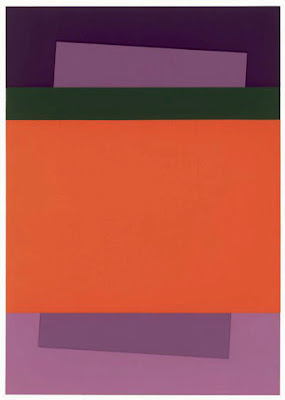
Plate IV-4 from Interaction of Color by Josef Albers again shows the relationship between influenced color and influencing color. (Courtesy Yale University Press)
In plate IV-4, the two interior violet shapes are the same color, but we see the top violet insert as the same as the bottom violet surround. The bottom surround is a tint (the color mixed with white) of the violet.
Albers designed these exercises to be completely abstract, so that your perception is not altered by symbolic or verbal thinking. Now, let’s toss in some meaning.
Gabriele MĂźnter’s Breakfast of the Birds with the drapery color changed.
At the very top of this post is Gabriele MĂźnter’s Breakfast of the Birds, 1934. MĂźnter had a difficult life, and this painting is thought to be autobiographical. The draperies have been described alternatively as cozy or claustrophobic, the model as reflective or isolated.

Immediately above, I have recolored the draperies to a cool blue. How does that change our perception of the other colors in the piece? How does it change the mood of the piece?

The brain that changes itself

Inborn talent? That’s just another take on that old lie, determinism.
Violinist. Painted so long ago I remember nothing about it.

If you’ve taken one of my classes or workshops, you know that I’m not a big believer in inborn talent. We are all born with great potential in many different areas. In some instances, that potential is magnified and a prodigy appears. In too many other cases, that potential withers from lack of nurture.

I don’t believe we’re born to be artists or mathematicians, any more than I believe we’re born to be depressives or alcoholics. That’s just a variation on that hoary old lie, Determinism. It’s not nice whether it shows up as eugenics, racism, gender roles or Predestination.
Of course, there are instances where the brain is damaged, either before birth or by accident or illness. But even this doesn’t necessarily mean the end of creativity. I know a guitarist who suffered a traumatic brain injury. He works hard to learn his parts, but he plays them with beautiful understated good taste, sensitivity and skill.
Creation, by Carol L. Douglas
One of my favorite books is Dr. Norman Doidge’s The Brain that Changes Itself. Doidge is a Columbia-trained psychiatrist and on the faculty at University of Toronto, so he’s not talking through his hat when he claims that the human brain is “a plastic, living organ that can actually change its own structure and function, even into old age.”
One of the ways the human brain adapts to injury or aging is by encouraging healthy brain regions to compensate for damaged areas. For example, music confers benefits to dementia patients. Conversely, damage in one neural pathway may hurt others. There is a linkbetween deafness and dementia. 
In some circumstances, healthy human brains cross-talk as a matter of course. This is a phenomenon called synesthesia, which is when stimulating one brain pathway leads to automatic, involuntary experiences in a second sensory or cognitive pathway.
In the most common form, letters are mentally associated with colors, but colors can be associated with sounds, or mathematical sequences can be seen spatially. More rarely, there is overlap between sensory stimulus and emotional states.
We know very little about what causes this. Heck, we didn’t even admit it was real until a few years ago. However, a 2014 paper suggests a linkbetween synesthetia and higher levels of creativity. 
Dancer, by Carol L. Douglas
Both synthesia and creativity work by creating or discovering links between different spheres, noted the authors, Lawrence E Marksand Catherine M. Mulvennad. These take the form of sensory links in synesthesia and conceptual links in metaphor. The sensory links are typically fixed and rigid. The conceptual links are mutable, however.
People with synesthesia show a greater capacity for creative cognition. This may be because of a link between synesthesia and neural hyperconnectivity, which plays a role in creativity.
Which came first, the synesthesia or the creativity? If Dr. Doidge is right, we all have the potential for running more than one process on the same neural tracks. I’m synesthetic myself, and I think they both grew up together in my brain.

A lament about bad design

American workers and engineering aren’t the problem. I blame our crummy washing machines on our corporate culture.

My oft-abused, much-loved Toyota Prius.
Regular followers of my travels know that I usually do them in a 2005 Toyota Prius. It has 250,000 miles on it, many of which were on back roads it was never designed to handle. In fact, its only major repair has been replacing the rear springs.
At the time I bought it, it was untried technology—in the US. But it had been sold in Japan since 1997. As of last year, Toyota has sold 4 million units of this car. It’s been a great success as a business venture.
My Prius replaced a Ford Windstar. At 148,000 miles, it suffered a catastrophic engine fail on a wintry road south of Binghamton, NY. That doesn’t tell the whole story. For the prior two years, it had been increasingly frail, needing large influxes of cash to keep moving.
It can move a whole show of paintings, or a party of snacks.
Last week, President Trump slapped steep tariffs on imports of washing machines and solar panels. This was in response to American manufacturers’ complaints about foreign competition. In washing machines, the tariffs will affect Samsung and LG. Not coincidentally, these are brands with excellent consumer ratings and satisfaction.
“Over the past three to five years, LG and Samsung have been driving washer innovations, more than other brands,” saidCR market analyst Mark Allwood.
In 2015, we purchased a house that came with two-year-old Whirlpool Cabrio washer and dryer. The washer lasted another two years. We replaced it with a laundry system made by Korean firm LG. That’s rather spectacular obsolescence, seeing as our previous washer dated from the 1980s.
I’d like to say that’s an anomaly, but it seems sadly common. I hear frequent complaints about the built-in obsolescence of American appliances. â€œIf you have an old refrigerator, dishwasher, stove, or washer, go to any lengths you can to keep it,” seems to be the common belief.
The conversation reminds me of the 1970s, when foreign imports were first taking a big piece of the American car market. Does anyone remember those Ford jokes, or how reliable those second-generation Toyota Corollas were in comparison? American automakers earned the loss of their major car market by building bad products based on false assumptions.
My other car, of course, is a bicycle. Here it is ready to paint in Camden.
I’ll assume the President’s impulse in setting these tariffs is to protect American jobs. Still, he’s hurting American consumers. Most of us are perfectly willing to buy American, but not when American corporations foist inferior products on us.
I’m not blaming American workers for this failure, or even American engineering. These products are designed and manufactured to financial realities that originate in our corporate culture. Is that so relentless about slashing costs that it doesn’t have time to build good consumer products?
What does this have to do with my life as a traveling artist? Well, I’m in New York again today, and once again I’m in an American-made car, my husband’s old Mercury minivan. It needs a major repair to get us home, and this is the third time this has happened in six months. I’m going back to Maine and trading it in for a Honda, quick, before the government slaps a tariff on those, too.

Water-miscible oils

They’re marketed as easier and safer than traditional oils. Are they?
Fitz Hugh Lane Day at Camden, by Carol L. Douglas. This would have been impossible to paint with water-miscible oils. They run at the first hint of atmospheric moisture.
Yesterday I got a note from a fellow professional mentioning that she’s finally seen the last of her water-miscible oil (WMO) paints. I was surprised she’d lasted this long.
Water miscible oil paint is engineered to be thinned and cleaned with water, thereby avoiding the supposedly-harmful use of turpentine. But few painters use turpentine anymore. It has been overwhelmingly replaced by odorless mineral spirits. Still, WMO are perceived as somehow ‘safer’ than regular oil paint.
Of course, the toxicity of paint rests not in its binders, but in its pigments. The heavy, or toxic, metals like copper, cobalt, cadmium, and lead are the worst. It’s impossible to avoid them completely, but when you buy paints, consider not just your own safety, but that of the poor schmoe in China who has to make them.
Traditionally, pigments were made in a binder of drying oil—flax, walnut, safflower or egg yolk—or gum Arabic, in the case of watercolor. All of these binders are organic, by the way. In the 20th century, we saw new binders developed, including alkyds, vinyl and acrylics. Water-miscible oils are in this class of engineered polymers.
Squall on Lake Huron, by Carol L. Douglas. I got soaked; so did my painting.
Most brands add an emulsifier, or detergent, that allows the linseed oil to accept up to 25% water by volume. Since emulsified paint rapidly becomes stodge, it’s wise to use as little water as you can with these paints.
Holbein’s Aqua Duo manipulates the polymer to accept water in a loose bond at the end of the chain. These paints contain no detergent. They tend to be less gummy than other WMO. However, they are marketed to be mixed with acrylics. Acrylics and oils dry so differently that this promises to be an archival disaster.
When this happens, the oil painter ducks, but can save his painting. WMO are immediately ruined.
WMO are designed to handle like oil paints, but in practice, they don’t. When thinned to a wash using water, they may refuse to adhere to the ground. At middle thicknesses, they dry more like gouache than like oil, with a flat surface and color shift. As impasto, they have the consistency of oatmeal. Like acrylics, their transparency changes as they dry. The paints have a different flow rate than conventional oils, so you can’t really place a long, lovely line with a loaded brush.
              
All oil paints dry through oxidation, but first the water-soluble oil must disperse the water through evaporation. That leaves the final surface slightly tacky to the touch.
Oil painters have been known to pick off the water droplets right before a sale. That’s impossible with WMO.
Most paint looks pretty good the moment it’s applied to a canvas. The question is, what will it look like when it’s been drying for a few hundred years? Oil paints develop cross-linked polymers that create a strong, tough surface over time. How will the emulsifier in water-miscible oils affect that? I don’t know, and neither does anyone else. They haven’t been around long enough.
How do manufacturers suggest you work around the technical limitations of WMO? By adding oil-based media to their product line: stand oils, quick dry media, or alkyds.
All of which defeats the purpose. Here’s a news flash: traditional oil painters wash our brushes with soap and water, too. I use a saddle soap, but any super-fatted soap will do. That’s because soap—like detergent—is an emulsifier. Soap is made up of molecules with different ends. One end loves water. The other end loves oil. It’s the same principle as the detergent in water-miscible oils, but applied at the end, where it can’t harm your painting or technique. Just rinse the solids out of your brush in your slops tank first, and you’ll find that oil brushes wash easily.

Thinking about teaching?

You might be an excellent painter, but make sure you understand your own process thoroughly. 

Me,teaching at Acadia National Park
I started writing Monday Morning Art School back in October. This was in response to my students’ need for continuing education while I was elsewhere. It was also a way to put my scattershot “how to” posts in some kind of framework.
It takes longer than the posts I write the rest of the week, and it’s more complicated. It does funny things to my readership stats as well: Monday Morning Art School gets fewer hits than any other day of the week, but I get more mail about it than about anything else.
The difficult thing about writing a “how to” is slicing and dicing your process. That’s true of teaching in general. It’s one thing to know how to do something, and another to be able to stand outside your work and explain it step-by-step to a beginner. In a classroom, you read your students’ reactions and adjust your method accordingly. Writing (or video) is a one-way street.
Painting by student Catherine Bullinger in a one-day workshop last summer.
A friend took drawing classes at a prestigious art school. I’ve wondered how a person with her mind could manage to not learn to draw in such a setting, but she did. She’s a brilliant woman. Drawing should have been a snap for her.
As I was writing about measuring curves as a series of straight line segments, I asked her if she’d ever been taught this simple skill. “The teacher was a wonderful botanical illustrator herself, but really in retrospect her teaching method was: ‘look at it and sketch it,’” she told me.
I’ve taken a few classes and workshops with great artists who couldn’t teach. At times the instructor thought that watching him paint was enough. No questions were allowed during the demo. That’s a real misunderstanding of the teacher’s role. His focus should be on describing and examining his process, not protecting it.
Students painting at Owls Head.
Anyway, if I wanted to watch someone paint, I’d have just bought the video.
Almost all artists get the idea somewhere along the way that they can teach, especially after their accountants tut-tut over their books. Many artists teach wonderfully, of course, and the world needs more people like them.
Others may be excellent painters, but haven’t analyzed their process thoroughly. Or, worse, they don’t have the communication skills to interact with strangers.
Yes, I demo, but there’s a lot more to teaching than that.
Before you decide to run that class, run a check on yourself as you start and finish a painting. Can you clearly describe all aspects of your process, or is some of it automatic and mysterious even to you? If the latter, do yourself and your students a favor and hold off on teaching until you’ve got it straight in your mind.
This, by the way, is a lesson I learned the hard way.

Monday Morning Art School: drawing draperies

Whether you want to make a drawing as detailed as Prud’hon’s or as simplified as Gauguin’s, the process is the same.

My precious linen drape.

If you’re lucky enough to own a worn mid-century linen tablecloth, don’t get rid of it. It can stand in as a drape under a still life, or as a sheet in a figure drawing. You can even iron it and put it over the deal table in your garret when company comes. If you don’t have one, you need a cotton sheet for today’s exercise. Throw it over something and let’s get going.

In the late eighteenth century, Neoclassicism brought drapery studies back to the forefront of art training. Their challenge and appeal were the same as in antiquity. Drapery plays peek-a-boo with the human form, exaggerating and pointing up the body’s activities. That artfulness is lost on modern viewers, and so is the skill of draping.
Same linen cloth, appearing as a sheet in The Laborer Resting, by Carol L. Douglas
Modern man wanders around in jeans and t-shirts. We don’t tend to draw people in them; most figure classes are done with nude models. We don’t learn much about rendering fabric, or about rendering people in clothes.
Free form curves are measured as straight line segments, as on the right, and then smoothed into their final shape.
We’ve talked about ellipses, but free-form curves appear often in the natural world, and especially in drapery. They’re wild and sinuous, and they can be very confusing. It helps to visualize them as straight-line segments that are joined up and smoothed, as in the above illustration. For a refresher on how to use your pencil to measure, click here.
This is done the same way; there are just more line segments.
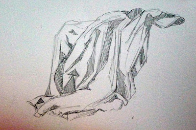
In my first pass, I have drawn all the curves of the drapes as straight-line segments. Pay no attention to value at this point. As always, measurement comes first. The most complicated shapes and shadows are still just a collection of angles, proportions and alignments.
With practice, you’ll be able to measure the curves as you draw them. You’ll still be measuring; you’ll just be doing it automatically.
Place the shadows. You get white or dark and that’s it. No shades of grey.
In your second pass, define the large areas of shadow. There is no detailed modeling done in this step, just placement of the large shapes. (If you’re nearsighted, you can take off your glasses for this step.) Don’t use value steps as we did two weeks ago: you get white and dark, and that’s it. Don’t refine your shapes, either.
Now you can start focusing on the details.
In your third pass, you can begin to explore the subtlety of the shapes and the relative values of each fold. Erase if you want, be more careful with your linework. If you love detailed drawing, start big and revel in this phase; it’s fun. Because you set the value relationships up front, you can’t really go wrong focusing on the details.
Drapery study, 1813, Pierre Paul Prud’hon, black and white chalk with stumping on blue paper, some squaring in black chalk (courtesy Metropolitan Museum of Art)
Why do I never finish these Monday Morning Art School drawings to the level of Pierre Paul Prud’hon’s wonderful drapery study at the Met, above? That kind of high finish is actually the easiest part of drawing, requiring just loads of time (and interest) to finish. It’s not where most people need help. They need help knowing how to fit all the puzzle pieces together at the beginning.
Whether you want to make a drawing as detailed as Prud’hon’s or as simplified as Gauguin’s, the process is the same—start by figuring out the shapes, then work out the shadow structure and then—and only then—worry about detailed modeling and mark-making.

Frumpy in the extreme

We build lousy modern churches because we don’t believe in the power of art.

The Kaiser-Wilhelm-Gedächtniskirchein Berlin (Courtesy Wikipedia)
One of the joys of being an intellectual mynah bird is that people lob the most interesting ideas my way. Yesterday someone said, “You know what makes me sad? The lack of passion in modern church design.” She is right. Modern American church design is frumpy in the extreme.
Consider Canterbury Cathedral, consecrated in 1070 AD. It’s meant to reach up to the heavens, while at the same time impressing and humbling the pilgrim. It is a good visual analogy of our longing for and relationship with God. It is the product of the highest and best gifts of eight centuries of artists. The relationship between God and man, our yearning, is palpable.
Lakewood Church in Houston, TX (Courtesy Wikipedia)
Compare that with the largest megachurch in the United States, Lakewood Church in Houston. Its congregation is 40,000 people. It’s housed in a building with all the charm of a basketball stadium. That’s no surprise; it’s the former home of the Houston Rockets. It has altar calls, but no altar. Its preachers work on a large stage.
Outside the city walls of Canterbury is the Church of St Martin, the oldest Christian house of worship in England. It was the private chapel of Queen Bertha of Kent in the 6th century, before Augustine arrived from Rome and officially established Christianity in Britain. It’s austere and slightly larger than my living room, but there is no doubt it is a sacred space.
The quire at Canterbury Cathedral (Courtesy Wikipedia)
Not all modern churches are terrible, of course. The original Kaiser-Wilhelm-Gedächtniskirchewas nearly destroyed in a bombing raid in 1943. It was rebuilt from 1959 to 1963, when Germany was recovering from the devastation of WWII. It’s a masterpiece of beautifully-crafted, controlled religious fervor.
Congregationalism may descend from the Puritans, but their austere churches were nonetheless beautiful, testimonies to the clear light of faith.
Old South Meeting House, Boston, MA (Courtesy Wikipedia)
Why, then, are modern American churches often so ugly? It’s not that we’re a post-Christian society; there are new congregations being formed and new churches being built here every day. And it’s not that we’re all poor; ours is the richest nation in the richest period in world history.
By and large, American Protestants subscribe to a practical theology of dualism. We believe that our physical space is separate from and less important than our spiritual life. We’re also transients at heart; we move around and take our churches with us. Like our Big Box stores, they’re built to be temporary. In part that comes from our premillennialist leanings. If Jesus is coming back soon, why waste money on the building?
The monumental choir screen at Chartres Cathedral (Courtesy Wikipedia)
We also feel guilty about art. Who among us hasn’t heard the canard that the Vatican should sell its treasures and use the money to feed the poor? That denies any connection to the transcendent, or any worship role for the architect and artist. It repudiates the purpose of the art.
Berninidid not build his amazing St. Peter’s Baldachinso it could be sold to grace some wealthy man’s office; he built it for the greater glory of God. And that’s a Biblical position. Bezalel was namedthe chief artisan of the Tabernacle by God himself, who said, “I have endowed him with a divine spirit of skill, ability, and knowledge in every kind of craft,” and then let him loose.
Of course, our culture as a whole is fashionable, rationalist, pragmatic, and consumerist. In church we want contemporary music, good production values and an entertaining preacher. They mean a stage and an audience, not an altar and congregation.
Churches see themselves as vendors of Christ, competing with vendors of other cultural properties, up and down the road. That doesn’t leave us much time or space to offer beauty up to the Lord.

Lois Dodd in New York

It’s not often you get to see the work of a living master, so go see this show while there’s still time.

Two Red Drapes and Part of White Sheet, 1981, Lois Dodd

If you like reading phrases like, “sets up a dialectic between an implication of distance and the optical immediacy of design,” by all means buy Lois Dodd, by Faye Hirsch. I don’t, but I like picture books. And I appreciate any attention paid to Lois Dodd. She is one of the masters of 20th century art, but has been overshadowed by her male brethren.

The 90-year-old painter has summered in Cushing, ME for six decades. She was part of a wave of New York modernists who came to Maine at the end of World War II. They were following an historic line of painters, starting with the Hudson River School artists. All of them found freedom and inspiration here. For Dodd and her peers, Maine was where they could break away from the strictures of Abstract Expressionism and explore representational painting.
Dodd never achieved the fame of the men who joined her on this trek to Maine: Fairfield PorterRackstraw DownesAlex Katz, Charles DuBack, and Neil Welliver. This was despite her sterling pedigree as a painter.

Globe Thistle, 1996, Lois Dodd

She was educated at Cooper Union, and one of five founding members of the Tanager Gallery. This was one of New York’s first artist cooperatives and central to the avant-garde scene of the time. Dodd taught at Brooklyn College and at Skowhegan School of Painting and Sculpture. She is an elected member of the American Academy and Institute of Arts and Letters and of the National Academy of Design.

Dodd didn’t receive her first solo museum show until 2013, and it wasn’t in New York, but at the Portland Museum of Art. “Artists who have experience in both New York and Maine will tell you that Maine is much friendlier to women artists,” wroteEdgar Allen Beam at the time. “Indeed, Caldbeck Gallery in Rockland, Dodd’s Maine gallery, can boast of gender equity with 51% of the artists it represents being women.
“I suppose the fact that Dodd mostly paints interiors, landscapes, gardens, flowers and female nudes in a very matter-of-fact modernist style of realism might explain why New York area museums – in love as they are with flash and fads – have failed her,” Beam continued.
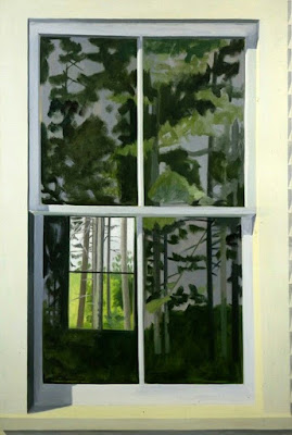
View Through Elliot’s Shack Looking South, 1971, Lois Dodd
Well, yeah. She’s not agonizing over sex, and she has an affection for the things she observes. What room does the art establishment have for that?
Meanwhile, the Alexandre Gallery, her New York representative, is finishing up its thirteenth show of Dodd’s work. Lois​ ​Dodd:​ ​Selected Paintings​, runs for one more week, until January 27, 2018.
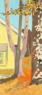
Two Trees, Afternoon Light, 2014, Lois Dodd
At 90, Dodd continues to paint, although she doesn’t get out like she used to. Mortality is staring her in the face, as it does with us all. She is one of the greatest living American masters, and this might be your last chance to see her work before she is frozen in time. If you’re in the metro New York area this week, you really should go.

Addendum:

Rewriting Painting

A panel discussion chaired by Barry Schwabsky, featuring painters Lois Dodd, Thomas Nozkowski and Philip Taaffe, and art critics Faye Hirsch and John Yau
Thursday, April 19, 2018, 6:30pm – 8pm

Join Barry Schwabsky and a panel of leading painters and critics for a lively debate on the state and shape of contemporary painting and its critical reception. How far have artists extended the boundaries of the medium in the 21st century, and what does it mean to be identified as a painter today? Is the word ‘painting’ still adequate to describe a practice which no longer necessarily involves paint or flat surfaces? And to what extent do the ways in which we write about painting influence both the public’s reception of the work and contemporary practice itself?