Wanna go sailing?

I’ll wager that you won’t find a more interesting brace of workshops anywhere.
The light is ever-changing on the open water.

If you’ve been following my blog for a while, you know I moved to Maine for the painting. The light, the sea and the granite coast have drawn artists here for 200 years. I was just the latest sucker they snared.

In the early spring of 2016, I wandered into the North End Shipyard and asked if I could paint while they worked. The smell of varnish in the cold morning air brought back memories of equally frigid mornings on Lake Ontario.
Exploring off the American Eagle.
That summer, Captain John Foss asked me to sail with him on the American Eagle. I painted some work I really liked. This October, I went out with them again, bringing watercolors instead of oils. I found that watercolor is perfect for capturing the changing scene from a boat under sail. And it’s less intimidating than oils. Several people tried painting with me.
This trip includes a gam, an open-water raft up of boats. That’s been known to include rowing troubadours.
When we got back to land, Captain Foss and I designed the perfect trip for the artistically-inclined boat lover. Next June, he and his crew will sail us around the coast of Maine on their beautifully-appointed boat, providing berths and all our meals. I will teach you watercolors.
From the galley.
Can you even paint on a moving boat? Heck, yeah, and it’s fascinating. The water, sky and shoreline are constantly changing. We’ve scheduled this workshop for the longest days of the year so that we’ll have plenty of time to paint sunrises and sunsets while at anchor.
What if you prefer your ocean from the shore?

Schoodic is a wild and isolated place, but still accessible from Bangor International Airport.
I offer a workshop at Acadia National Park’s Schoodic Institute every August. This is designed to help the painter find his or her own voice and style. It’s intensive, with morning and afternoon on-site painting sessions and lunch-time demos. Classes are kept small so every student gets the attention they deserve.
All mediums are welcome.
Acadia is famous for its ocean breakers and big granite outcroppings. I’ve ferreted out some very exciting spots to paint, both in and out of the park. By the time your week is done, you’ll be at one with the wind, waves and pounding surf.
Breakers by Carol L. Douglas.
Schoodic offers many other non-painting entertainments for the outdoors enthusiast. There’s biking, mountain climbing, fishing and hiking all in the immediate area. Seabirds, dolphins and grey seals are regularly sighted off the coast here.
Both trips are also all-inclusive, so you don’t have to worry about meals or accommodations. And both are designed so it’s easy to bring your non-painting partner.
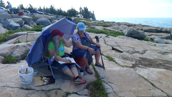
The instruction is one-on-one and intensive.
Why am I mentioning this now? Christmas is coming, but that’s not all. If you register before January 1 for either workshop, you get a discount. And I’m willing to wager that you won’t find a more interesting brace of workshops anywhere.
You can learn more about both workshops here.

Monday Morning Art School: mastering your color palette

Monday Morning Art School now has a Facebook page, a place for online students to post their homework and look at others’ projects. I’ll look in to see what you’re doing. Try to limit your posts to the class exercises, please.
Today’s project is designed to help you learn more about the colors you’ve chosen and to give you more confidence in mixing colors. You can do this in any medium: oils, acrylics, pastels, gouache, colored pencils, watercolor, or even a dime-store paint kit. The examples were done with a Winsor& Newton field kit by my student Sheryl in my Rockport, ME class.
My wheel, above, is an approximation. Every manufacturer formulates its colors differently. Still, I’ve tried to match a pigment name with each spot on the wheel. The biggest circles are what we call the primary colors, followed in size by the secondary colors, and then the tertiary colors.
The outside of the wheel represents the highest chroma (intensity) colors. The center of the wheel represents low-chroma neutrals. The circles in the middle are the common earth pigments.
Start by drawing two circles, one inside of the other, on a piece of paper or a primed white canvas. Then draw a triangle inside the circle to help position your colors.
We’re going to use paint straight out of the tube. The colors on the outside of the wheel are modern pigments. They’re the highest chroma. The earth tones are historic pigments and less intense. Black falls in the middle.
Use only the paints you carry in your paint kit. No painter has everything. One point of this exercise is to find the holes in your colorspace.
Sheryl’s palette, interpreted on the color wheel above. Note how lacking her palette is in cool tones.
Find the closest thing you have to true red, blue and yellow. Choose paints that don’t have overtones of other colors. You might not have a color that is a true primary. Don’t force another color into that spot. Sheryl’s kit didn’t have a clear blue. She put both her blue dots to the left of the primary blue square, because they were both a little on the violet side. Another common paint is cadmium yellow medium. It’s actually pretty orange, so it goes to the side of true yellow. Label your colors, if you know their names.
You will have some tubes in your paint kit that don’t belong on the outside of the color wheel at all. Besides the earth tones, tubes that contain more than one pigment are less intense than straight pigments. (Pigments are usually listed on the tube.) Approximate where they go. For example, Sheryl has sap green, which is mix. She put it slightly inside the pure-pigment wheel, because it’s on the dull side.
Check your color wheel to see where you have gaps. Sheryl’s paint wheel is strongly weighted toward the warm colors—reds and yellows—and short on the blues and violets.
Sheryl’s finished wheel, showing various mixes of pigments. Yours should look something like this.
Draw a dotted line from two pigments on the outside of your color wheel—say quinacridone rose to ultramarine blue. Then make a mixture of those two colors and put a circle of that paint between the two. Repeat this with different combinations until you get bored.
Note that the holes in Sheryl’s palette means she can’t hit a clear blue-green or a clear purple.

Pastel and pencil artists can fill in the missing points with colors they have in their boxes, or they can mix combinations.
You should notice three things:

  • Mixing across the color wheel gives you beautiful neutral tones. They are far more interesting than mixing black and white to get grey;
  • You can never mix a paint that’s more brilliant than the straight-from-the-tube paints you started with. If all your paints are on the dull side, your finished painting will be dull too.
  • What you learned about primary colors in elementary school is only partially true. I remember my disappointment while trying to mix purple as a kid; that was because the paints I had weren’t true blues or reds.

Note: These lessons are a learning experience for me as well as you. I’ve taught painting for many years, but teaching in print is a new experience for me. I’m still trying to figure it out, so your suggestions and input are appreciated. You can email me here.

Iconoclastic fury

History tells us that tearing down statues is divisive and traumatic, a sort of village-by-village civil war.

The Ghent Altarpiece survived destruction because of the courageous actions of a few.
Yesterday, red paint was splashed on the statue of Theodore Roosevelt on the steps of the American Museum of Natural History in New York City. This comes on the heels of Mayor Bill de Blasio’s appointment of a commission to review monuments, and calls by activists to remove this particular ‘racist’ statue. These follow a nationwide wave of monument destruction.
There is a word for this in English: iconoclasm. This specifically means the destruction of icons, images or monuments for religious or political reasons. It happens during political revolution and periods of religious fervor. We decry it when it is done by the Taliban; are we willing to examine our own behavior with the same critical lens?
Remains of Reformation iconoclasm, Clocher Saint-BarthĂ©lĂ©my, La Rochelle, France, courtesy World Imaging.
The Protestant Reformation unleashed a wave of iconoclasm across Northern Europe and England in the 16th century. The result was the destruction of significant cultural works, including many more Northern European Renaissance paintings than were ever saved.
These attacks went by different names: the Iconoclastic Fury, the Beeldenstorm (Dutch), Bildersturm (German) or, in England, the Dissolution of the Monasteries. In France, the violence was part of the Huguenot Wars. Whatever it was called, it was part of the anti-Catholic revolution we now call the Reformation. The violence was often official.
No thought was given to the artistic heritage of the destroyed works. In England, 90% of religious art was destroyed in the years following the Reformation. The percentages are probably similar in Germany and the Low Countries. The purge extended equally to music and literature.
Altar piece in St. Martin’s Cathedral, Utrecht, attacked in the Beeldenstorm in 1566. This was hidden behind a false wall and rediscovered in 1919. Courtesy Pepijntje.
Occasionally, great works were saved by individuals or families. The most well-known is the van Eycks‘ Ghent Altarpiece, an outstanding example of Early Netherlandish painting. It was already famous in August of 1556, when the Beeldenstorm hit Ghent. An attack on the Cathedral on August 19 was deterred by guards. On August 21, the iconoclasts used a tree trunk as a battering ram to break through the doors. By then the panels and the guards had been hidden on the narrow spiral staircase within the tower. The panels were then hidden in the town hall. The original, elaborate frame was destroyed.
In Britain, Henry VIII disbanded monasteries, priories, convents and friaries in his dominions. He took their income and sold, appropriated or destroyed their assets. Much of this served to fund his military campaigns in the 1540s.
Shrines to saints were destroyed, libraries were burned, and many precious relics were lost. The more fortunate of cathedrals and abbeys saw their jeweled reliquaries stripped, precious metals and ornaments looted, and their painted walls covered with whitewash. The less fortunate houses were leveled and their leaders strung up. Among these were Glastonbury Abbey, legendary for the tomb of King Arthur.
Medieval altarpiece fragments destroyed during the English Dissolution, mid-16th century, courtesy PHGCOM, photographed at the Museum of London. 
Henry’s son, Edward, was depicted during his life and afterwards as a new Josiah, destroying the idols of Baal. Although he only reigned six years, they had a lasting impact on the English Reformation. His counter-reforming sister is now remembered as Bloody Mary, but she was just another 16th century leader who used murder to advance her religious agenda.
As I watch our country going through its first real experience with iconoclasm, I wonder about a favorite bronze relief in Boston. An historical illiterate might see the Robert Gould Shaw Memorial as racist. After all, it’s a white officer on horseback, surrounded by black men. But it’s not, and it’s also a masterpiece by Augustus Saint-Gaudens.
As the 16th century saw, violence against objects usually goes hand in hand with violence against people. The destruction was divisive and traumatic to communities, a sort of civil war on a town-by-town basis. It’s nothing you’d wish on the people you love.

Baloney or Malarkey, what’s your pleasure?

English is the lingua franca of the modern world, but I’m not sure how well that’s working.

Still life by Carol L. Douglas

If you manage your time right, it’s possible to be a professional artist without ever lifting a brush. It’s very easy for the administrative work of a small shop to swamp the creative time.

In some ways, the time we spend on hold is the price we pay for the convenience of living in the computer age. Our ancestors would probably happily trade sitting by the phone for a take-out dinner.
At work it’s a different story. Of all the rabbit holes the self-employed person can go down, a ‘customer-service’ call is the worst. Especially since so many modern corporations no longer talk to you in person, but require that you ‘chat’ online. At least with a phone hold you can reline the kitchen cabinets or straighten your pencil drawer while you’re waiting.
Still life by Carol L. Douglas
Yesterday I did a chat help that lasted two hours, 32 minutes and 47 seconds. You might think that’s not so bad (if you’re insane), but it was the third one in eight days. The first one lasted two hours, nine minutes and 25 seconds. The second one I forgot to record.
I used to believe these were happening with a living person whose English wasn’t good, but now I’m not so sure. Certain phrases repeat through the conversation, like “I am checking it for you Carol,” or “Please may I get to know
” or “I would like to suggest you that please
”
Eventually I told the other party that I’d been holding so long I needed a bathroom. “What I can see is that you can again come up with the same case number after you had a bath,” it replied.
Still life by Carol L. Douglas
We duly got through the reinstall and it didn’t work, as it hadn’t worked on the previous three tries. 
“I would like to suggest you that please follow the steps again I have share with you,” wrote the bot.
“You mean you want me to uninstall and reinstall the software again?” I asked. It takes about an hour.
“In above chat I have share with you,” came the cryptic reply.
My case has been bounced to another “team” of specialists. They promise to respond within 48 or 72 or 96 hours. Meanwhile, my ads for my workshops aren’t done.
Hah! The joke’s on you! Painting by Carol L. Douglas
I was very philosophical until my bot signed off with, “I understand how inconvenient this is,” an automated comment if there ever was one. No, I don’t think you do, bot. Human beings have a finite life span. Time matters to us.
This morning I got up to a comment on my post about the scientists of color. It was in Hindi, and I expected it would be an ad for sunglasses (which is why comments on this blog are now moderated). Google translated it for me. It read in part, “Crops used to use the crop in Madhya Pradesh in the central area of ​​the overthrow of the crop fields or other birds, they eat your armor. Hummingbird think that was a real man tight figures in old clothes, and go in fear, well, firstly remove Bkshyon the Scarpon, but they will stay away from any kind, understand, even when happy Landry, a few days
”
I can’t believe my bot is now sending me personal messages.

The trouble with nocturnes

Modern nocturnes document only the contrast between bright lights and the void. There are so many other cool things that go bump in the night.

Nocturne in Blue and Gold: Old Battersea Bridge, c. 1872-1875, James Abbott McNeill Whistler

Yesterday, a student was describing a late-evening sky she had seen, with the objects bathed in an unusual warm light. “I’m sick of nocturnes always being done in Prussian blue fading to black,” she complained. Since she has an MA in art history and works in a gallery, she’s not talking through her hat.

“We always paint nocturnes wearing headlamps,” said another student. “The human eye takes about 25 minutes to fully adapt from bright sunlight to complete darkness, and the headlamp continuously interrupts that. Cameras lie, too, about what darkness looks like.”
The Polish Rider, 1655, Rembrandt van Rijn 
She had just explained the technical problem with painting nocturnes in a nutshell. They are driven by our current technology—headlamps and easel lights—just as the high contrast of Frederic Remington’s nocturnes were driven by camera technology of his day. Headlamps and easel lights exaggerate the contrast between dark and light because they’re constantly stimulating our eyes to stay in a photopic(daylight) state.
Winter, Midnight, 1894, Childe Hassam
Human night vision is limited to discriminating between different values of black and white, and the resolution and contrast are poorer. But there are many steps between light and true darkness, and most nocturnes are in fact painted using mesopicvision, which we use when we’re faced with a combination of lighting.
Moonlight, Ralph Albert Blakelock
When we transition from day to night, our eyes create photopigments in the cones and rods to increase sensitivity. The adaptation period is different for rod and cone cells. Cone cells can do this in about ten minutes of darkness, but rods require between 30-45 minutes. There are, of course, differences in how fast each of us can make the adaptation. Old age, as with so many other things, slows us down.
Snow in New York, 1902, Robert Henri
The transition from dark to light happens much more quickly. It takes about five minutes for the eyes to bleach out the photopigments they created to see in the dark.
The Call for Help, Frederic Remington
Humans are color-blind in true low-light situations. However, at twilight, when most nocturnes were painted, we suffer from something called the Purkinje shift. During the daytime, people are most sensitive to light that is greenish-yellow. At night, people are more sensitive to greenish-blue light.
The Tornado, 1835, Thomas Cole
The rods in our eyes (which are more light-sensitive and thus more important in low-light situations) respond best to green-blue light. The cones in the retina, which respond to colors, don’t work well in lower-light situations. As the light gets lower, our ability to see reds falls off.
Moonrise, 1894, David Davies
Scientists and tinkerers have long understood that red lights don’t trigger our eyes into photopic vision. That’s why they’re used in control rooms or the nocturnal animal displays at the zoo.  
Starry Night Over the RhĂŽne, 1888, Vincent Van Gogh
Historically, nocturnes were about solitude, or sometimes, bad behavior. In our jazzed, electric world, they’re more likely to focus on lighting and energy. The modern nocturne is always a description of civilization overtaking nature. It is a brightly-lit subject set against an empty field of blackness. By definition, that’s urban, and it contrasts our desires against our fears. The best modern nocturnes create a place to go to escape encroaching darkness. I’d say there’s more to that than just how our eyes work, but our vision certainly plays a part.
Nocturnes are very popular right now, both with painters and with buyers. I don’t paint them often, because I’m not a night person, but several of my friends do, and do it well.
Hiawatha, 1870, Thomas Eakins
Today’s post is absurdly larded with illustrations, but I wanted to show you the many ways in which people painted nocturnes before we had headlamps.

The Internet is a control freak

There is no Fountain of Youth on the internet. Publish or perish, my friend.

Jonathan Submarining, 2016, Carol L. Douglas
Earlier this month, I went sailing. That made social media almost impossible. I could have found a workaround solution, but it would have been time-consuming. Constantly searching for a phone signal to make my next tweet, post, or pin would have wrecked my trip.
I’ve written before about how important frequency is to blogging. The results of my mini-vacation were immediate and dramatic. The following week, hits to my blog dropped by half. It was as if Social Media was in a snit, refusing to speak to me. I was talking to myself in an empty room. Then, suddenly, I was forgiven and my readership went back to normal.
If Social Media were a person and had given me the silent treatment because I went sailing, I’d know exactly what to do about it. I don’t have much use for control freaks. But in our relationship, Social Media holds the whip card. I need her more than she needs me.
J&E Riggins and Bowdoin in Castine Harbor, 2016, Carol L. Douglas
Most artists don’t have access to market research, so we end up guessing a lot, looking at successful posters and trying to figure out how they manage to get so many followers.
Guessing, of course, is just a nasty word for ‘testing.’ We read, try things, fail, and try again.
A marketing guru gives the following as his schedule:
  • Tweet 14 times a day during the week, seven times a day on weekends;
  • Post to Facebook twice a day, once at 10 AM and once at 3 PM;
  • Post to LinkedIn once each weekday, at 8 AM;
  • Post to Google+ twice each weekday, at 9 AM and 7 PM.

Obviously, there’s a big problem here for one-man shops like ours. We don’t have the staff to post at 3 AM, and we don’t have the time (or in some cases the knowledge) to automate posts to go ‘bang’ at that hour.
Storm over Lake Huron, 2016, Carol L. Douglas
Socialbakers, a media analytics company, found that the sweet spot on Facebook is five to ten posts a week. Of course, that was done in 2011, and Facebook has tweaked its algorithms many times since then.
They also say that between three and five tweets a day gives you the optimal engagement per tweet. This isn’t, of course, the optimal engagement for your brand, it’s just the point where you wring out the most value for your work. If you want to get the most value for your Twitter presence, multiply that by ten. No joke.
I’m never going to tweet 30 times a day. I haven’t got that many insights. I’m not sure I can stretch them to 3-5 times a day.
Parker dinghy, 2015, Carol L. Douglas 
Social media experts measure posts by ‘half-life,’ which is the time it takes for your post to reach half its total engagements.
Twitter’s half-life is eighteen minutes. Instagram’s is slightly less than an hour. Facebook posts have a half-life of 90 minutes. Conversely, a Pinterest post has a half-life of 3.5 months.
It helps to live in the eastern time zone. About half of Americans do, which means you get a timing advantage.
What does this tell us? Basically, that artists can use the so-called ‘free’ marketing platforms to great effect, but only if we’re constant and aggressive. Otherwise, we’ll sink without a trace.
Note: if you want to read this blog without having to find it on Social Media, you can always subscribe. There’s a subscription box right below that gold medal on the top right.

Monday Morning Art School: Mixing color

Mixing paint colors is easy, but practice makes perfect.

Balmoral Castle from the Approach (Abergeldie Side), 1852, Watercolor, by Queen Victoria.
If you think you’re too busy to paint, consider the above watercolor. It was painted by a mother of nine with a demanding full-time job: Queen Victoria. Note the fine, restrained greens in it and the cool autumn sky. If a queen can do it, so can you.
Green is a so-called secondary color, meaning it is made from a combination of two primary colors (yellow and blue). A secondary color is always across the color wheel from a primary color. It’s handy to remember that. If you want to neutralize a color in a hurry, a fast way to do it is to mix it with whatever’s across the color wheel. That’s its complement.
The conventional color wheel.
There are no pure paint pigments. They all have overtones that muddy them up in certain mixes. That’s why your local paint dealer uses many, many more pigments than just red, blue, and yellow. Most artist palettes also have duplicates. I use paired primaries, meaning I have a warm and cool blue, warm and cool red, and warm and cool yellow. (Here are my supply lists for oilsacrylics, and watercolors.)
The distinction between warm and cool colors has been important since the Impressionists, who emphasized the color of light in their paintings. Warm colors are said to be hues from red through yellow and cool colors are said to be the hues from green through violet. There is no ‘right’ answer to which colors are the anchors, but convention says the peaks are red-orange and blue-green.
Paired primaries.
I should stress that this is a convention, not a fact. In reality, the hottest stars radiate blue light, and cooler ones are red. Much of what we believe about the psychology of color is hocus pocus.
The only part of this that concerns the painter are the attributes of each individual pigment. We say that Hansa yellow is cooler than cadmium yellow deep, even though they’re both ‘warm’ colors. We mean that if you are trying to mix a greenish yellow, you’ll get a clearer shade with the Hansa than you will with the cadmium. If you’re trying to go more orange, start with the cadmium. The warm-cool language is just a convenient way of saying that.
I lay my paints out in hue-order, and encourage my students to do so, too. Not only does this eliminate the “hunt and peck” method of mixing, it makes it easier for you to compare pigments.
The business of mixing color is simple, but it needs to be practiced. First, find the pigment that’s closest to where you want to end up. Then, determine if it needs to be warmer or cooler and modulate it with the appropriate neighbor. If it’s too intense (too high in chroma), you can cut that by adding some of its complement. That’s the color across the color wheel from the original. In oils and acrylics, you lighten the color with white; in watercolor, you dilute it.
In some cases, you might start with a color that’s too dull. For example, chromium oxide green (PG17) is a good, opaque, solid, non-fading green, but it’s relatively low in chroma (intensity). It can only be made even more dull, not tarted up to greater brilliance. If you use that green on your palette, you may need to back up and mix a green with blue (or black) and yellow to get to the appropriate starting point.
A good way to look at this is to imagine the neutral colors as occupying the middle space of the color wheel. You can easily get to neutral by mixing paints across the wheel, but you can never get more intense than your starting point.
Today’s exercise involves stopping at your local hardware store for a few paint swatches. These are Benjamin Moore brand, but you should be able to find similar ones anywhere. There are two off-whites: one cool and one warm. There’s yellow, green, and two soft blues. Your assignment is to mix until you think you’ve hit the exact color. Then put a dot of it on the card to see how close you got. (If you’re working in watercolor, the dot goes on paper instead.)
I also ask my students to make neutrals using combinations of ultramarine blue with burnt sienna and raw sienna. I use the combination of ultramarine blue and burnt sienna as my standard dark neutral, because it can go to the warm or cool side depending on how it is mixed.
These combinations are my starting point for rocks and sands. They’re a variation on the complement set of blue-orange. But you can make good neutrals with other complement sets. Try purple and yellow or red and green. Each has its own character. 

Am I done yet?

“Don’t overwork it” is terrible advice. Even the freshest of Impressionists reworked paintings.
Vase of Flowers, started 1882, Claude Monet

Yesterday I wrote about scientific research into color perception and how that affected painting at the end of the 20th century. Another major change of the same period had to do with what constituted a finished painting.

For earlier generations, a painting was complete when it had a slick surface with plenty of detail. The mechanics of painting were carefully hidden underneath the bling of the finish layer. Part of the ideal was that the viewer should have no idea about the sheer hard graft involved in painting. Unfinished paintings had no place in collections and were often destroyed on an artist’s death.
Late 19th century painters inserted the process of painting into the finished work. They used thick impasto, left parts of their canvas bare, and kept outlines and drawing marks visible. That made the painting a temporal record of development as much as a snapshot of a moment. These ideas continue into the modern period (perhaps in some cases to overripeness).
Edmondo and Therese Morbilli, started 1866, Edgar Degas
But were they ever that straightforward? Recently, researchers Kimberly Jones and Ann Hoenigswald analyzedEdgar Degas’ portrait of Edmondo and ThĂ©rĂšse Morbilli at the National Gallery of Art in Washington. They were trying to determine what “finished” meant to Degas.
Degas was a compulsive tweaker of his paintings, sometimes repainting them even after they’d been shown and sold. Many of his paintings appear to be unfinished, but are they? Jones and Hoenigswald discovered that this Morbilli portrait (he painted the couple more than once) was extensively reworked over a period of decades. Passages that appear to be open ground were, in fact, painted over sections with finished detail. The researchers’ conclusion was that, even though they could lay the order of his process bare, they could not determine his intentions.
The myth is that Impressionists recorded things quickly, easily and confidently. Claude Monet’s Vase of Flowers appears to be a finished painting, but in his correspondence, he mentioned his dissatisfaction with it. Analysis shows that he repeatedly returned to it, scraping paint off or painting over dried sections. It sat in his studio for forty years, occasionally being reworked, until he signed it in the 1920s. Did he truly think it was finished, or was he, in his eighties, just sick of working on it?
Route tournante Ă  La Roche-Guyon (A Turn in the Road at La Roche-Guyon), 1885, Paul CĂ©zanne. When part of the aesthetic is to show the bare bones of process, how can anyone but the artist say a painting is done?
Part of the shift in what constituted ‘finished’ might have been driven by economics. During the Renaissance, most work was done to commission. An artist didn’t have the luxury to continuously fiddle with his work.
But part of this is also attitude, and it’s worth thinking about in terms of our own work. Camille Picasso famously said, ‘To finish a work is to kill it.’ The modern interpretation of this is the overused injunction to “not overwork” a painting. This is a corruption of the process-baring aesthetic, and usually terrible advice. If you don’t hit your limit, you’ll never learn how to negotiate past or around it. Jones and Hoenigswald’s analysis shows us that, for Degas, it was possible to bring a painting back from the brink repeatedly.

When part of the aesthetic is process—as it is now—only the artist can definitely say that a painting is finished.

How we arrive at completion is another matter. I prefer a less-detailed surface myself. I often get there by painting over, painting out, and scraping out fussy passages, and, yes, paintings sit around my studio for a long time sometimes. It’s nice to see these techniques validated by art historians.

The scientists of color

We owe a great debt to the engineers and scientists of the 19th century. In many ways, they invented modern painting.
In the Time of Harmony. The Golden Age is not in the Past, it is in the Future, 1893–95, Paul Signac, Mairie de Montreuil

A friend once told me engineers were ‘boring.’ Having now been married to one for 37 years, I can tell you that she was wrong. Equally importantly, we wouldn’t have much art without science and engineering. Art rests on discoveries in the physical world.

Bright Earth: Art and the Invention of Color by Philip Ball is a fun read. It also makes the serious point that art isn’t created merely by artists. Art incorporates the scientific and engineering innovations of its day.
Ball’s emphasis is on the advances made in pigment technology in the 19th century, and how they influenced Impressionism. That’s true as far as it goes, but scientific insight into perception also influenced how painters handled color.
Impression, soleil levant (Impression, Sunrise), 1872, Claude Monet, MusĂ©e Marmottan Monet. This painting is what gave the movement its name.
Michel EugĂšne Chevreul was a famous French chemist. He is best remembered for having invented margarine. He was also the director of the dye works at the Gobelins Manufactory in Paris. In trying to make a uniform black dye, he realized that a color was perceived differently based on its setting. This lead to the idea of simultaneous contrast, which in turn led to the Impressionist understanding of complementary colors.
Scientists have a great influence on art, but they are sometimes reactionary. Chevreul believed chiaroscuro was the most important element in creating natural, or lifelike, paintings. Instead, Impressionists turned to his color relationships to define light and shadows.
Scottish physicist James Clerk Maxwellis most famous for his theory of electromagnetic radiation, but his interests were wide. He was particularly interested in color perception, color-blindness, and color theory. Using linear algebra, he proved that all human color perception was based on three types of receptors. He is the father of colorimetry, or the systematic measurement of color perception.
An image of James Clerk Maxwell’s color photograph of a tartan ribbon. Scanned from The Illustrated History of Colour Photography, Jack H. Coote, 1993
Based on his research into the psychology of color perception, Maxwell designed the first color photography system. He proposed that a color photograph could be made by shooting three black-and-white pictures through red, green and blue filters and then projecting it in the same way. He demonstrated this first color photograph in 1861.
American physicist Ogden Rood was also an avid painter, a member of the American Watercolor Society. Rood divided color into three constants: purity, luminosity, and hue. In 1874 he gave two lectures to the National Academy of Design in New York on Modern Optics in Painting.
La RĂ©colte des Foins, Éragny, 1887, Camille Pissarro, Van Gogh Museum.
Rood suggested that small dots or lines of different colors, when viewed from a distance, would blend into a new color. He believed that the complementary colors of his color wheel, when applied in pairs by the artist, would enhance the presence of a painting: “… paintings, made up almost entirely of tints that by themselves seem modest and far from brilliant, often strike us as being rich and gorgeous in colour, while, on the other hand, the most gaudy colours can easily be arranged so as to produce a depressing effect on the beholder.”
Rood’s theory of contrasting colors influenced Impressionism, and was particularly influential on  Georges-Pierre Seurat. Seurat called his new style chromo-luminarism; Pointillism was a derogatory term invented by his critics. We are now so used to optics experiments in painting that we hardly  give any thought to their origins. But we, along with the painters who came before us, owe a great debt to the work of Maxwell, Chevreul, Rood and others.

Linden Frederick: Night Stories

What happens when you create the illustration first and ask a writer to craft the story?
50 Percent, 2016, oil on linen, by Linden Frederick. This painting inspired the short story, Vital Signs, by Lois Lowry. (Forum Gallery.)

Last week my pal Pamela took me to Rockland to see Linden Frederick: Night Stories at the Center for Maine Contemporary Art (CMCA). Pamela is an avid reader of contemporary fiction. She was interested in the short stories accompanying the paintings. These are by some of the most renowned fiction writers in modern America. As usual, I just looked at the pictures.

Nocturnes are experiencing a wave of popularity right now, but Frederick is probably more cause than follower; this show was eight years in the making. The premise was to invert the relationship between words and illustration. Frederick offered fifteen contemporary writers a finished painting and asked them to create a written narrative inspired by it.
Frederick is a native of Amsterdam, NY. While he currently lives in Belfast, ME, the paintings in this series represent more of the stunted economy of the Mohawk Valley than the hip regeneration of Belfast. Offramp, 2016, is not the split between Routes 1 and 3; it’s the Governor Thomas E. Dewey Thruway in New York. Vacant might as well be the street where my husband grew up. In fact, it could be in any town in New York north of Westchester County. (One of the writers in this series is Richard Russo, also a native of the Mohawk Valley, also expatriated to Maine.)
Vacant, 2016 oil on linen, by Linden Frederick. This painting inspired the short story, Constellation, by Ann Patchett. (Forum Gallery.)
That these paintings are physically situated in upstate New York doesn’t mean that their story isn’t universal. Maine certainly has its share of struggling small towns.
Although we associate the Dust Bowl and Great Depression with flight to the cities, it was not until the 2010 census that rural America officially lost population for the first time. This shows up in odd ways, such as a lack of medical care outside of cities. “About a fifth of Americans live in rural areas, but barely a tenth of physicians practice there,” reported the Atlantic in 2014, and the situation hasn’t improved since then.
I once calculated that I’ve driven more than a million miles. Much of it has been on rural roads in the Northeast. I found Frederick’s paintings happily evocative of many late nights behind the wheel. Another person in our party, also a native New Yorker, pronounced the paintings ‘depressing.’ In both cases, we were bringing our own story to the work. There was no need to superimpose another story on them. Pamela, of course, felt differently.
Offramp, 2016, oil on linen, by Linden Frederick. This painting inspired the short story, Offramp, by Dennis Lehane. (Forum Gallery.)
The book can be purchased at CMCA’s gift shop or on Amazon. The featured writers are Anthony Doerr, Andre Dubus III, Louise Erdrich, Joshua Ferris, Tess Gerritsen, Lawrence Kasdan, Lily King, Dennis Lehane, Lois Lowry, Ann Patchett, Luanne Rice, Richard Russo, Elizabeth Strout, Ted Tally, and Daniel Woodrell.
The show is on until November 5, at CMCA, 21 Winter Street, Rockland. If you’re in coastal Maine, it’s worth the visit. If you’re not, autumn is a beautiful time to come here, friend.