|
| I think this is the best photo I took in the entire photo essay, but you be the judge. |
See the whole photo-essay
HERE.
A few months ago, Carolyn Mrazek asked me what my obsession was with East Avenue Wegmans’ construction project. “It’s a work of art,” I replied, “as important as anything I’ve painted. And, besides, the construction workers are cute.”
Wegmansis a phenom in Rochester, something that isn’t necessary fathomable if you don’t live here. This is its hometown, it’s a family-owned company, and it’s been on
Fortune’s annual “100 Best Companies to Work For” list since the list was started. But beyond that, it’s a first-hand, constant experience in the lives of Rochesterians. To “go to Wegmans” is a universal act we all participate in and understand, even if it isn’t our first choice of grocery stores.
 |
| Gone forever… an improvement or a loss? |
This was a private-enterprise project; we see so few of them in New York these days. Over time, I realized that the contractors were consummate professionals. Their workflow was a joy to watch, and they were fanatically neat. (I wish I’d taken photographs of the times I saw their workers sweeping up after themselves.) Read the comments by my friends comparing this to the public-works projects in their neighborhoods. It will give you pause.
Living a mile from the East Avenue store, I’ve long been in the habit of walking to it daily to shop. This photo essay started as a casual, personal project—I took photos and posted them on Facebook for the amusement of my friends. Over time, it hardened into a specific project with a documentary goal.
 |
Moving the pharmacy to its temporary location. I shot this with my cell phone,
through my windshield, on my way home from Maine. |
Oddly enough, I don’t have any photos of the first buildings to be torn down for the project: the M&T bank branch and a parking garage behind it. I remember messaging my friend Ron that it was cool and he should photograph it; I remember commenting to my husband at one point that it looked like Christo was in town (when the bank was wrapped in plastic for asbestos abatement), but I don’t have a single photo of it. A pity, because that bank never looked better than as a skeleton.
Certain ground rules applied: I couldn’t make my husband late for work; I couldn’t trespass on Wegmans’ property. This project obviously lacks a studied artfulness, because that was never my goal. But it makes up in breadth for that, since I took photos five days a week for the better part of two years.
 |
| Probably asbestos abatement but who really knows? |
Of the thousands of shots I took, I saved fewer than 300. I travel quite a bit, so there were periods when I took no photos. And there were periods when they seemed to be doing nothing much, and I didn’t feel like taking pictures. But overall, this is as complete a record as you could want.
Imagine my surprise to find that many of my earliest pictures are missing from my Facebook album. Either I lost them because I wasn’t thinking in terms of a photo essay, or they’ve been deleted. There’s never been any guarantee from Facebook that it would provide a ‘safe’ repository for art, and of course there’s no such guarantee from Google, either. But here we are in the Brave New World of open source art: I can’t be bothered to print and show these photos in a traditional gallery, or publish them in a book. So I will use social media to disseminate them and see what happens.
 |
| One of my earliest photos, and a favorite. Nature will never be totally suppressed. |
The process of moving these pictures to Google created problems I never anticipated. Because the photos were shot with three different pocket cameras and two cell phones over two years, Google couldn’t reconstruct a date order that matched the original. I had to meticulously reconstruct it, using the original FB album as a guide. (Anyone who thinks the life of an artist is glamorous should spend three days assembling a folio on a laptop; I may never walk again.)
I meticulously copied the captions and comments from the individual photos, but of course can’t copy all the comments made elsewhere—and on Facebook, as with blogs, comments happen in weird places. I also added photos back into the original photo essay. The Facebook album was a day-by-day experience, and I think of this as more of an exhaustive memoir.
 |
Maybe I wouldn’t have been so obsessed if
they hadn’t constantly messed with my sidewalks. |
There is actually a small amount of work left to be done on the store since I said, “It is finished.” Just as I didn’t document tearing down the M&T branch building, I’m ignoring the finishing touches on the wine bar. To me it is enough that it is open and I can shop there again.
A note about their new logo—it is the third one I can recall. The original one on the old store was designed by Janice Corea, RIT graduate and graphic designer. I always loved it, and I think devotees of mid-century modern will appreciate it in coming years. But the new one is equally lovely. Graphic design is by its nature fashionable and fleeting. Just imagine someone looking at these photos of the Grand Opening in 40 years—will it all seem quaint to them?
 |
| Wegmans is a phenom in Rochester. |
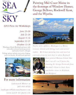
August and September are sold out for my workshop at Lakewatch Manor in Rockland, ME. Join us in June, July and October, but please hurry! Check here or here for more information.